Form Controls
A form control is a mechanism that allows you to interact with data on a form (example: Text box, List box, Button, etc.).
CSM provides the following types of form controls:
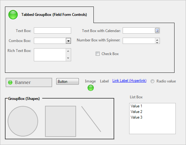
- Field form controls: Displays/stores data from a Business Object field (example: Text box, Combo box, Rich Text box, Text box with calendar, and check box).
- Standard form controls:
Enhances design and data entry.
Note: Buttons and link labels can execute a single Action when clicked (example: Run an Action). Labels might or might not be tied to a field control. Radio Buttons are associated with a field.
- Special Form Controls: Special built-in CSM Controls with enhanced functionality (example: Embedded Form, Matrix Selector, and Related Item Picker).
The following table describes the different form controls:
| Icon | Form Control | Description |
|---|---|---|
| Field Controls | ||

|
Text Box |
Rectangular frame into which you can type text. This can be a single-line Text Box or a multi-line Text Box (field property determines the number of lines). Use for:
|

|
Combo Box |
Rectangular frame into which you can either type a value or select a validated value from a list. Note: If validation is enforced on the field, you can only enter valid values into the control. Use for validated:
|
|
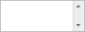
Rich Text Box |
Rectangular frame into which you can type/paste Rich Text (formatted text and/or images). This control allows access to formatting options using the Rich Text Zoom window (F8). Use for Rich Text:
|

|
Text Box with Calendar |
Rectangular frame with a popup calendar, into which you can type a date or select a date from the calendar popup window. Use for:
|

|
Number Box with Spinner |
Rectangular frame into which you can either type a number or select an incremental number from a list. Use for:
|

|
Check Box |
Square box that is selected (checked) or cleared (unchecked) to indicate a logical decision (example: Enabled/disabled, on/off, yes/no). Use for:
|
| Standard Controls | ||
|
Banner | Title and image (example: company name and logo). |
|
Button | Button that is capable of executing a single action when clicked (example: Run an Action). |
|
Group Box/Tabbed Group Box | "Container" shape around other controls. Used to organize other controls and enhance the appearance/usability of the form. |
|
Image | Custom image. Use to enhance the appearance/usability of the form. |
|
Label | Text that identifies or enhances other form elements (example: The form itself, area, control, group of controls, etc). Often, a label is tied to and identifies a field control. |
|
Link Label | Underlined text that is capable of executing a single action when select (example: Run an Action). |
|
List Box | Rectangular box with multiple values. |
|
Radio Button | List of choices; stores a value for the selection. |
|
Shape | Various shapes (ellipses, lines, and rectangles) that organize other controls and enhance the appearance/usability of the form. |
| Special Controls | ||
|
Embedded Form | Special Control that provides a "container" frame for one or more embedded forms. The control's properties define when and how the embedded forms are displayed. |
|
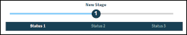
Lifecycle Progress Indicator | Special Control that shows users where their Business Object (example: Incident) is in its lifecycle. Current status and stage is shown and this is a read-only control. |
|
|
Matrix Selector | Special Control that displays a configurable matrix. |
|
|
Related Item Picker |
Special Control that allows you to quickly access related information in order to view or populate a field with a value. In CSM, you can access the following related information:
|
|
Transition Status Control | Special Control that allows the user to transition a Business Object from one status to another in its lifecycle. A tooltip is present to explain why a particular transition may not be possible. |
 Text fields
 Number fields
 Date/Time fields
 Logical fields

 and Customer Record
 )
)
 and CI Record
The following figures show the different form controls.