Theme Editor
The Theme Editor is a tool within the Theme Manager that helps define colors, fonts, images, and styles for a Theme.
Use the Theme Editor to define colors, fonts, images, and styles for:
- Dashboards.
- Forms: Alert Colors and Controls.
- Portal Sites: Header, Footer, and Grids.
- Action Catalogs.
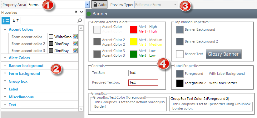
The Theme Editor preview is dynamic; when changes are made, the changes are immediately reflected in the preview (this is not available for the Portal Property Area). To commit any changes, select OK.

| 1 | Property Area: Type of Theme (Form, Dashboard, Portal, or Action Catalog). Each Theme area is organized by a group/category (example: Background, Text, Miscellaneous, and so on). |
| 2 |
Properties pane: Lists the different properties alphabetically (ascending) by group/category and then alphabetically within each group/category (example: Fonts, colors, styles, and so on). Find a property by searching, filtering by category or sorting A-Z. You can move and dock the Properties pane. |
| 3 |
Preview Type and toolbar: Item to preview with the Theme properties applied, either a specific Form, Dashboard, Portal site, or Action Catalog, or a reference Form, Dashboard, Portal site, or Action Catalog. The Auto toggle button in the toolbar locks the preview type to the property area value. While Auto is selected, a property area of Forms always shows the reference Form (for example). To see a specific Form, select the Auto button again so it is disabled. That allows users to select any preview regardless of the property area. This is important when deciding to use Dashboard named colors in a Form or the other way round. |
| 4 | Preview area: Preview of the Theme applied to a specific or reference Form, Dashboard, Portal site, or Action Catalog. |