Define a Custom Color for an X-Value in a Bar, Column, Line, or Scatter Chart Widget
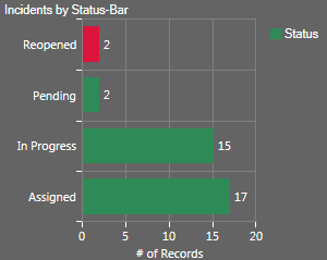
Use the Custom Colors page (accessed from within the Chart Series window) to define a custom color for a specific x-value on a Bar, Column, Line, or Scatter Chart Widget (example: Make Reopened Incidents (Status=Reopened) red to signify a higher priority). The x-value is represented by a bar in a bar chart, a column in a column chart, and a point in a line or scatter chart.
Good to know:
- By default, bar/column/point colors come from the Chart Color Palette defined in a Dashboard Theme; selecting a custom color overrides the Dashboard Theme palette.
- Dashboard Theme colors/styles can also be overridden on a per Widget basis (see Display tab).
To define a custom color for an x-value in a Bar, Column, Line, or Scatter Chart Widget:
- Create a Chart Widget.
- Define a custom color for an x-value:
- Click the
Create New button
 .
.
- Provide the value for which you want to select a custom color (example: "Reopened").
- Click the
Color Selector button
 to open the Color Selector, and then select a
color:
to open the Color Selector, and then select a
color:
- System:
Set of colors provided by your Operating System. System colors can greatly vary depending on the Operating System and browser used to view the color.
- Web:
Set of named Web-safe colors.
- Custom:
Customized Red, Green, Blue (RGB) colors.
- System:
Select OK.
Tip: Click the Edit button to change a selected color; click the Delete button to remove a selected color from the list- Show a different color for each value: Select this check box to
show a different color for each value. If you do not define custom colors for
each value, colors are assigned to each value based on the
Chart Color Palette.
Note: For Bar and Column Charts that do not use grouping, the default behavior is for every bar/column to be the same color.
- Click the
Create New button
-
Select OK.