Define Display Properties for an Action Catalog Widget
Use the Display page (accessed from within the Action Catalog Widget Properties window) to define the display properties for an Action Catalog widget.
- How the Action Catalog widgets will display: Style, color, text, images.
- When the Actions will happen: Use an expression to enable or disable
Actions using an expression (example: Disable Actions for users in a specific
Security Role). See
About
Expressions.
Access the Action Catalog Properties window from within the Widget Manager when you create or edit an Action Catalog widget.
To define display properties for an Action Catalog widget:
The OOTB Service Catalog uses the Metro Blue theme to display Actions in colorful tiles. The text to display in the Action hyperlink (example: One-Time Conference Setup and Request Account) comes from the Subcategory field. No description or images are used, and no expressions are used to enable/disable Actions.
- Create a widget.
- In the Type drop-down list, select Action Catalog.
- Select a
Style (color, font) for the Action Catalog.
Styles vary by layout (example: Column, List, Cards with Search).
Styles are based on Cascading Style Sheets (CSS) and can vary the functionality of the Action Catalog (example: The Metro style can display only three levels in a hierarchy).
- Select a Theme for the Action Catalog. Themes vary by color (example: A/C Forest, A/C Orange, Earth Tones).
- If you select the Cards with Search or Cards with Search v2 style, you can optionally select the Always show items as cards check box.
- In
Fields Holding Display Text option, select the
text to display in the Action hyperlink:
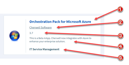
- (Mandatory)Title text: Select the field to provide the text that displays in the hyperlink (example: Subcategory).
- (Mandatory) Descriptive text: Select the field to provide a description of the Action. The descriptive text displays directly under the hyperlink.
1. Title text
2. Subtitle
3. Rating
4. Description
5. Footer
- (Optional) Select the images to display next to the Action
hyperlinks:
- Show image next to each command: Select
this check box to display an image next to each Action hyperlink and then
select one of these options:
- Field with image: Select this option to display an image from a field, and then select the field that contains the image from the list.
- Expression: Select this option to use
an expression to conditionally provide the image (example: If Subcategory
equals Submit Incident, display a green check mark), and then define the
expression using one of the following options:
- Stored Expression: Select the
ellipsis button
 to open the Expression Manager, and then
select an existing stored expression or create a new stored expression. Stored
expressions can be reused in numerous places in
CSM.
to open the Expression Manager, and then
select an existing stored expression or create a new stored expression. Stored
expressions can be reused in numerous places in
CSM.
- Custom Expression: Select the
Custom Expression button
 to open the Custom Expression Builder, and
then create a custom expression specifically for this scenario.
to open the Custom Expression Builder, and
then create a custom expression specifically for this scenario.
- Stored Expression: Select the
ellipsis button
See About Expressions and Create an Expression.
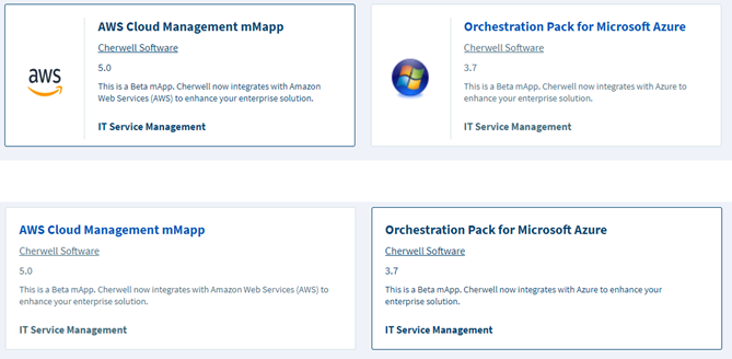
The figure below shows two Cards. The first one has Show image next to each command selected and the second one has Show image next to each command cleared.
- Show image next to each command: Select
this check box to display an image next to each Action hyperlink and then
select one of these options:
- (Optional) Select the check box
Use an expression to enable/disable actions to
use one of the following options (example: To Disable Actions for users in a
specific security role):
- Stored Expression: Select the
to open the Expression Manager, and then select an
existing stored expression or create a new stored expression. See
Create an
Expression.
- Custom Expression: Select the Custom Expression button to open the Custom Expression Builder, and then create a custom expression specifically for this scenario.
- Stored Expression: Select the
- Select OK.