Standard Widgets
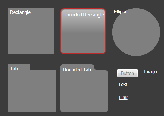
A Standard Widget is a Widget that enhances the appearance and usability of a Dashboard. CSM provides the following Standard Widgets:
- Button: Executes a single Action when clicked (example: Run a Report, send an e-mail, create a new Incident, etc.).
- Image: Displays a custom image (example: Company logo, employee photos, icons to indicate breached SLAs, etc.).
- Link: Executes a single Action when clicked (example: Drill down into another Dashboard, open the Dashboard Manager, etc.).
- Text: A "floating" Widget that textually identifies or enhances other Dashboard elements (example: The Dashboard itself, area, Widget, group of Widgets, etc.).
- Shapes (Ellipse, Rectangle, Rounded Rectangle, Tab, and Rounded Tab): Widgets that can be used to organize other Widgets to enhance the usability/appearance of a Dashboard.

Good to know:
- Standard Widgets are highly configurable and vary by type.
- A Text Widget is technically a Gauge Widget.
- Button and Link Widgets can execute a single Action.
- By default, most Shape Widgets acquire their text, colors, border style, and background style properties from the defined Dashboard Theme; however, you can define your own properties, if needed.
- Image Widgets do not support text, background, foreground, or border colors; therefore no colors, styles, or fonts can be applied.
- By default, Text Gauge Widgets have a transparent background. To manually add a background, right-click the Widget, select a background style, and then select a background color and border color.