Tour a Grid
Grids display a list of items that you can view and edit. Common features of grids include titles, columns that you can sort and filter, check boxes for selecting multiple items (Search Results grids only), and menu bars for taking Actions.
The following figure shows an example of a grid in the CSM Desktop Client.
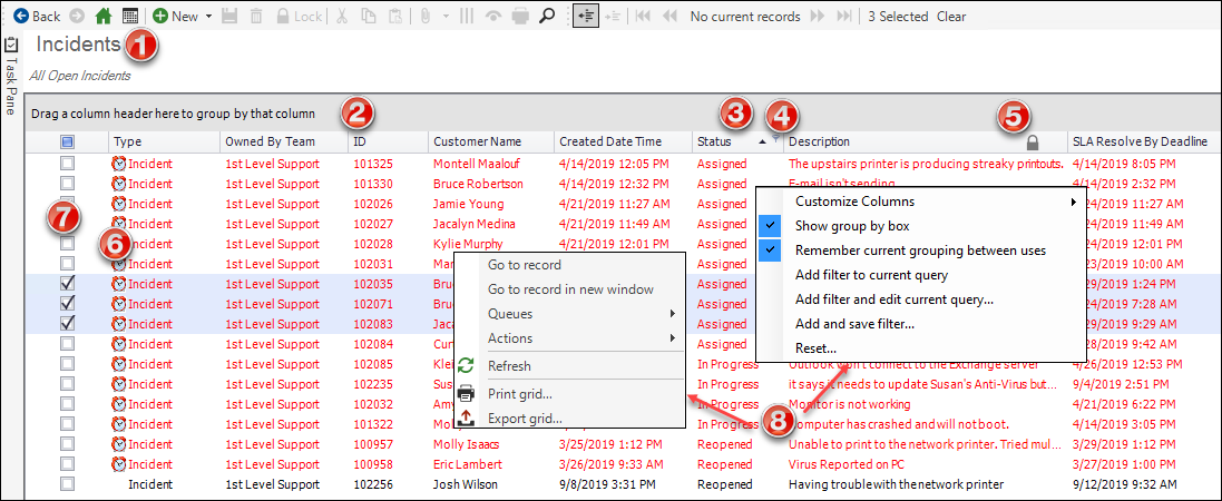
- Grid title: This title may not match the name of the Business Object that the grid represents. Also, a Business Object might have multiple grids, each with its own name.
- Group By box: Displays the grid data grouped by one or more columns so that data can be broken down into smaller parts or examined from a different viewpoint (example: Group Incidents by Priority). To group a grid, drag a column header into the Group By box (located directly above the grid header).
- Sort icon: Indicates the column currently
sorting the grid and if it is in ascending or descending order (

 ). Select the icon to toggle sorting. Select another
column heading to sort by that column.
). Select the icon to toggle sorting. Select another
column heading to sort by that column.
- Filter icon: Indicates the column data can be filtered. Select the icon to show filtering options (possible filter values appear in the column's Filter drop-down menu).
- Lock icon: Indicates that the column cannot be sorted.
- Images: Expression-driven images can be used to indicate a condition has been met (ex: Display breached SLAs with an Alarm Clock image). Grid rows also support expression-driven colors.
- Selection check boxes: Check boxes allow you to select multiple items for exporting records or running One-Step Actions.
- Context (Right-Click) menus: Shows common grid operations, such as customize columns, refresh, print, export, and more.
Grids in the Browser Client and CSM Portal look very similar to CSM Desktop Client grids, except that Export, Run Action, and Add/Remove Grid Column options are available on a grid toolbar rather than from a context menu or menu bar. Grid grouping is not currently available.
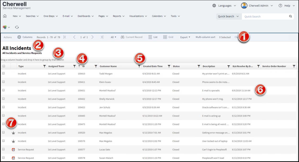
- Grid menu bar: Displays actions available for the grid, including navigation, Actions, export, number of items selected, and available columns.
- Title: Grid title. This might or might not match the name of the Business Object that the grid represents. Also, a Business Object might have multiple grids, so each might have its own name.
- Group By box: Displays the grid data grouped by one or more columns so that data can be broken down into smaller parts or examined from a different viewpoint (example: Group Incidents by Priority). To group a grid, drag a column header into the Group By Box (located directly above the grid header).
- Sort icon: Indicates the column currently sorting the grid,
and if it is in ascending or descending order (). Select the icon to toggle sorting. By default, the
Browser Client
sorts grids using single-column sorting. To sort the grid using multiple
columns, select the
Multi-column sort button in the grid menu bar.
If you need to resize a column, use the sizing handles to drag the column to
the width you want.
- Filter icon: Indicates the column data can be filtered. Select the icon to show filtering options (possible filter values appear in the column's Filter list).
- Grid item: Each item within a grid contains its own line of information. Selecting the item opens the record in the main pane.
- Selection check boxes: Check boxes allow you to select
multiple items for exporting records or running
One-Step Actions.
Note: The Actions menu is disabled when more than one item is selected in a Search Results grid.