Define Analysis for a Column, Line, or Scatter Chart Widget
Use the Analysis page (accessed from within the Chart Series window) to define Analysis formulas (example: Forecasting/trend lines) for a Column, Line, or Scatter Chart Widget. Formulas include:
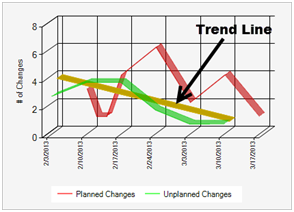
- Trend Lines: A Trend Line is a straight line that connects two or
more points on a chart to indicate a pattern. Use a Trend Line on your Column,
Line, or Scatter Chart Widgets to analyze trends so that you can more
accurately forecast and implement mitigation strategies. For example, use a
Trend Line to display/predict a pattern for:
- Number of Incidents that your Service Desk logs.
- How long it takes to resolve P1 Incidents.
- How many planned and unplanned changes affect your organization.
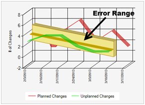
Note: You can also add an error range above and below the Trend Line.
The following figures show a Chart Widget with a Trend Line, with and without a calculated error range.
Trend Lines are highly configurable, so you define:
- Whether or not to display a Trend Line.
- Whether or not to display an error range above and below a Trend Line.
- Whether or not to display the Trend Line and error range in the Chart Widget legend.
- Colors for the Trend Line, error range border, and error range
background.
Note: The Chart Series window is accessed from within the Widget Manager when you create or edit a Chart Widget, and then add a Series.
Good to know:
- Trend Lines are available only on Column, Line, and Scatter Charts.
- Trend Lines can be added for one or more series in a chart.
- Forecasting formulas (example: Trend Lines) are not available when individual values are plotted next to one another in a chart.
- Formulas cannot apply to stacked series. Because the origin of the stacked points are not at the x-axis, stacked series points are not drawn at their actual Cartesian coordinates.
To define Analysis for a Column, Line, or Chart Widget:
- Create a Chart Widget.
- In the Chart Series window, click the Analysis page.
- Define the formula to use for analyzing the data in the Chart Widget. Currently, Forecasting (Trend Lines) is the only option.
- Define the analysis parameters:
- Regression Type: Select the type of regression for the Trend Line. Currently, only Linear is supported.
- Show Approximation Error: Select this check box to display an error range above and below the Trend Line.
- Show Approximation in Legend: Select this check box to display the Trend Line (labeled "Approx") in the Chart Widget legend.
- Show Error Range in Legend: Select this check box to display the error range (labeled "Error" in the Chart Widget legend).
- Define colors for Trend Lines and error ranges (Appearance area):
- Approximation Line Color: Select a color for the Trend Line.
- Error Range Border Color: Select a color for the border (top and bottom) of the error range.
- Error Range Background Color: Select a color for the background (area between the top and bottom border) of the error range.
-
Select OK.