Define Appearance for a Matrix Widget
Use the Appearance page (in the Matrix Widget Properties window) to define how the Matrix Widget looks and behaves, including:
- Custom font and font color.
- Highlighting alternate rows.
- Fixed row height.
- Show/hide column headers.
To define appearance for a Matrix Widget:
- Create a Widget.
- In the Type drop-down, select Matrix.
- Click the
Appearance page.
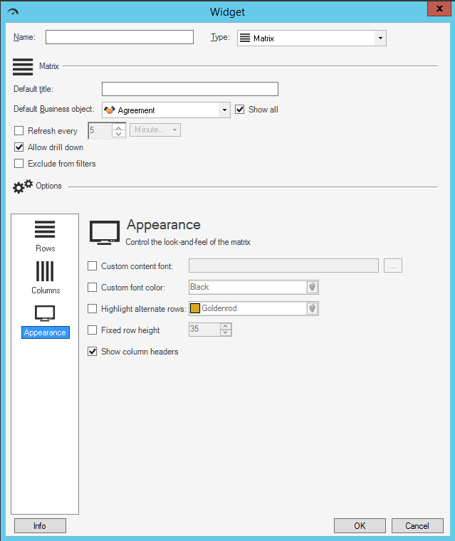
- Define the appearance properties:
- Custom content font: Select this check box to use a specific font
for text displayed on the Matrix. (If not selected, the Widget uses the Theme
font currently applied to the Dashboard on which the Matrix appears). Click the
Ellipses button
 to open the Font window, and then select a
Font,
Style, and
Size.
to open the Font window, and then select a
Font,
Style, and
Size.
- Custom font color: Select this check box to use a custom color to
use for all text (that is not otherwise overridden by Expressions on a
per-column basis). Click the
Color Selector button
 to open the Color Selector, and then select a
color:
to open the Color Selector, and then select a
color:
- System:
Set of colors provided by your operating system. System colors can vary greatly depending on the operating system and browser used to view the color.
- Web:
Set of named web-safe colors.
- Custom:
Customized red, green, blue (RGB) colors.
- System:
- Highlight alternate rows: Select this check box to add a color to every other row so that rows can be differentiated from one another. Then, select the color for the alternate row.
- Fixed row height: Select this check box to use a specific row height. Then, provide the row height, in pixels. By default, the height of rows is based on content and available space.
- Show column headers: Select this check box to display the name of each column above that column. If unselected, headers will not be displayed.
- Custom content font: Select this check box to use a specific font
for text displayed on the Matrix. (If not selected, the Widget uses the Theme
font currently applied to the Dashboard on which the Matrix appears). Click the
Ellipses button
-
Select OK.