Define the Y-Axis Values for a Bar, Column, Line, or Scatter Chart Widget
Use the Y-Axis page (accessed from within the Chart Series window) to define the values to display on the y-axis of a Bar, Column, Line, or Scatter Chart Widget. Values can be based on:
- The number of records.
- A calculated function (average, maximum, minimum, or total): For example, an average customer satisfaction rating.
- A calculated duration (average, maximum, minimum, or total based on
an amount of time): For example, the average amount of time that Incidents
(meeting your criteria) take to resolve each day.
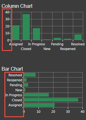
Note: In Column, Line, and Scatter charts, the y-axis is the vertical axis. In Bar charts, the y-axis is the horizontal axis because the bars go across the Chart.
 Note: The Chart Series window is accessed from within the Widget Manager when you create or edit a Chart Widget, and then add a Series.
To define the y-axis values for a Bar, Column, Line, or Scatter Chart:
- Create a Chart Widget.
- In the Chart Series window, click the Y-Axis page.
- Define the values to display on the y-axis. Values can be:
- Number of records: Select this radio button to display the number of records that match the criteria (example: 15 Open Incidents).
- Function: Select this radio button to display a value that calculates an average, maximum, minimum, or total value based on a selected Field, and then select the function and Field (example: Display the average cost of Incidents that meet the criteria; Function = Average and Field = Cost).
- Duration function: Select this radio button to calculate a value based on an amount of time, and then select the Start/End Fields and the units (duration) (example: Display the average amount of time that Incidents (meeting your criteria) take to resolve each day (example: Start Field = Created Date/Time, End Field = Closed Date/Time, and Units = Days).
- Axis Type: Associate the data series with an axis, either:
- Primary (default): Select this radio button to associate the data series with the y-axis to the left of the chart.
- Secondary: Select this radio button to associate the data series
with the y-axis on the right of the chart.
Tip: Use a secondary axis when you have two or more data series with ranges that are very different in magnitude and you want to display details of both (example: Data series 1 has values ranging from 0 to 5; data series 2 has values ranging from 0 to 2000). Displaying them on the same y-axis would mean data series 1 would look flat.
-
Select OK.