Define an X-Axis for a Chart Widget
Use the X-Axis page (accessed from within the Chart Widget Properties window) to define how an x-axis looks and behaves in a Chart Widget. Properties include:
- Value Type: Date/Time, Number, Text, or Logical (True/False).
- Value Units (Date/Time value only): Days, Weeks, Months, Quarters, Years, Hours, Minutes, or Seconds.
- Label: Text to display on the x-axis.
Doughnut and Pie Charts only:
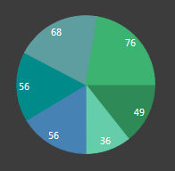
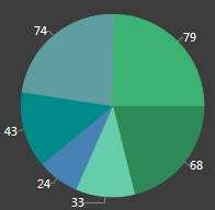
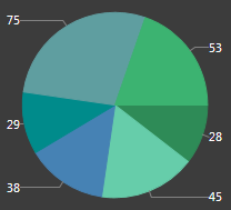
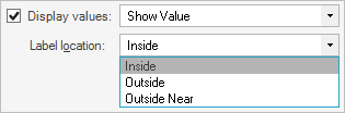
- Label Location: Where to place the labels on a Doughnut/Pie Chart (ex: Inside the slice, Outside the slice with a line connector, Outside Near the slice aligned in columns with a line connector).
|
|
|
| Inside | Outside | Outside Near |
Date/Time and Number values only:
- Axis Represents: Timeline or
Numeric Sequence, with values distributed over
time/number line: Distributes data points in order on a continuous timeline
or numeric sequence (ex: Earliest to latest date for Date/Time values and 1-100
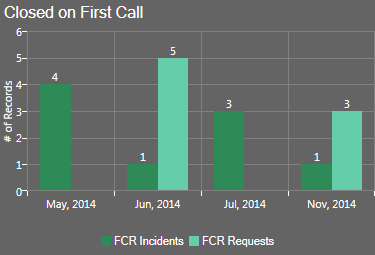
for Number values). For example, the following figures show Column, Line, and
Scatter Charts that plot on a timeline (May through November) the # of
Incidents and the # of Requests Resolved on First Call each month. Months with
no data points (ex: August through October) ARE included in the timeline
(x-axis).
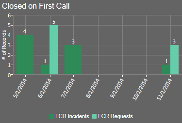
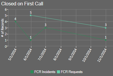
Timeline on Column Chart Timeline on Line Chart 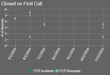
Timeline on Scatter Chart - Individual values, with data points next to
one another: Plots Individual data points next to one another with time or
numbers for reference. For example, the following figures show Column, Line,
and Scatter Charts that plot the # of Incidents and the # of Requests resolved
on First Call, with the month for reference. Note that months with no data (ex:
Aug through October) are NOT included in the x-axis. Also note that a line is
not drawn from one point to the next point in a series when there is a
"missing" x-value between the points (ex: When two or more series do not have
the same number of points, such as FCR Request not having a July data point).
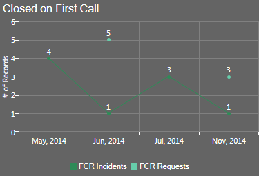
Individual Values on Column Chart Individual Values on Line Chart 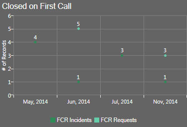
Individual Values on Scatter Chart The Chart Series window is accessed from within the Widget Manager when you create or edit a Chart Widget, and then add a Series.
Good to know:
- You can have multiple data series in a chart but all series must be the same Value Type (ex: All Date/Time).
- The x-axis values themselves are defined as part of the series (see Define a Series for a Chart Widget).
- In Column, Line, and Scatter Charts, the x-axis is the horizontal axis. In Bar Charts, the x-axis is the vertical axis because the bars go across the chart.
- Forecasting formulas (ex: Trend Lines) are not available when individual values are plotted next to one another in a chart.
- Prior to CSM 4.6, all charts plotted individual values on the x-axis (timeline was not available).
To define an x-axis for a Chart Widget:
- Create a Widget.
- In the Type drop-down, select Chart.
- Click the x-axis
page.
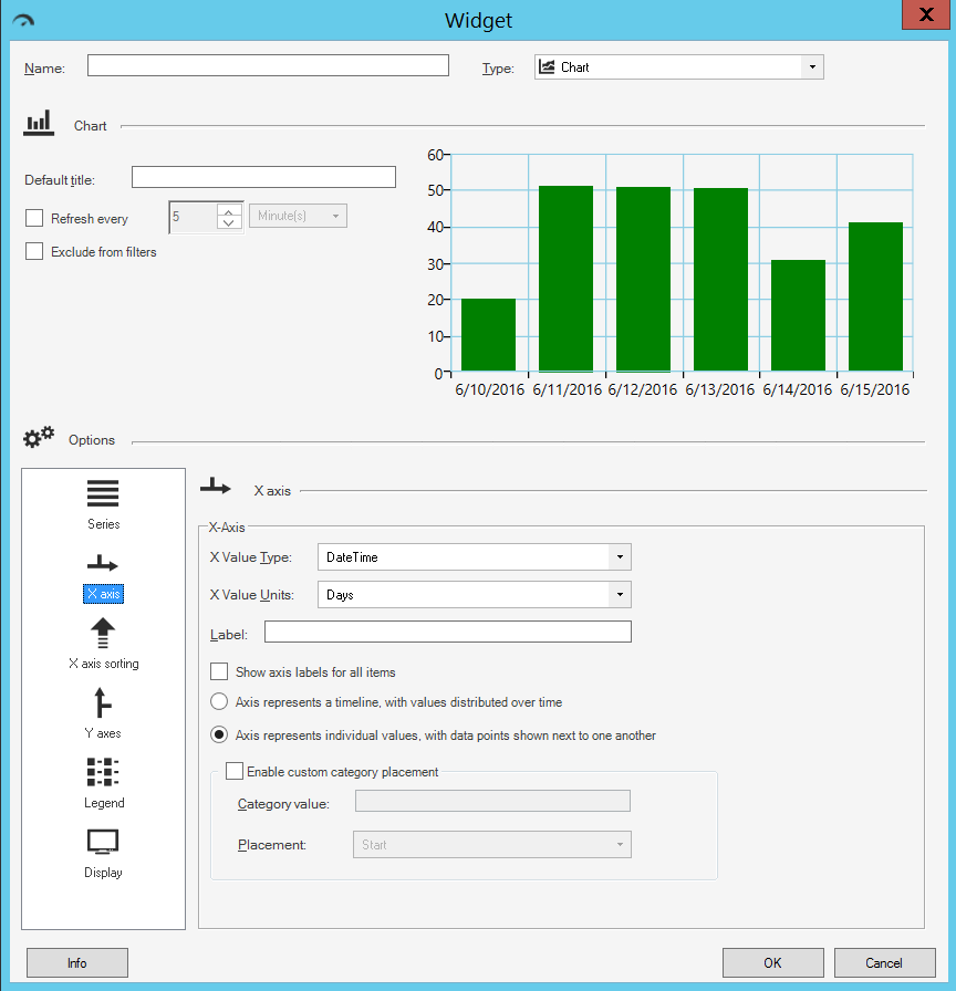
- Define the following properties:
- X-Value Type: Select the
type of data to display on the x-axis (you
can have multiple data series but all series must be the same type of data):
- DateTime
- Number
- Text
- Logical (True/False)
- X-Value Units (Date/Time value only): Select the date/time units (ticks) to display on the x-axis (ex: Days, Weeks, Months, Quarters, Years, Hours, Minutes, or Seconds).
- Label: Provide the
text
to display on the x-axis.
Tip: Typically, the x-axis is labeled with the name of the Field whose data it displays.
- Show Label for All Items: Select this check box to display a label for every tick on the x-axis. Otherwise, the chart only displays labels for some ticks to save space.
- Label Location (Doughnut/Pie Chart only): Select where to place
the labels on a Doughnut/Pie Chart (ex: Inside, Outside, Outside Near).
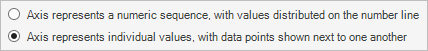
- Axis represents (Date/Time and Number values only): Select one
option:
- Timeline or Numeric Sequence, with values distributed over time: Select this radio button to distribute data points in order on a continuous timeline or numeric sequence (ex: Earliest to latest date for Date/Time values and 1-100 for Number values).
- Individual values, with data points
next to one another: Select this radio button to plot individual data
points next to one another with time or numbers for reference.
- Enable Custom Category Placement: Select this check box to enable
the placement of one axis value at either the start or end of the x-axis:
- Category Value: Provide the text of the axis label of the category that you want to match.
- Placement: In the drop-down, select where on the x-axis to
place the category value (either Start or End).
Custom Category Placement can be enabled for all charts except pie, doughnut, and pipeline, and does not work for continuous numeric or date/time axes.
- X-Value Type: Select the
type of data to display on the x-axis (you
can have multiple data series but all series must be the same type of data):
-
Select OK.