Define How Values are Grouped for a Bar, Column, Line, or Scatter Chart Widget
Use the Grouping page (accessed from within the Chart Series window) to define when and how values are grouped in a Bar, Column, Line, or Scatter Chart Widget. Use this data to further break down your main field and to view patterns. For example, group:
- Category by status: Displays a bar, column, line, or point for each status within each category.
- Status by owner: Displays a bar, column, line, or point for each owner within a status.
- Status by priority: Displays a bar, column, line, or point for each priority within a status.
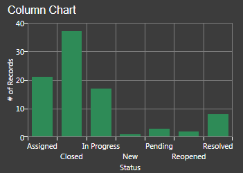
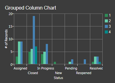
The following figures show Incident by Status column charts, ungrouped and then grouped by priority:
|
|
| Column Chart - Incidents by Status | Grouped Column Chart - Incidents by Status, Grouped by Priority |
The Chart Series window is accessed from within the
Widget Manager when you create or edit a Chart Widget, and then add a series.
Good to know:
- Use grouping on simpler charts. Grouping values on multi-series charts and stacked charts can clutter the data.
To define how values are grouped for a Bar, Column, Line, or Scatter Chart Widget:
- Create a Chart Widget.
- Define how values are grouped:
- Group by: Select this check box to enable grouping.
- Field: Select the Field to use to group values (example: Priority).
- Units (date/time Fields only): Select the date/time unit to display.
-
Select OK.