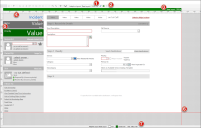
Design Features for Adaptive Forms
Tour the Adaptive Layout design features in the Form Editor.
-
Layout selector: Toggles to the specified layout when you select it from the drop-down of available layouts.
-
Create, Edit, and Delete buttons: Opens the Create Layout dialog box when you select the Create New button
 . Opens the Edit Layout dialog box when you select the Edit button
  . Opens the Delete Layout dialog box when you select the Delete button
  .
. -
Visual guide bar: Shows the display name and the width for each of the configured layouts. Toggles to the selected layout when you click anywhere in the guide color for the layout. A triangle appears next the name of the layout that is currently selected. Right-click anywhere in the guide color to edit the layout's properties or to delete it. Define the guide color for a layout by editing its properties.
-
Horizontal ruler: Indicates width in device-independent pixels. Use this ruler to measure the point where a horizontal scroll bar will appear. For example, for a layout with a width of 1200 DPI, a horizontal scroll bar will appear on devices with screen widths that are 1199 DPI or smaller unless you create additional layouts.
-
Vertical ruler: Indicates height in device-independent pixels. Use this ruler to measure the point where a vertical scroll bar will appear. For example, for a layout with a height of 800 DPI, a vertical scroll bar will appear on devices with screen heights that are 799 DPI or smaller unless you create additional layouts.
- Layout boundaries: The width boundary indicates the width of the layout. The height boundary indicates the height of the layout. The space beyond the layout boundaries is grey to indicate that Fields in that space will not render on the layout.
-
Status bar: Shows the properties for the selected layout, including display name, icon, guide color, and size.
