Working with Theme Editor State Override
You can override the associated colors in the Color Palette for any element to which override colors can be applied.
You cannot add or delete State Override swatches.
State Override is displayed for forms only.
The colors in the Color Palette that are associated to elements in your theme are overridden by the colors you configure in a State Override swatch when the element changes state.
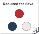
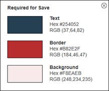
Each State Override swatch contains three colors that are applied to an element's text, border and background.
There are five permanent color swatches in the State Override section, these are:
- Required for Save: Applies to any element in your form that must contain content (such as text) or requires an action to enable save.
- Disabled: Applies to specific elements on your form that are disabled, such as a drop-down list or control text.
- Disabled Button: Applies to form buttons that are disabled.
- Disabled Link: Applies to link labels that are disabled.
- Read-Only: Applies to text content that is (or is changed to) read-only.
Edit State Override Colors
To edit a State Override color swatch:
- Hover the cursor over the swatch and select Edit.

The Color Edit dialog box opens.
- Hover the cursor over a color you want to change and select Edit.
The State Override Color dialog box opens.The State Override Color dialog box contains the Color Selector feature, see About the Color Selector.
- Use the Color Selector to define the new color.
- Select Apply.
Any changes you apply are displayed in the Form Preview.