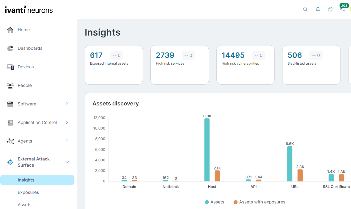
Insights
Use the External Attack Surface > Insights page to see a high-level overview of your organization's internet attack surface.
When you first open this page it will show data from all workspaces. In the all workspaces view, selecting a tile will show that tile's data for each configured workspace. If you only want to see data for a specific workspace that you are a member of, select it from the Workspace list at the top.
At the top of the page are your attack surface key performance indicators:
- Exposed internal assets
- High risk services
- High risk vulnerabilities
- Blocklisted assets
- Email and IP breaches
Selecting a blue number in an indicator will take you to a filtered summary of those items for each workspace. Select a workspace from the summary to see the details.
The image below describes how the Vulnerability Risk Score (VRS) that appears on this page is calculated:

The following sections describe widgets on the Insights page.
Workspace asset discovery
This widget summarizes discovered asset types. Selecting a bar in the widget will take you to a filtered Assets tab view.
The asset types include:
- Domain: The Domain Name System (DNS) that your organization belongs to.
- Host: The Internet Protocol (IP) addresses in your account.
- URL: Contains addresses referring to different objects on the web.
- API: Application Program Interfaces (APIs) allow applications to communicate and share data.
- ASN: Autonomous System Numbers that control routing within a network.
- SSL Certificate: The Secure Sockets Layer (SSL) certificate or web server code provides security for online communications, issued by a certificate authority.
- Netblocks: Netblocks are Classless Inter-Domain Routing (CIDR) ranges consisting of IP address ranges.
- Others: Assets that do not fit into any of the above categories.
Workspace exposures breakup
This funnel widget divides exposures by type, with the more critical and recommended actionable exposures to the left side of the widget. Each section is color-coded by severity and shows how many exposures are detected and the number of assets affected.
- Open Exposures: This stage provides a consolidated count of all exposures detected across your assets.
- Vulnerable: These exposures represent vulnerabilities within your network infrastructure that need attention and remediation.
- Exploitable: These vulnerabilities are accompanied by publicly known exploits that can be leveraged by attackers, making them more dangerous and urgent to address.
- Ransomware: This stage includes vulnerabilities with known associations to ransomware families or those that have been exploited by ransomware gangs in the past. Remediation of exposures at this level is of utmost importance, as they pose a critical risk and could lead to debilitating ransomware attacks.
Top exposed services
This widget shows internet service ports with critical exposures. These include service ports such as FTP and SSH, along with ports commonly used by remote access trojans (RAT).
Hosts by geolocation
This widget shows geographically where assets have been discovered. Use this to find assets in unexpected locations that perhaps need investigation. Selecting a dot on the map will take you to a filtered list showing those assets.
Top 5 vulnerabilities
This widget shows you the top five CVEs based on the VRS score and the number of assets affected.
VRS is based on vulnerability intelligence from over 100 sources, including how likely a CVE will be exploited in the near future. This information is then used to calculate a consolidated score.
Ivanti Neurons for RBVM customers may be familiar with the VRR score used there. The main difference is that the VRS score used here includes exploitability prediction in the calculation.
Open exposures by age and severity
This widget helps you visualize your exposure status over time. The severity axis levels are based on the Common Vulnerability Scoring System score.
Workspace exposure breakup
This funnel widget divides exposures by type, with the more critical and recommended actionable exposures to the left side of the widget. Each section is color-coded by severity and shows how many exposures are detected and the number of assets affected. The exposure timeline is for a six month period.
Exposures older than 90 days and categorized as critical severity pose the highest risk and should be addressed urgently. Additionally, exposures older than one week (critical severity) and 30 days (high severity) require attention.
Assets vs. exposures timeline
This widget shows monthly exposure timeline trends, based on the number of exposures and the color-coded exposure severity. When you first set up EASM, you will only see a single bar for the month you started data collection. Another bar will be added each month.
Select a severity at the bottom of the widget to toggle whether that severity is included in the chart.
Exploits
The Exploits widget displays the total number of Exploits identified in the assets of your selected workspace. It categorizes the total number of exploits by Exploit Type in the column indicating number of exposures detected for each exploit type. Additionally, it provides the count of Assets associated with each exploit type. This information is crucial for the security analysts to understand the prevalent threats within their estate.
Exposures by risk vectors
The Exposures by risk vectors widget provides you with an overview of security exposures across different risk vectors in your workspace. Severity levels categorize the risk vectors as Critical, High, Medium, and Low.
The risk vectors include the following:
-
DNS health
-
Network security
-
Email security
-
Data leaks
-
Patching cadence
-
Application security
-
Social engineering
Quick Filters
The Quick Filters in the Assets, Exposures, and Technologies tabs in External Attack Surface > Insights are pre-set options that let you instantly narrow down assets and findings by type, status, or risk. Accessed from the dashboard, they help you quickly highlight items like vulnerable assets or expired certificates with a single click. The available selections within a quick filter depend on what EASM has detected in your assets. Quick filters work in combination with column filters.