Self Service Mobile UI changes
This topic lists all the changes made to the Self Service Mobile user interface in 2021.2 release.
•Form field height
The minimum height of fields in the Service Catalog is set to 50. If you set a value less than 50, by default it is re-adjusted to consider 50.
•Upload field
The upload control fields in the Service Catalog are dynamic. Whatever value is set for the field height when configuring the Service Catalog form the height will be set to 0 and the fields expand based of the content in it. For example, when you add multiple attachments, the field's height expands to display the file names of all attachments.
•Service Catalog Card size
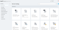
The size of cards in the Service Catalog workspace is increased.
•Icons
All icons are revamped to align with the improved modern user interface.
•UI Theme
The user interface is gray themed giving it a more sophisticated look aligning with the modern UI.
•Popular Items
The Service Offerings for the Popular Items category in the Service Catalog workspace is collapsed by default in the desktop mode. However, it is expanded in tablet and mobile.
•Internet Explorer
The user interface in Internet Explorer is slightly different, the fields have squared edges instead or rounded.
•Fields
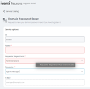
The fields color varies based on it's state. The following are the different color codes:
•Gray border - this is the default state when no field selection is made.
•Blue border - when the field is selected.
•Dotted gray border - read-only field.
•Red border - when no input is provided for the field mandatory and when the field has wrong input. When you hover over your mouse, the reason is displayed.

