Working with Page Settings - Home Page
Role:Administrator.
Minimum Version: IvantiNeurons for ITSM 2024.2.
To access the Home page settings:
-
Log in to Neurons for ITSMSelf Service portal as an Administrator.
-
Click Edit Page at the top right of the window. The Page Designer opens.
-
Select the Home page from the Page Selector dropdown list.
-
Select the page view you want to edit from the View Selector dropdown list - Desktop, Mobile, or Tablet.
-
Select the Page Settings tab.
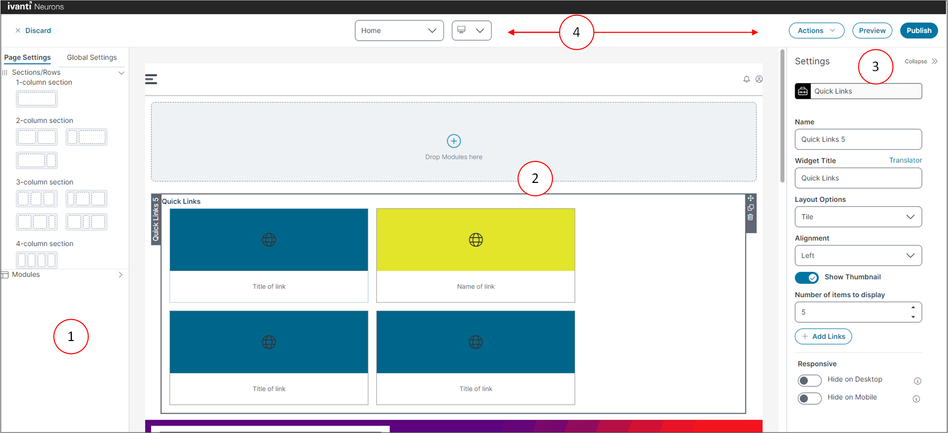
Page Designer Settings Displayed for the Home Page:
-
Page Settings and Global Settings tabs: Select the Page Setting tab to access the Sections/Rows and Module element lists. Select the Global Settings tab to access settings that apply to the entire page.
-
Design panel: The area where you construct and view your page design.
-
Settings panel: Select and configure the various settings that apply to your page elements.
-
Page functions:
•Page selector: Use the Page Selector drop-down list to display the page you want to edit.
•Role selector: Use the Role Selector to select the role template you want to edit.
•Organization selector: Use the Organization selector to select the organization template you want to edit.
The Config Homepage for MSP global constant must be enabled (set to True) to view the Organization selector. For information on global constants, refer to Working with Global Constants.
•View selector: Use the View Selector drop-down list to select the page design view for different devices; select Desktop, Mobile or Tablet.
•Actions: Select to save and continue editing the page, delete the draft page, export the page, or import a page.
•Preview: Preview the current section and module design. In preview, select Back to edit mode to return to editing.
•Publish: Publish the page.
•Discard: Discards all edits that you have made during the editing session.
For information on the Global Settings tab, refer to Working with Global Settings.
When all settings are completed, including any global settings you have made:
•Click Publish to publish the page.
•You can also click the Preview button to preview the page and check your settings prior to publishing.
If you want to save the page as a draft for a later time, or continue editing:
•Click the Actions drop-down, and then select Save and continue editing.
•Page selector: Use the Page Selector drop-down list to display the page you want to edit.
•Role selector: Use the Role Selector to select the role template you want to edit.
•Organization selector: Use the Organization selector to select the organization template you want to edit.
The Config Homepage for MSP global constant must be enabled (set to True) to view the Organization selector. For information on global constants, refer to Working with Global Constants.
•View selector: Use the View Selector drop-down list to select the page design view for different devices; select Desktop, Mobile or Tablet.
•Actions: Select to save and continue editing the page, delete the draft page, export the page, or import a page.
•Preview: Preview the current section and module design. In preview, select Back to edit mode to return to editing.
•Publish: Publish the page.
•Discard: Discards all edits that you have made during the editing session.
For information on the Global Settings tab, refer to Working with Global Settings.
When all settings are completed, including any global settings you have made, click Publish to publish the page.
You can also click the Preview button to preview the page and check your settings prior to publishing.
Click the Actions dropdown, and then select Save and continue editing to save the page as a draft for a later time, or continue editing.
The Page Settings tab contains the following page elements:
Use the Sections/Row tab to add sections, and specify background colors and images. You can also drag the modules onto existing sections to rearrange them within the layout.
1.Click Sections/Rows. You can add 1-column, 2-column, 3-column, and 4-column sections to your page design based on your requirements.
2. Once you drag the sections onto the page, the Drop Modules here box appears, allowing you to drag the modules you want to create for your page design.
3.Drag the sections you want to add to the page; the Settings panel appears. Enter the following details.
| Field | Description |
|---|---|
| Name | Enter a name for the section. |
|
Number of columns |
Select the number of columns to display in the section. |
|
Background Color |
Select a background color for the section. Use the Background image toggle icon to enable or disable the background image. You can also edit or delete the image based on your requirement. Click Add image and select an image for the background. |
|
Background Width |
Background width. Use the Rounded Corners toggle icon to enable or disable rounded corners. |
|
Responsive |
Under Responsive, two options appear: Hide on Desktop: Enable or disable to hide or show the entire section/row only in desktop view. Hide on Mobile: Enable or disable to hide or show the entire section/row only in Mobile view. |
The following buttons are also available in the Sections/Rows:
•
![]() to clone a widget.
to clone a widget.
•
![]() to arrange the section.
to arrange the section.
•
![]() to delete the section.
to delete the section.
Use the Modules tab to create custom widgets, hero banners, search bar, add text and media, and quick links.
To add a Hero banner:
The Hero Banner is a drag-and-drop module used to create static or dynamic banners. It supports multilingual content, call-to-action buttons, carousel layouts, and responsive visibility.
1.Click Modules.
2.Drag the Hero Banner onto the page. The Settings panel appears on the right side of the page. Specify the following details.
| Field | Description |
|---|---|
| Name |
Name of the banner. Select the Static or Dynamic options based on your requirements. The Static option enables you to use different colors, title text, and Call-to-Action (CTA)links, which can add a banner in the carousel view. The Dynamic option allows you to configure a banner with the help of different business objects, sorting criteria, and number of items to display. |
|
Add image |
Add an image for the banner. |
|
Color |
Select a color for the banner. |
|
Use color as image overlay |
Enable this option to overlay the image with the selected color. The color is added as an opaque layer over the image. |
|
Title text |
Enter a title for the banner. The Translator enables you to select a language and enter a translation for the title text. |
|
Title text & CTA alignment |
Select the alignment from the dropdown list. |
|
Show call to action link |
Enable this option to show the action link as a link button on the banner. |
|
Call to action text |
Enter text to display on the link button. |
|
Call to action link |
Enter the link for the action. |
|
Add Banner |
Click to add another banner to the section. When an additional banner is added, individual settings for this banner are displayed in the Settings panel. |
|
Responsive |
Hide on Desktop: Enable or disable to hide or show the entire section/row only in desktop view. Hide on Mobile: Enable or disable to hide or show the entire section/row only in Mobile view. |
3.These steps are optional.
•To add additional banners, click Add Banner in the Settings section.
•To remove a banner, click Remove Banner in the Settings section.
•To remove all the banners, click the Remove Module in the Settings section.
-
Recommended formats for all the banners are .png, .jpeg, .gif, and .svg recommended dimensions for the banner are width = 1920px and height = 512px for large size, 256px for medium size, and 128px for small size. The maximum supported file size for banner images is 2 MB. If the uploaded file exceeds this limit, the system displays an error message.
-
To use .svg files in banner configurations, you must first add *.svg to the list of allowed attachment types. By default, .svg is not included in the out-of-the-box (OOTB) list. If it is not added, the application will display an error when you attempt to upload the file. To enable it, refer to Allowed File Extensions, and add *.svg to the list.
Use the List widget to fetch search data based on Saved Search, Service Catalog, My Items, Favorites, and Validation List and list their results.
1.Click Modules.
2.Under the Widgets section, drag the List icon to the page section.
3.To configure the List widget, edit Settings panel.
•Enter Name and Widget Title.
•Select one of the following option from the Get data from dropdown menu:
•Select Saved Search to configure the List widget by selecting a Business Object, and select the Saved Search based on that business object. You can also Sort order in Ascending and Descending order.
•Select Service Catalog to configure List with a Saved Search based on the service catalog.
•Select My Items to list your items based on the filter from From Search in the My Items workspace. You can also Sort By based on a item and Sort order in Ascending and Descending order.
•Select Favorites to list Service Requests that are marked as favorite in the service catalog.
By default Favorites is disabled here, enable Favorites in the Service Catalog workspace to reflect Favorites here. For more information refer to Enabling or disabling the Favorites icon from the Page Designer:.
•Select Validation List to fetch data from a Validation List of a Business Object.
•Define the Number of items to display/Limit to limit the list. Check Show Count to show the total number of items in the list.
The show count is only for configuration with the following data-sources: MyItems, Service Catalog, and Favourites.
• Click the Options button, you can define:
•Actions such as
•Header Click to set click action for the list header.
•Item Click to set click action for list item.
•See all Click to enable and to set click action for View All link for the list.
•Configure Card of list items:
•Select the checkbox next to the dorpdown menu to show the particular field in the card.
The dropdown fields in the Configuration Card shows only when at least one record is added for the respective configuration. Otherwise it displays "no data to display" in the dropdown.
•Select the Target for the parameter. Selecting a parameter for the Title field is mandatory.
•Enable Icon and Star Ratings to show in the card.
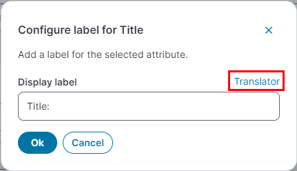
•Edit labels using the Configure Label icon ![]() .
.
To localize the label, select Translator.
•Use Empty Text to show a specific words if the item is empty.
•You can also Preview the item based on the parameters selected in the Configured Card section.
•Click Save as custom widget to save the list as a custom widget.
•You can also hide the list based on Hide on Desktop or Hide on Mobile.
You can configure and view the list widget in the Self Service even when there is no data to show or render.
To add an HTML Text box:
1.Click Modules.
2.Under Widgets, drag the List icon to the page section. The Settings panel appears on the right side on the page.
3.Enter the following:
•Name of the HTML text box and Widget Title.
•Pick a Title Color.
•Select the Title Alignment as Center, Left, or Right for the title.
•Widget Height:
•Select Auto to automatically assign the text box height.
•Select Custom to specify the height of the widget (pixels).
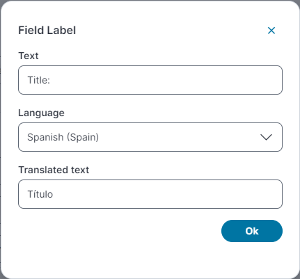
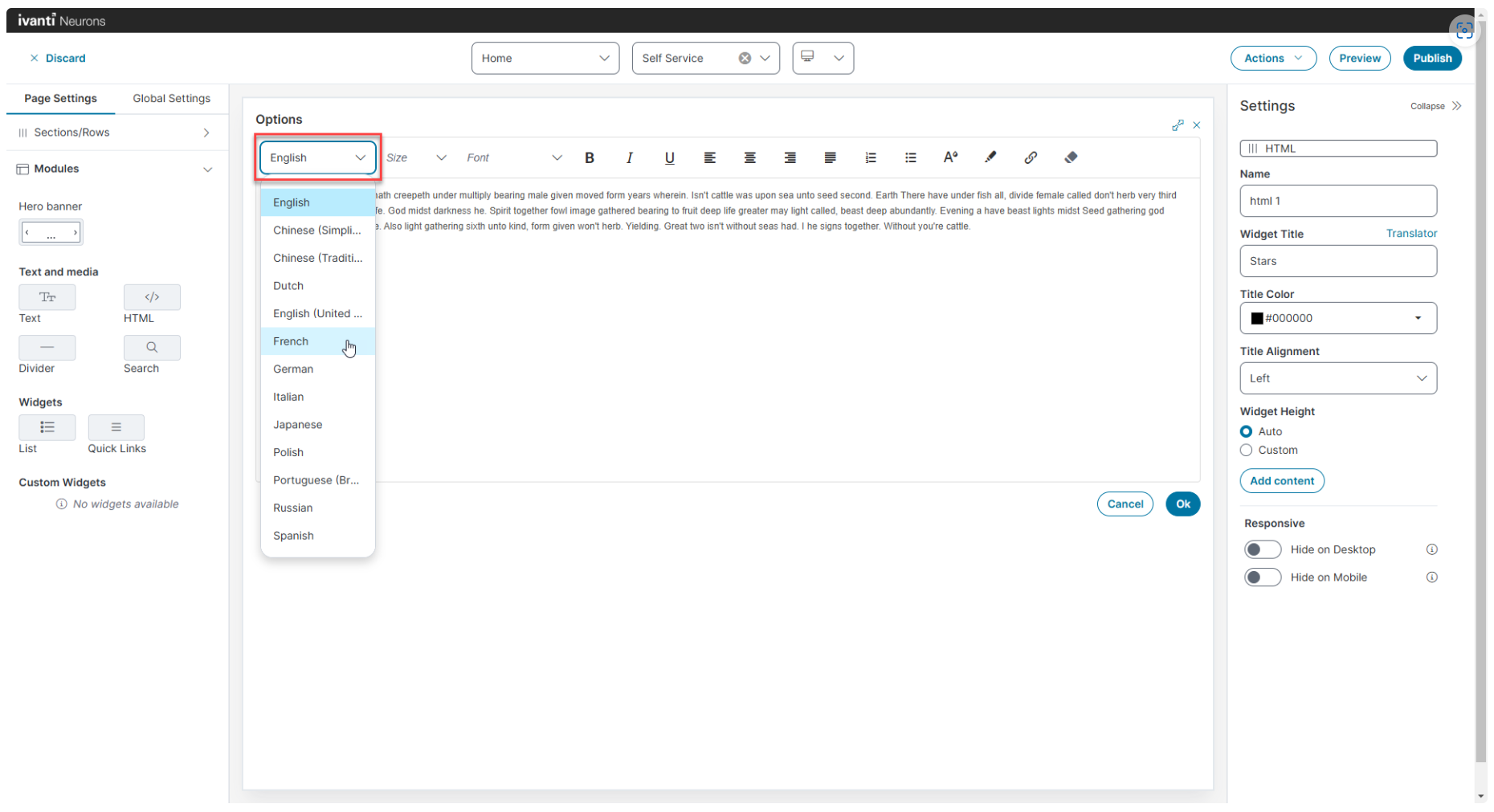
•Click Add Content to open the HTML text editor. In this you can configure the:
•Font size, color and format, add lists, links, background color, and the custom HTML code.
•Localize the content by selecting the Language and enter the Translated Text to translate.
For each language you have to manually enter the localized or the translated content.
•Select the required Responsiveness of the widget:
•Hide on Desktop: Enable or disable to hide or show the entire module only in desktop view.
•Hide on Mobile: Enable or disable to hide or show the entire module only in Mobile view.
To add a Search bar:
1.Click Modules.
2.Under Text and Media, drag the Search icon onto the page. The Settings panel appears on the right side on the page.
3.Specify the following:
•Name
•PlaceHolder text
•Search Bar Size
4.This step is optional. Enable the Show common search toggle icon to display the common search items, and enable the Show trending common keyword before a user starts typing toggle icon to display the common and trending keywords before you start typing the keywords.
To add List:
Use List widget to fetch search data based on Saved Search, Service Catalog, My Items, Favorites, and Validation List and list their results.
1.Click Modules.
2.Under Widgets section, drag the List icon to the page section.
3.To the configure List widget, edit the Settings panel.
•Enter Name and Widget Title.
•Select one of the following option from Get data from drop down menu:
•Select Saved Search to configure List with selecting a Business Object and a Saved Search based on that business object. You can also Sort order in Ascending and Descending order.
•Select Service Catalog to configure List with a Saved Search based on the service catalog.
•Select My Items to list your items based on the filter from From Search in My Items workspace. You can also Sort By based on a item and Sort order in Ascending and Descending order.
•Select Favorites to list Service Requests that are marked favorite in the service catalog.
By default Favorites is disabled here, enable Favorites in the Service Catalog workspace to reflect Favorites here. For more information see Enabling or disabling the Favorites icon from the Page Designer:.
•Select Validation List to fetch data from a Validation List of a Business Object.
•Define the Number of items to display/Limit to limit the list.
•You can define Actions and Visual Layout by clicking the Options button.
•Click Save as custom widget to save the list as a custom widget.
•You can also hide the list based on Hide on Desktop or Hide on Mobile.
To add custom widgets:
1.Click Modules.
2.Under Widgets, drag the List icon. The Text box appears. Specify the following details:
•Name
•Widget Title
•get data
•Saved Search
•Sort by and Sort order
•Number of items to display/Limit
3.This step is optional. Click Options to select the following options:
•Header click
•Item click
•See all click
•Title
•Description
•Text
4.This step is optional. Click Save as custom widget to save the widget. The saved widget appears under custom widgets.
Use Quick Links to display useful links to Business Objects, workspaces or web pages. Quick Links can be displayed in your page design as lists, tiles, or a carousel.
-
Click Modules.
-
Under Widgets, drag the Quick Links icon into the section you want them to appear.
-
In the Settings panel, specify the following:
Field/Option Description Name The name displayed on the Quick Links box tab - shown in the Page Designer only. Widget Title A title for the Quick Links widget. The title is shown on the published page (default name is Quick Links). Layout options Select a layout option from the dropdown list - List, Tile, Carousel, or Button Group Alignment Only displayed for the Tile layout. Select the link display alignment. Show Thumbnail This option is only displayed for the Tile, Carousel, and Button Group layouts. Using this you can display links as thumbnails. Enabling this option displays additional configurable options when configuring links in step 4 below. Number of items to display
The number of links to display in the widget. If you add additional links in the link Options editor, you may need to increase this value to ensure the additional links are displayed.
Add Links
Opens the link Options editor where you configure each individual link, or add additional links.
Hide on Desktop
Enable to hide the link section in desktop view.
Hide on Mobile
Enable to hide the link section in mobile view.
-
Click Add Links to add a Title for each individual quick link, the Link type, Link to details, and configure the link placement, title background color, and title font color.
Field/Option Description Title Name for the link. Translator Click to select a translation language and provide a translation for the title text. Link Type Select the link type from the dropdown list. Link To Define the destination for the link. This is dependent on the selection you make in the Link Type dropdown list, for example, a URL, workspace or Business Object. RecId
This parameter is displayed if you select a Business Object in the Link to dropdown list. Enter the RecId of the Business Object.
New Window
Only displayed for a URL link type. Select to open the link in a new browser window.
Title Placement Only displayed forTile, Carousel, and Button Group layouts. Select the link title alignment. Title Background Only displayed for Tile, Carousel, and Button Group layouts. Click to open the color editor and define the link title background color. Title Font Color Only displayed for Tile, Carousel, and Button Group layout. Click to open the color editor and define the link title font color. Thumbnail Type Only displayed if you enable the Show Thumbnail option. Select the thumbnail type from the dropdown list, can be an icon or image.
Recommended thumbnail icon dimensions are 48px x 48px and the thumbnail image renders as stretched to size of Tile, Carousel, or Button Group layouts.
Change Only displayed if you enable the Show Thumbnail option. Click to select a different icon or an image for the thumbnail. Thumbnail Background
Only displayed if you enable the Show Thumbnail option. Click to open the color editor and define the thumbnail background color.
-
Click Ok.
-
Below are the screenshot of the all the layout options in Quick Links.
Recommended Image Sizes and Layout Dimensions for Quick Links
To maintain alignment and responsiveness across different layouts and screen resolutions, use the following specifications for Quick Links widgets.
Button Group Layout
-
Thumbnail Size: (Width) 48px × (Height) 48px
Tiles Layout (when multiple tiles are used)
-
Tile Size: (Width) 226px × (Height) 168px
Carousel Layout
-
Fixed Height: 168px
|
Screen Resolution (x) |
1 Column (0.75 × x) |
2 Columns (0.45 × x) | 3 Columns (0.30 × x) |
|---|---|---|---|
|
1920px (Full HD) |
1440px |
864px | 576px |
|
1600px |
1200px |
720px |
480px |
|
1440px |
1080px |
648px |
432px |
|
1366px |
1025px |
615px |
410px |
|
1280px |
960px |
576px |
384px |
The recommended widths for the Carousel layout are calculated as a percentage of the screen resolution:
-
One-column layout: 75 percent of screen width
-
Two-column layout: 45 percent of screen width
-
Three-column layout: 30 percent of screen width
These values are approximations intended to optimize alignment and visibility across common screen resolutions. Using proportional widths ensures that carousel content is not cut off or overly compressed when rendered on different devices.
Save customized page settings as a template with the Export and Import feature in the Page Designer. You can make changes such as adding or removing widgets and modifying widget settings.
To export the page settings
1.In Page Designer, click Page Settings, and select Workspace from the dropdown list.
2.Make the required changes and click Publish.
3.Click Actions and select Export to save the template.
Exporting the page settings packages the entire template with all the page elements and media files such as images, icons, logos, or any attachments.
To import the page settings template
1.In Page Designer, click Page Settings, and select workspace from the dropdown list.
2.Click Actions and select Import.
3.Locate the saved page settings file and click Yes to confirm the overwrite the Import Changes.
4.Click Ok to confirm successful import
5.Click Publish to apply the configuration to the Page Settings.
Optionally, click Save and Continue to keep changes as a draft or click Delete Draft to discard the changes.
Importing the template automatically fetches and renders the entire template, including all the page elements and media files such as images, icons, logos, or attachments.


