To Configure Banners and Favorites
Role: Administrator
The following procedure describes how to configure Banners and enable the Add to Favorite option in the Self Service Portal V3. You can set a default banner across all workspaces or override it with page-specific banners. Banner settings allow you to define images, overlay colors, text, and search behavior. You can also configure static or dynamic Hero banners with multilingual content and call-to-action links. Additionally, you can enable the Add to Favorite icon to let Self Service users quickly access frequently visited pages.
Banner image requirements
•Recommended formats: .png, .jpeg, .gif, and .svg
•Recommended dimensions:
•Large: width = 1920px and height = 512px
•Medium: width = 1920px and height = 256px
•Small: : width = 1920px and height = 128px
•Maximum file size: 2 MB
If the uploaded file exceeds this limit, the system displays an error.
•To use .svg files, add *.svg to the allowed attachment types. By default, .svg is not included in the out-of-the-box (OOTB) list. If not added, the system returns an error when uploading an *.svg file. To enable it, refer to Allowed File Extensions.
 Configuring a (Home Page) Banner with Search bar
To configure a banner for a specific page:
-
Open Page Designer.
-
Select the target page from the Page Selector.
-
Click the Page Settings tab.
-
In the Banner section, configure the following settings:
-
Display Banner: Toggle on or off to show or hide the banner.
-
Banner Style: Use default or custom banner style.
-
Banner Size: Large or medium or small.
-
Click Edit to upload a Background Image.
-
Background Color: Choose a color for the background.
-
Use Color as Image Overlay: Overlay the background color on the image.
-
Text Color: Set the color for banner text.
-
Welcome Message: Toggle on to enable message display.
-
Message Text: Enter a greeting (e.g., “Hello #first_name!”).
-
Message Sub Text: Add supporting text (e.g., “All the Facilities services you need”).
-
-
Search:
-
Set placeholder text.
-
Choose Search Bar Size (Small, Medium, or Large).
-
-
-
Click Publish to apply the changes.
-
Click the Preview button to preview prior to publishing.
Recommended Banner Widths by Screen Resolution
To ensure correct banner display across layouts, use approximately 75% of screen resolution.
Recommended Width (Based on Screen Resolution)
| Screen Resolution (x) | Recommended Width (0.75 × x) |
|---|---|
| 1920px (Full HD) |
1440px |
|
1600px |
1200px |
|
1440px |
1080px |
|
1366px |
1025px |
|
1280px |
960px |
Banner Height Options
Banner height is determined by the selected size setting:
| Banner Size | Height |
|---|---|
| Large |
480px |
|
Medium |
320px |
|
Small |
160px |
Configuring the Default Banner Style
The Default Banner Style settings allow you to define a consistent banner across all workspaces in the Self Service Management Portal V3. You can configure default images, overlay colors, text, and search behavior that appear globally unless overridden at the page level.
Use the Default Banner Style tab to set a banner with a default image, color, and text across the workspaces.
To configure the default banner:
1.Log in to Neurons for ITSM as Administrator.
2.Go to Configuration console > Build > User Interfaces Styles > Style Editor.
3.Select the edit icon in Action column of the Self Service role in Exceptions / Custom roles column.
The Page Designer appears.
4.Click Global Settings > Default Banner Style or
5.Or click banner section in the center pane, you can customize a banner from the Settings pane.
6.Enter the following details:
•Upload a Banner Image.
•Define a Background color.
•Toggle on Use color as image overlay to overlay the background color on banner.
•Select a Text Color.
Default Banner Sizes for Home page - Large size, Enterprise Landing Page - Medium size, and for other Inner Pages with Small size.
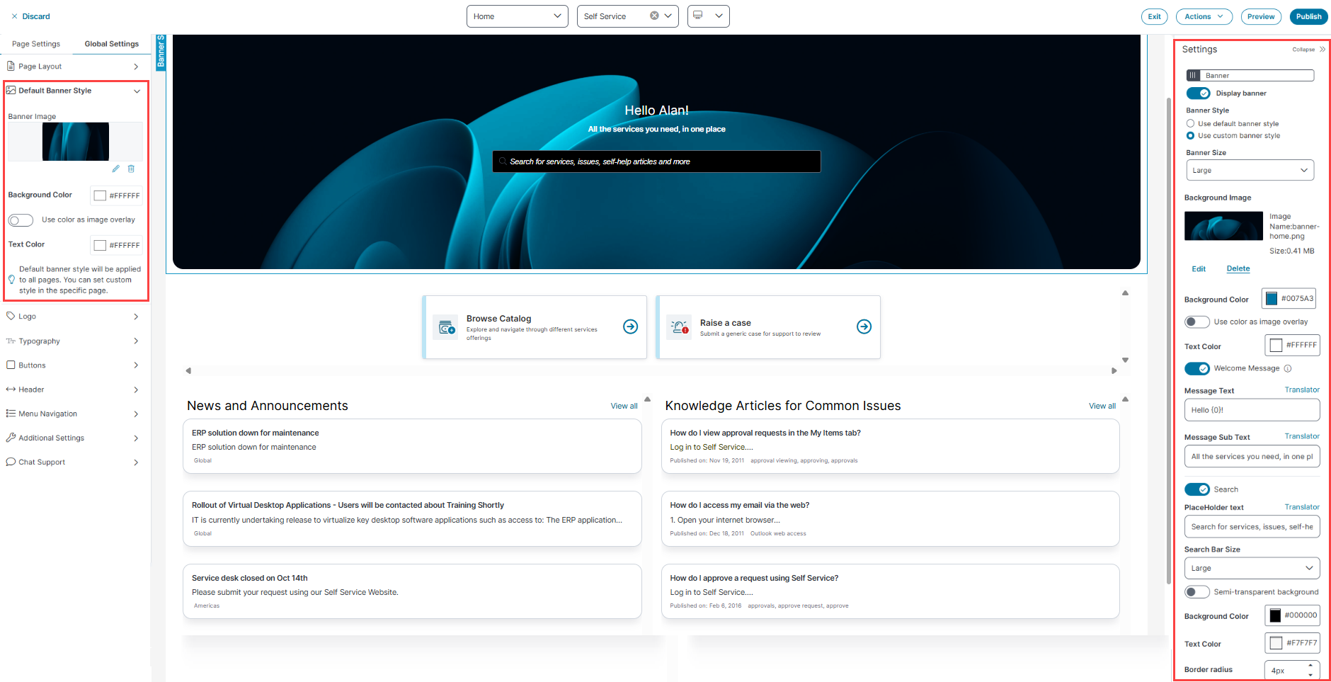
Customize the Banner Section for a Workspace
To customize banner section for Self Service or other workspaces:
1.In the Settings panel, toggle Display Banner to show or hide the banner.
2. Select Use Custom Banner Style to apply a unique style for the selected workspace.
3.From the Banner Size dropdown, select Small, Medium, or Large.
4.To update the banner image:
•Click Edit the image to upload a new image
•Click Delete to remove the existing image.
5.To change the banner's background color, click the Background Color and select the desired color.
6.To update the font color of the Welcome Message and Message Sub Text, click Text color and select the required color.
7.Toggle Welcome Message to enable or disable Message Text and Message Sub Text as required.
8.Toggle Search to enable search bar. Enter custom PlaceHolder Text or retain the default text.
9.From the Search Bar Size dropdown, select Large or Medium to define the input field size.
10.To enable the transparent background for the search bar, toggle the Semi-transparent background.
The Background Color option is grayed out if Semi-transparent background is enabled.
11.To set a solid background color for search bar, click Background Color and select a color.
To apply the selected color, toggle off the Semi-transparent background.
12.To change the search bar text color, click Text Color and select the required color.
13.To adjust the corner radius of the search bar, enter a value or choose from the Border radius field.
The radius supports a minimum of 4 pixels and a maximum of 24 pixels. The default value is 24 pixels.
Banner Style settings
The default banner is application for all the workspaces, but you can customize the banner style for different pages or workspaces by selecting Use Custom banner style from the Setting Panel. Also, if you have an old Section with background image as banner, you need to remove that section and enable the banner again to reflect the custom Banner on Self Service home page.
Configuring the Hero Banner Style
To add a Hero banner:
1.Click Modules.
2.Drag the Hero Banner onto the page.
The Settings panel appears on the right side of the page. Specify the following details.
| Field | Description |
|---|---|
| Name |
Enter a banner name. Select the Static or Dynamic options based on your requirements. The Static option enables you to use different colors, title text, and call-to-action links, which can add a banner in the carousel view. The Dynamic option allows you to configure a banner with the help of different business objects, sorting criteria, and number of items to display. |
|
Add image |
Upload a banner image. |
|
Color |
Select a color for the banner. |
|
Use color as image overlay |
Enable this option to overlay the image with the selected color. The color is added as an opaque layer over the image. |
|
Title text |
Enter a title for the banner. The Translator enables you to select a language and enter a translation for the title text. |
|
Title sub text |
Enter a title subtext for the banner. |
|
Title text & CTA alignment |
Select the alignment from the dropdown list. |
|
Show call to action link |
Enable this option to show the action link as a link button on the banner. Configure the call to action with: •Call to action text: Enter text to display on the link button. •Call to action link: Enter the link for the action. |
|
Add Banner |
Click to add another banner to the section. When an additional banner is added, individual settings for this banner are displayed in the Settings panel. |
|
Responsive |
Hide on Desktop: Enable or disable to hide or show the entire section/row only in desktop view. Hide on Mobile: Enable or disable to hide or show the entire section/row only in Mobile view. |
3.(Optional), You can perform following:
•To add additional banners, click Add Banner in the Settings section.
•To remove a banner, click Remove Banner in the Settings section.
•To remove all the banners, click the Remove Module in the Settings section.
Recommended formats for the banner are .png and .jpg and recommended dimensions for the banner are width = 1920px and height = 512px for large size, 256px for medium size, and 128px for small size.
Configuring a Page-Specific dynamic Banner
You can override the default banner by configuring a static banner for a specific page.
To configure a page level banner:
-
Open Page Designer.
-
Select the target page from the Page Selector.
-
Click the Page Settings tab.
-
In the Banner section, configure the following options:
-
Upload an image.
-
Set the background and text colors.
-
Enter a title and optional subtext.
-
Enable or disable the search bar and other icons (e.g., Add to Favourite).
-
-
Click Publish to apply the changes.
The application displays the default banner only if no page-specific banner is configured.
Enable the Add to Favorite Option
The Add to Favorite option allows users to mark specific pages as favorites in Self Service Management Portal V3.
To enable this feature:
-
Log in to Neurons for ITSM as Administrator.
-
Open Page Designer.
-
Select the Service Catalog or Knowledge Base page from the Page Selector dropdown list.
-
Select the Self Service page from the Workspace Selector dropdown list.
-
Select the page view you want to edit from the View Selector dropdown list - Desktop, Mobile, or Tablet.
-
Click the Page Settings tab.
-
In the Additional Settings section, locate the Add to Favourite Icon toggle.
-
Toggle Add to Favourite Icon to On.
-
Click Publish to apply the changes.
The Favorite feature is exclusively available for the Self Service role and doesn't apply to other roles. Furthermore, selecting the Favorites checkbox does not show any templates.