Configuring Global Settings
Role: Administrator
Minimum Version: Ivanti Neurons for ITSM 2024.2.
The Global Settings page lets you customize the user interface to make it clear and easy to use. You can change the page layout, banner style, company logo, headers, fonts, text colors, and button colors. This helps match the look to your brand. You can also edit the welcome message, organize menu items, and turn on chat support to help self service users to connect with support team for any issues.
You access the Global Settings user interface only after you configure the user for UI v3 in the Style Editor.
The Global Settings page displays the following sections:
 Page Layout
Use the Page Layout to modify the content width, margins, and grid spacing for the home page layout.
To configure the page layout:
1.Log in to Neurons for ITSM as a Self Service user, and change role to Administrator.
2.Click Edit Page on the top right corner of the page banner.
The Page Designer page is displayed.
3.Click Global Settings.
4.In the Page Layout section, in Content width select either Boxed or Full Width from dropdown list.
•For Full Width, you can specify Left margin, Right margin, and Grid Spacing.
•For Boxed, you can specify only Grid Spacing.
Margin Settings: Set the left and right margins between 24px and 48px (this is applicable only for full width).
Grid Spacing: Set spacing between columns (horizontal) and rows (vertical) from 8px to 24px.
Default Banner Style
Use the Default Banner Style section to modify image, color, and text across the workspaces.
1.To modify the image, click Edit  icon, select the image from your library.
2.To change the background color, click color box and select the desired background color from the palette.
3.Turn on the Use color as image overlay toggle.
The selected color appear as a transparent layer over the image, this improves the text readability and visual consistency.
4.You can customize a banner from the Settings panel, select Use custom banner style in center panel.
5.From the Banner Size dropdown, select desired size Small, or Medium, or Large.
•Banner sizes varies for different page types, by default the sizes are:
•Home Page - Large size
•Enterprise Landing Page - Medium size
•Inner Pages - Small size
•Recommended image formats are .png and .jpg
•Recommended image dimensions:
•Large size - width = 1920px and height = 512px
•Medium size - 256px
•Small size - 128px
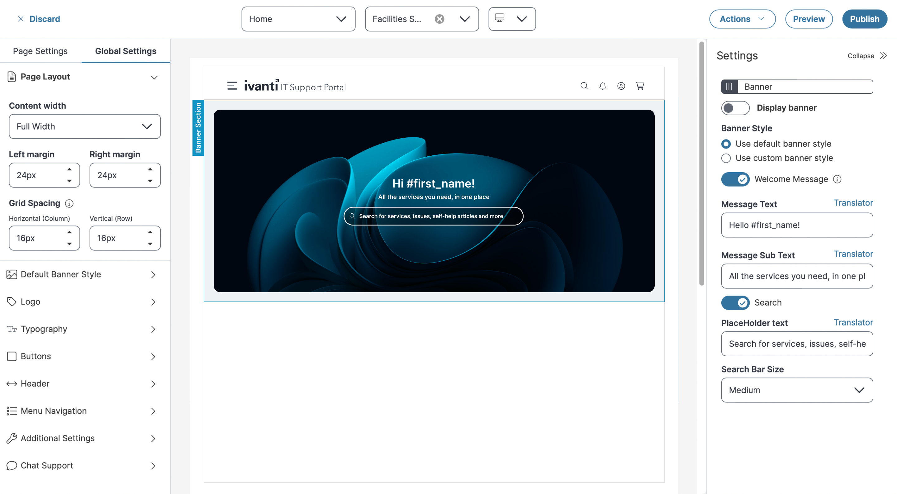
6.Turn on/off the Display Banner toggle to show/hide the banner in each workspace.
7.To enable welcome messages, turn on Welcome Message toggle, and you can add Message Text and Message Sub Text on the banner.
•To include the user's name dynamically, use the placeholders #firstname, #middlename (optional), and #lastname. For example, Hello #firstname, #middlename#lastname! - Hello John Michael Smith!.
8.To enable search option, turn on the Search toggle, enter text in Place Holder Text to set as default for user to view the search options , and then select Search Bar Size from dropdown list.
Default Banner Style settings for Service Catalog
-
Recommended formats for all the banners are .png, .jpeg, .gif, and .svg, recommended dimensions for the banner are width = 1920px and height = 512px for large size, 256px for medium size, and 128px for small size. The maximum supported file size for banner images is 2 MB. If the uploaded file exceeds this limit, the system displays an error message.
-
To use .svg files in banner configurations, you must first add *.svg to the list of allowed attachment types. By default, .svg is not included in the out-of-the-box (OOTB) list. If it is not added, the application will display an error when you attempt to upload the file. To enable it, refer to Allowed File Extensions, and add *.svg to the list.
-
The default banner is application for all the workspaces, but you can customize the banner style for different pages or workspaces by selecting Use Custom banner style from the Setting Panel. Also, if you have an old Section with background image as banner, you need to remove that section and enable the banner again to reflect the custom Banner on Self Service home page.
Logo
Use the Logo section to set your logo for the workspace.
-
You can use the Edit
icon to upload a new logo and the Delete  to remove the existing logo.
 -
Specify the following details:
-
Logo Spacing - Enter the spacing for logo to align as per requirement
-
Enable separate logo for mobile - To set separate logo for mobile, turn on Separate logo for mobile toggle, click
 icon and then upload the image.
 -
Enable Favorite icon - To set the favorites icon, turn on Fav icon toggle, click
 icon and then upload the image.
-
-
You can use the Edit
icon to upload a new logo and the Delete to remove the existing logo.
-
Recommended formats for all the Logos are .png, .jpeg, .gif, and .svg recommended dimensions for the banner are width = 1920px and height = 512px for large size, 256px for medium size, and 128px for small size. The maximum supported file size for banner images is 2 MB. If the uploaded file exceeds this limit, the system displays an error message.
-
To use .svg files in banner configurations, you must first add *.svg to the list of allowed attachment types. By default, .svg is not included in the out-of-the-box (OOTB) list. If it is not added, the application will display an error when you attempt to upload the file. To enable it, refer to Allowed File Extensions, and add *.svg to the list.
Typography
Use the Typography section to set to define the default fonts and sizes.
1.To set the font type and size in banner section for body text, specify the following:
•Select the desired font from the Body font dropdown to define the font style for the text beneath the title.
•Enter or select above arrow from the Body font default size dropdown to define the font style for the body text.
2.To set the font type and size in banner section for header text, specify the following:
•Select the desired font from the Header font dropdown to define the font style for the title.
•Enter or select above arrow from the Header font default size dropdown to define the font style for the header.
Buttons
Use the Buttons section to configure the look and feel of the buttons displayed across the pages.
1.Click Edit icon adjacent to Primary Button or Secondary Button to modify the background color, text color, border type, and border radius.
2.Click Ok.
3.You can also click Reset to default style to reset to default.
Header
Use the Header section to customize the page header. You can set the title text color, background color, and icon color.
1.Toggle the Show title button to display or hide the title.
2.Enter the desired title in Title text field.
3.Select the desired background color from the palette, to set the color in banner section above title.
4.Select the desired background color from the palette, to set the color for icons.
The icon color will be applied to all icons in the header, including the menu icon.
5.Optionally, you can enable or disable the Search bar, Alerts, and Shopping cart features based on your requirements.
Configure Alerts
To configure alerts, do the following:
1.Select turn on Alerts toggle.
The Configure link is enabled.
2.Click Configure.
The Configure Alerts window is displayed.
3.Select Alert from Business Object dropdown list.
4.Select required from the Saved Search dropdown list.
5.Enter total number of alerts to display in the Number of items to display/Limit field.
6.Select the appropriate option from the Severity Field dropdown list.
7.Select the display field from the Display Field dropdown list.
8.Enter the desired Update Interval and click Ok.
Menu Navigation
Use the Menu Navigation section to edit the workspace name and display text.
To set the menu navigation:
1.To view all available menu items, select the Select All checkbox, and to hide a workspace, clear its checkbox.
2.Click Edit  icon to change the display text for a workspace.
Additional Settings
Use the Additional Settings section to enable or disable the following features:
•FAQ
•Welcome Message
To configure the welcome messages:
1.In the Welcome Message section, enter the Message Text, Message Sub Text.
2.Select the Welcome Text Color.
3.To include the user's name dynamically, use the placeholders #firstname, #middlename (optional), and #lastname. For example, Hello #firstname, #middlename #lastname! - Hello John Michael Smith!.
4.Click the Translator link to translate the message text and message sub text into your preferred language.
Chat Support
Use the Chat Support tab to enable, disable, or edit the Chat with Support and Chatbot features in the Self Service.
You also must enable the Enable "Chat with support" button option in the Role Details configuration to use chat support in the Self Service. Refer to Creating a Role.
To enable the Chat with support option
-
Log into Neurons for ITSM as an Administrator.
-
In the Configuration console, set the ChatEnabled global constant to True.
-
Select Build > User Interface Styles > Style Editor, in the UI column, select UI v3.
-
Select Self Service role to enable the chat feature.
-
In the page designer, go to Global Settings > Chat Support and select Chat with support.
-
Click Save.
To enable or disable chat support:
1.Select Global Settings, and select Chat Support.
2.Select or clear the Chat with Support or the Chatbot checkbox to enable or disable the chat options.
When both options are enabled, the Chat with Support and Chatbot icons are visible in the Self Service UI.
To edit the Chatbot button and integration settings:
1.Select the Edit icon for the Chatbot entry to open the Chatbot Settings form.
2.Edit the button styling message and color settings as required.
3.Select the Integration tab. The Integration Type drop-down dispalys "URL"; this is currently the only selection available.
4.Enter the URL for the Chatbot you want to connect to in the text box.
Chatbot Integration Settings - example
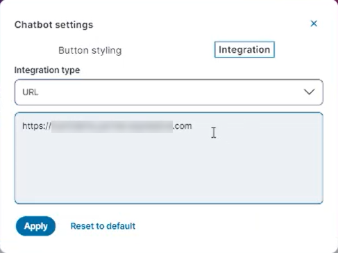
5.Select Apply.