Configure Form Views Using the Modern Page Designer
Role:Administrator
Prerequisites:
-
Administrator access is required.
-
The global constant EnableNova must be set to True.
You use a Form view to build the record detail and data-entry form for a business object. A form view belongs to the Detail page view type. You build each form view through a three-step process you add sections, add content blocks, and then add controls. This procedure uses the Incident business object as an example.
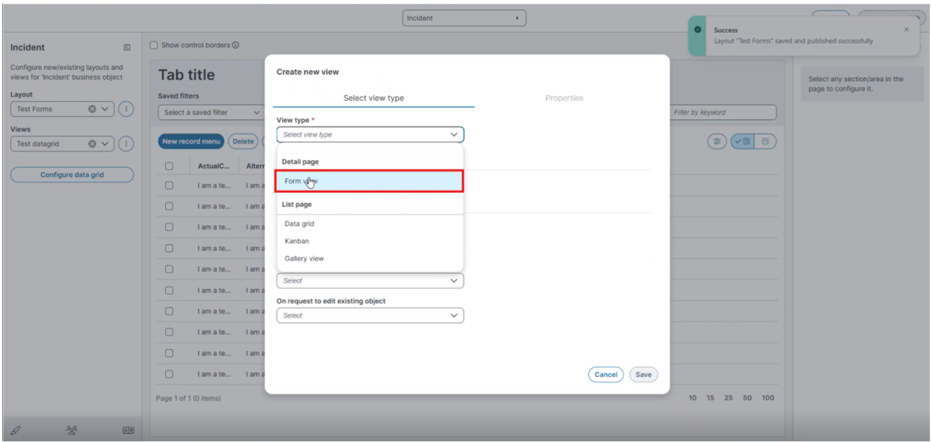
The Create new view dialog groups view types into two categories. Select a view type under Detail page (Form view) or under List page (Data grid, Kanban, or Gallery view).
To configure layouts and views under List page, see Configure and Assign Views and Layouts Using the Modern Page Designer.
If you set a control's Control Type to Object Matching Control and select the Self Service checkbox when creating a layout in the Ivanti Service Management Portfolio UI V3 displays the control as a text field. For more information on Self Service Form Offering, see Configuring-Modern-Layouts-for-Form-Offerings.
Create a Form View
-
In the Views dropdown, select the ellipsis (⋮), and then select Add New.
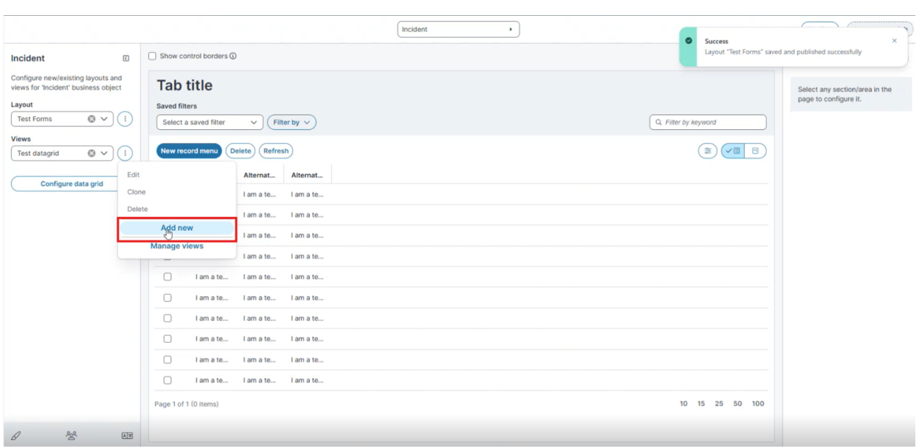
The Create new view dialog appears on the Select view type tab.
-
From the View type dropdown, under Detail page, select Form view.
-
(Optional) Select the Use existing Form view checkbox to base the new view on a previously created form view.
-
In View name, enter a descriptive name for the view.
-
Under Navigation to other views - after saving object, show, select the view to display after a user saves the object.
-
Click Save to continue to the Properties tab.
Configure Form View Properties
On the Properties tab, configure the following fields.
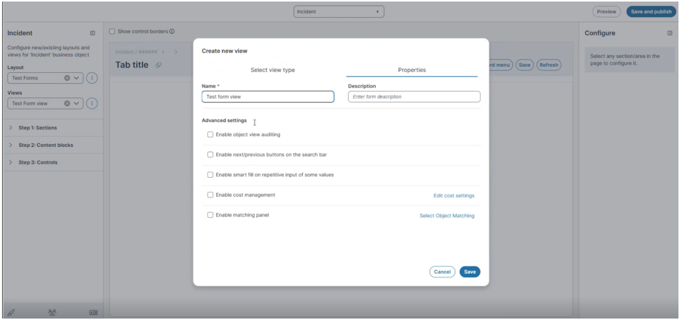
Field Description
Name The internal name of the form view.
Description
An optional description of the form view.
Advanced Settings
Enable object view auditing
Records audit entries when users open the form view.
Enable next/previous buttons on the search bar
Displays next and previous navigation buttons on the search bar so that users can move between records.
Enable smart fill on repetitive input of some values
Suggests previously entered values when a user repeats input on a field.
Enable cost management
Activates cost management for the form view. Select Edit cost settings to configure the cost options.
Enable matching panel
Displays the matching panel on the form. Select Select Object Matching to choose the object matching configuration.
-
Click Save.
The Form View Workspace
After you save the form view properties, the designer opens. The workspace contains the following areas.
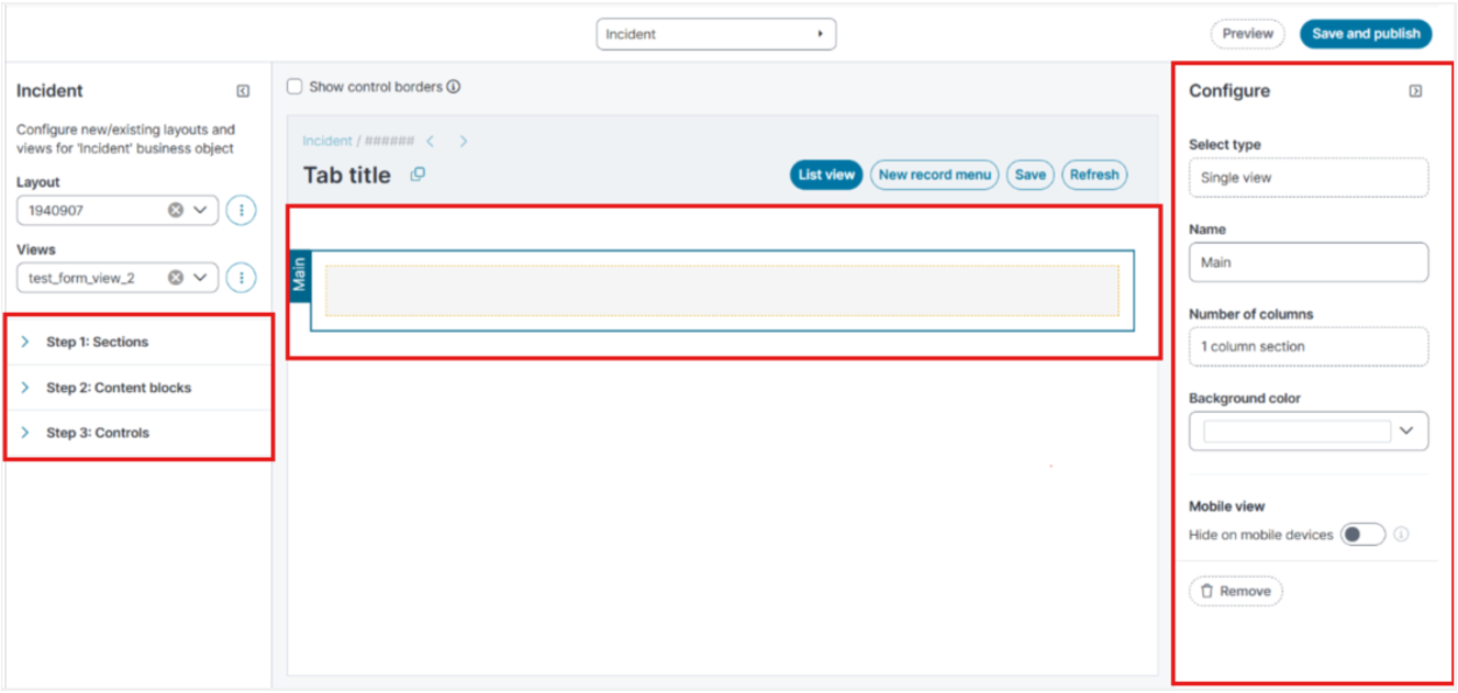
Field Description
Left pane Contains the Layout and Views dropdowns and the three build steps: Step 1: Sections, Step 2: Content blocks, and Step 3: Controls.
Center pane
Displays the form as you build it. By default, an empty form with a single column is available.
Configure pane
Displays the properties of the item you select on the Center pane. The fields in this pane change depending on whether you select a section, a content block, or a control.
Show control borders
Displays borders for the forms when you select the checkbox.
Preview
Previews the changes you make in the Modern Page Designer.
Save and Publish
Applies the form view to the layout.
Default State of a New Form View
When the designer opens, the center pane displays an empty form with a single column by default. You do not need to add this form. The Configure pane on the right displays the properties of this default form, and you can configure it immediately.
When you select the default form on the canvas, the Manage cells button appears above it. Use Manage cells to change the cell layout of the form. See Manage the Cells in a Content Block.
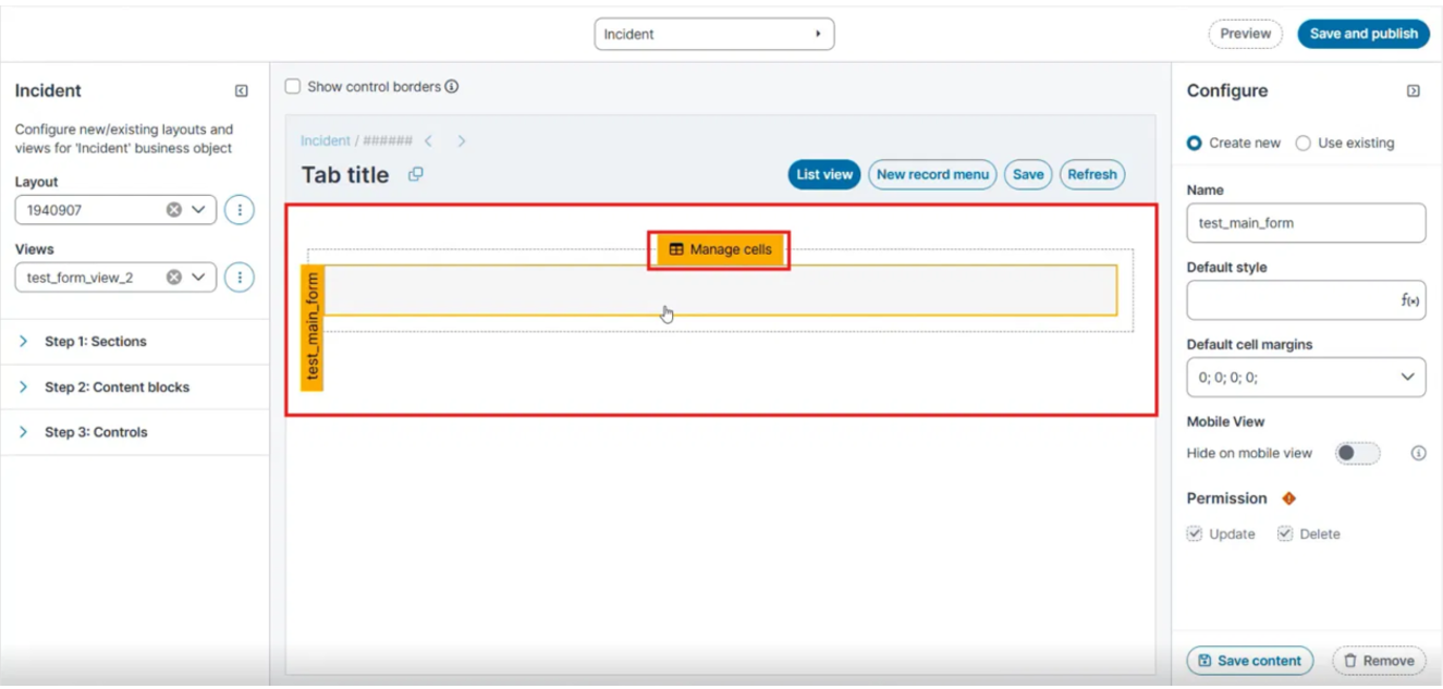
Use Step 1, Step 2, and Step 3 in the left pane to add further sections, content blocks, and controls to the form view
Build a Form View
After you create a form view, build it from top to bottom: add a section, add a content block to the section, and then add controls to the content block.
Step 1: Add and Configure Sections
-
In the left pane, expand Step 1: Sections.
-
Select a section layout from the available layouts.
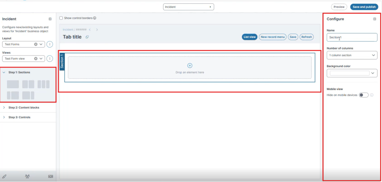
Drag drop the section to the center pane.
-
Select the section, and then configure it in the Configure properties section.
Field Description Name The display name of the section. Number of columns The column layout of the section. Select one of the following values: 1 column section, 2 column section, 3 column section, 2 column section (small – large), or 2 column section (large – small). Background color The background color applied to the section. Select a color from the palette. Mobile view
Hide on mobile devices Hides the section on mobile devices when you turn the toggle on. Use this option to control which sections appear in responsive layouts. Remove
Removes the section from the form view.
Step 2: Add Content Blocks
-
In the left pane, expand Step 2: Content blocks.
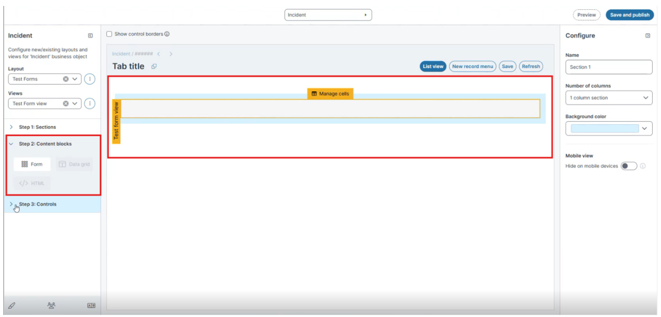
-
Drag a content block into the section. Select one of the following block types:
-
Form
-
Data grid
-
HTML
-
-
(Optional) Select Manage cells on the content block to adjust the cell layout.
Step 3: Add and Configure Controls
-
In the left pane, expand Step 3: Controls.
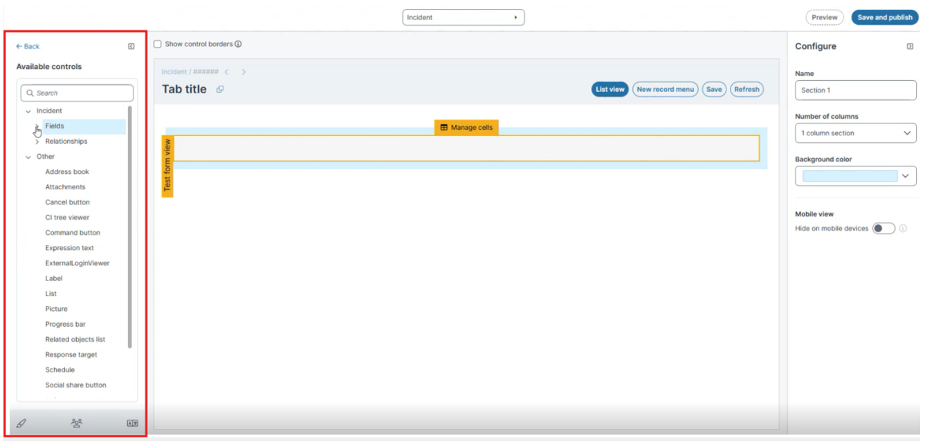
The Available controls pane appears.
-
(Optional) In the Search box, enter a control name to locate a control.
-
Locate the control under one of the following groups:
-
Incident > Expand Fields to add a business object field, or expand Relationships to add a related field.
-
Other > Add a non-field control, such as Label, Picture, Response target, Command button, or Cancel button etc.
For more information refer Form Controls and
-
-
Drag the control into a cell in the content block.
-
Select the control to open the Configure pane (also called the Properties panel), and then set the control's properties.
-
Click Save and publish to apply the form view to the layout.
-
Navigate to Configure > Users and Permissions > Roles and Permissions to Assign the New Layout to a Role.
-
Reload the Home page.
Manage the Cells in a Content Block
Use Manage cells to edit the cell layout of a content block.
-
Select the Form. The Manage cells button appears above the form.
-
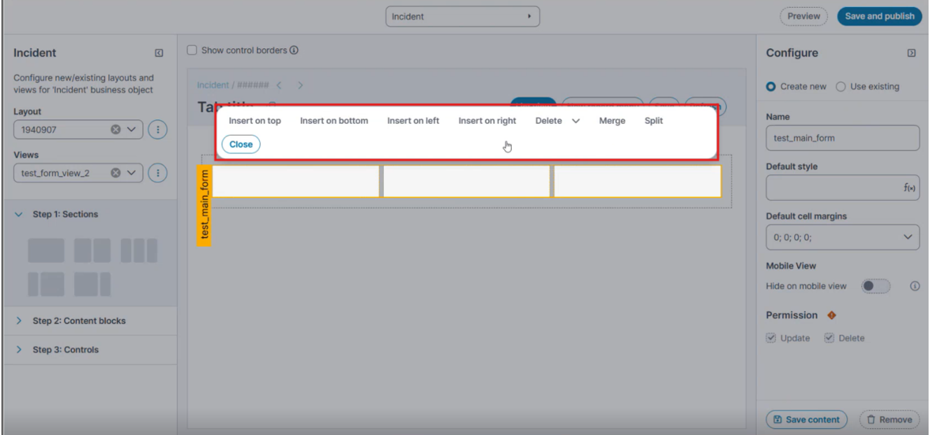
Select Manage cells. The cell editing options appear.
-
Select the cell you want to change, and then select one of the following options.
Field Description Insert on top Inserts a row above the selected cell. Insert on bottom Inserts a row below the selected cell. Insert on left Inserts a column to the left of the selected cell. Insert on right Inserts a column to the right of the selected cell. Delete
Deletes a row or a column from the form view.
Merge
Merges the selected cells into a single cell. Hold the Ctrl key, select each cell you want to merge, and then select Merge.
Split
Splits the selected form.
Close
Closes the cell editing options.
Control Types
In the Available controls pane, controls come from three groups: Fields, Relationships, and Other. How a control behaves and which properties appear in the Configure pane depend on which group the control comes from.
-
Fields: The business object's own fields (for example, the Incident fields). When you drag a field onto the form, the application wires the control to that field. Each field has a predefined data type, and the field's data type determines the available control types and the properties shown in the Configure pane.
-
Relationships: A list of related business objects and their fields. Select a field from a related business object when you want to use that relationship.
-
Other: A predefined list of form controls organized by type. These controls are not linked to a field, so their properties start empty and you configure them yourself. See Other Form Controls below.
For a field-based control, you set the control type in the Control type dropdown in the Configure pane. The available control types depend on the field's data type:
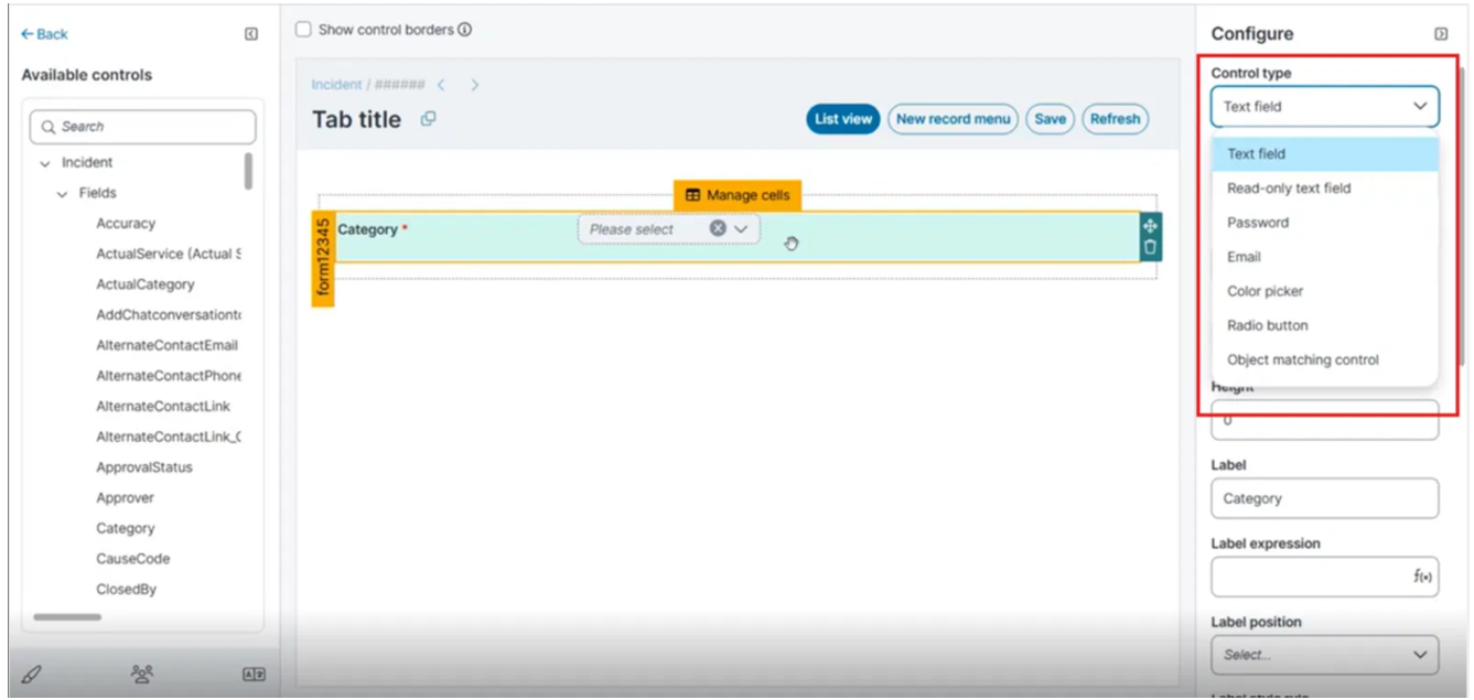
The fields and field types available in the Modern Page Designer work in the same way as the fields and field types in the Classic UI. The difference in the Modern Page Designer is that you can edit multiple forms. For more information on individual field types, see the Creating a Form.
 Text field
Captures text input on a field. The following properties are transcribed from the Text field Configure panel (Category field). Where a description is not shown in the panel, it is marked below.
The following components are available when you build a form view. Each component opens its own set of properties in the Configure pane.
| Property | Description |
|---|---|
| Control Type |
Text field HTML Editor Enables HTML controls and allows users to enter HTML text. HTML fields are limited to 2 GB. |
| Edit mask |
Select the mask from the dropdown None, MAC Address, IP Address, US Phone, ZIP code, Custom. |
| Editable |
Determines whether users can edit the field. Select Yes or No. |
| Field Name |
The business object field bound to this control. This value is read-only. |
| Height |
The control height (lines). |
| Label |
The text to appear on the field or control label. |
| Label Expression | An expression to apply to this label, if needed. |
| Label Position |
The placement of the label relative to the field. |
| Label Style Rule |
An expression to be applied to this style, if needed. |
| Read-only Rule | An expression that determines when the field is read-only. |
|
Required Rule |
An expression that determines when the field requires a value. |
|
Searchable |
Determines whether users can edit the field. Select Yes or No. |
|
Style |
See Using Highlighter Styles. |
|
Style Rule |
See About Using Expressions in Styles. |
|
Tab Index |
The order in which users can tab into this field. |
|
Visible Expression |
Accepts the expression $(true) to make the control visible, or $(false) to hide it from the user. |
|
Width |
The control width (ems). |
Read-only text field
Displays a field's value as read-only text. The following properties are those visible in the Read-only text field Configure panel
The following components are available when you build a form view. Each component opens its own set of properties in the Configure pane.
| Property | Description |
|---|---|
| Control Type |
Read-only text field |
|
Field Name |
The business object field bound to this control. This value is read-only. |
| Height |
The control height (lines). |
| Label |
The text to appear on the field or control label. |
| Label Expression |
An expression to apply to this label, if needed. |
| Label Position |
The placement of the label relative to the field. |
| Label Style Rule |
An expression to be applied to this style, if needed. |
| Read-only Rule | An expression that determines when the field is read-only. |
| Required Rule |
An expression that determines when the field requires a value. |
| Style |
See Using Highlighter Styles. |
| Style Rule | See About Using Expressions in Styles. |
|
Tab Index |
The order in which users can tab into this field. |
|
Visible Expression |
Accepts the expression $(true) to make the control visible, or $(false) to hide it from the user. |
|
Width |
The control width (ems). |
Radio button
Displays a field's value as read-only text. The following properties are those visible in the Radio button Configure panel
The following components are available when you build a form view. Each component opens its own set of properties in the Configure pane.
| Property | Description |
|---|---|
| Control Type |
Radio button |
|
Field Name |
The business object field bound to this control. This value is read-only. |
|
Horizontal Layout |
The layout can be selected from the dropdown. |
| Height |
The control height (lines). |
| Label |
The text to appear on the field or control label. |
| Label Expression |
An expression to apply to this label, if needed. |
| Label Position |
The placement of the label relative to the field. |
| Label Style Rule |
An expression to be applied to this style, if needed. |
| Read-only Rule | An expression that determines when the field is read-only. |
| Required Rule |
An expression that determines when the field requires a value. |
| Style |
See Using Highlighter Styles. |
| Style Rule | See About Using Expressions in Styles. |
|
Tab Index |
The order in which users can tab into this field. |
|
Visible Expression |
Accepts the expression $(true) to make the control visible, or $(false) to hide it from the user. |
|
Width |
The control width (ems). |
Number
Captures numeric input on a field. The following properties are transcribed from the Number Configure panel
The following components are available when you build a form view. Each component opens its own set of properties in the Configure pane.
| Property | Description |
|---|---|
| Control Type |
Number |
|
Decimal precision |
The number of digits to display after the decimal point. Enter a number to set how many decimal places the field shows. |
| Edit mask |
Select the mask from the dropdown None, MAC Address, IP Address, US Phone, ZIP code, Custom. |
| Editable |
Determines whether users can edit the field. Select Yes or No. |
| Field Name |
The business object field bound to this control. This value is read-only. |
| Height |
The control height (lines). |
| Label |
The text to appear on the field or control label. |
| Label Expression | An expression to apply to this label, if needed. |
| Label Position |
The placement of the label relative to the field. |
| Label Style Rule |
An expression to be applied to this style, if needed. |
| Read-only Rule | An expression that determines when the field is read-only. |
|
Required Rule |
An expression that determines when the field requires a value. |
|
Searchable |
Determines whether users can edit the field. Select Yes or No. |
|
Style |
See Using Highlighter Styles. |
|
Style Rule |
See About Using Expressions in Styles. |
|
Tab Index |
The order in which users can tab into this field. |
|
Visible Expression |
Accepts the expression $(true) to make the control visible, or $(false) to hide it from the user. |
|
Width |
The control width (ems). |
Check box
Renders a boolean field as a checkbox. The following properties are transcribed from the Check box Configure panel (VIP field).
The following components are available when you build a form view. Each component opens its own set of properties in the Configure pane.
| Property | Description |
|---|---|
| Control Type |
Check box |
|
Field Name |
The business object field bound to this control. |
| Height |
The control height (lines). |
| Label |
The text to appear on the field or control label. |
| Label Expression |
An expression to apply to this label, if needed. |
| Label Position |
The placement of the label relative to the field. |
| Label Style Rule |
An expression to be applied to this style, if needed. |
| Read-only Rule | An expression that determines when the field is read-only. |
| Required Rule |
An expression that determines when the field requires a value. |
| Style |
See Using Highlighter Styles. |
| Style Rule | See About Using Expressions in Styles. |
|
Tab Index |
The order in which users can tab into this field. |
|
Visible Expression |
Accepts the expression $(true) to make the control visible, or $(false) to hide it from the user. |
|
Width |
The control width (ems). |
Email
Captures and validates an email address. Add a text field control, and then select Email from the Control type dropdown in the Configure pane.
Displays a fixed text string on the form. Use this control to show informational or instructional text that does not change with the record.
| Property | Description |
|---|---|
| Control Type | |
|
Field Name |
The business object field bound to this control. |
| Height |
The control height (lines). |
| Label |
The text to appear on the field label. |
| Label Expression |
An expression to apply to this label, if needed. For example, on the KnowledgeSelfService form, the following expression has been added to the Details cells: $(("Article ID: " + KnowledgeNumber)). This adds the label Article ID to the label and the Knowledge Base number assigned to this record. |
| Label Style Rule |
An expression to be applied to this style, if needed. You can define what existing style (bold, header, etc.) to apply to a control based on a condition. |
| Style | |
| Style Rule | See About Using Expressions in Styles. |
| Tab Index |
The order in which users can tab into this field. |
| Visible Expression |
Accepts the expression $(true) to make the expression control visible, or $(false) to hide it from the user. |
| Width | The control width (ems). |
Configure a Link Field Control in the Modern Page Designer
A Link Field lets you view data from a related business object within the current business object. For example, the Incident business object uses link fields such as Customer, Org/Acct, and Employee to display data from those objects. You need to select Link Field control under the Control type in the Configure pane.
You can use link fields to refer to related objects. Link fields are associated with relationships and provide an alternate form of reference. To access a related object through a link field, use the relationship specifier. Use this specifier only from the business object that contains the link field; you cannot reference remote link fields.
Add a Link Field Control
-
Open the required form view in the Modern Page Designer.
-
In the left pane, expand Step 3: Controls.
-
Under Incident, expand Fields, and then locate the link field you want to add (for example, Customer or Organization Unit).
-
Drag the field into a cell in the content block.
-
Select the control to open the Configure pane. In Control type, select Link field from the dropdown.
-
Set the properties described in the following table.
-
Select Save and publish to apply the form view to the layout.
Link Field Properties
Configure the following properties in the Configure pane.
| Property | Description |
|---|---|
| Control Type | Link field. |
| Disable Add Action |
Determines whether the Add new action is unavailable on the rendered control. Select Yes to hide Add new, or No to allow it. |
| Disabled Expression |
An expression that determines when the control is disabled. |
| Display Field | The field from the linked object that appears as the display value in the control (for example, Display Name). |
| Do not sort autocomplete result |
Determines whether the application leaves the type-ahead (autocomplete) results unsorted. |
| Editable |
Determines whether users can edit the field. Select Yes or No. |
| Field Name | The business object field bound to this control (for example, ProfileLink). This value is read-only. |
| Filter Expression |
An expression that filters the records returned during lookup and advanced search. |
| Grid Name |
The data grid used to display records in the lookup and advanced search. |
| Height | The control height (lines). |
|
Hierarchical Picker |
Determines whether the lookup opens the Hierarchical Picker for a linked object organized in a parent-child hierarchy. Select Yes or No. |
|
Label |
The text to appear on the field label. |
|
Label Expression |
An expression to apply to this label, if needed. |
|
Label Position |
The placement of the label relative to the field (for example, On the left). |
|
Label Style Rule |
An expression that applies a style to the label based on a condition. |
|
Link Relationship |
The relationship that defines the linked business object (for example, IncidentAssociatedCustomer). |
|
Read-only Rule |
An expression that determines when the field is read-only. |
|
Required Rule |
An expression that determines when the field requires a value. |
|
Style |
The style applied to the control. See Using Highlighter Styles. |
|
Style Rule |
An expression that applies a style based on a condition. See About Using Expressions in Styles. |
|
Tab Index |
The order in which users can tab into this field. |
|
Use like search for autocomplete |
Determines whether autocomplete uses a partial-match ("like") search. Select Yes or No. |
|
Visible Expression |
Accepts the expression $(true) to make the control visible, or $(false) to hide it from the user. |
|
Width |
The control width (ems). |
Date, Date and Time, and Time
In the Fields workspace, this is displayed as one of the following:
- Date: Date only
- Time: Time only
- Date/Time: Date and time only
| Property | Description |
|---|---|
| Control Type | Date picker is the control type applied to the field. |
| Edit mask |
Select the mask from the dropdown None, MAC Address, IP Address, US Phone, ZIP code, Custom |
| Field name |
The business object field bound to this control. This value is read-only. |
| Height | The control height (lines). |
| Label |
The text to appear on the field or control label. |
| Label expression |
An expression to apply to this label, if needed. |
| Label position | The placement of the label relative to the field. |
| Label style rule |
An expression to be applied to this style, if needed. You can define which existing style (for example, bold or header) to apply to a control based on a condition. |
| Read-only rule |
An expression that determines when the field is read-only. |
| Required rule | An expression that determines when the field requires a value. |
|
Style |
The style applied to the control. See Using Highlighter Styles. |
|
Style rule |
An expression that applies a style based on a condition. See About Using Expressions in Styles. |
|
Tab index |
The order in which users can tab into this field. |
|
Visible expression |
Accepts the expression $(true) to make the control visible, or $(false) to hide it from the user. |
|
Width |
The control width (ems). |
Other Form Controls
The following controls come from the Other group in the Available controls pane. They are not linked to a field, so you configure their properties yourself. Each control opens its own set of properties in the Configure pane.
Label
Adds a static or dynamic label to a form.
| Property | Description |
|---|---|
| Control Type | Label |
| Height |
The control height (lines). |
| Label |
The text to appear on the field or control label. |
| Label Expression |
An expression to apply to this label, if needed. For example, on the KnowledgeSelfService form, the following expression has been added to the Details cells: $(("Article ID: " + KnowledgeNumber)). This adds the label Article ID to the label and the Knowledge Base number assigned to this record. |
| Label Style Rule |
An expression to be applied to this style, if needed. You can define what existing style (bold, header, etc.) to apply to a control based on a condition. |
| Style | |
| Style Rule | See About Using Expressions in Styles. |
| Tab Index |
The order in which users can tab into this field. |
| Visible Expression |
Accepts the expression $(true) to make the expression control visible, or $(false) to hide it from the user. |
| Width | The control width (ems). |
Attachments
Allows attachments to be added, listed, and viewed on the form.
| Property | Description |
|---|---|
|
Allow editing file name |
Select Yes to allow users to edit the file name, or No to prevent users from editing the file name. |
| Can add | Specifies if users can add attachments to the record. |
| Can delete | Specifies if users can delete attachments from the record. |
| Can paste | Specifies if users can paste content from the clipboard as an attachment. |
|
Enable to add URL |
Select Yes to show the Add URL button in extended mode, which lets users add URL-based attachments. The New URL attachment function appears in the Details tab. |
|
Field 1 |
An optional metadata field displayed below the file name on each attachment. Select one of the following: Created By, Created Date Time, Last Modified Date Time, or Attachment Size. |
|
Field 2 |
A second optional metadata field displayed below the file name on each attachment. Select one of the following: Created By, Created Date Time, Last Modified Date Time, or Attachment Size. |
| Control Type | Attachments |
| Height |
The control height (lines). |
| Label |
The text to appear on the field or control label. |
| Label Expression |
An expression to apply to this label, if needed. For example, on the KnowledgeSelfService form, the following expression has been added to the Details cells: $(("Article ID: " + KnowledgeNumber)). This adds the label Article ID to the label and the Knowledge Base number assigned to this record. |
| Label Position |
The label position. |
| Label Style Rule | The field label style. Choose a style or enter an expression. |
| Max files | Specifies the maximum number of files allowed to be attached to a record. For example, to have no more than ten files be attached, enter 10. Enter at least 1 to enable file upload. |
|
Max files per upload |
Specifies the maximum number of pending (not yet saved) attachments. The application disables upload once this limit is reached. |
| Max Height | Optional. The maximum height (in pixels) of the control. |
|
Max single file size |
Specifies the maximum size of a single file, in the unit set by the Size in property. |
|
Max summary files size |
Specifies the maximum combined size of all attachments on the record, in the unit set by the Size in property. |
| Min Height | Optional. The minimum height (in pixels) of the control. |
| Relationship | The related field. Choose from the drop-down list. |
| Size in | How to measure the size. Choose either KB or MB. |
| Style | |
| Style Rule | See About Using Expressions in Styles. |
| Tab Index |
The order in which users can tab into this field. |
| Visible Expression |
Accepts the expression $(true) to make the expression control visible, or $(false) to hide it from the user. |
| Width | The control width (ems). |
Response Target and Progress Bar
Shows incident response time in relation to target response time. The states are:
•blank: The incident record has been created recently. Response window still open.
•met: Response was on time.
•breached: No response, or late.
| Property | Description |
|---|---|
| Breach DateTime | Enter the value for the breach date and time. |
| Breach Passed | Enter the value for the breach passed date and time. |
| Clock State | Enter the value for the clock state. |
| Control Type | Response target |
| Height |
The control height (lines). |
| Label Style Rule |
An expression to be applied to this style, if needed. You can define what existing style (bold, header, etc.) to apply to a control based on a condition. |
| Label Width | Enter a value for the label width. |
| Start Date | Enter a value for the start date of the response. |
| Style | |
| Style Rule | See About Using Expressions in Styles. |
| Tab Index |
The order in which users can tab into this field. |
| Visible Expression |
Accepts the expression $(true) to make the expression control visible, or $(false) to hide it from the user. |
| Width | The control width (ems). |
Progress Bar
Define a progress bar for tracking purposes. For example, you can add a progress bar to track escalations for an incident.
| Property | Description |
|---|---|
| 1st Esc DateTime | Enter an expression for the first escalation date and time. For example, enter $([link:ResolutionEscLink]L1DateTime). |
| 1st Esc Enabled | Empty. |
| 1st Esc Passed | Enter an expression for when the first escalation has passed. For example, enter $([link:ResolutionEscLink]L1Passed). |
| 2nd Esc DateTime | Enter an expression for the second escalation date and time. For example, enter $([link:ResolutionEscLink]L2DateTime). |
| 2nd Esc Enabled | Empty. |
| 2nd Esc Passed | Enter an expression for when the second escalation has passed. For example, enter $([link:ResolutionEscLink]L2Passed). |
| 3rd Esc DateTime | Enter an expression for the third escalation date and time. For example, enter $([link:ResolutionEscLink]L3DateTime). |
| 3rd Esc Enabled | Empty. |
| 3rd Esc Passed | Enter an expression for when the third escalation has passed. For example, enter $([link:ResolutionEscLink]L3Passed). |
| Breach DateTime | Enter an expression for the escalation breach date and time. For example, enter $([link:ResolutionEscLink]BreachDateTime). |
| Breach Passed | Enter an expression for when the escalation breach has passed. For example, enter $([link:ResolutionEscLink]BreachPassed). |
| Clock State | Enter an expression for the clock state. For example, enter $([link:ResolutionEscLink]ClockState). |
| Control Type | Color bar indicator |
| Height |
The control height (lines). |
| Label Style Rule |
An expression to be applied to this style, if needed. You can define what existing style (bold, header, etc.) to apply to a control based on a condition. |
| Label Width | Enter the number of pixels for the width of the label. |
| Start Date | Enter the start date. |
| Style | |
| Style Rule | See About Using Expressions in Styles. |
| Tab Index |
The order in which users can tab into this field. |
| Visible Expression |
Accepts the expression $(true) to make the expression control visible, or $(false) to hide it from the user. |
| Width | The control width (ems). |
Picture
Add images to the form, such as buttons or company logos.
| Property | Description |
|---|---|
| Control Type | Image |
| Image |
An image to associate with this control. |
| Visible Expression |
Accepts the expression $(true) to make the expression control visible, or $(false) to hide it from the user. |
Configuring Command Buttons in Forms views
You can configure a form to include Command buttons for executing commands such as Quick Actions or predefined system actions.
The Command button control is available in the Angular-based form designer and provides functionality similar to the Classic UI.
To configure a Command button in a form view
-
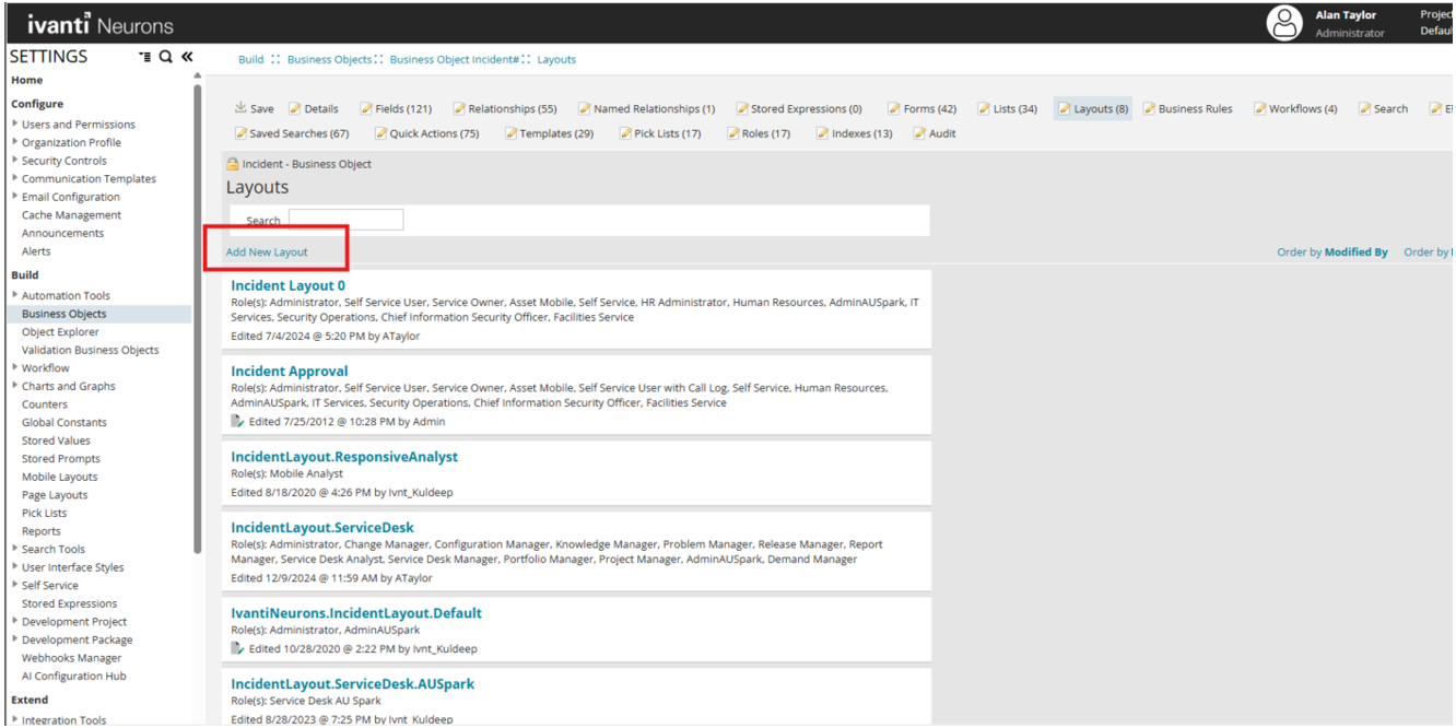
Go to Build > Business Objects, and select the Incident business object.
-
Select the Layouts tab.
-
Select Add New Layout.
-
When prompted, select Try Modern Designer.
-
In the Layout list, select the required layout.
-
In the Views list, select the required form view.
-
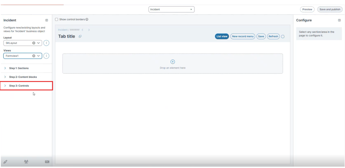
In the form designer, select Step 3: Controls.
-
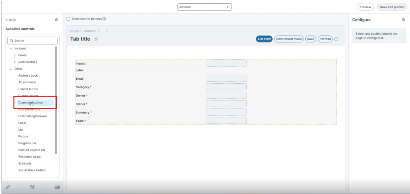
Expand the Other section.
-
Scroll to locate the Command button control.
-
Drag the Command button and drop it in the required section of the form.
-
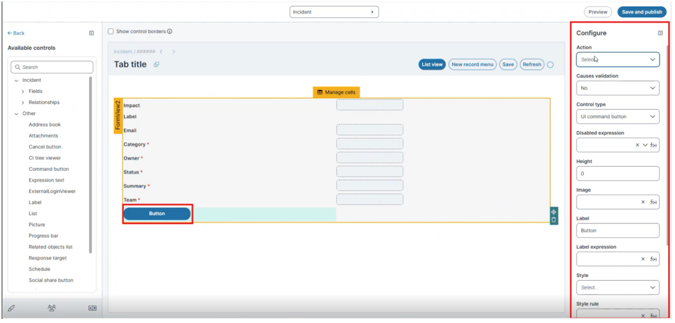
Select the button that you added, and then configure it in the Configure panel.
Command Button
-
Select an Action
-
In the Configure panel, select the Action dropdown.
-
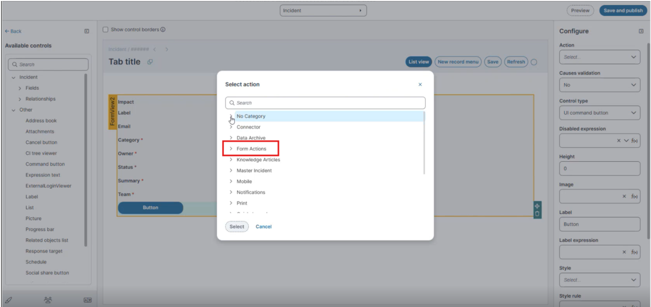
In the Select action dialog box:
-
Expand the required category and select Form Actions.
-
The list displays all available Quick Actions and predefined commands.
-
-
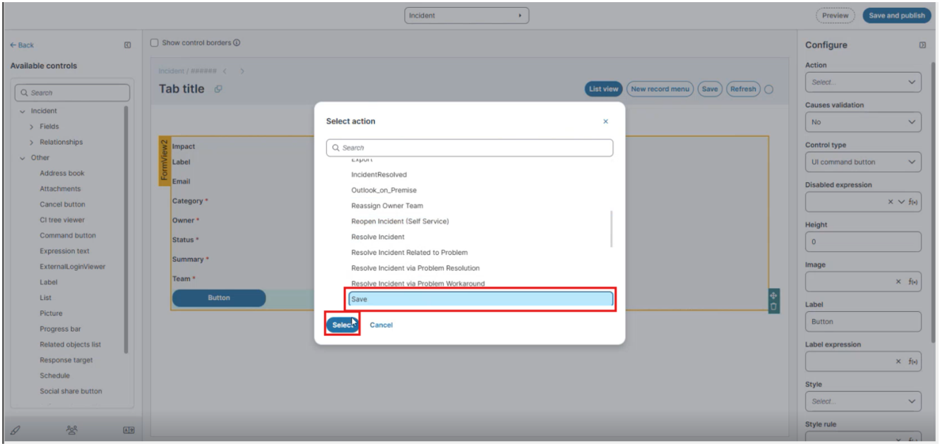
Select the required action (You can select predefined commands such as Save and Reload for Refresh, available under categories such as Form Actions.).
-
Click Select to confirm.
-
The Action list includes all configured Quick Actions and system commands.
-
Ensure that the required actions are available before associating them with a Command button.
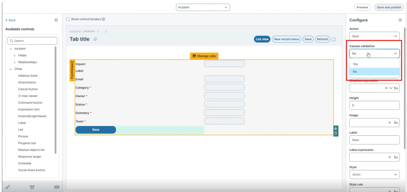
The Button executes a specific command, such as running a report or a quick action. In the Configure panel you can configure the button.
| Property | Description |
|---|---|
| Action | Choose a quick action to be performed when a user clicks the button. |
| Causes Validation |
Specifies whether the button triggers validation before executing the action. Select Yes to validate the form before execution, or No to execute the action without validation.
|
| Control Type | User interface command button. |
| Disabled Expression | Create an expression, or choose from the drop-down list. |
| Height |
The control height (lines). |
| Image |
An image to associate with this control. |
| Label |
The text to appear on the field or control label. |
| Label Expression |
An expression to apply to this label, if needed. For example, on the KnowledgeSelfService form, the following expression has been added to the Details cells: $(("Article ID: " + KnowledgeNumber)). This adds the label Article ID to the label and the Knowledge Base number assigned to this record. |
| Quick Action | Choose a quick action from the drop down list. |
| Quick Action | Choose a quick action from the drop-down list. |
| Style | |
| Style Rule | See About Using Expressions in Styles. |
| Tab Index |
The order in which users can tab into this field. |
| Visible Expression |
Accepts the expression $(true) to make the expression control visible, or $(false) to hide it from the user. |
| Width | The control width (ems). |
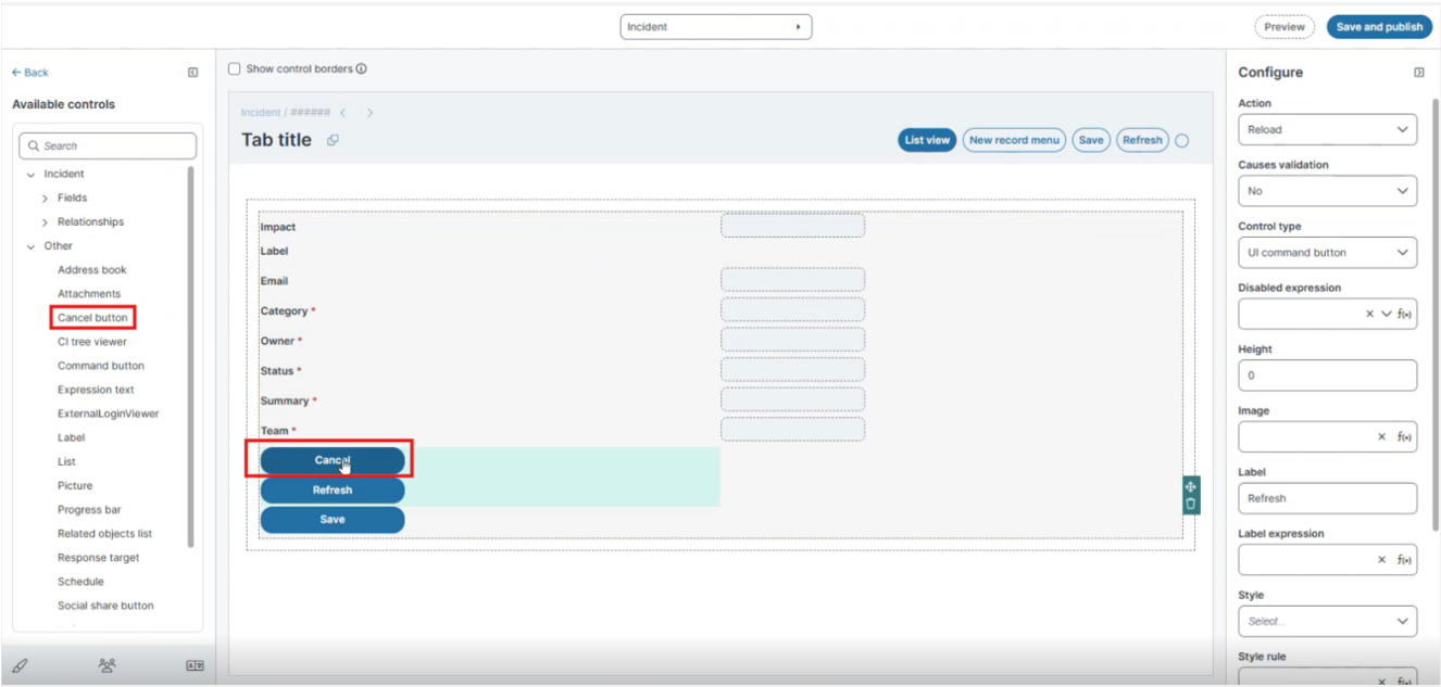
 Cancel Button
The Cancel button is available as an out-of-the-box (OOTB) control.
-
When a user selects Cancel, the system cancels the current operation and navigates back to the list view from the form view.
-
If the form contains unsaved changes, the system displays a confirmation prompt.
Adds a Cancel button to the form. In the Configure panel you can configure the button.
| Property | Description |
|---|---|
| Control Type | Cancel Button |
| Height |
The control height (lines). |
| Image |
An image to associate with this control. |
| Label | Cancel |
| Label Expression |
An expression to apply to this label, if needed. For example, on the KnowledgeSelfService form, the following expression has been added to the Details cells: $(("Article ID: " + KnowledgeNumber)). This adds the label Article ID to the label and the Knowledge Base number assigned to this record. |
| Style | |
| Style Rule | See About Using Expressions in Styles. |
| Tab Index |
The order in which users can tab into this field. |
| Visible Expression |
Accepts the expression $(true) to make the expression control visible, or $(false) to hide it from the user. |
| Width | The control width (ems). |
Assign the New Layout to a Role
After you create a layout (for example, Demo Layout) and a list view (for example, Grid View, Kanban View or Gallery View), assign the layout to a role so that users with that role can access it in the Incident workspace.
-
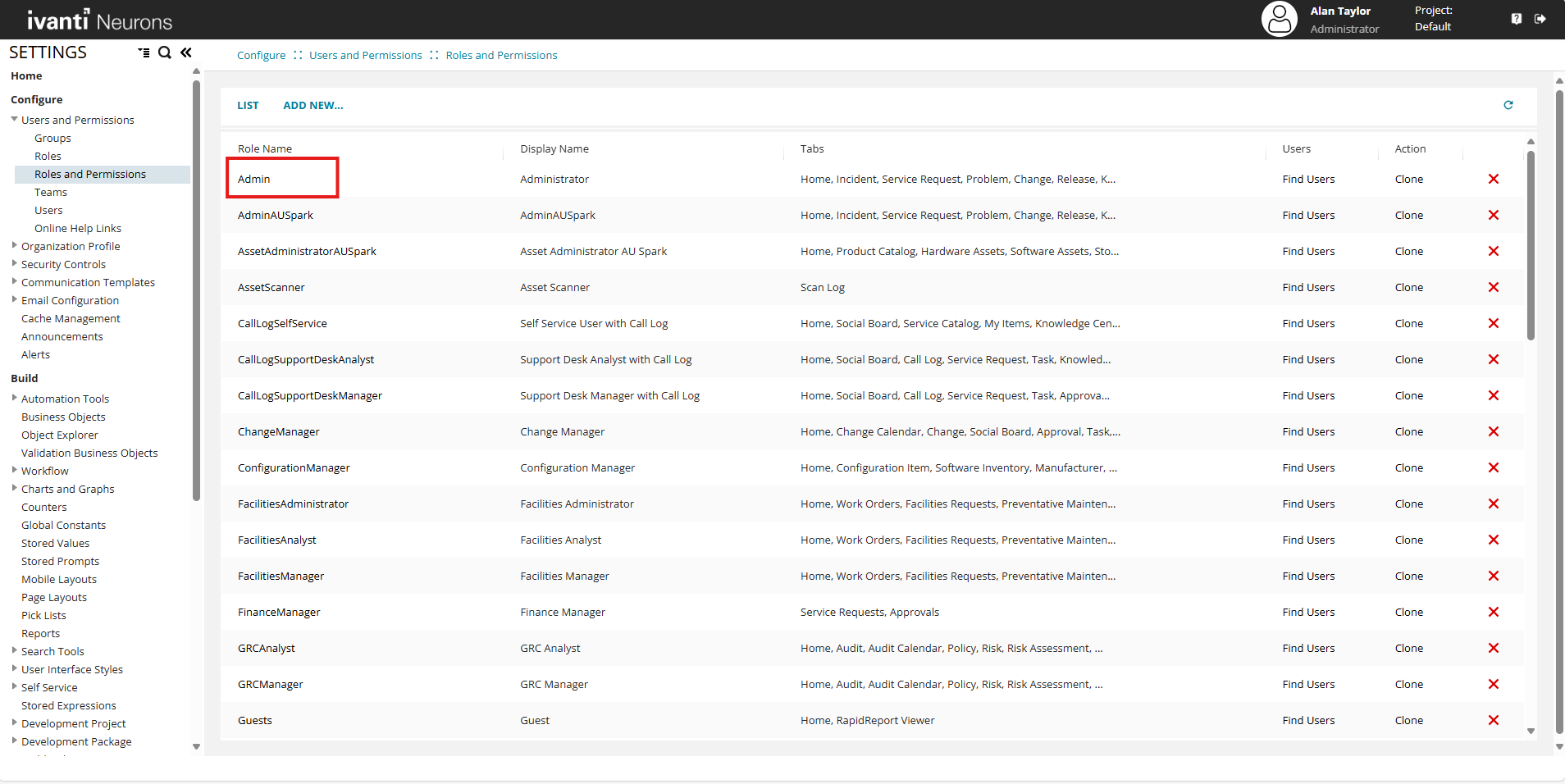
In the Configuration Console, go to Configure > Users and Permissions > Roles and Permissions.
-
In the Roles and Permissions list, select Admin.
-
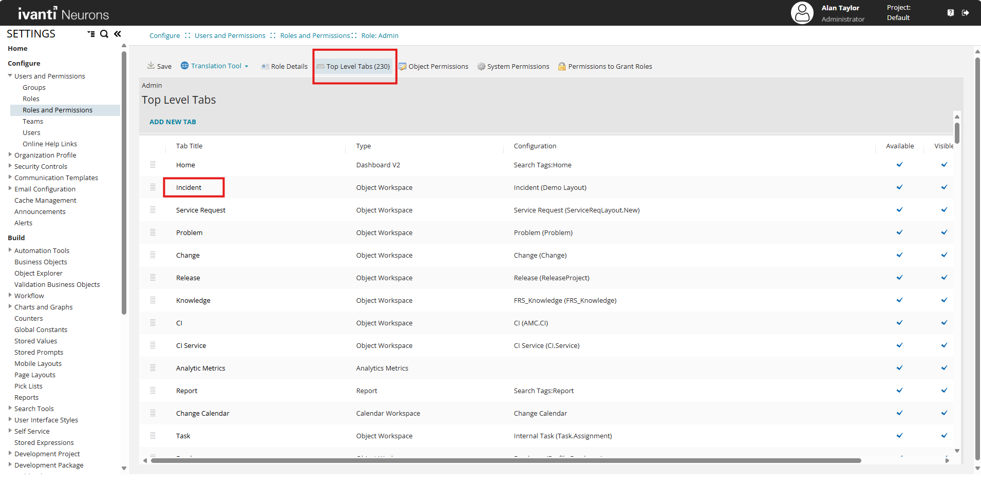
Select the Top Level Tabs tab.
-
In the list of tabs, select the Incident workspace.
-
In the Layout list, select the layout you created. For example, select Demo Layout.
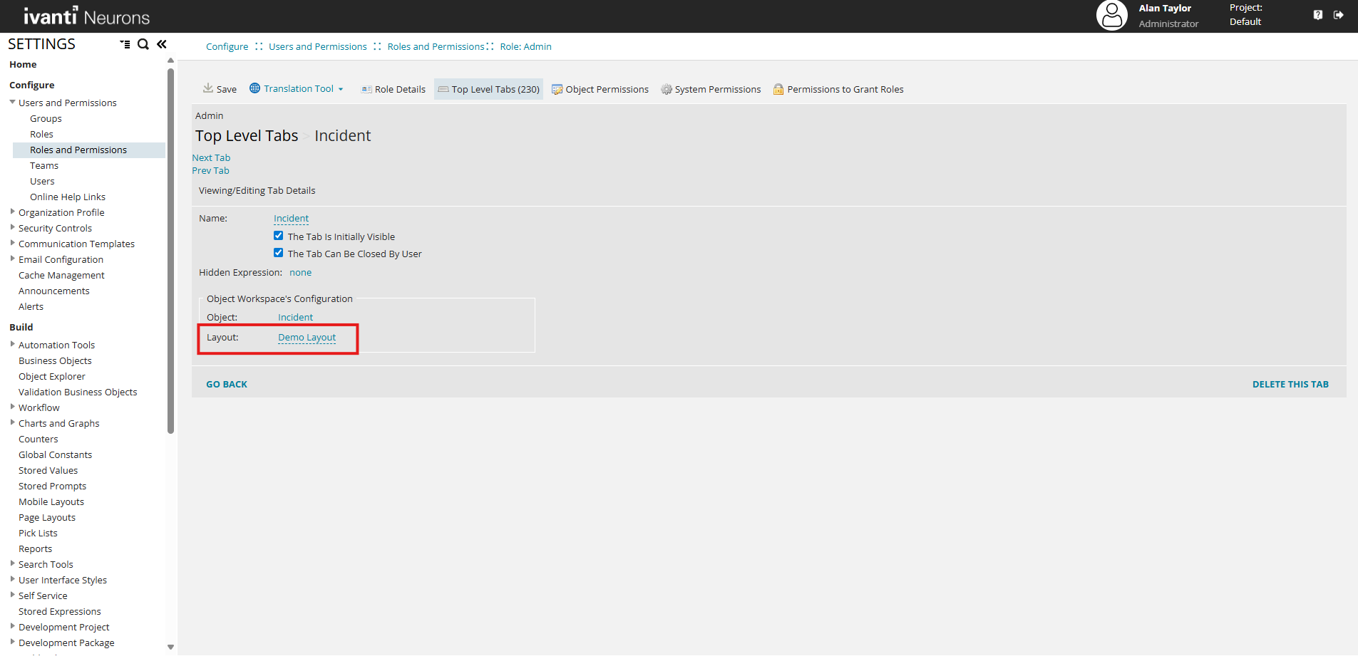
-
Select Save.
Configure the Toolbar for a Form View
After you configure a form view (detail page), you can edit the toolbar to control which tools and actions appear to end users.
On a form view, all toolbar tools appear on the right side of the toolbar. Unlike the Data Grid, Kanban, and Gallery views, the form view toolbar does not support left and right placement.
If you select the Self Service checkbox when you create the layout, the form view toolbar appears at the bottom of the form. For more information on Self Service Form Offering, see Configuring-Modern-Layouts-for-Form-Offerings.
Open the Toolbar Editor
-
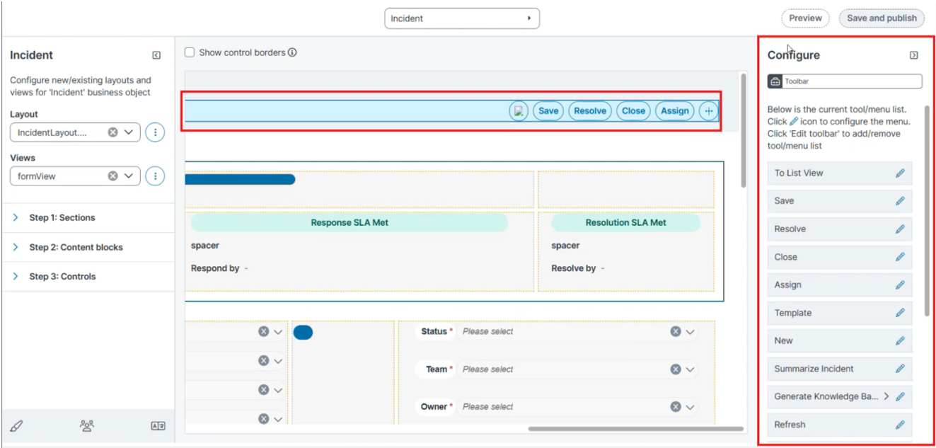
Open the Form view in the Modern Page Designer.
-
Select the toolbar at the top of the form.
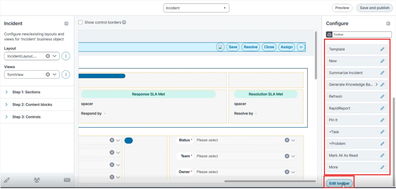
The Configure pane displays the current tool/menu list. Each tool includes an Edit
 icon.
icon. -
To configure an individual tool, select its Edit
icon. -
To add or remove tools, select Edit toolbar.
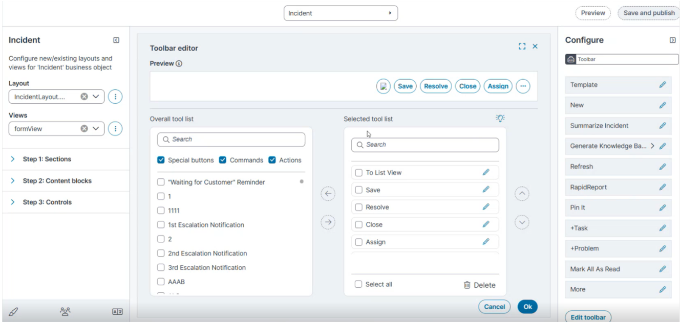
The Toolbar editor opens.
Toolbar Editor Fields and Controls
The Toolbar editor includes the following sections and controls.
| Field |
Description |
|---|---|
| Preview |
Shows how the toolbar will appear to end users. Updates automatically as you add, remove, or reorder tools. |
|
Overall tool list |
Lists all available tools you can add to the toolbar. Use the Search box to locate a tool. Filter the list using the Special buttons, Commands, and Actions check boxes. |
|
Selected tool list |
Displays the tools currently assigned to the toolbar. When you finish editing, select OK to save your changes and return to the main Toolbar Editor window. |
|
Left section / Right section |
Define the placement of tools in the toolbar. Use the arrow controls to move tools from the Overall tool list into either section. |
|
Up and down arrows |
Change the order of tools in the Selected tool list. |
|
Select all |
In the Selected tool list, use this checkbox to select every tool at once. This is useful if you want to remove all tools. |
|
Delete |
Removes selected tools from the Selected tool list. The tools return to the Overall tool list. |
|
Arrow controls |
Move tools between the Overall tool list and the Selected tool list. |
|
Ok |
Saves changes made in the Toolbar editor and closes the window. |
|
Cancel |
Closes the Toolbar editor without saving changes. |
Add, Remove, and Reorder Tools
-
In the Overall tool list, select the tool you want to add.
-
Use the arrow controls to move the tool into the Selected tool list. To remove a tool, select it in the Selected tool list and use the arrow controls to move it back to the Overall tool list.
-
To delete a tool, select it in the Selected tool list, and then select Delete. To delete all tools, select Select all, and then select Delete.
-
Use the up and down arrows to change the order of the tools in the Selected tool list.
-
Click OK to save your changes and close the Toolbar editor.
Configure panel
You configure the Form panel in the Configure pane.
| Field |
Description |
|---|---|
| Create new / Use existing |
Select the radio button to use existing to embed an existing panel, or Create new one. |
|
Select existing panel |
The existing panel to embed in the form (for example, Problem.DataEntry). Available when you select Use existing. |
|
Relationship(s) |
The relationship that links the from panel to the other form's view business object. |
|
Object |
The business object that the embedded panel displays (for example, Problem). |
|
Hidden expression |
An expression that determines when the panel is hidden. |
|
Initially visible |
An expression that determines whether the panel is visible when the form first opens. For example, False hides the panel initially. |
|
Default style |
The default style applied to the panel. |
|
Section toolbar – Display toolbar area |
Select this checkbox to show a toolbar for the child form. |
|
Default cell margins |
The default margins applied to the panel's cells (for example, 0; 0; 0; 0;). |
|
Mobile View – Hide on mobile view |
Hides the panel on mobile devices when you turn the toggle on. |
|
Permission |
The Update and Delete permissions for the panel. |
Configure a Toolbar for a Child Form
An embedded child form (a panel added to the form view) can have its own toolbar, separate from the main form view toolbar.
-
In the Modern Page Designer, select the embedded child form panel.
-
In the Configure pane, confirm that Relationship(s) is not set to To Itself.
-
Under Section toolbar, select the Display toolbar area checkbox.
A toolbar appears for the child form.
Unlike the main form view toolbar, which is right-aligned only, the child form toolbar supports both a Left section and a Right section. Use the arrow controls in the Toolbar editor to place tools into either section.
You can add a toolbar to the child form only when you select a specific relationship from the dropdown in Relationship(s).
Publish and Assign the Layout
-
On the form view page, do one of the following:
-
Select Preview to review the updates before publishing.
-
Select Save and publish to apply the changes.
-
-
Navigate to Configure > Users and Permissions > Roles and Permissions to Assign the New Layout to a Role.
-
Reload the Home page.
-
Navigate to the Incident workspace. The application displays the form view with the configured toolbar.
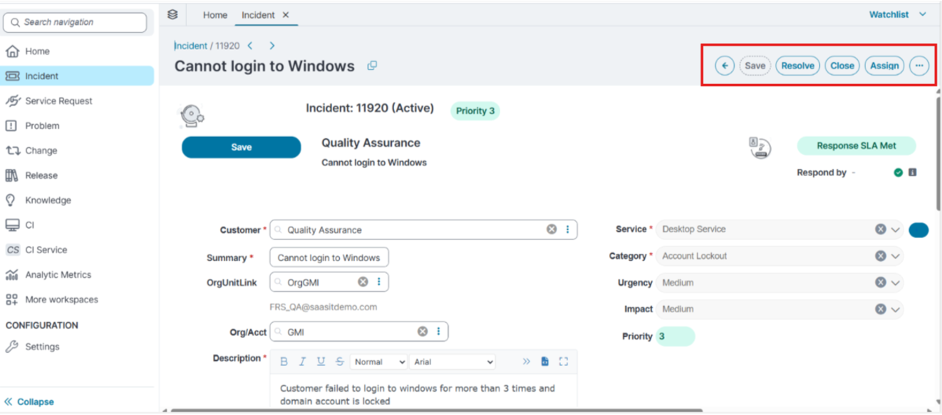
In the ellipsis (⋮) menu to access more toolbar actions.
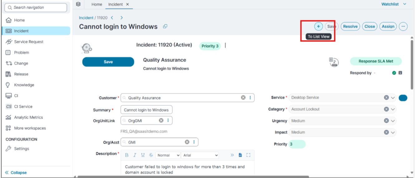
To return to the list view, select the back arrow (To List View).
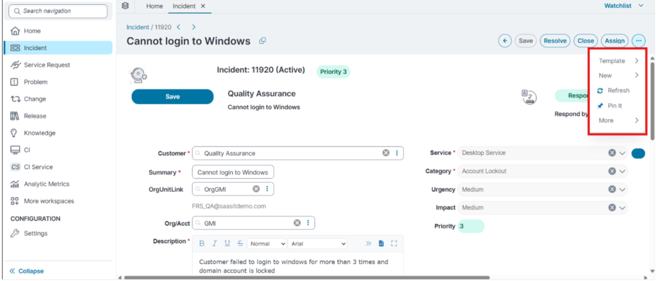
In the ellipsis (⋮) menu, select More to access additional quick actions, grouped into categories.
For information about how users add, rename, download, and delete attachments in the application, see Other Form Controls and Working with Attachments.