Configure and Assign Views and Layouts Using the Modern Page Designer
Role:Administrator
Prerequisites:
-
Administrator access is required.
-
The global constant EnableNova must be set to True.
You can use the Modern Page Designer to create and assign role-based layouts for any business object. In this procedure, we use the Incident business object as an example use case. You will configure a layout, add a view (Data grid, Kanban or Gallery View), and publish a data grid layout.
 Steps to create a Ivanti Service Management Portfolio UI V3
Enable the Modern Designer
-
Log in to Neurons for ITSM as an Administrator.
-
From the Configuration Console, click Build > Global Constants.
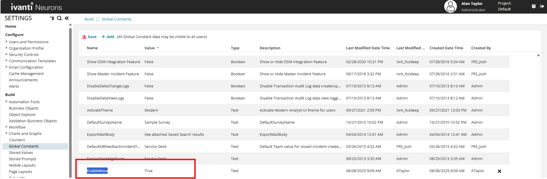
-
Search for the global constant EnableNova.
-
If the constant exists, set the value to True.
-
If the constant does not exist:
-
Select
 Add.
Add. -
In the Name field, enter EnableNova.
-
In the Value field, enter True.
-
In the Type field, select Boolean form the dropdown.
-
Select Save.
-
-
-
Select Save.
When you enable the global constant EnableNova, table widgets in the Dashboard UI v2 workspace display the Ivanti Service Management Portfolio UI V3 Data Grid. This behavior applies to all dashboards, both existing and new, in the Dashboard UI v2 workspace.
Launch the Modern Page Designer
-
Navigate to Build > Business Objects, and select the Incident business object.
-
Select the Layouts tab.
-
Select Add New Layout.
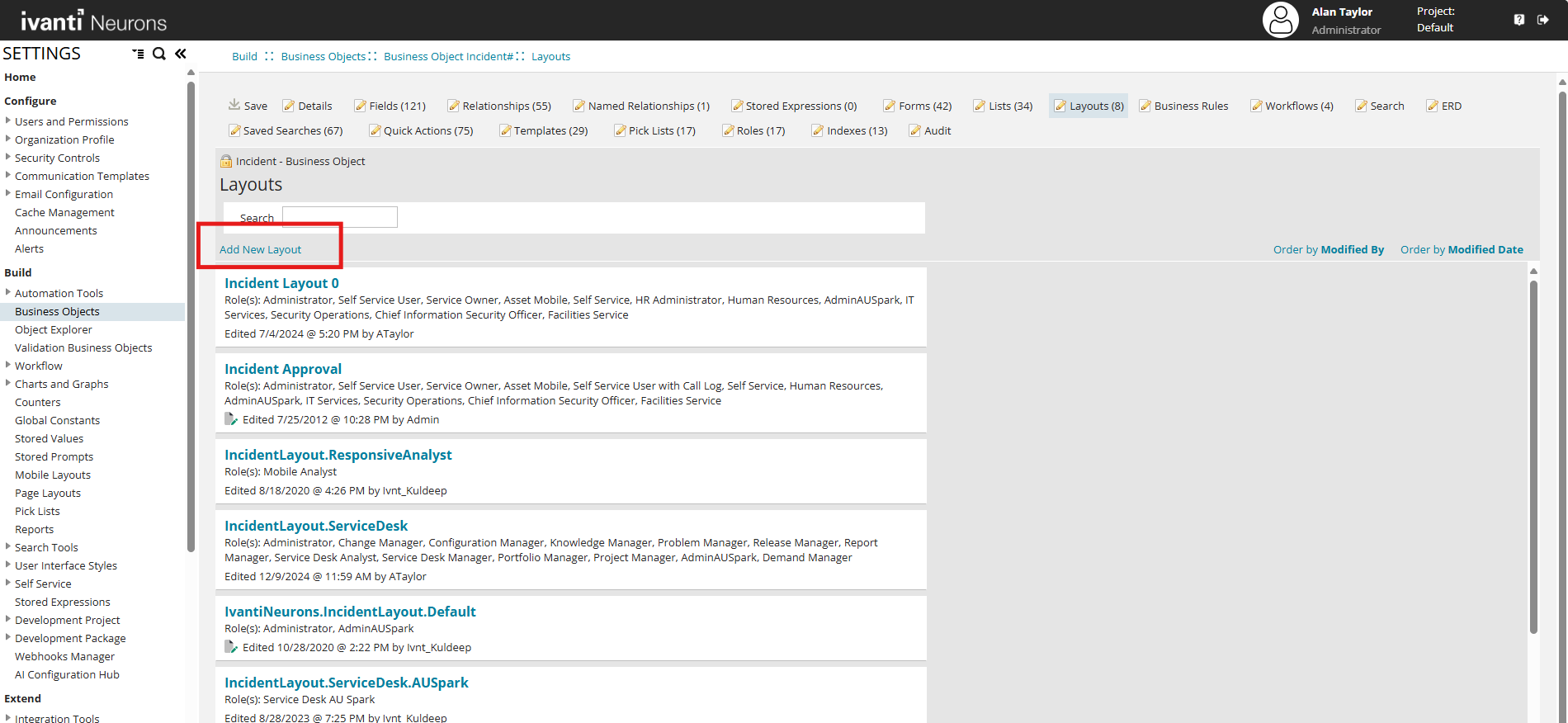
-
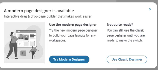
When prompted, select Try Modern Designer.
The application displays an onboarding dialog box :
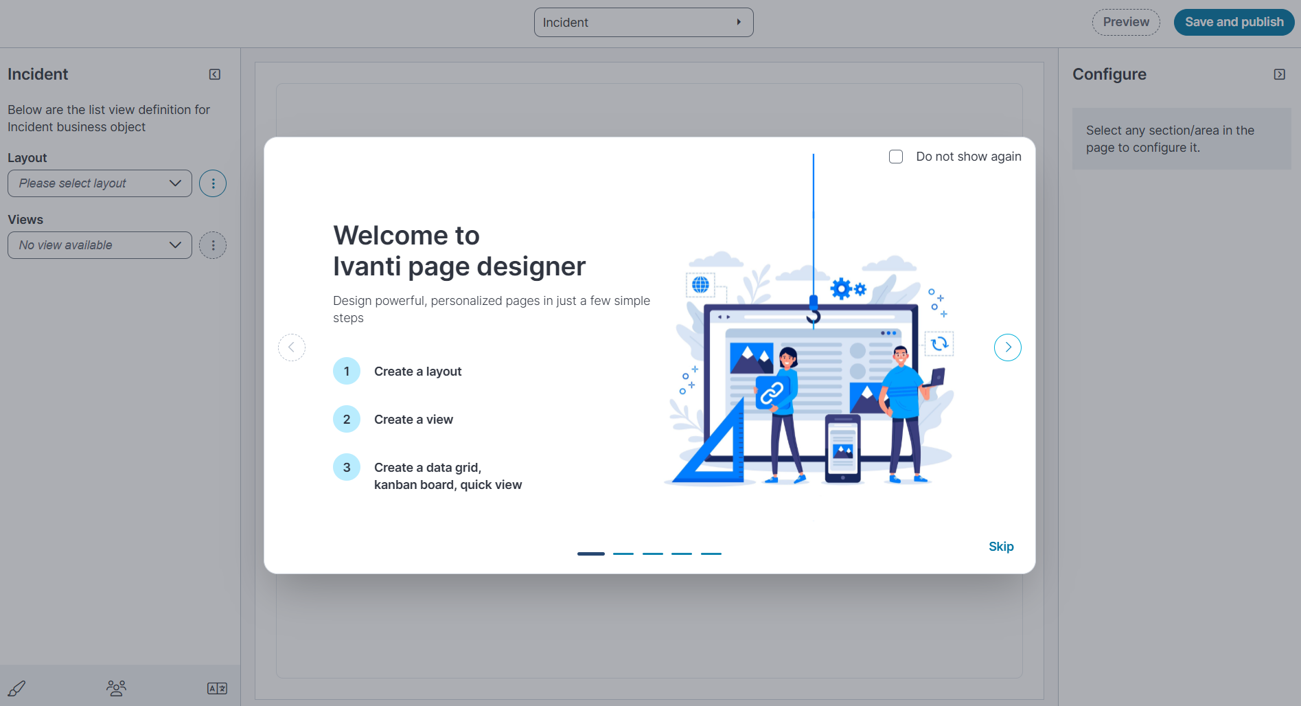
An onboarding dialog box appears; you can Start or Skip the walkthrough. Select Do not show again to hide it in future sessions.
Modern Page Designer Home Page
The designer page is divided into three sections:
-
At the top: Select the business object from the dropdown list.
- Left pane:
-
Layout: Use the ellipsis (⋮) next to the layout dropdown to Edit, Clone, Delete, or Add new layouts.
-
Views: Use the ellipsis (⋮) next to the Views dropdown to Add new or Manage views.
-
-
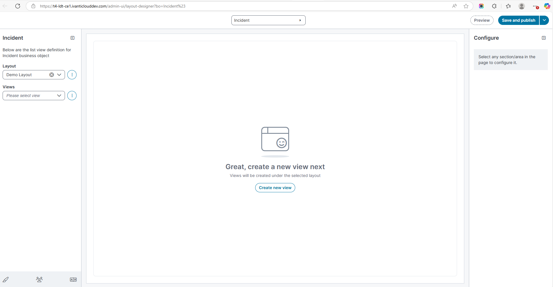
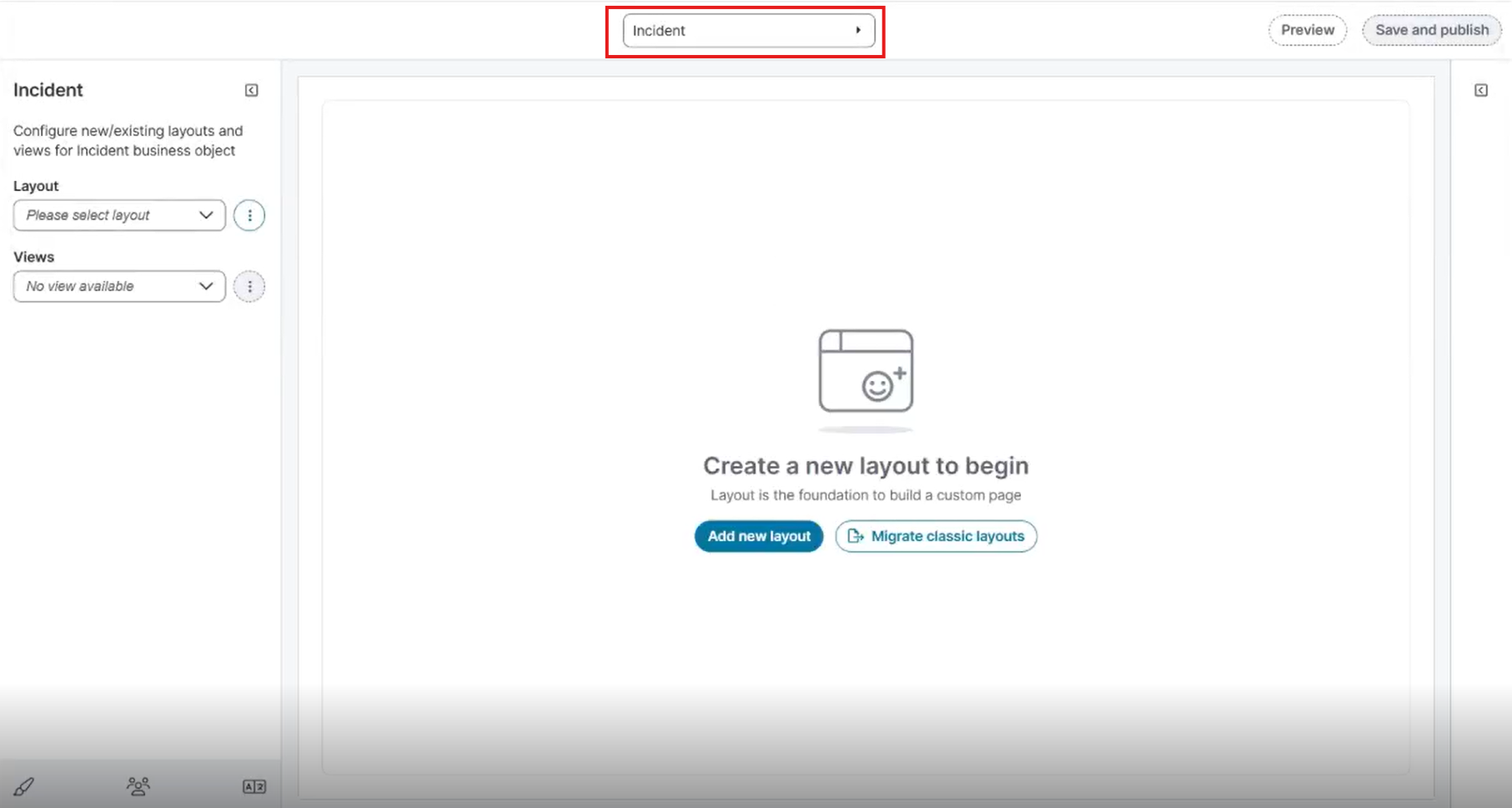
Center pane: Displays Create a new layout to begin.
-
Right pane (Configure): The right pane properties appears only after a column is selected from the data grid.
Create a New Layout
-
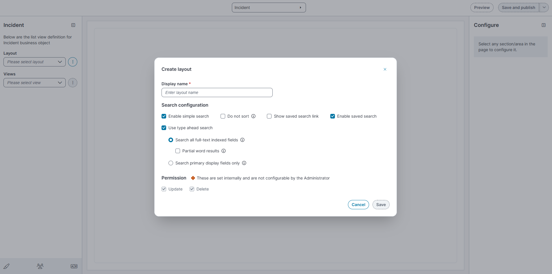
In the Layout dropdown, select the ellipsis (⋮) and then select Add New.
-
In the Create layout dialog box:
Field Description Display Name A unique name for this layout. Enable Simple Search Makes the simple search text box visible on the workspace. Also known as full-text search, this searches all full-text indexed fields. See About the Different Search Types for more information on how this works. Use Type Ahead Search Enables type ahead search. This option invokes a panel listing the results of what the user types into the search box, allowing them to click one of the results. Search all full-text indexed fields Only searches in full-text indexed fields. This option is checked by default and enables you to use Partial word results. Partial word results
Shows partial word results in the Type Ahead panel and the results list.
Search primary display fields only
Limits the search to only the primary display field (as opposed to all full-text indexed fields). Use this option only if the search freezes due to an excessive number of records. Note that the results from this search option will be different from the list results.
Do not sort
Disables automatically sorted results. By default, Type Ahead search results are sorted in ascending alphabetical-numeric order. This might cause a slow-down in getting search results.
Show Saved Search Link
Shows the saved search link (see Using a Saved Search).
Enable Saved Search
Shows the list of saved searches with this layout.
-
Select Save.
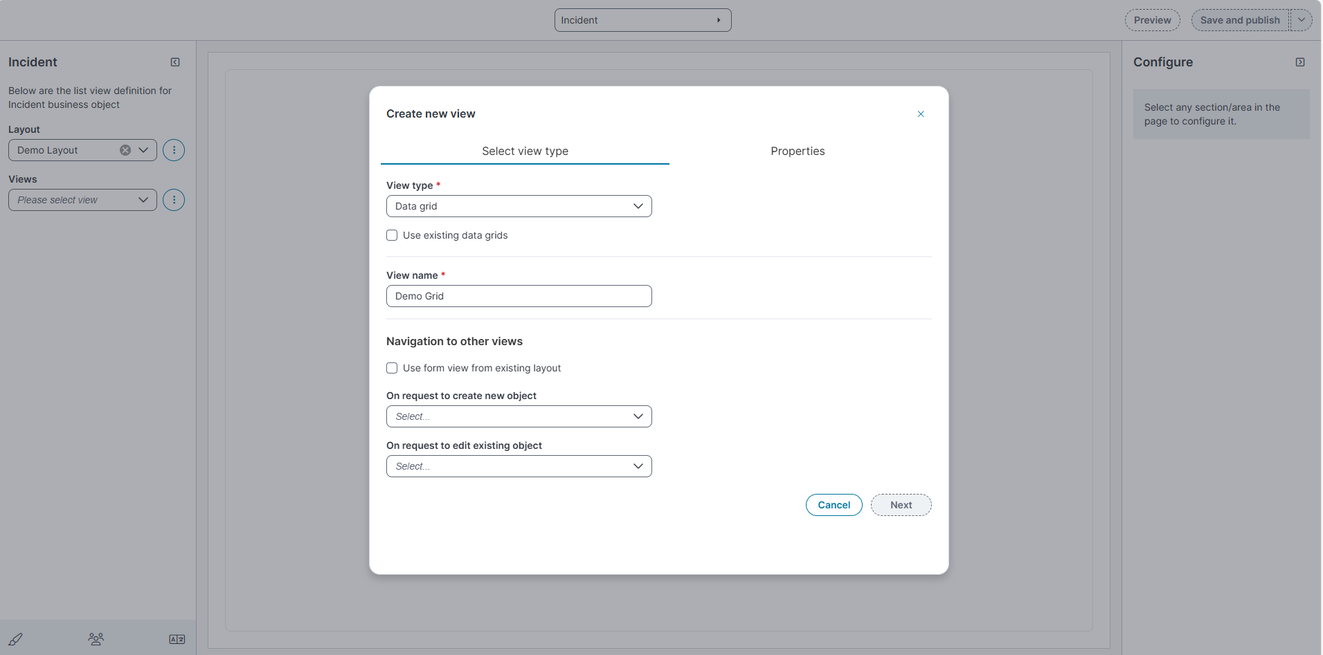
Create a New View
-
In the Views dropdown, select the ellipsis (⋮) and then select Add New.
The Create new view dialog appears.
-
From the View type dropdown, select one of the following:
-
Data grid
-
Kanban
-
Gallery View
-
-
(Optional) Select the checkbox Use existing data grids to base the view on a previously created data grid.
-
In View name, enter a descriptive (e.g., Grid, Kanban or Gallery) name for the view.
-
Under Navigation to other views:
-
Select the checkbox Use form view from existing layout to reuse a form layout.
-
From the On request to create new object dropdown, select the view to display when creating a new object.
-
From the On request to edit existing object dropdown, select the view to display when editing an existing object.
-
-
Select Save to continue to the Properties tab.
-
On the Properties tab, configure the following fields:
If you select Use existing data grids in the Select View Type tab, the Properties tab automatically populates with the settings from the selected data grid. You can review and modify them as needed.
Field Description
Values Name Internal name for the data grid or Kanban view.
Free text
Description
Optional description of the view.
Free text
Style
UI style applied to the view.
Default
Workspace paging
Number of records per page in the workspace.
0, 10, 15, 25, 50, 100
Dashboard paging
Number of records per page in dashboard widgets.
0, 10, 15, 25, 50, 100
Dialog paging
Number of records per page in dialogs.
0, 10, 15, 25, 50, 100
Search paging
Number of records per page in search results.
0, 10, 15, 25, 50, 100
Sort column
Column used for default sorting.
Any available field.
Sort order
Order applied to the sort column.
Ascending, Descending
Group by
Field used to group data.
Any available field.
Open in new tab
Whether the view opens in a new tab.
Yes, No
Go to
Object opened when a row is clicked.
This Object, AlternateContactLink, ClosingEscLink, Customer, EntityLink, GRCRiskLink, HRCaseLink, KnowledgeLink, MasterIncidentLink, nrn_ClusterIncidentLink, nrn_CorrelatedIncidentLink, OrgUnitLink, ProblemLink
Permissions
These permissions are set internally and are not configurable by the Administrator.
Update or Delete
-
Select Save.
Manage Views
-
In the Views dropdown, select Manage views.
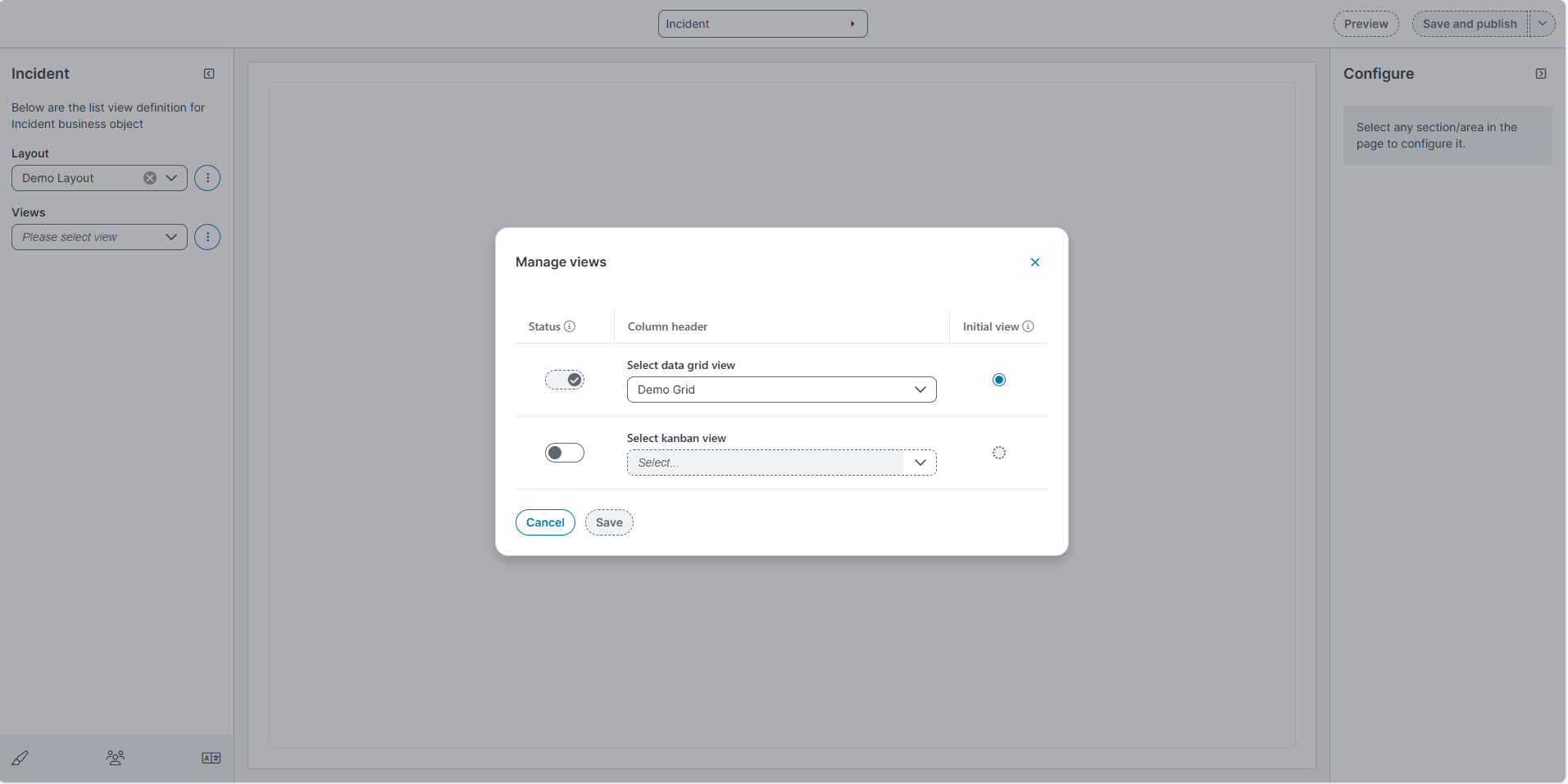
-
In the Manage views dialog:
-
Use the toggle under Status to enable or disable the view.
-
From Select data grid view, select the view to use (e.g., Demo Grid).
-
From Select Kanban view, select the view to use for Kanban display.
-
From Select Gallery view, select the view to use for Gallery display.
-
In the Initial view column, select the Radio button for the view you want to set as the Initial view.
When the Select data grid view type is selected as (e.g., Demo Grid) grid, you must select the Initial view radio button. If you do not select this option, the data grid will not appear in the new Ivanti Service Management Portfolio UI V3 page.
-
-
Select Save.
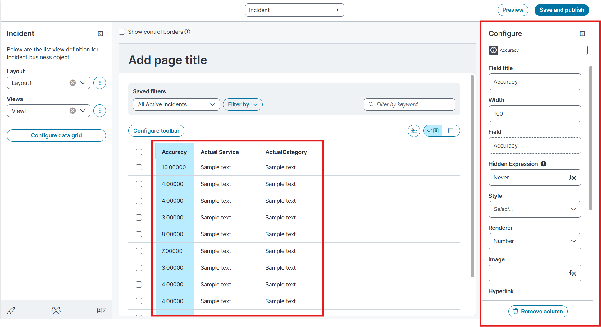
Configure the data grid
-
In the Layout list, select the required layout (for example, Demo Layout).
-
In the Views list, select the required view (for example, Demo Grid).
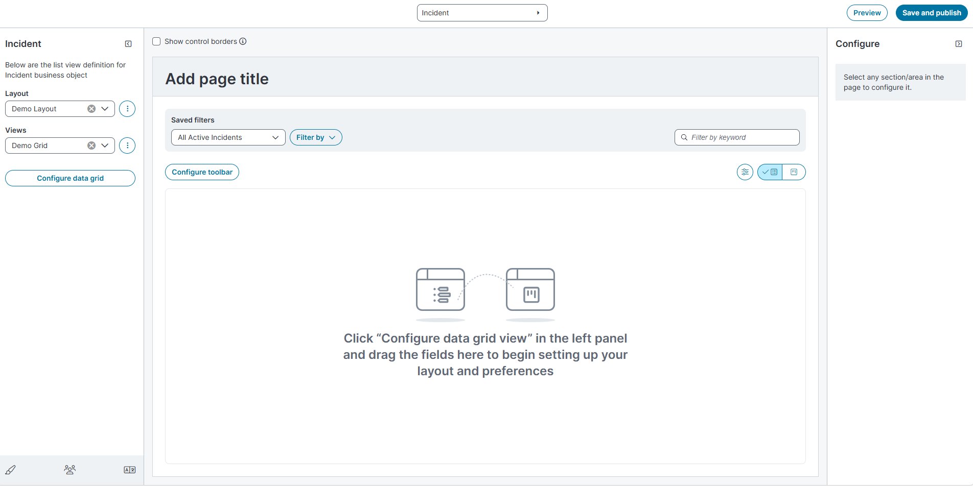
-
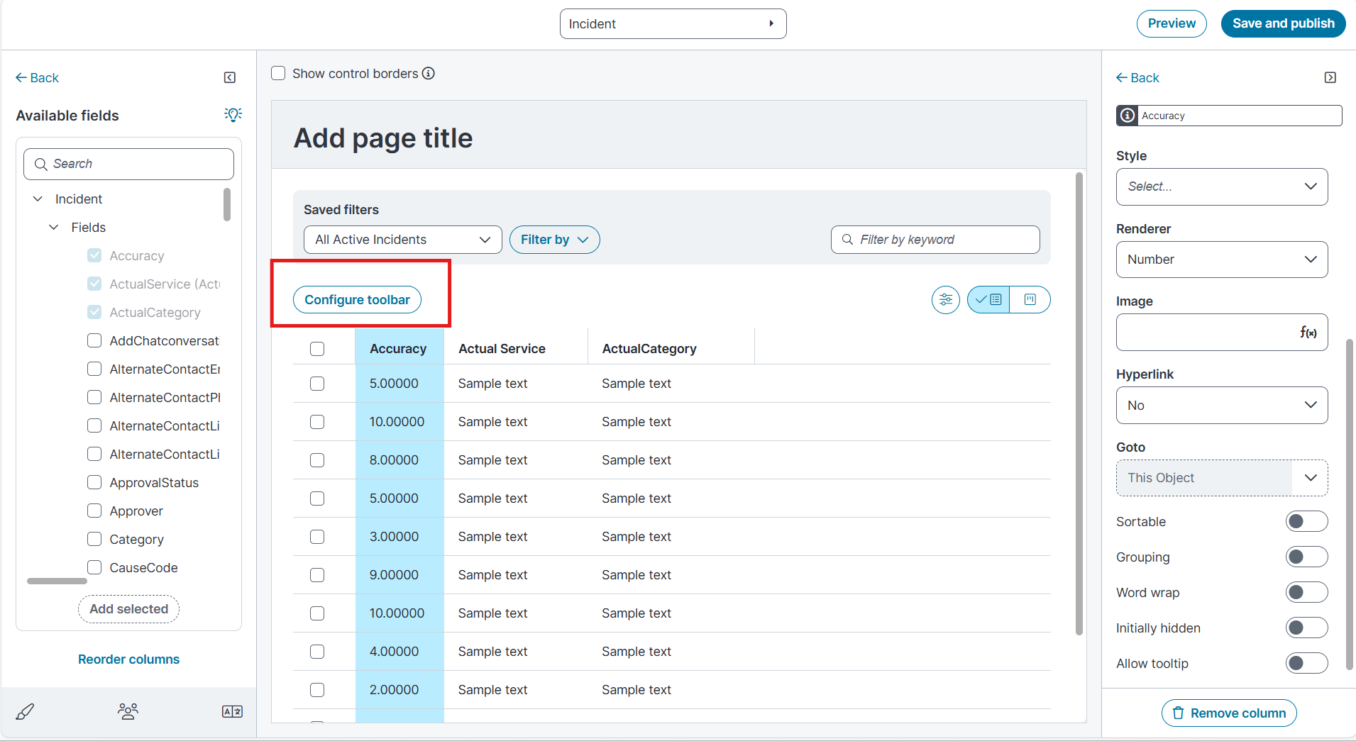
Select Configure data grid.
-
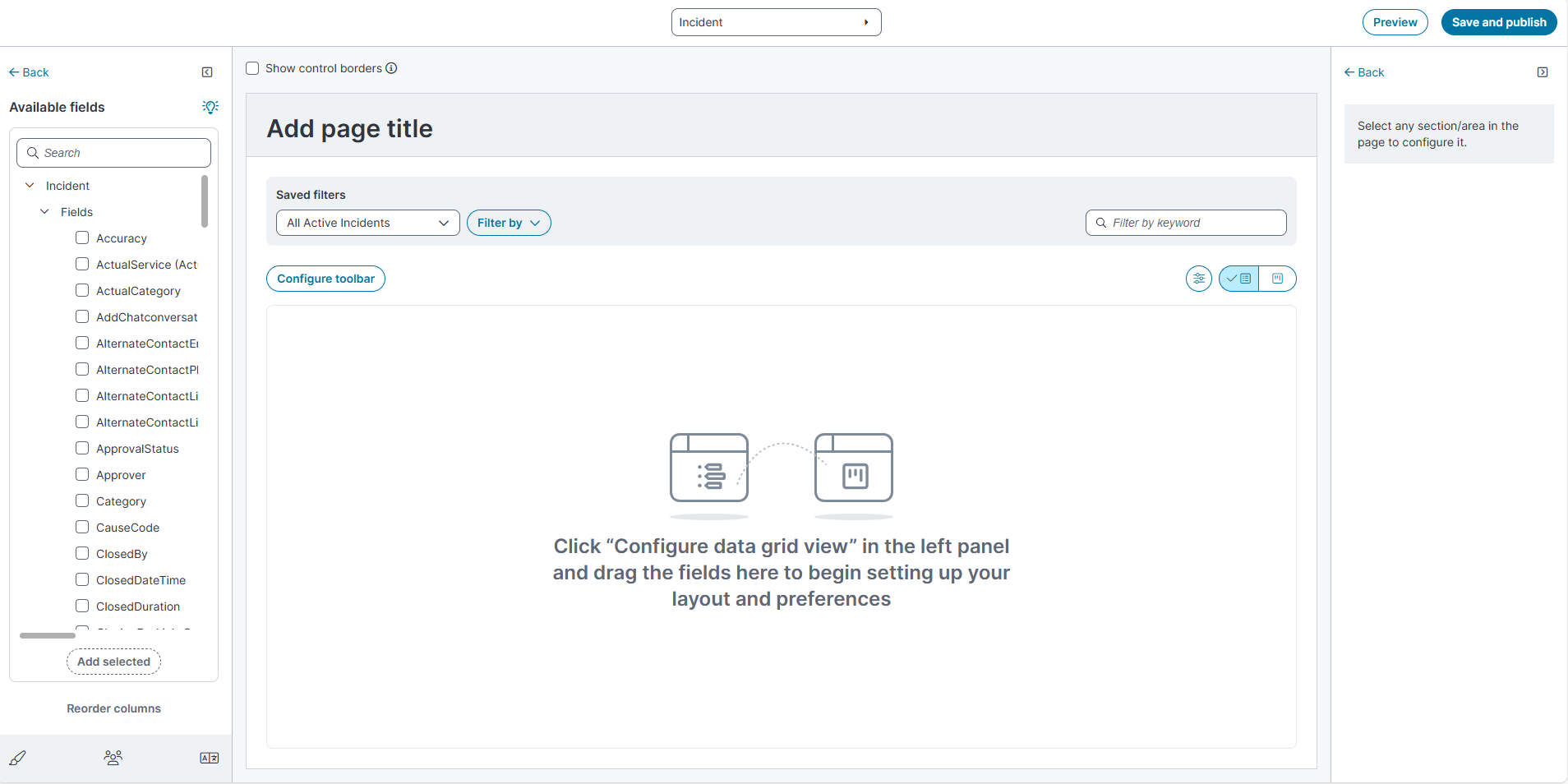
In Available fields (left pane) under the Incident business object in the fields pane, select the required fields.
-
Select the checkboxes for the fields you want in the grid.
-
-
Select Add selected to add the fields to the grid.
-
The columns appear in the center pane.
-
-
In the center pane, verify the displayed grid:
-
Columns such as Accuracy, Actual Service, ActualCategory
-
-
Column configuration options
When you select a column in the grid, the Configure pane opens on the right. You can set the following properties:
Field Description
Values Field title Display name of the column.
Free text
Width
Column width.
Free text (numeric)
Field
Field in the business object.
Displays the selected column.
Hidden Expression
Expression used to hide the column.
Boolean
Boolean, ƒ(x) expression editor
Style
UI style for the column.
Select Open Highlighter style list or Open Expression editor from the dropdown.
When you configure a style for a column, you can choose from two options:
-
Fixed styles: The Highlighter Styles dialog lists predefined, out-of-the-box styles. Each row shows the style name (for example, AUSparkButton, AUSparkField, AUSparkFormBackground) and a style preview so you can see how it will look when applied. The list is long, so not all styles are documented here.
-
Custom styles: The ƒ(x) Expression editor lets you define a conditional style expression. The editor includes tools grouped under Incident (business object fields), Functions (logic functions), Time Zones, and Styles. Use this option to apply conditional formatting. For example, you can highlight rows where the Priority field equals 1.
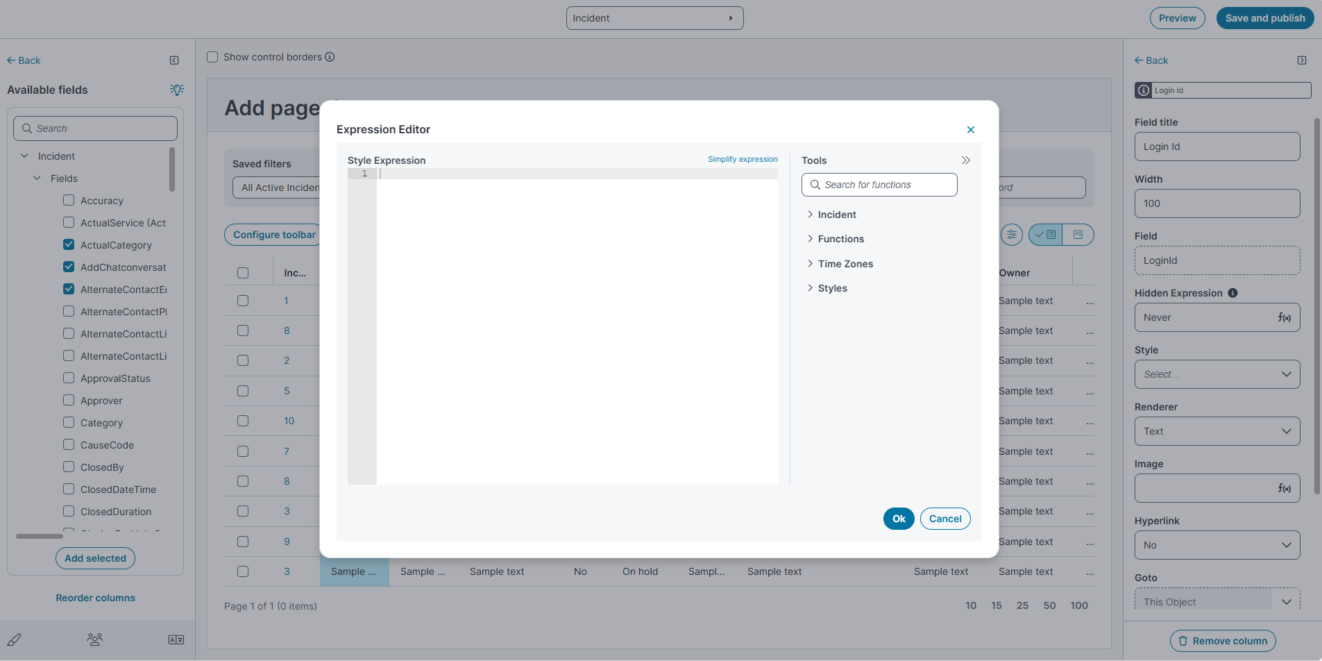
Renderer
How the value is rendered/aligned.
Left Aligned, Number, Right Aligned, Size
Image
To render an image.
ƒ(x) expression editor
Hyperlink
Whether the column shows as a hyperlink.
Yes, No
Goto
Object to navigate to when hyperlink is selected.
This Object (default)
Sortable
Allow column to be sortable.
Toggle: On or Off
Grouping
Allow data grouping by this column.
Toggle: On or Off
Word wrap
Wraps text in the column.
Toggle: On or Off
Initially hidden
Hides the column by default.
Toggle: On or Off
Allow tooltip
Shows tooltips on hover.
Toggle: On or Off
Remove column
To remove the column from the grid.
Action button
-
-
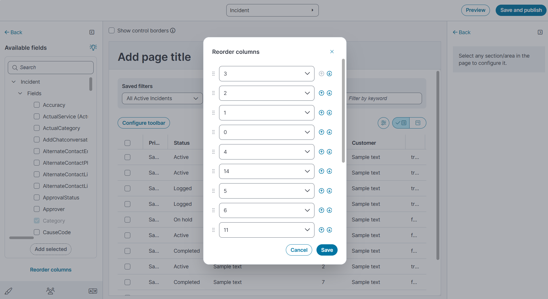
(Optional) To change the order of the columns, select Reorder columns and arrange the columns as needed.
-
Select Save.
Configure toolbar for data grid
After you configure the grid columns, you can edit the toolbar to control which tools and actions appear to end users.
-
In the grid, select Configure toolbar.
-
The Toolbar editor opens.
-
The Toolbar editor includes the following sections and controls:
The Toolbar Editor is available for Data Grid, Kanban, and Gallery views. You can use it to configure which tools and actions appear to end users in the workspace toolbar.
Field Description
Preview Shows how the toolbar will appear to end users. Updates automatically as you add, remove, or reorder tools.
Overall tool list
Lists all available tools you can add to the toolbar. Use the Search box to locate a tool. Filter the list using the Special buttons, Commands, and Actions check boxes.
Selected tool list
Displays the tools currently assigned to the toolbar. Tools are displayed under the Left section or Right section, depending on where you place them.
Each tool in this list includes an Edit
 icon. Select the icon to open the Toolbar Editor for that specific tool. From here, you can:
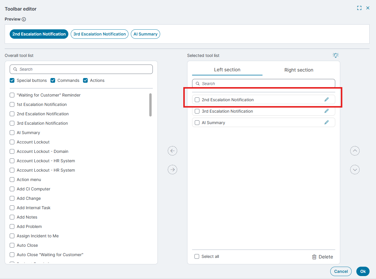
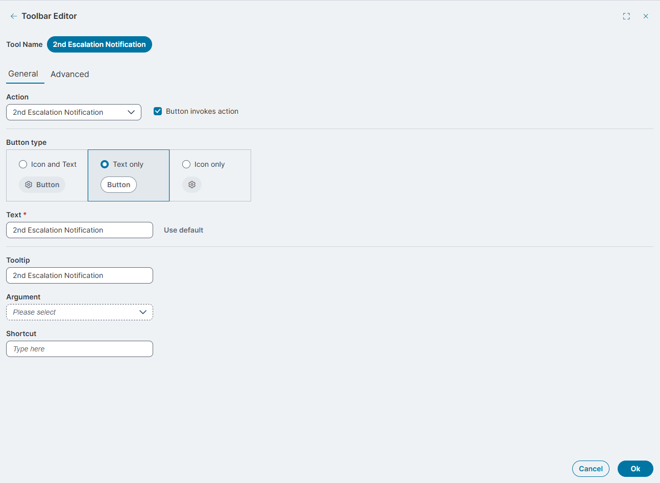
Modify the Action associated with the tool.
-
Choose a Button type, Icon and Text, Text only, or Icon only.
-
Update the Text label and Tooltip displayed in the toolbar.
-
Define Arguments or Shortcuts, if applicable.
When you finish editing, select OK to save your changes and return to the main Toolbar Editor window.
-
The Toolbar Editor is available for Data Grid, Kanban, and Gallery views.
-
Changes take effect in the Incident workspace after you select Save and publish.
Left section / Right section
Define the placement of tools in the toolbar. Use the arrow controls to move tools from the Overall tool list into either section.
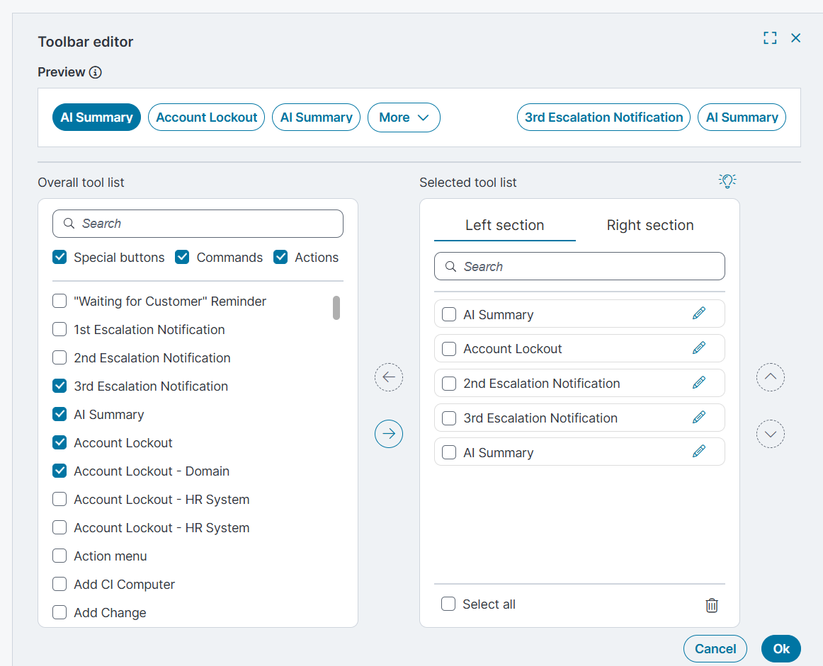
Select all
In the Selected tool list, use this checkbox to select every tool at once. This is useful if you want to remove all tools.
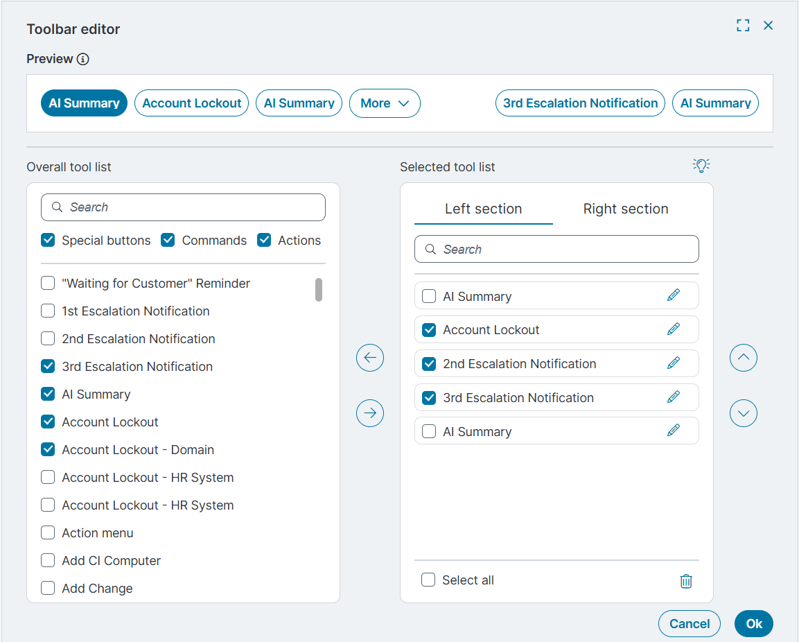
Delete
Removes selected tools from the Selected tool list. The tools return to the Overall tool list.
Arrow controls
Move tools between the Overall tool list and the Selected tool list.
Up and down arrows
Change the order of tools in the Selected tool list.
Ok
Saves changes made in the Toolbar editor and closes the window.
Cancel
Closes the Toolbar editor without saving changes.
-
-
Select Save and publish to apply the changes to the grid.
-
Back on the grid page, do one of the following:
-
Select Preview to review the updates before publishing.
-
Select Save and publish to apply the changes to the grid.
-
-
Reload the Home page.
-
Verify that the Ivanti Service Management Portfolio UI V3 opens.
-
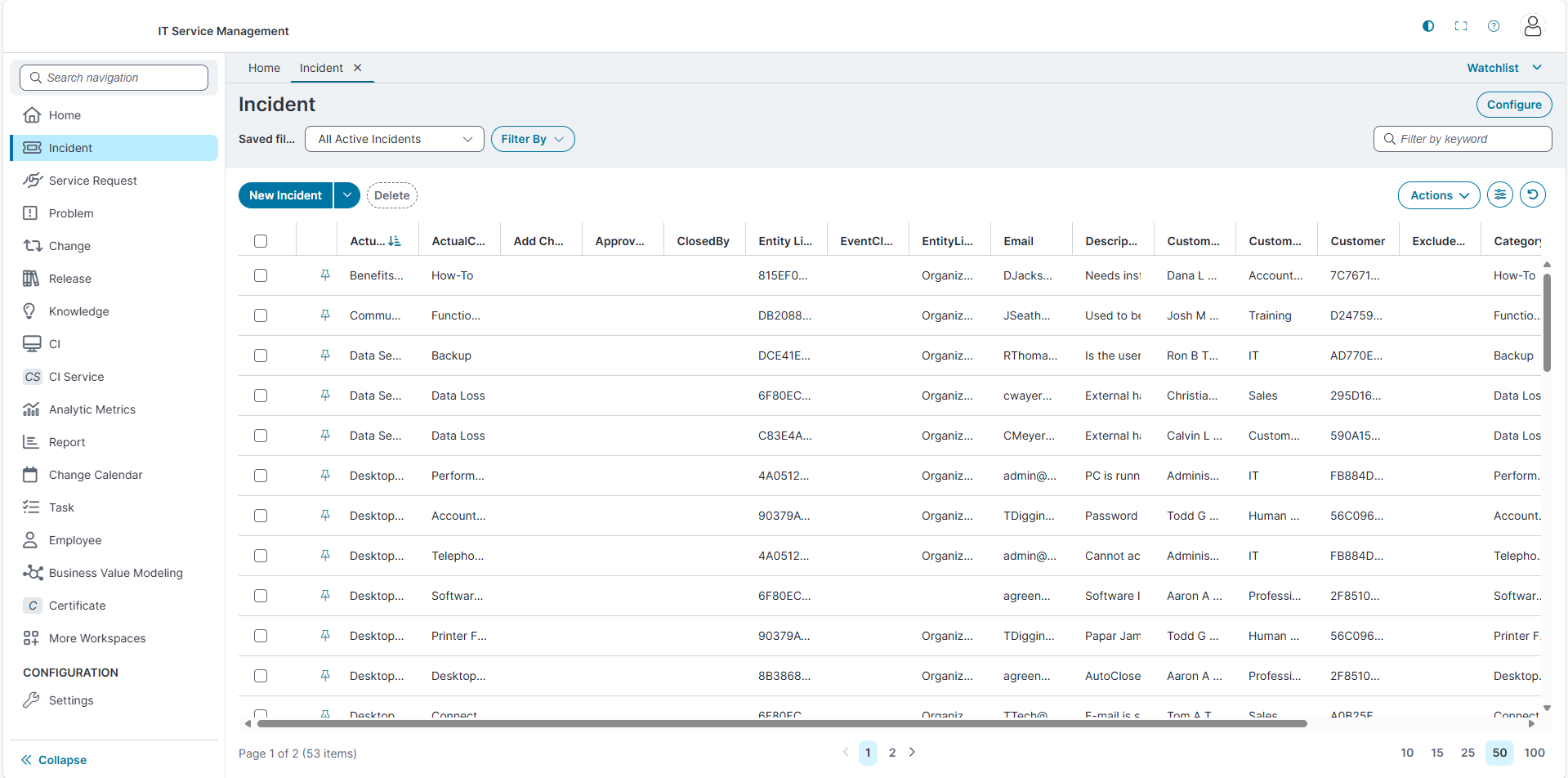
Use the theme icon in the top-right corner to toggle between Light mode and Dark mode.
-
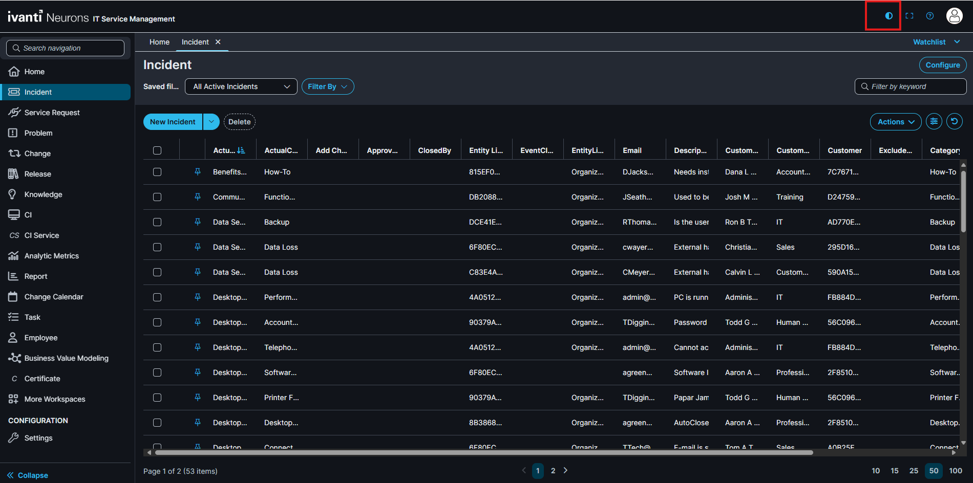
Navigate to the Incident workspace. The application displays the new data grid configured using the Modern Page Designer.
-
To return to the Modern Page Designer and make changes, select Configure.
-
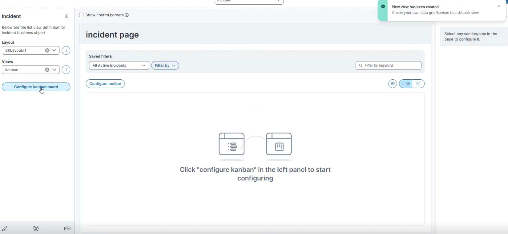
Configure Kanban View
-
In the Layout list, select the required layout (for example, Demo Layout).
-
In the Views list, select the required view (for example, Kanban).
-
Select Configure Kanban board.
-
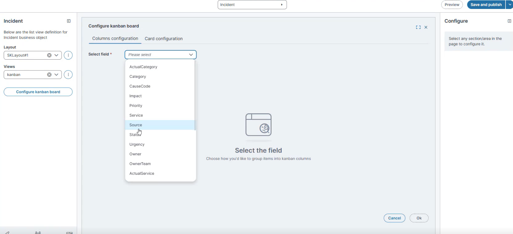
In Columns configuration, from Select field, choose the field used to group cards (for example, Status).
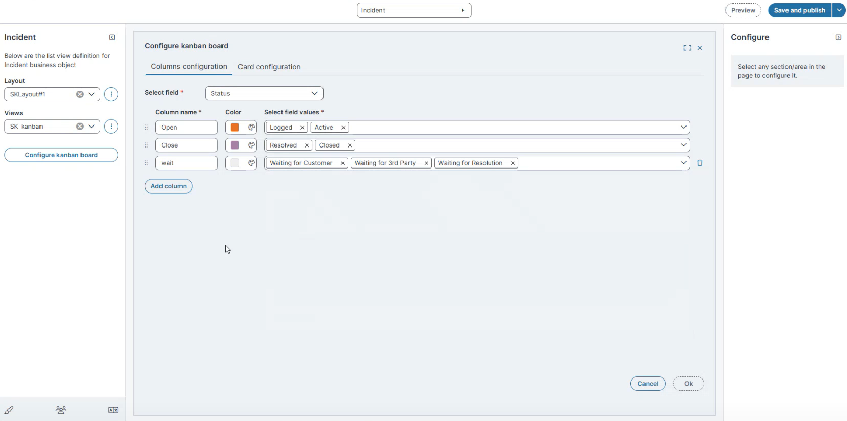
Prerequisite: The field selected for Columns configuration must use a pick list that contains unique values.
-
Define columns:
-
Enter a Column name (for example, Open, Close, Wait).
-
Select a Color.
-
From Select field values, assign values to each column.
-
Example:
-
Open: Logged, Active
-
Close: Resolved, Closed
-
Wait: Waiting for Customer, Waiting for 3rd Party, Waiting for Resolution
-
-
-
-
Select Add column to include more lanes as needed.
-
Select OK.
-
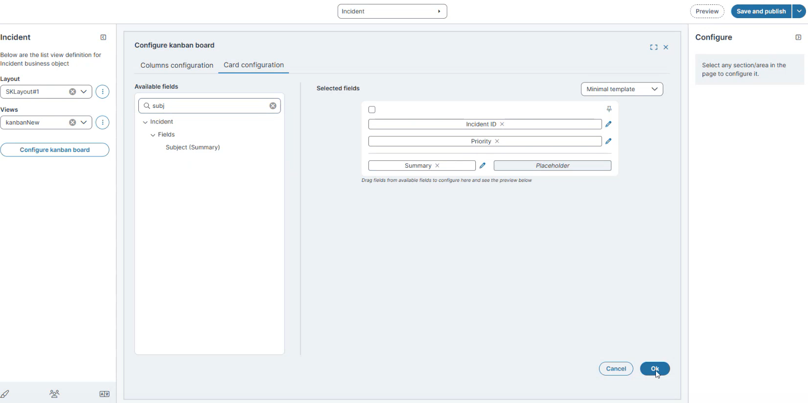
Open the Card configuration tab.
-
From Available fields, drag fields to the Selected fields area.
-
Example fields: Priority, Status, Incident ID, Owner, Category, Impact, Summary, Customer Name.
-
-
From the Template dropdown, select a card style:
-
Default template
-
Minimal template
-
Classic template
-
-
Select the Edit
icon next to a field to configure its properties. The Configure pane opens on the right -
Select OK.
Manage Views
-
From the Views dropdown, select Manage views.
-
In the Manage views dialog:
-
Enable the Kanban view you created (for example, Incident Kanban).
-
(Optional) Set it as the Initial view.
-
-
Select Save.
Verify the Kanban Layout
-
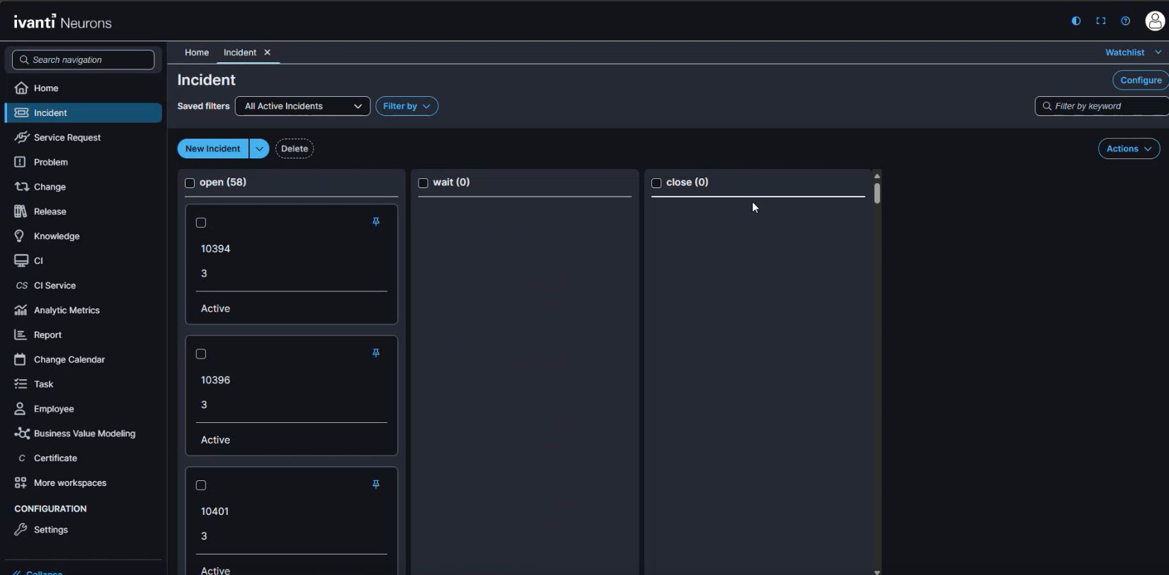
Reload the Home page.
-
Navigate to the Incident workspace.
-
Verify that the Kanban board opens in theIvanti Service Management Portfolio UI V3 with the configured columns and cards.
-
Example: Open, Wait, Close lanes with cards displaying Incident ID, Priority, and Status.
-
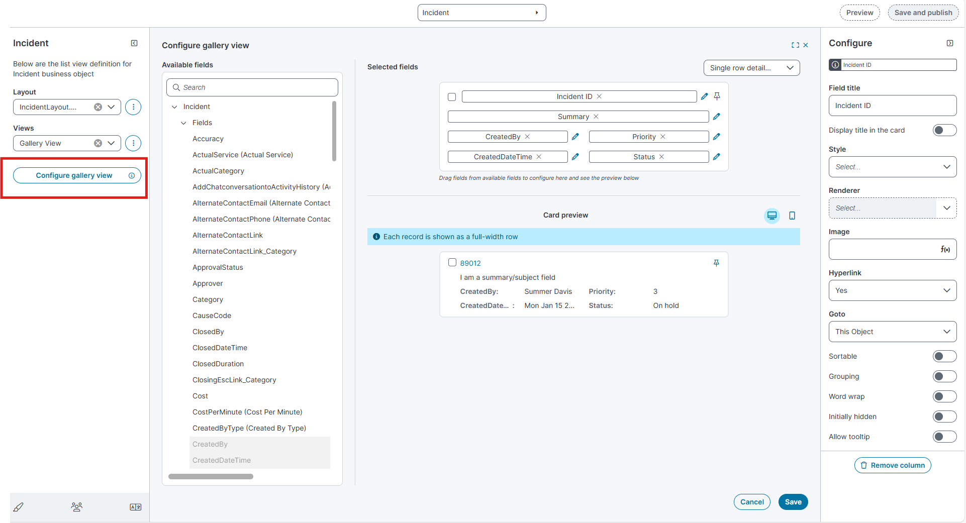
Configure Gallery View
-
In the Layout list, select the required layout (for example, Demo Layout).
-
In the Views list, select the required view (for example, Gallery View).
-
Select Configure Gallery View.
-
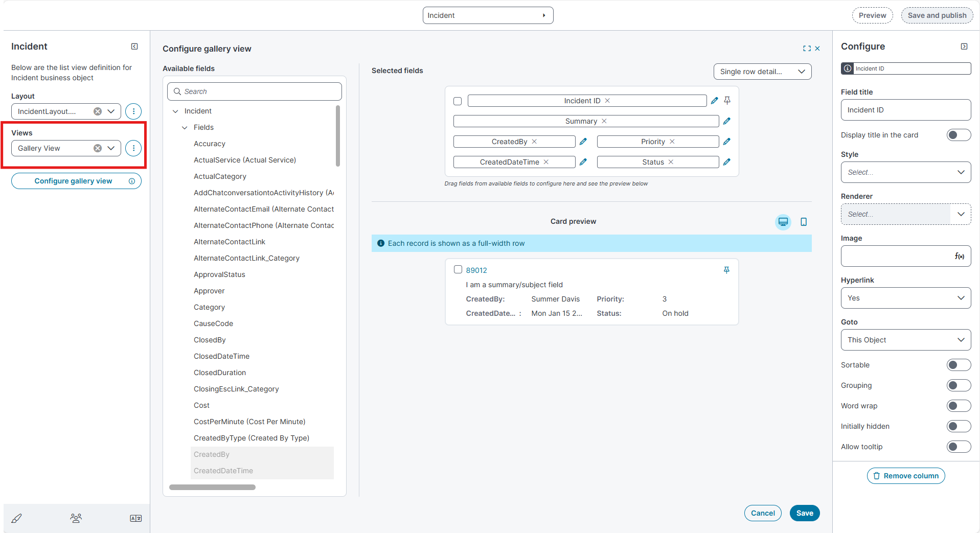
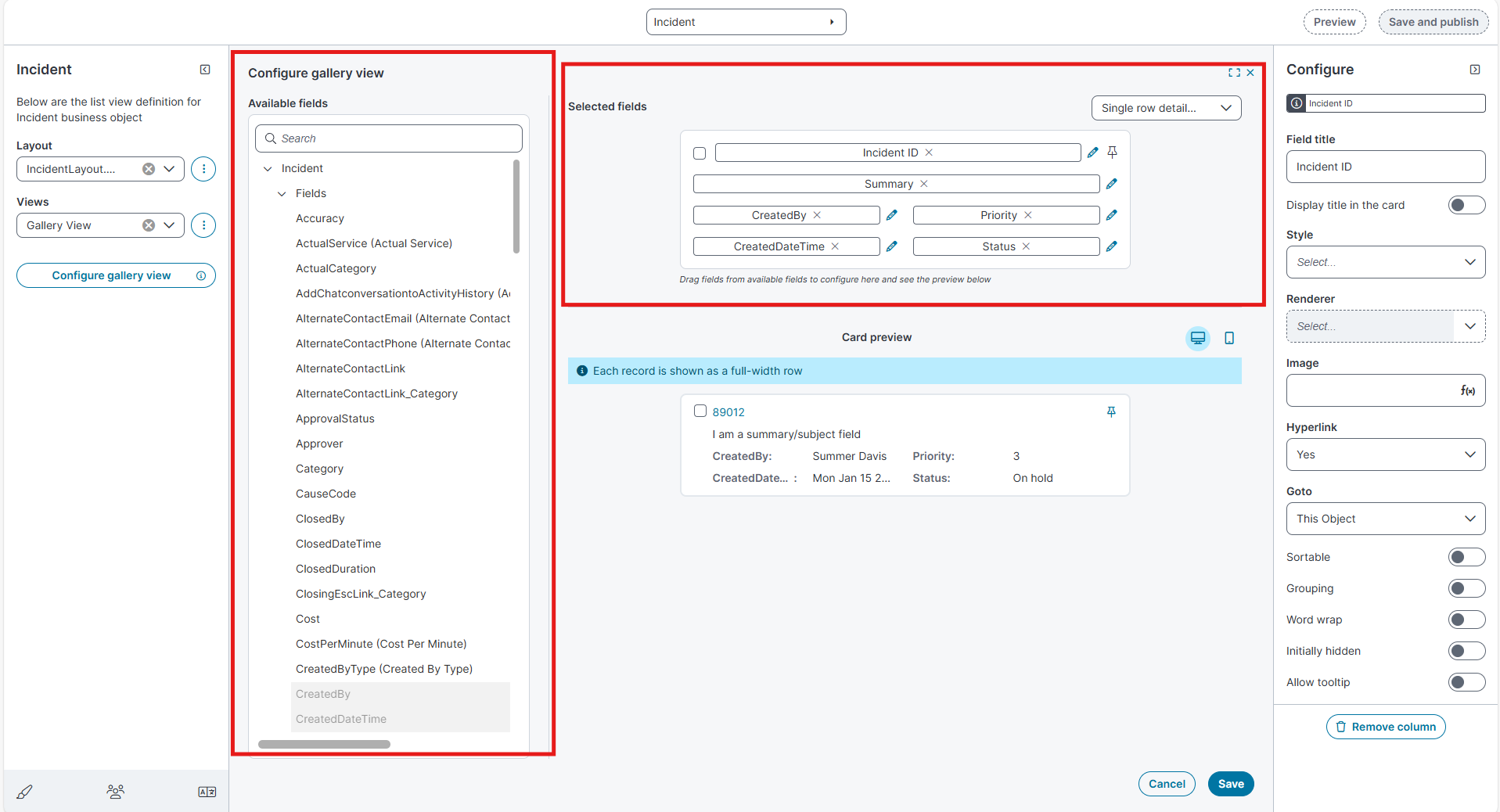
In the Available Fields pane, select the fields you want to display.
Drag the fields into the Selected Fields area.
-
From the Template dropdown, choose one of the following templates:
Field Description
Single Row Detailed Displays up to Six fields in a single, full-width row.
Single Row Compact
Displays up to three fields in a minimal single-row layout.
Card Detailed
Displays up to eight fields in a detailed card layout.
Card Compact
Displays up to five fields in a compact card layout.
-
Use the Preview icons at the top to review the layout in different device modes:
-
Desktop
-
Mobile
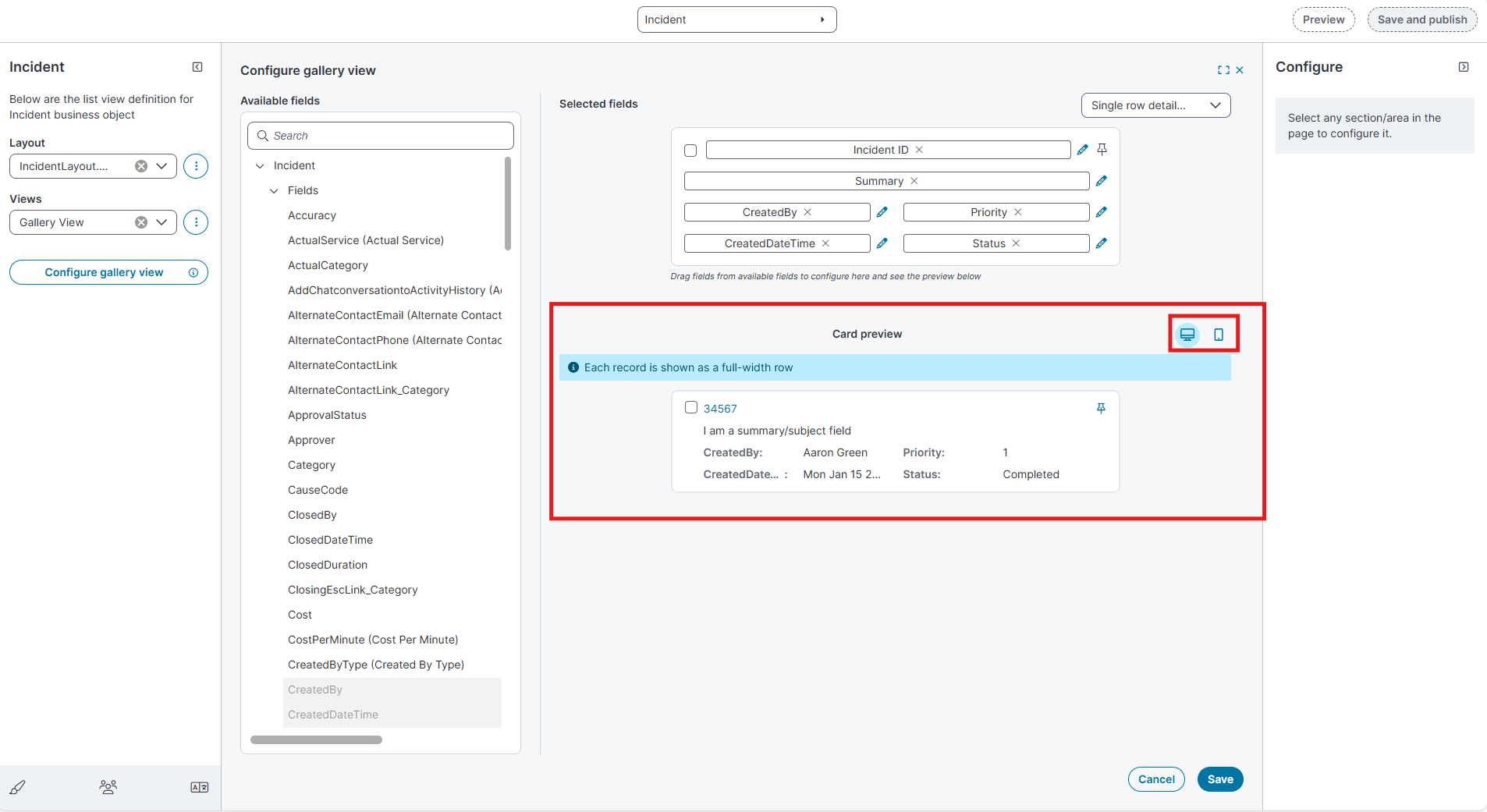
The Desktop and Mobile preview options are available only for Row templates.
-
-
Select the Edit
icon next to a field to configure its properties. The Configure pane opens on the right -
Select Save to apply the configuration.
Manage Gallery View
-
In the Views list, select the ellipsis (⋮) and then select Manage Views.
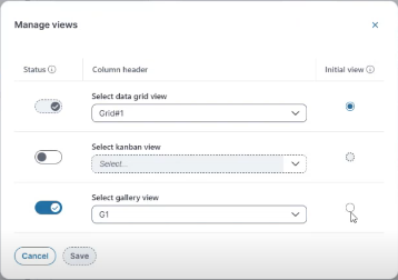
-
In the Manage Views dialog box:
-
Use the Status toggle to enable the Gallery view.
-
From Select Gallery view, choose the view you created (for example, Gallery View).
-
Use the Initial View radio button to set the Gallery view as the default workspace view.
-
Select Save.
-
Select Save and publish to apply the changes.
-
Reload the Home page.
Clone Layouts and Views in the Modern Page Designer
The Clone option lets you duplicate existing layouts and views without recreating them manually. When you clone a layout or view, all its properties, configurations, and any associated elements such as views, fields, and toolbar settings are copied to the new item.
This helps you reuse complex configurations for different roles or use cases without rebuilding them from scratch.
Clone a Layout
-
In the Modern Page Designer, open the required Business Object (for example, Incident).
-
In the Layout dropdown, select the ellipsis(⋮) menu.
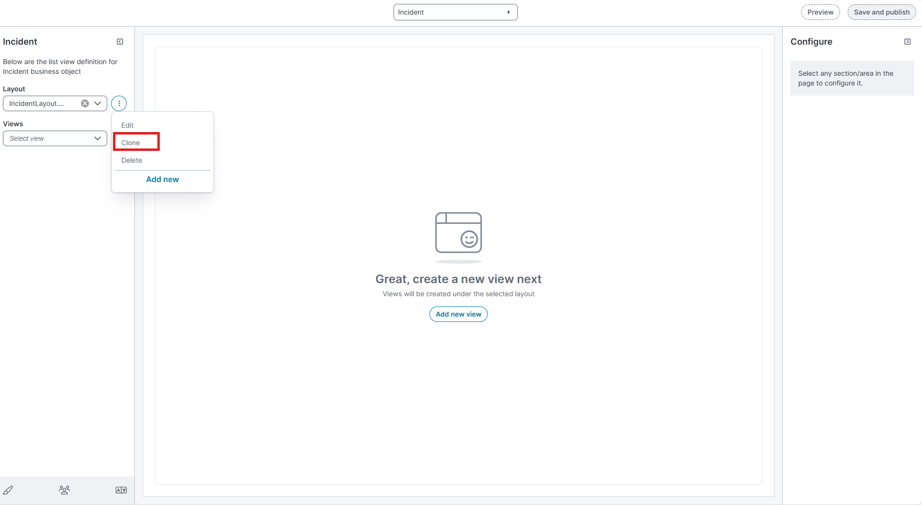
-
Select Clone.
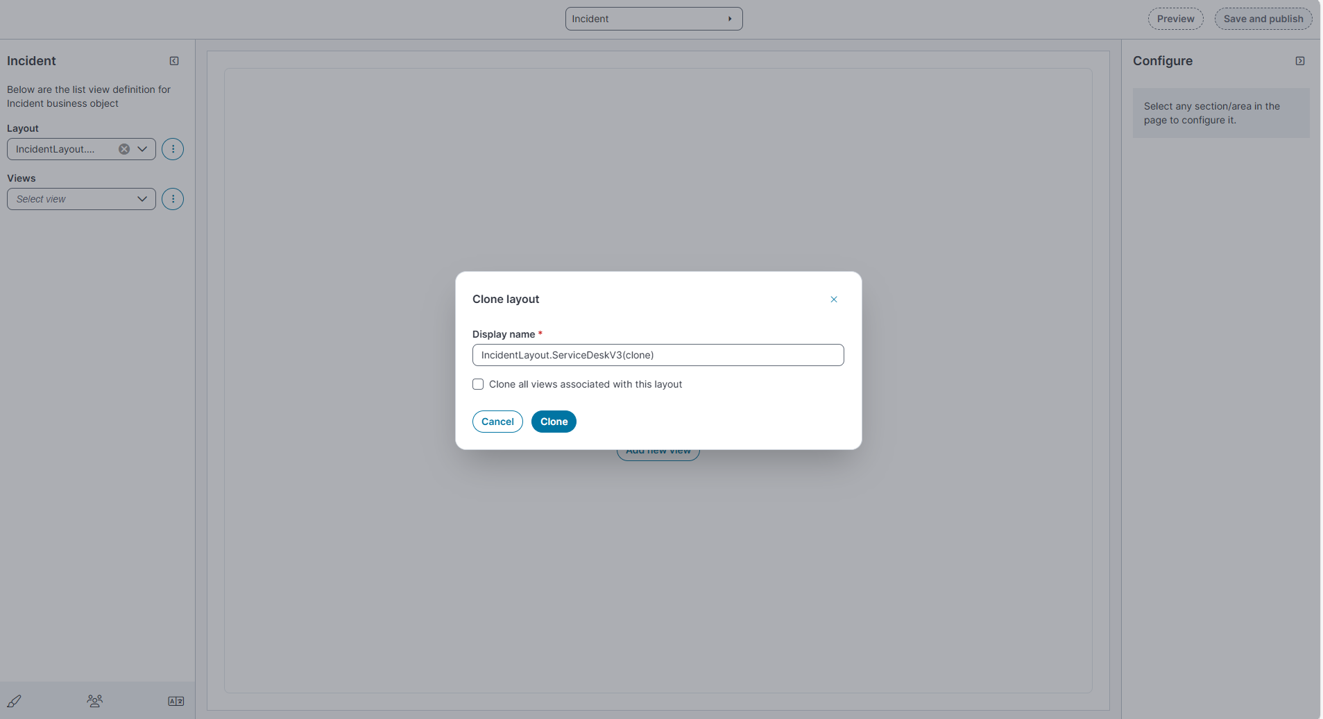
The Clone layout dialog box appears.
-
In the Display name field, review or update the layout name.
-
By default, the cloned layout name appears as <LayoutName>(clone).
-
-
Update any required configurations in the cloned layout.
-
Select Save and publish to apply the changes.
Clone a View
-
In the Views dropdown, select the ellipsis (⋮) menu next to the view name.
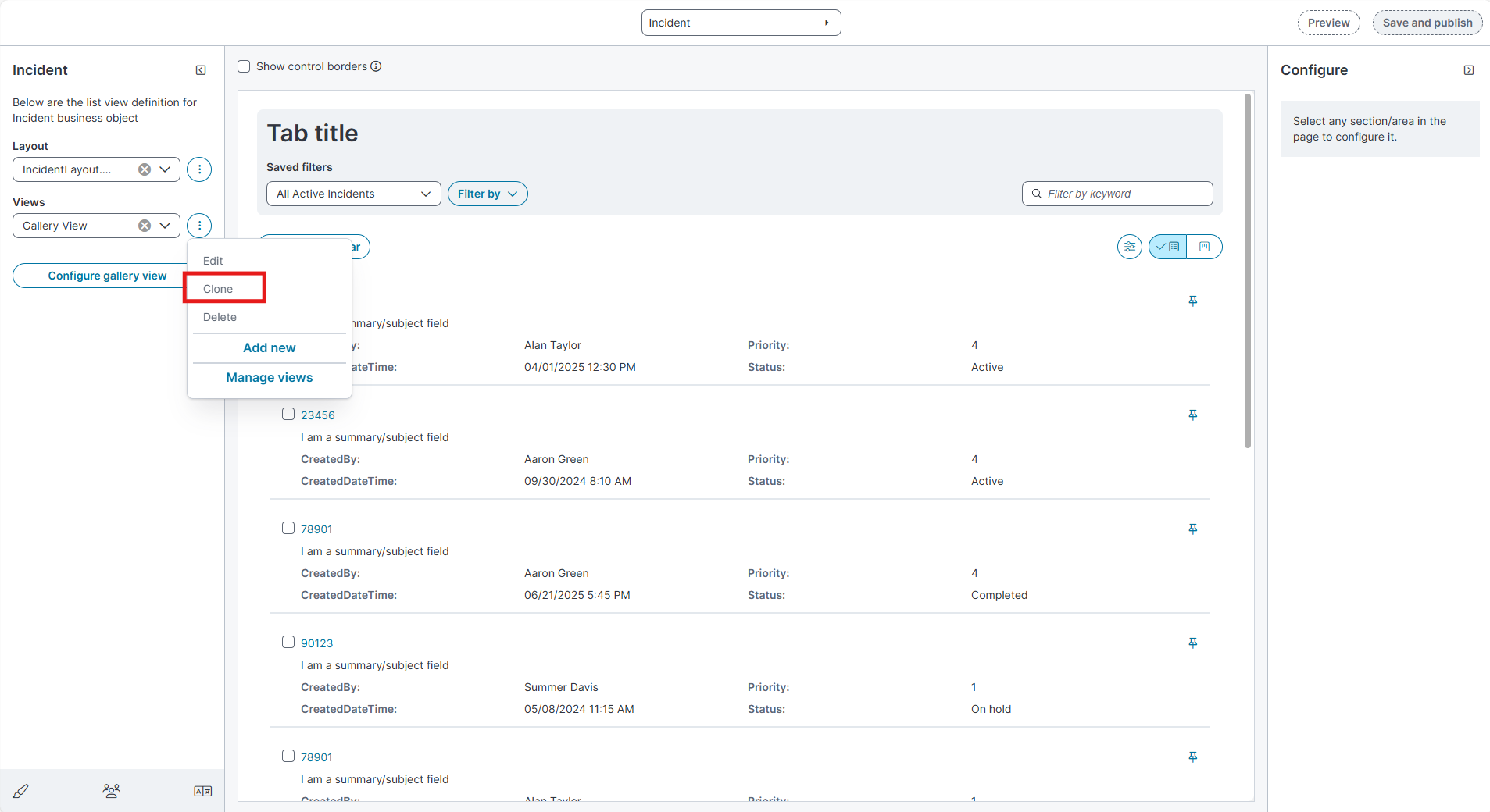
-
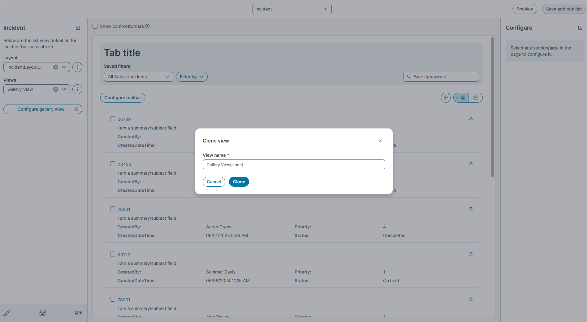
Select Clone, the Clone view dialog box appears.
-
In the Display name field, review or update the name.
-
By default, the cloned view name appears as <ViewName>(clone).
-
-
Select Clone.
-
The cloned view appears in the Views list.
-
All properties and configurations of the original view such as columns, field settings, and toolbar definitions are copied automatically.
-
-
Update any required configurations in the cloned view.
-
Select Save and publish.
Control Edit Permissions (Soft Lock via System Mode)
Enable System Mode
-
Sign in to Admin UI.
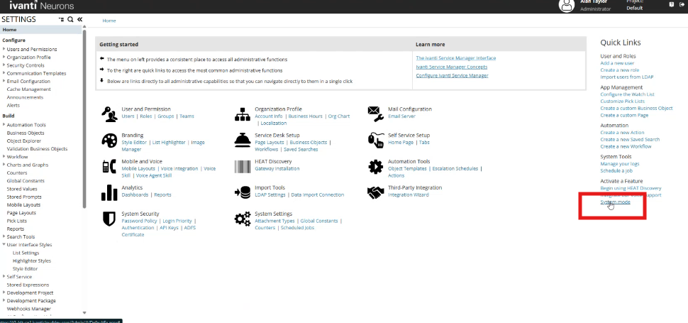
-
Go to Settings and select System mode. (screenshot shows the System mode link on the right panel.)
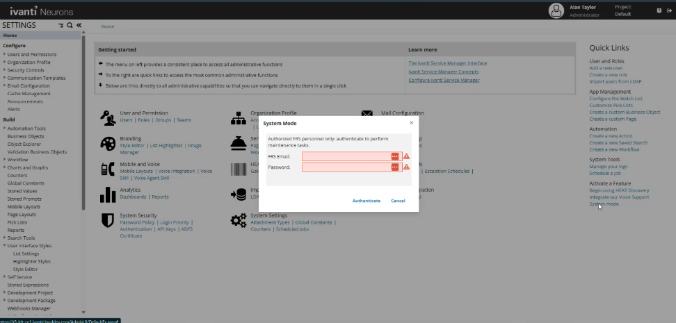
-
In the System Mode dialog, enter your credentials and select Authenticate.
Set Permissions on a Layout
-
Open Modern Page Designer.
-
In Layout, select the ellipsis (⋮) and then select Edit.
-
In the Edit layout dialog, go to Permissions.
-
Select the check boxes:
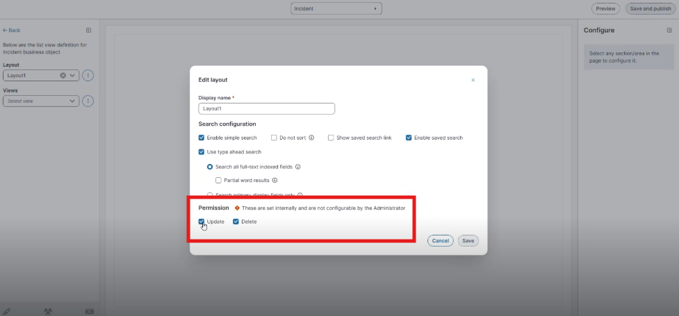
-
Update (allow edits)
-
Delete (allow delete)
-
-
Select Save (and Save and publish).
Set Permissions on Views
-
Open Modern Page Designer.
-
In Views, select the ellipsis (⋮) next to the view and then select Edit.
-
In the Edit dialog, go to Permissions and set Update / Delete as needed.
-
Select Save (and Save and publish).
When permissions restrict updates on a view, only the Field title is editable; other settings are not editable.
Assign the New Layout to a Role
After you create a layout (for example, Demo Layout) and a list view (for example, Grid View, Kanban View or Gallery View), assign the layout to a role so that users with that role can access it in the Incident workspace.
-
In the Configuration Console, go to Configure > Users and Permissions > Roles and Permissions.
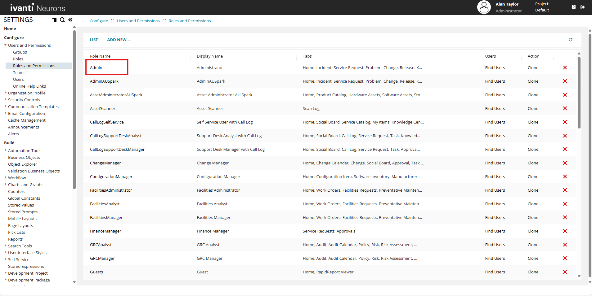
-
In the Roles and Permissions list, select Admin.
-
Select the Top Level Tabs tab.
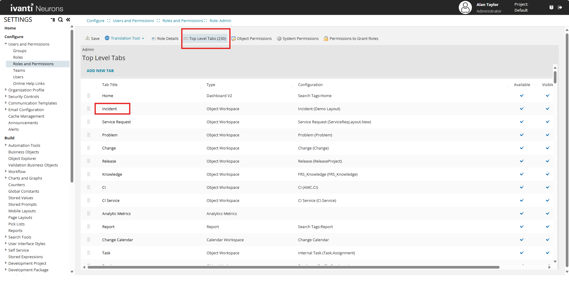
-
In the list of tabs, select the Incident workspace.
-
In the Layout list, select the layout you created. For example, select Demo Layout.
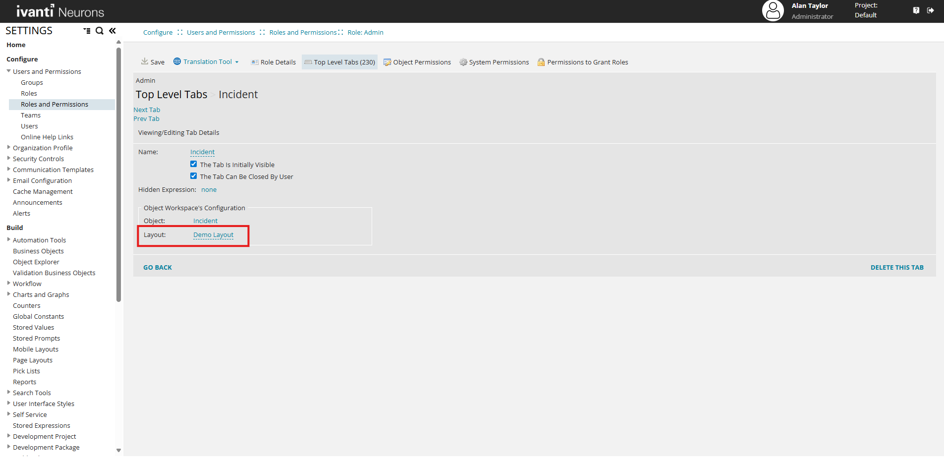
-
Select Save.
(Optional) Configure UI Exceptions for the Role
After assigning the layout to the role, configure the role to use the new UI version.
Configure an UI exception for the role
-
In the Configuration Console, go to Build > User Interface Styles > Style Editor.
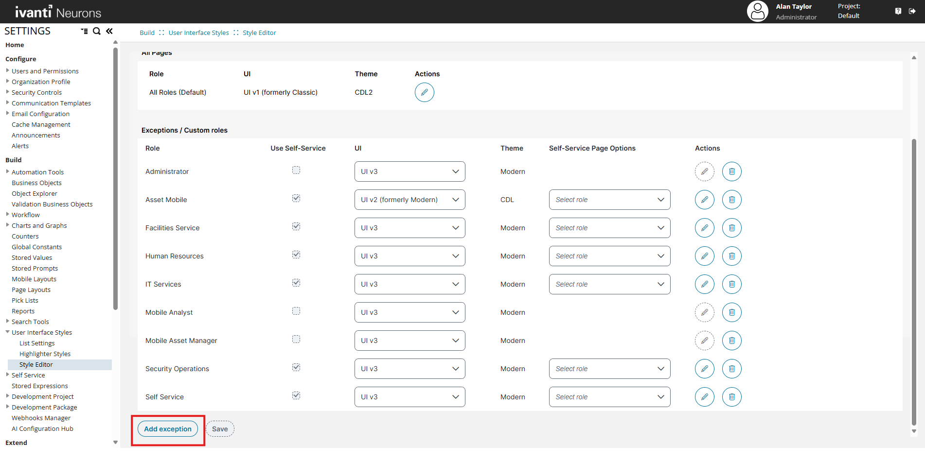
-
Select Add exception.
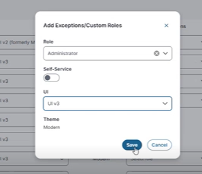
-
In the Role list, select the role Administrator.
-
In the UI list, select UI v3.
-
Select Save.
Manage Saved Filters in the Modern Page Designer
Saved Filters are supported in Modern Page Designer, providing the same management capabilities that were previously available in the Ivanti Service Management Portfolio UI V3.
You can manage saved filters directly from the Modern Page Designer, without switching to the user workspace.
Access saved filters in the Modern Page Designer
-
Open the Modern Page Designer.
-
In the Layout list, select the required layout (for example, Demo Layout).
-
In the Views list, select the required view (for example, Demo Grid).
-
Select a business object (for example, Incident).
-
In the Configure pane, select Saved filters.
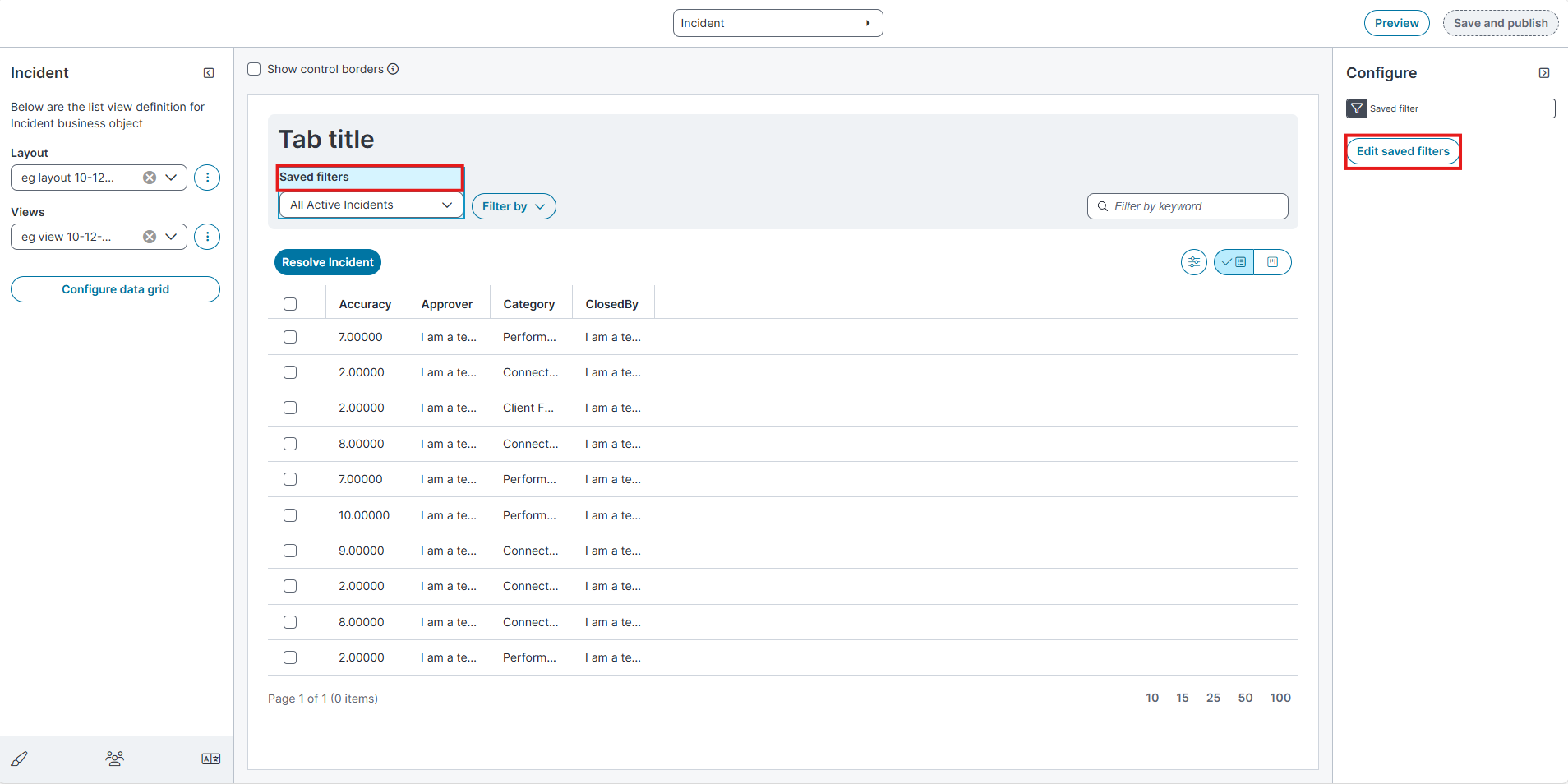
-
Select Edit saved filters.
-
The Edit saved filters page opens.
-
Edit saved filters page
The Edit saved filters page displays a list of saved filters for the selected business object.
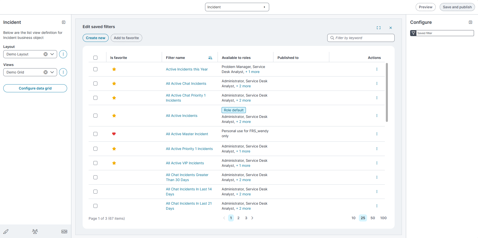
Page controls
Below mentioned are the Edit saved filter page controls,
-
Create new: Creates a new saved filter.
-
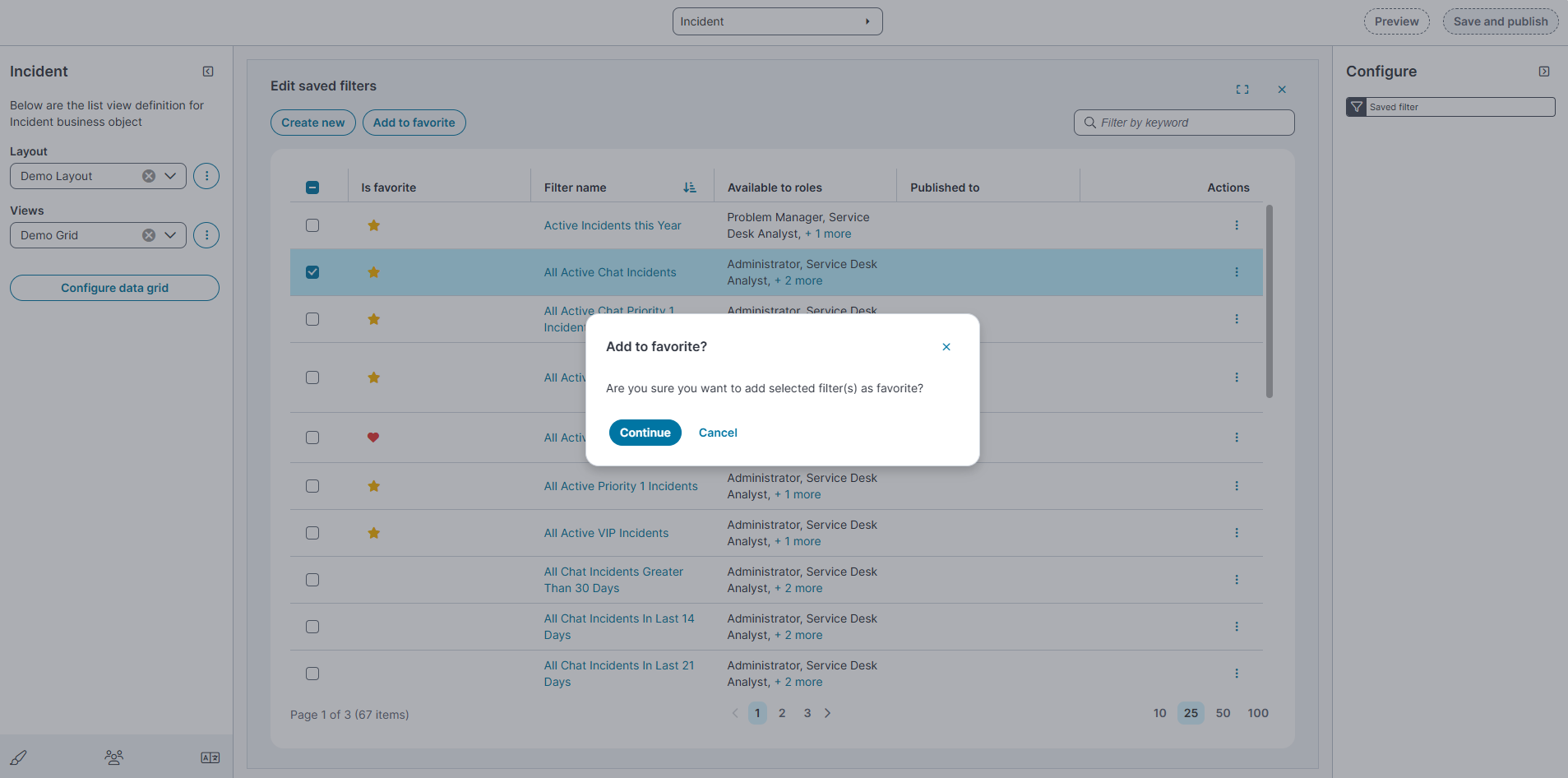
Add to favorite: Marks selected filters as favorites.
-
Filter by keyword: Searches saved filters by name.
-
Pagination controls: Located at the bottom of the page. Use these to change the number of filters displayed per page (10, 25, 50, or 100) and navigate between pages.
Saved Filters page
The Saved Filters page displays the following columns:
| Field | Description |
|---|---|
| Is favorite | Indicates whether the filter is marked as a favorite. A star icon shows that the filter appears under Favorites in the Saved filters dropdown. |
| Filter name | Displays the name of the saved filter. Select the filter name to view or edit its configuration. |
| Available to roles | Lists the roles that can access the saved filter. |
|
Published to |
Indicates whether the filter is published to specific teams. |
|
Actions |
Provides additional options for the filter, such as Export to Excel, Email, Edit, Clone, Dependency and Delete. |
Actions menu
Each saved filter includes an Actions (⋮) menu with the following options:
-
Export to Microsoft Excel: Exports the saved filter details to an Excel file.
-
Email to yourself: Sends the saved filter details to your email address.
-
Edit: Opens the saved filter for modification.
-
Clone: Creates a copy of the selected saved filter.
-
Dependency
The Dependency action shows where a saved filter is used in the application.
To view dependencies:
-
Select the Actions (⋮) menu for a saved filter.
-
Select Dependency.
A dialog opens listing where the saved filter is referenced:
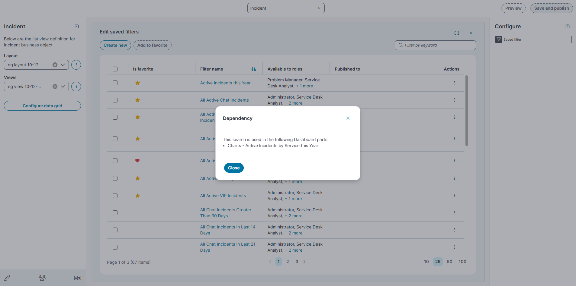
This helps you understand the impact of editing or deleting a saved filter.
-
-
Delete: Removes the saved filter.
These actions allow you to manage saved filters directly from the Modern Page Designer.
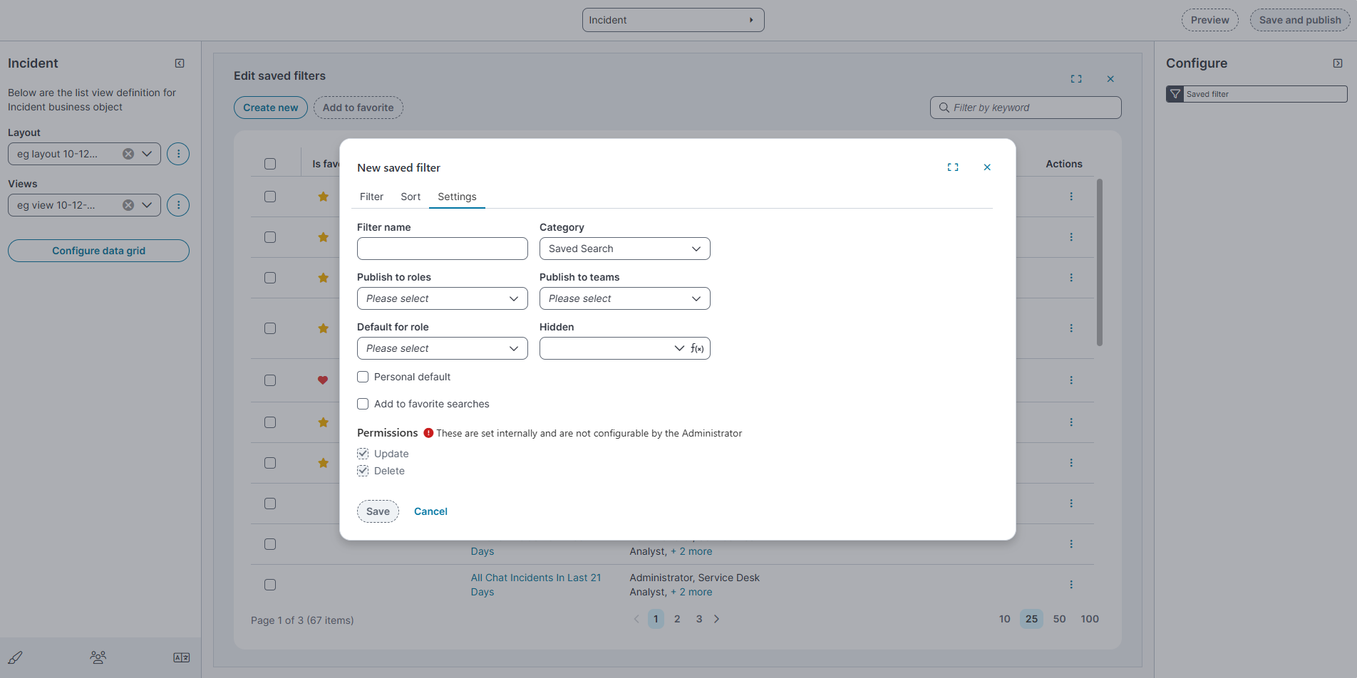
Create and Edit Saved Filter
The create and edit saved filter dialog box displays the following:
Creating and Editing Saved Filters
-
Select Create New to create a New saved filter dialog box opens.
-
The filter editor includes three tabs:
- Filter
-
In the Filter tab, define the conditions for the filter:
-
Use the dropdowns to select fields, operators, and values.
-
Use AND or OR to Delete multiple conditions.
-
-
Select Save or Cancel to clear the fields.
-
-
Sorting
-
In the Sort tab, choose the field to sort by from the Sort by dropdown.
-
Select the sort order: Ascending or Descending.
-
Select Save or Cancel to clear the fields.
-
-
Settings:
-
Use this tab to configure filter properties.
-
Filter name: Enter a unique name for the filter.
-
Category: Select a category (default is Saved Search).
-
Publish to roles: Select roles that can access this filter.
-
Publish to teams: Select teams that can access this filter.
-
Filters published to teams appear between Favorites and All in the Saved filters dropdown.
-
-
Default for role: Choose whether the filter should be the default for selected roles.
-
Personal default: Checkbox to mark the filter as your personal default.
-
Add to favorite searches: Checkbox to mark the filter as a favorite for quick access.
-
Permissions: These permissions are set internally and are not configurable by the Administrator.
-
Select Save or Cancel to clear the fields.
-
Hidden saved filters
The Hidden saved filters dialog displays the following:
-
The Hidden option controls the visibility of a saved filter.
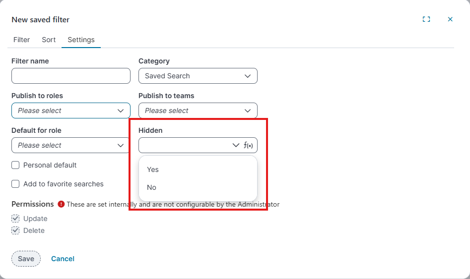
ƒ(x) (expression) values:
-
Yes
-
No
-
When a saved filter is hidden, it is not visible in the end user workspace.
-
Hidden takes precedence over all other settings, including role defaults, personal defaults, and publishing.
-
For more information about saved searches, refer Using search.
-
-
-
- Filter
Configure advanced expressions for filter criteria
When you create or edit a saved filter, you can define advanced expressions to control how filter conditions are evaluated.
From the Filter tab of the Edit saved filter dialog, select the expression (ƒx) icon next to a filter condition to open the Expression editor.
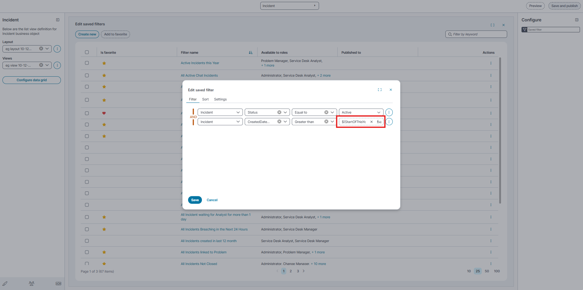
Expression editor
-
Use the Expression editor to build advanced filter logic using supported fields, functions, and date/time expressions.
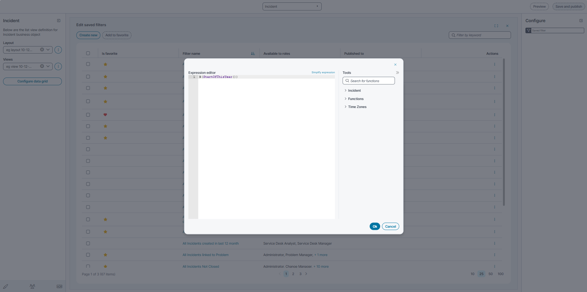
-
The editor provides the following tools:
-
Incident: Business object fields available for filtering.
-
Functions: Built-in functions (for example, date and time functions).
-
Time Zones: Time zone aware functions for date comparisons.
-
-
Select OK to apply the expression and return to the saved filter editor.
Configure filter searches in the Modern Page Designer
Filter search configuration that was previously configured in the Configuration Console (Classic UI) is available in the Modern Page Designer for a business object Table (grid) view.
You configure filter categories and filter criteria directly in the layout designer. The configured filters appear in the Filter by menu in the workspace table view.
The Modern Page Designer also includes a Filter by search box in the Configure panel to locate filters during configuration.
Open filter configuration
-
Go to Settings > Build.
-
Open the required business object (for example, Incident).
-
Select a Layout.
-
Select a View (for example, Grid view).
-
Select Filter by in the preview toolbar.
The Configure panel appears.
Show or hide filter categories
In the Configure panel, enable or disable categories:
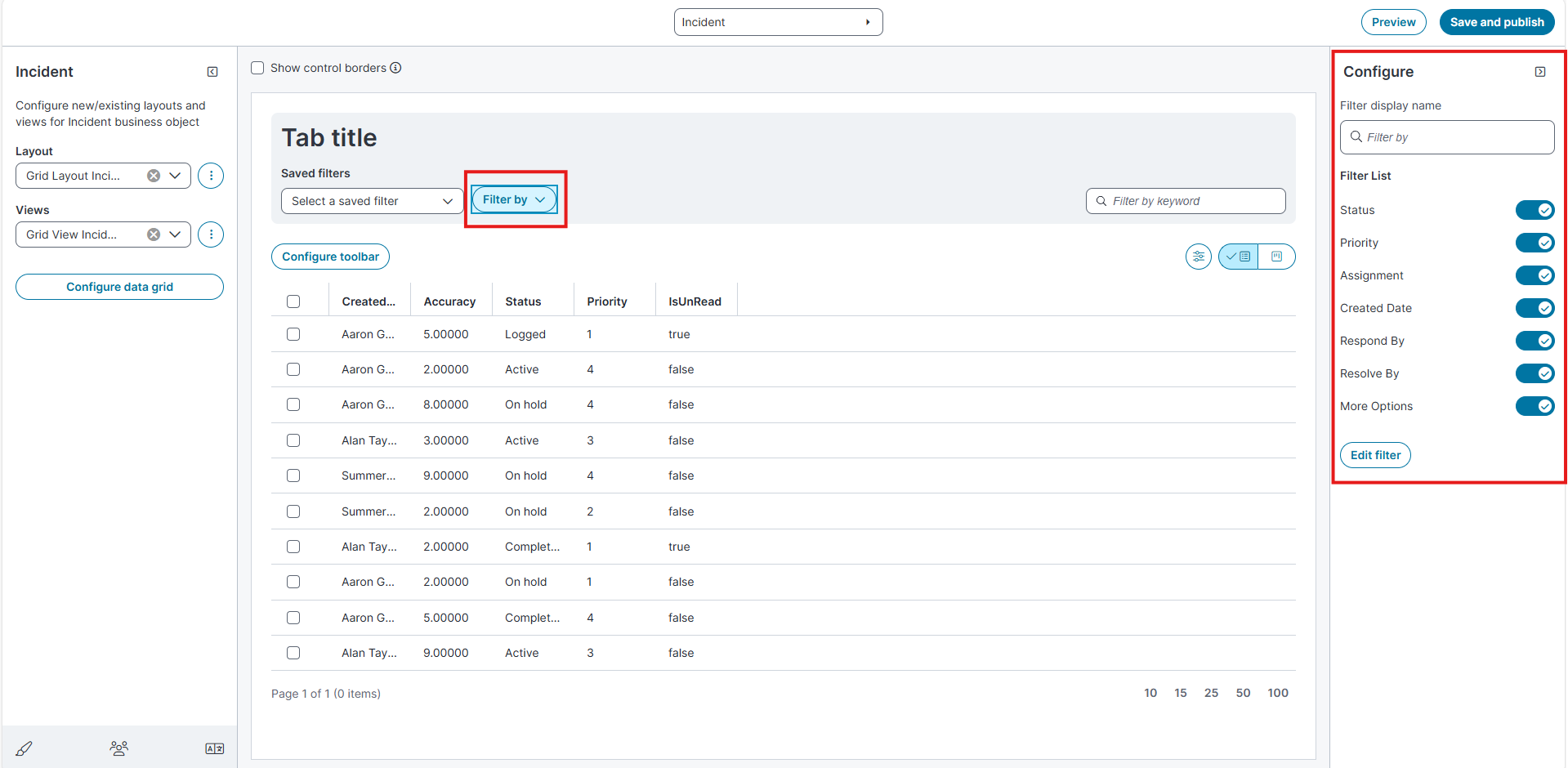
-
Status
-
Priority
-
Assignment
-
Created Date
-
Respond By
-
Resolve By
-
More Options
Turn a toggle ON to display the category in the workspace filter menu.
Turn a toggle OFF to hide the category.
Find a filter
Enter text in the Filter by search box in the Configure panel.
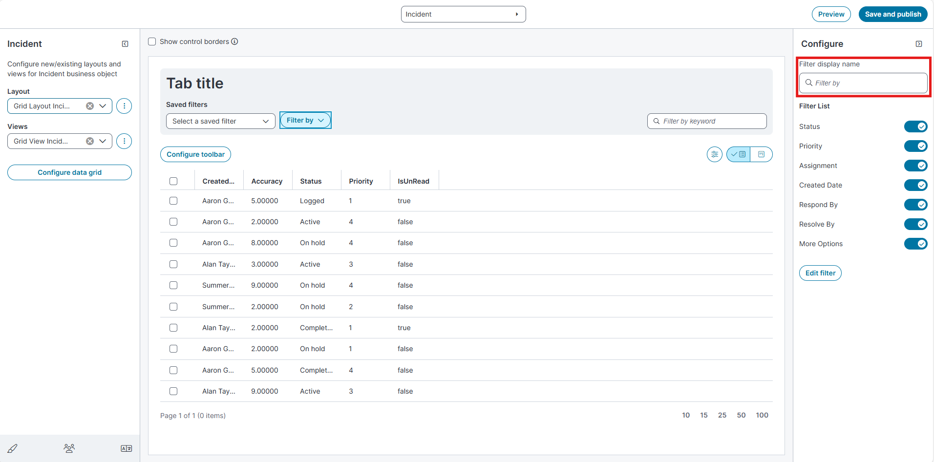
The list displays only the filter categories and values that match the entered text, making it easier to locate and enable or disable a specific filter in the configuration list. This search does not filter or update the configuration details displayed in the middle pane.
Edit filter definitions
Select Edit filter.
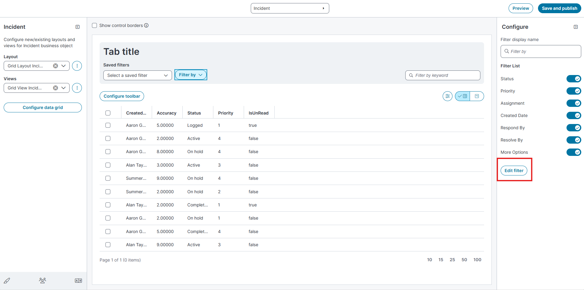
The filter editor opens.
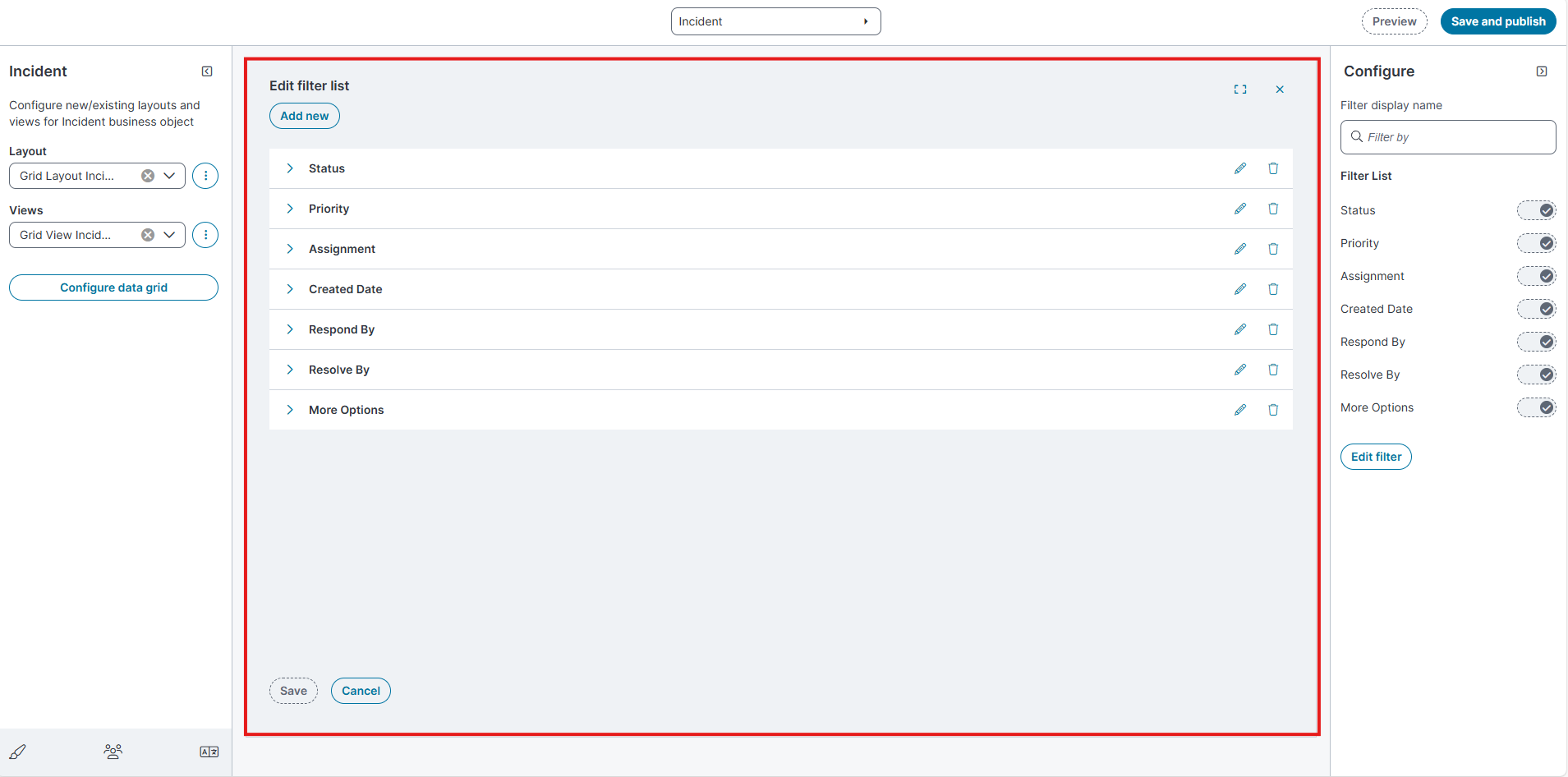
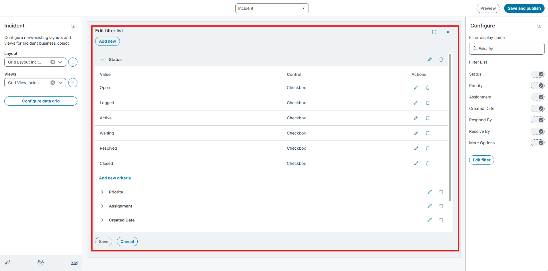
From this page you can add, edit, or delete filter categories.
Add a filter
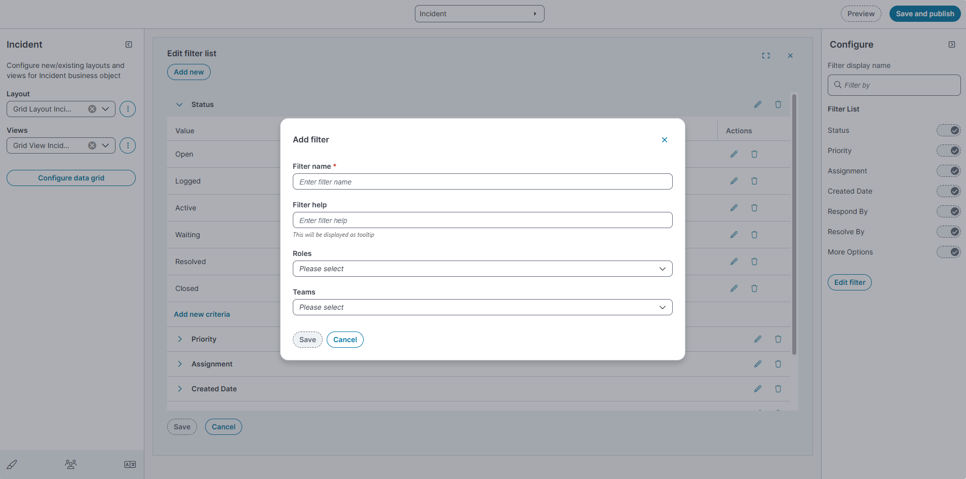
-
Select Add new filter.
-
Enter the filter name in the Filter name field.
-
Enter Filter help (tooltip text).
-
Enter the appropriate role in the Roles field.
-
Specify the appropriate team in the Teams field
-
Select Save.
If you configure a filter with roles or teams conditions, the filter is not visible in the Classic interface.
Configure filter criteria
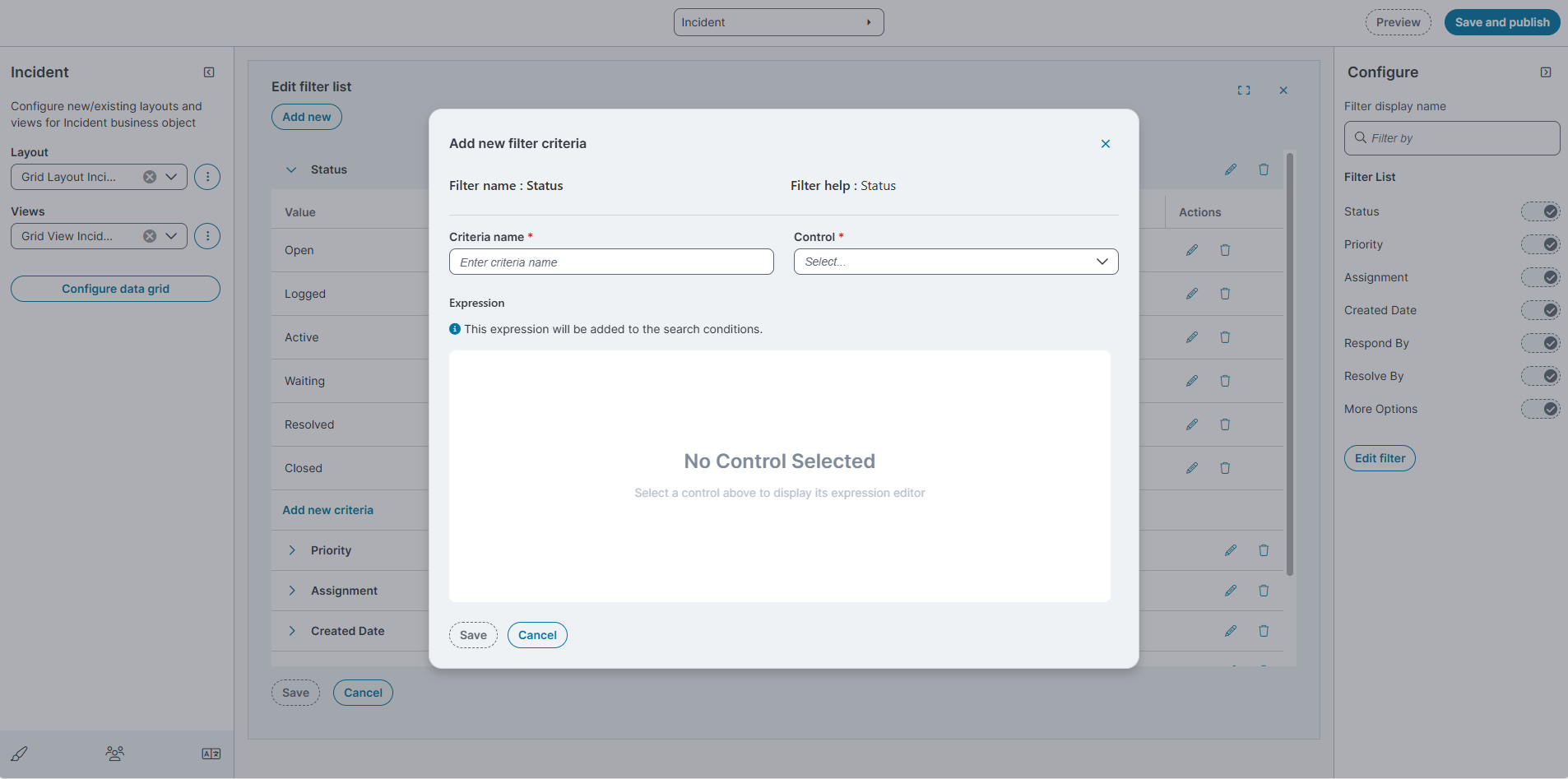
-
Expand a filter category.
-
Select Add new criteria.
-
Enter Criteria name.
-
Select a Control:
-
None
-
Calendar
-
Checkbox
-
Pick List
-
Textbox
-
-
Select Save.
Edit or Delete criteria
-
Expand a filter category.
-
Click
 Edit or
  Delete a value using the action icons.
 -
Change Show by default if required.
-
Select Save(and Save and publish).
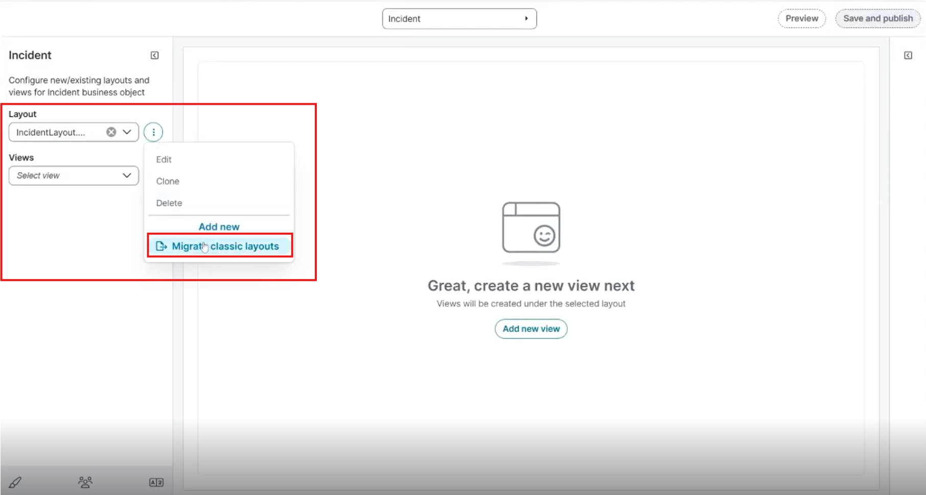
Migrate Classic Layouts to Modern Page Designer
You can migrate existing classic layouts of a business object to the Modern Page Designer. The migration process converts the selected classic layout to a modern layout while preserving its configuration.
You can initiate migration from two locations in the Layout section.
Migrate a Classic Layout
-
In the Modern Page Designer, select the required business object (for example, Incident).
-
Select Migrate classic layouts option from either of the following locations:
-
The Layout action menu.
-
The Migrate classic layouts button displayed in the page designer area.
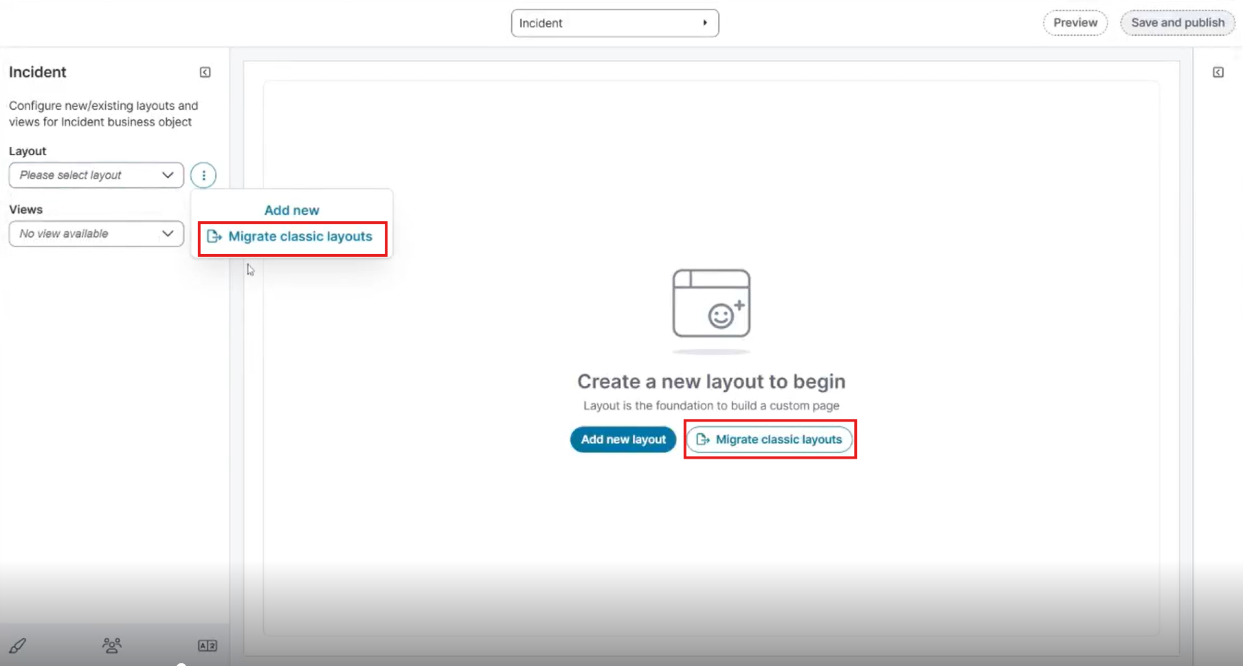
-
The Migrate classic layouts option appears in the Layout action menu ellipsis (⋮) only when a layout is selected in the Layout field.
-
-
The Migrate classic layouts dialog opens.
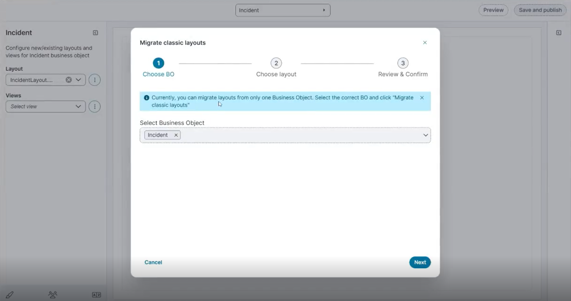
Currently, you can migrate layouts from only one Business Object at a time. Select the correct Business Object and click Migrate classic layouts.
-
Click Next.
-
Select the layout that you want to migrate.
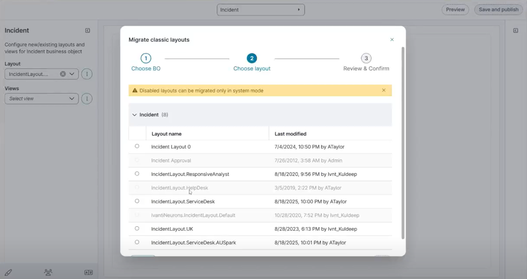
-
Some FRS layouts are disabled and cannot be migrated in non-system mode.
-
If you log in using System mode, these layouts become available for migration.
-
-
Click Next.
-
Review & Confirm, review the selected Business Object and Layout.
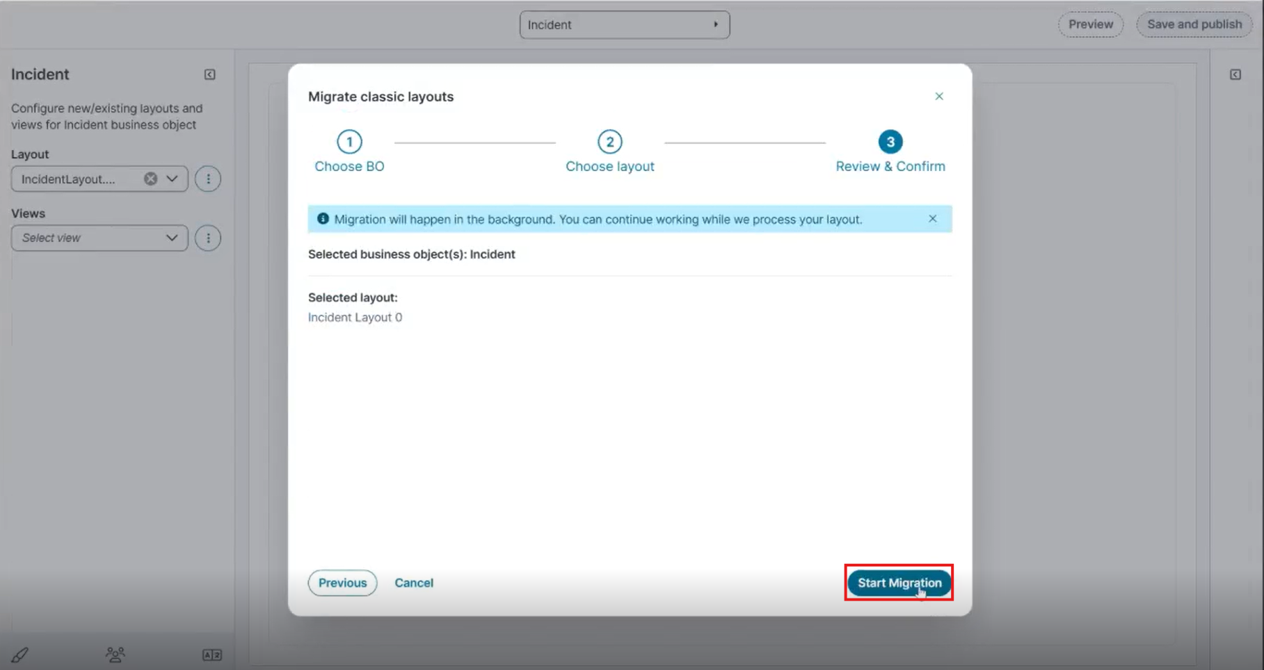
-
Click Start Migration.
-
After the migration completes, a notification appears confirming that the layout was Migration successful.
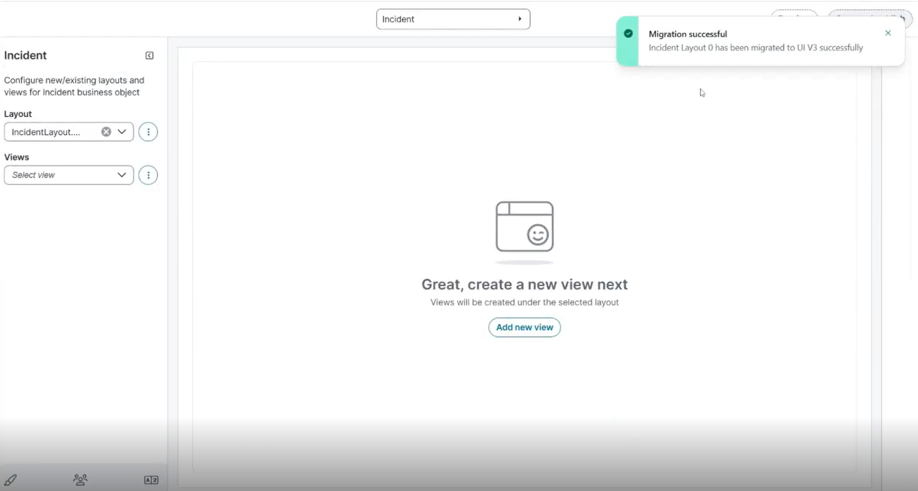
-
You can import the same layout multiple times. Each imported layout includes a time stamp appended to the layout name, which helps you differentiate between multiple imported versions of the same layout.
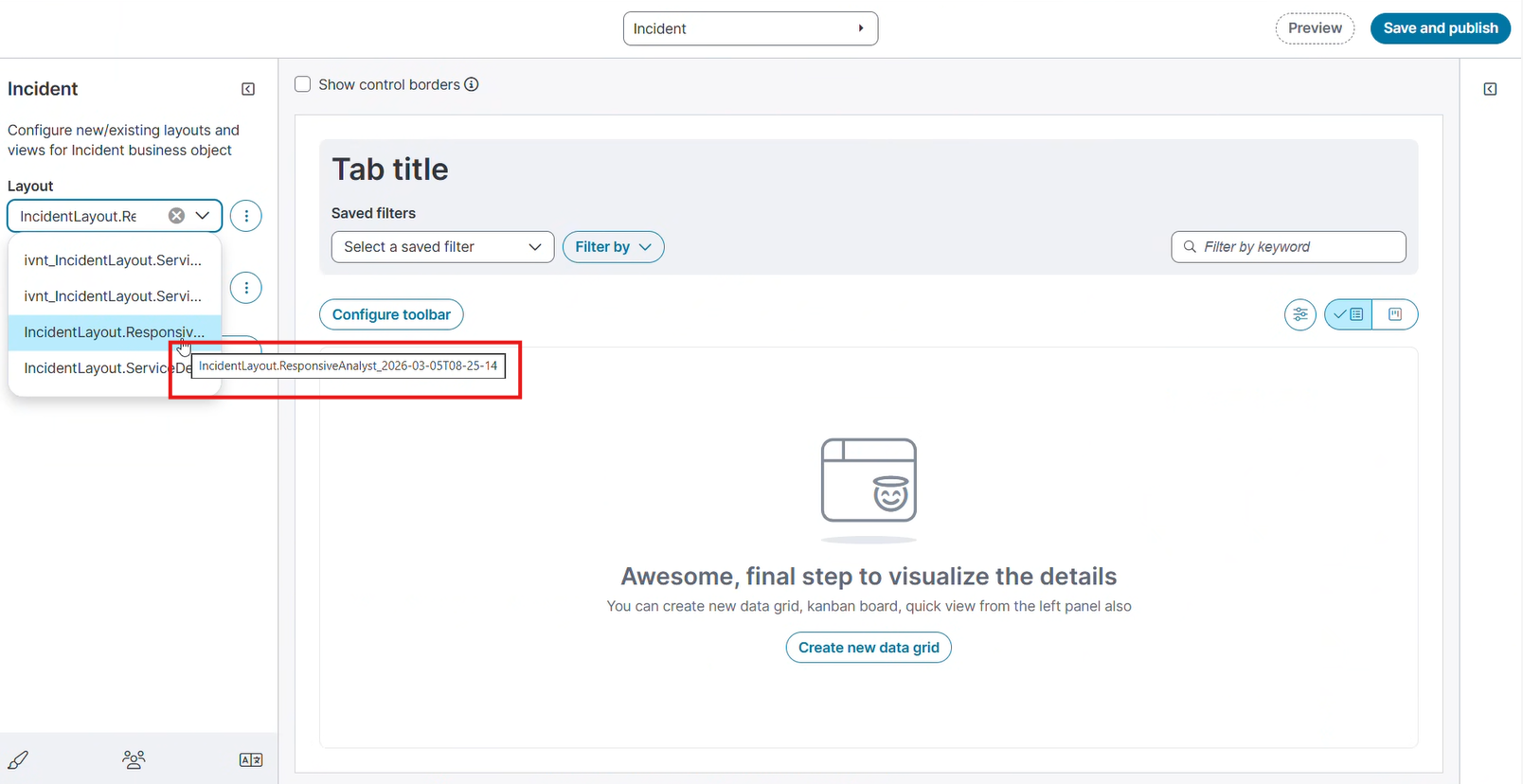
Example: {classic_layout_name}_{utc_timestamp}