Ivanti Service Management Portfolio UI V3 Incident Workspace
The Ivanti Service Management Portfolio UI V3 Incident Workspace offers a modern interface that allows you to manage incidents using either a data grid, Kanban view or Gallery view, with flexible filtering, personalization, and workflow tools.
Incident Workspace
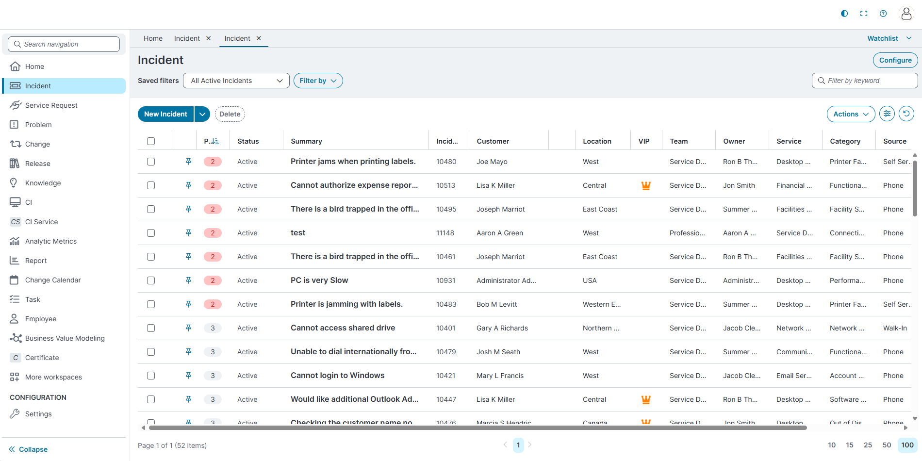
The Incident workspace displays incident records in a modernized Data Grid, Kanban or Gallery views layout.
Layout Overview
-
Saved Filters: A dropdown to select saved filters.
-
Filter By: A control for applying additional filters, such as Status, Priority, Assignment, Created date, Respond by, Resolve by and Advanced Filter options.
-
Search Bar: A keyword search box to locate incidents quickly.
-
Configure Button: Opens the Modern Page Designer for administrators to modify the data grid.
-
Center dashboard: Displays the configured data grid for the selected business object created using the Modern Page Designer.
-
Settings icon: The Group by and Column chooser options are available under the Settings icon.
-
Reset icon: It will Reset list personalization, Column width, Column order, Hidden columns, Sorting, Grouping, and Rows per page.
-
Pagination controls: Located at the bottom of the page. Use these to change the number of filters displayed per page (10, 25, 50, or 100) and navigate between pages.
 Key Features in the Home page
Switching Between Grid, Kanban and Gallery Views
You can switch between the data grid and Kanban views directly from the Incident workspace.
-
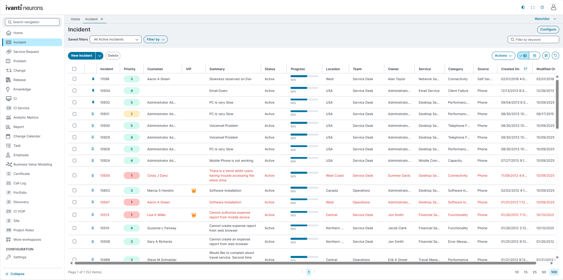
The Grid view displays incidents in a tabular layout with columns and rows, making it easier to filter, sort, and analyze data in detail.
-
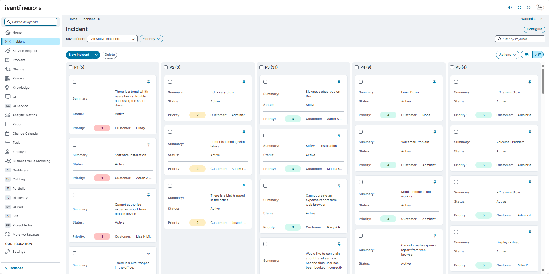
The Kanban view displays incidents as cards grouped into columns, providing a visual workflow that supports drag-and-drop management.
-
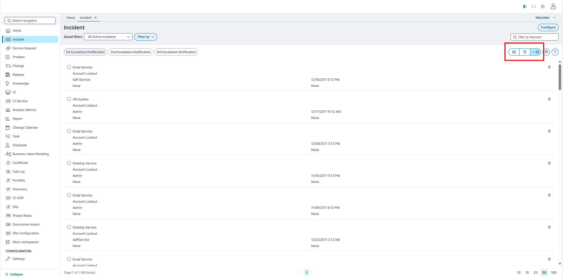
The Gallery view displays incident details in a responsive layout that works on both mobile and desktop.
Tab List and Grouping
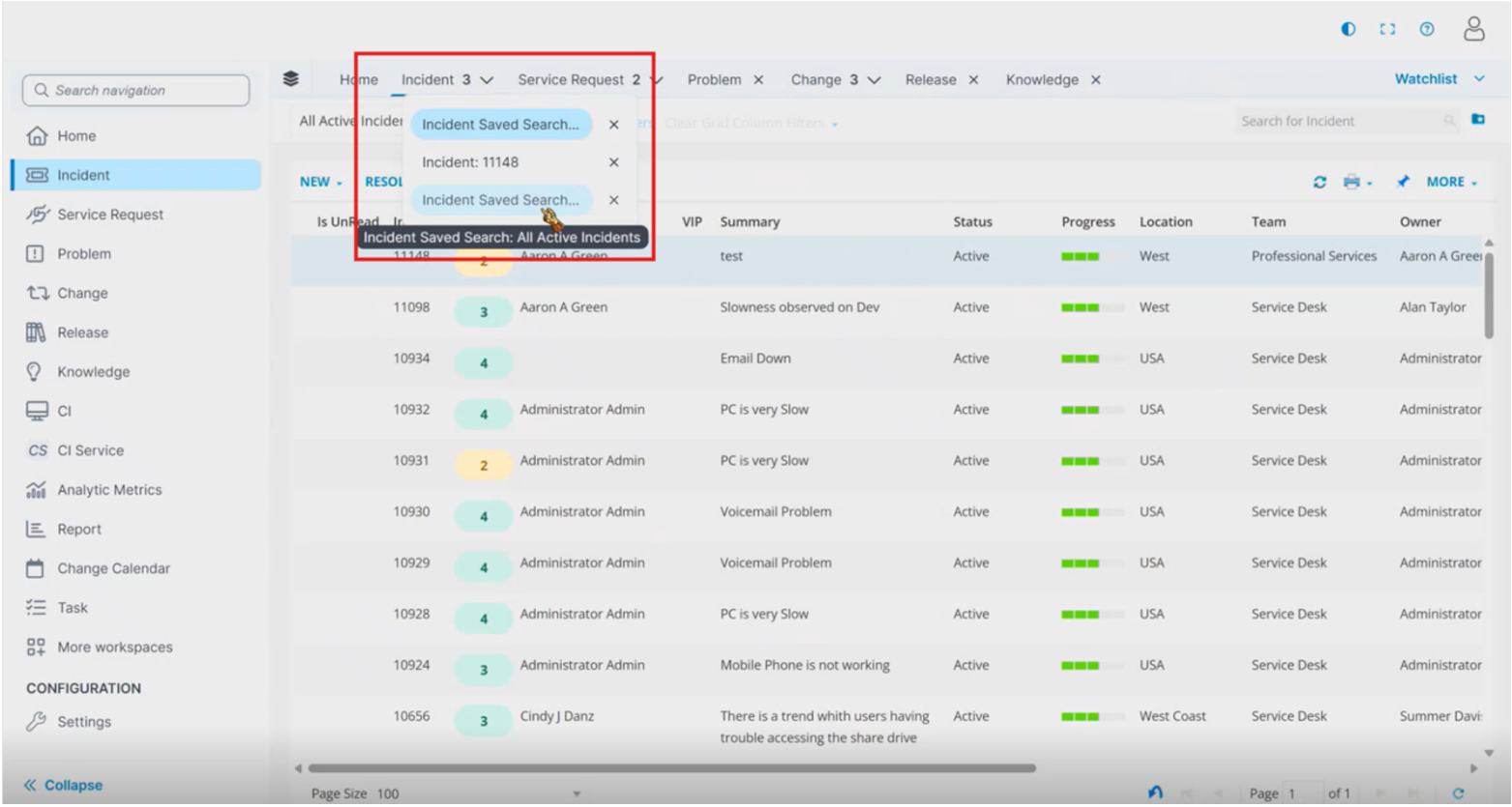
Use the tab list and grouping to manage multiple open workspace tabs. When you open multiple tabs from the same workspace, the application groups those tabs under the workspace name. The number beside the workspace name indicates how many tabs are open for that workspace.
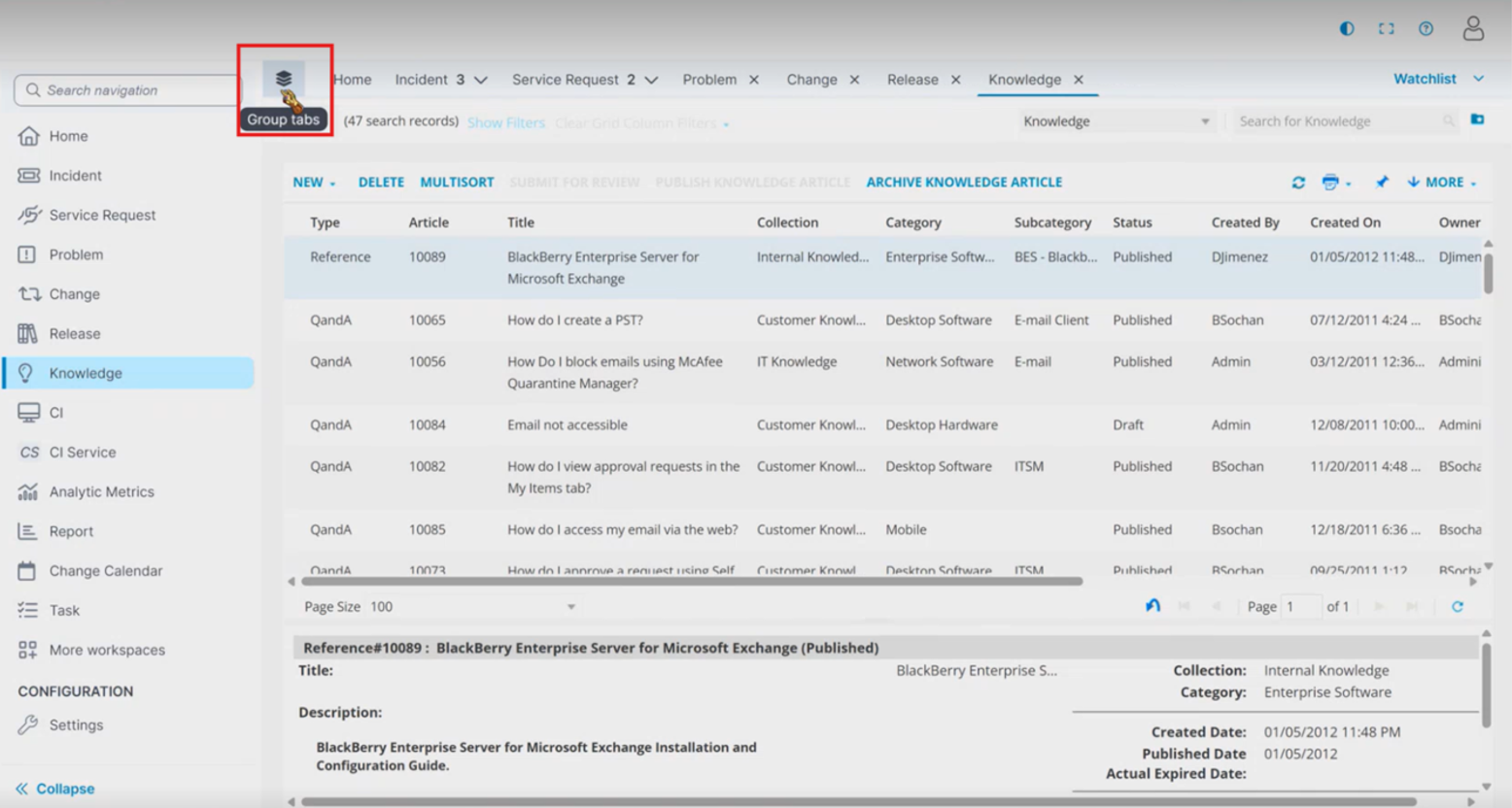
For example, if you open multiple Incident records, the application groups the tabs under the Incident workspace. You can use the grouped tab to switch between open tabs in that workspace.
-
Desktop view:
In desktop view, the application groups open tabs by workspace. It does not combine tabs from different workspaces into one group.
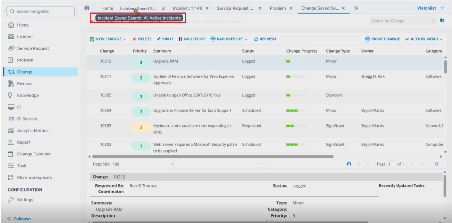
When the tab bar has enough space, the application displays the full tab name. When the available space is limited, the application shortens the tab name and displays the full tab name in a tooltip.
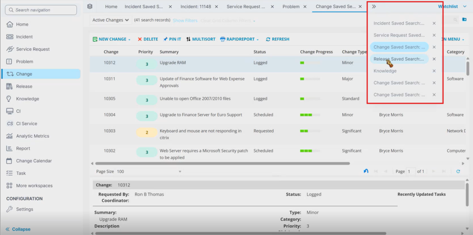
If more tabs are open than the tab bar can display, the extra tabs move to the overflow list.
You can use the keyboard to navigate between workspace tabs and interact with tab controls.
-
Use Tab to move forward through the tab controls. Use Shift+Tab to move back to the previous tab control.
-
If a dropdown or list is available, use the arrow keys to move through the options.
-
Use Enter or Space to select or activate a button.
-
You can also close tabs from the tab bar.
-
-
Mobile view
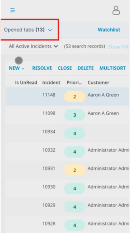
In mobile view, the application does not group tabs by workspace. Instead, the application displays an Open tabs dropdown. Use the Opened tabs dropdown to view all open tabs and navigate to a tab.
Row Selection with Checkboxes
-
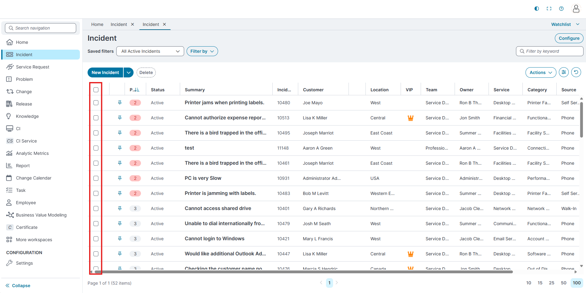
Each row now includes a checkbox for selection.
-
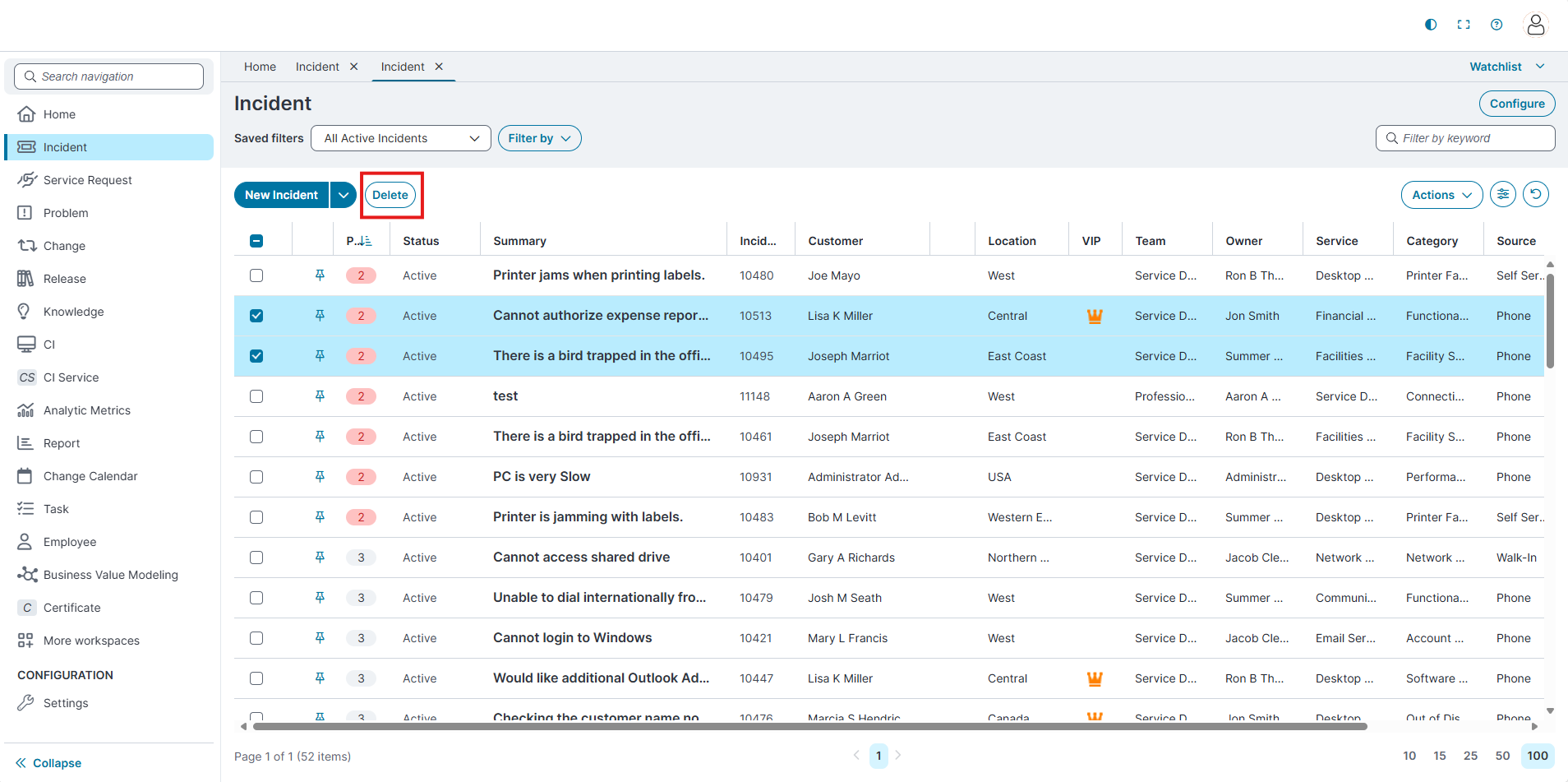
Once a row is selected, related toolbar actions (for example, Delete) are activated.
-
Delete Action
-
The Delete button is inactive until you select one or more rows using the checkbox.
-
After selection, the Delete option becomes available.
-
-
Group by and Column Chooser
-
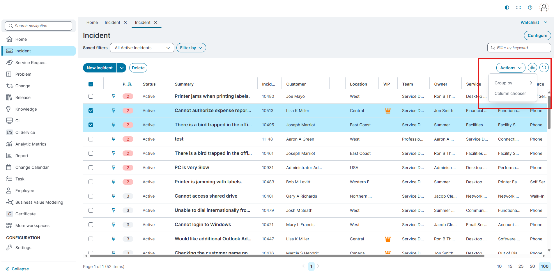
The Group by and Column chooser options are available from the Settings icon next to the Actions menu.
-
You can group records by a selected column or adjust which columns are displayed in the data grid.
Pin Records to Watchlist
-
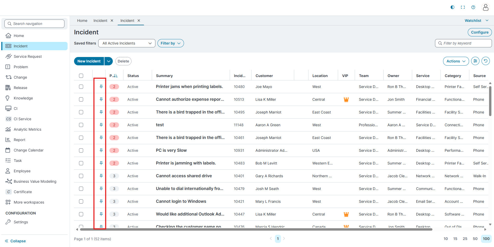
Each row now includes a Pin icon.
-
Selecting the pin adds the record to the Watchlist at the top of the page.
Saved Filters and Fliter by searches
-
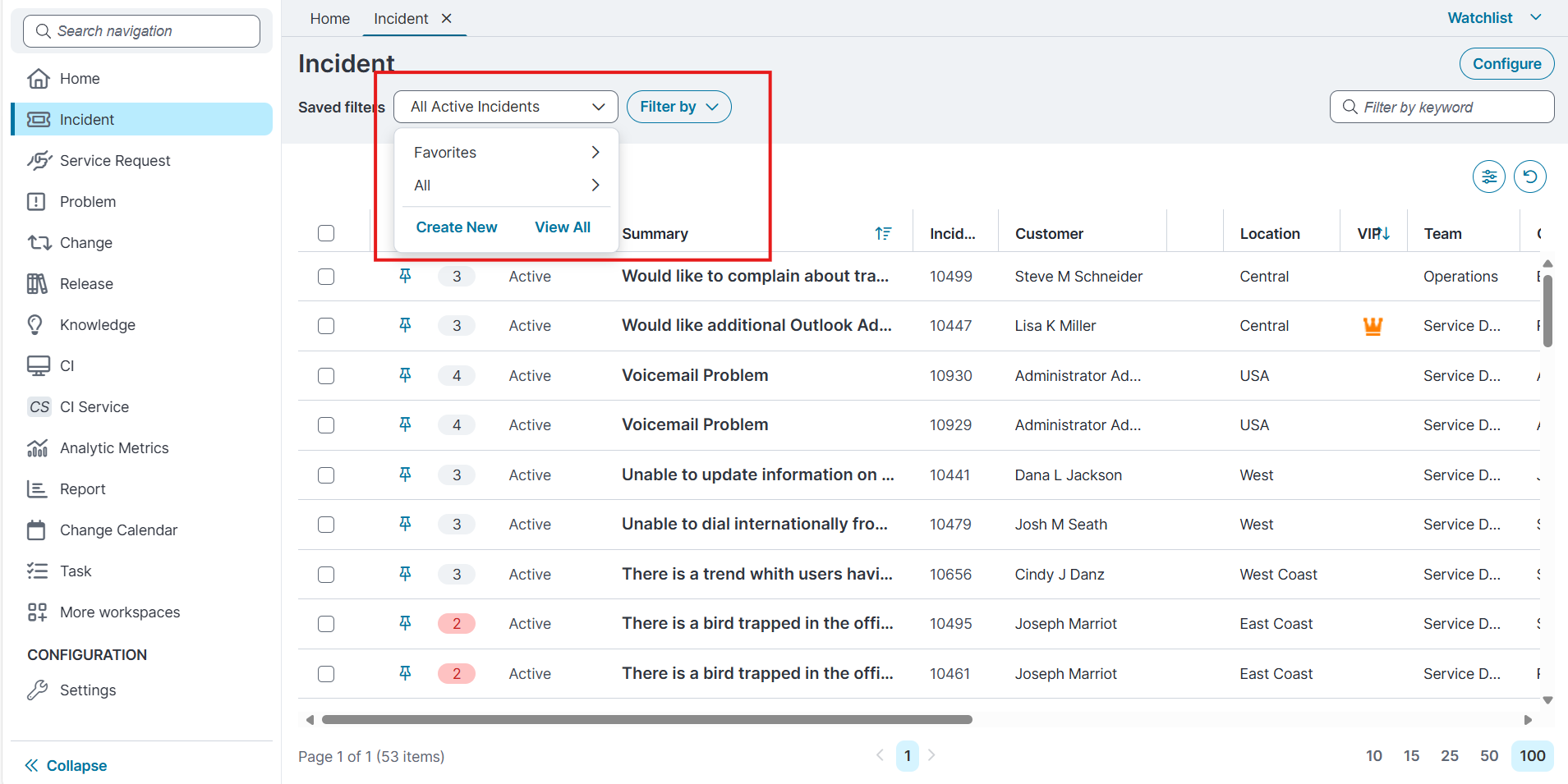
The Saved filters dropdown appears at the top of the workspace, next to the Filter by menu.
-
The Saved filters dropdown includes:
-
Favorites: Access filters you have marked as favorites.
-
All: Access the full list of saved filters.
-
Create New: Opens the Advanced filter editor to define a new saved filter.
-
View All: Opens the Saved Filters page to view and manage all saved filters.
-
Create a New Saved Filters
-
From the Saved filters dropdown, select Create New.
-
The Advanced filter dialog opens. This dialog has two tabs: Filter and Sort.
Configure Filter
-
In the Filter tab, define the conditions for the filter:
-
Use the dropdowns to select fields, operators, and values.
-
Use AND or OR to Delete multiple conditions.
-
-
Select Apply, Cancel or Reset the filter to clear the fields.
Configure Sorting
-
In the Sort tab, choose the field to sort by from the Sort by dropdown.
-
Options include Category, Created On, Customer, Incident, Location, Modified On, Owner, Priority, Service, Source, and Status.
-
-
Select the sort order: Ascending or Descending.
-
Select Apply, Cancel or Reset the filter to clear the fields.
-
View All Saved filters
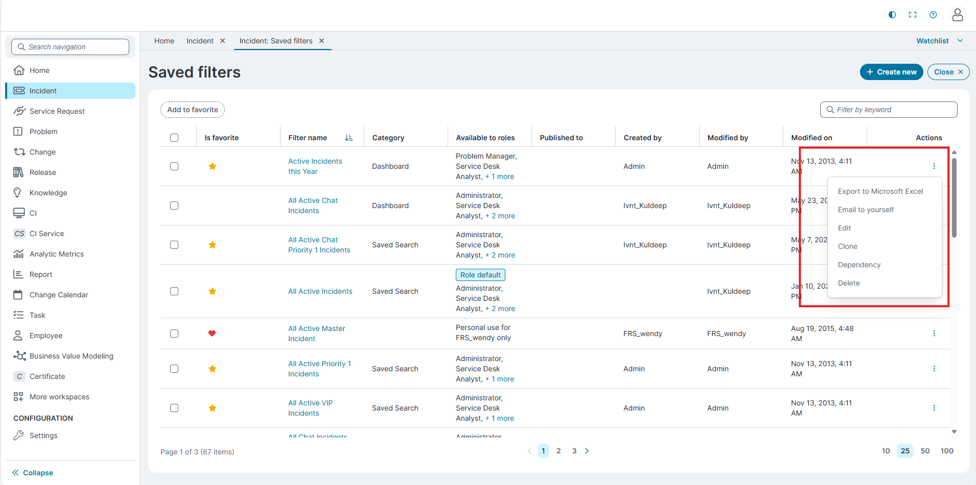
Select View All from the Saved filters dropdown to open the Saved Filters page.
Page Layout
-
Add to favorite: Marks the selected filter as a favorite.
-
Create new: Opens the New saved filter editor where you can define a new filter.
-
Close: Exits the Saved Filters page and returns to the workspace.
-
Filter by keyword: Allows you to search for filters by name.
-
Pagination controls: Located at the bottom of the page. Use these to change the number of filters displayed per page (10, 25, 50, or 100) and navigate between pages.
-
Pagination controls: Located at the bottom of the page. Use these to change the number of filters displayed per page (10, 25, 50, or 100) and navigate between pages.
Saved Filters page
The Saved Filters page displays the following columns:
| Field | Description |
|---|---|
| Is favorite | Indicates whether the filter is marked as a favorite. A star icon shows that the filter appears under Favorites in the Saved filters dropdown. |
| Filter name | Displays the name of the saved filter. Select the filter name to view or edit its configuration. |
| Category | Shows the category assigned to the saved filter, such as Saved Search or Dashboard. |
| Available to roles | Lists the roles that can access the saved filter. |
|
Published to |
Indicates whether the filter is published to specific teams |
|
Created by |
Displays the user who created the saved filter. |
|
Modified by |
Displays the user who last modified the saved filter. |
|
Modified on |
Shows the date and time when the filter was last updated. |
|
Actions |
Provides additional options for the filter, such as Export to Excel, Email, Edit, Clone, Dependency and Delete. |
Create a New
-
Creating and Editing Saved Filters
-
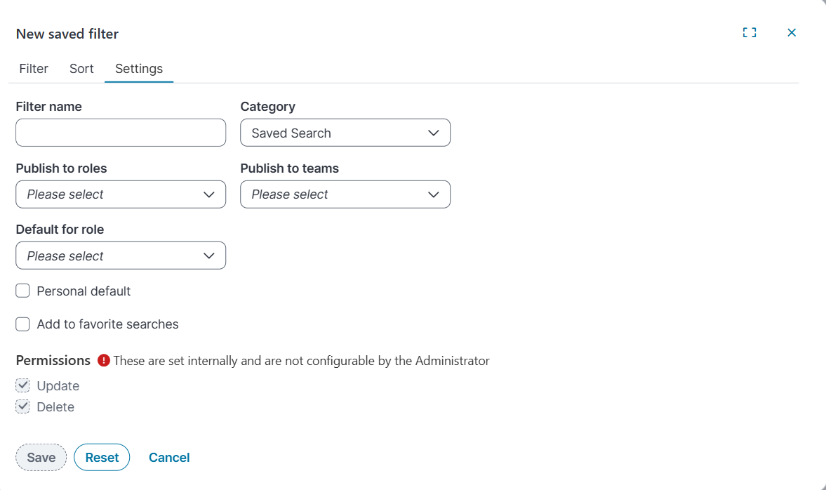
Select Create New to create a New saved filter dialog box opens.
-
The filter editor includes three tabs:
- Filter
-
In the Filter tab, define the conditions for the filter:
-
Use the dropdowns to select fields, operators, and values.
-
Use AND or OR to Delete multiple conditions.
-
-
Select Apply, Cancel or Reset the filter to clear the fields.
-
-
Sorting
-
In the Sort tab, choose the field to sort by from the Sort by dropdown.
-
Options include Category, Created On, Customer, Incident, Location, Modified On, Owner, Priority, Service, Source, and Status.
-
-
Select the sort order: Ascending or Descending.
-
Select Apply, Cancel or Reset the filter to clear the fields.
-
-
Settings:
-
Use this tab to configure filter properties.
-
Filter name: Enter a unique name for the filter.
-
Category: Select a category (default is Saved Search).
-
Publish to roles: Select roles that can access this filter.
-
Publish to teams: Select teams that can access this filter.
-
Filters published to teams appear between Favorites and All in the Saved filters dropdown.
-
-
Default for role: Choose whether the filter should be the default for selected roles.
-
Personal default: Checkbox to mark the filter as your personal default.
-
Add to favorite searches: Checkbox to mark the filter as a favorite for quick access.
-
Select Apply, Cancel or Reset the filter to clear the fields.
-
- Filter
-
Configure advanced expressions for filter criteria
When you create or edit a saved filter, you can define advanced expressions to control how filter conditions are evaluated.
From the Filter tab of the Edit saved filter dialog, select the expression (ƒx) icon next to a filter condition to open the Expression editor.
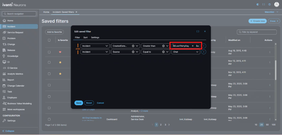
Expression editor
-
Use the Expression editor to build advanced filter logic using supported fields, functions, and date/time expressions.
-
The editor provides the following tools:
-
Incident: Business object fields available for filtering
-
Functions: Built-in functions (for example, date and time functions)
-
Time Zones: Time zone aware functions for date comparisons
-
-
Select Save, Cancel or Reset the filter to clear the fields.
Filter by Options
-
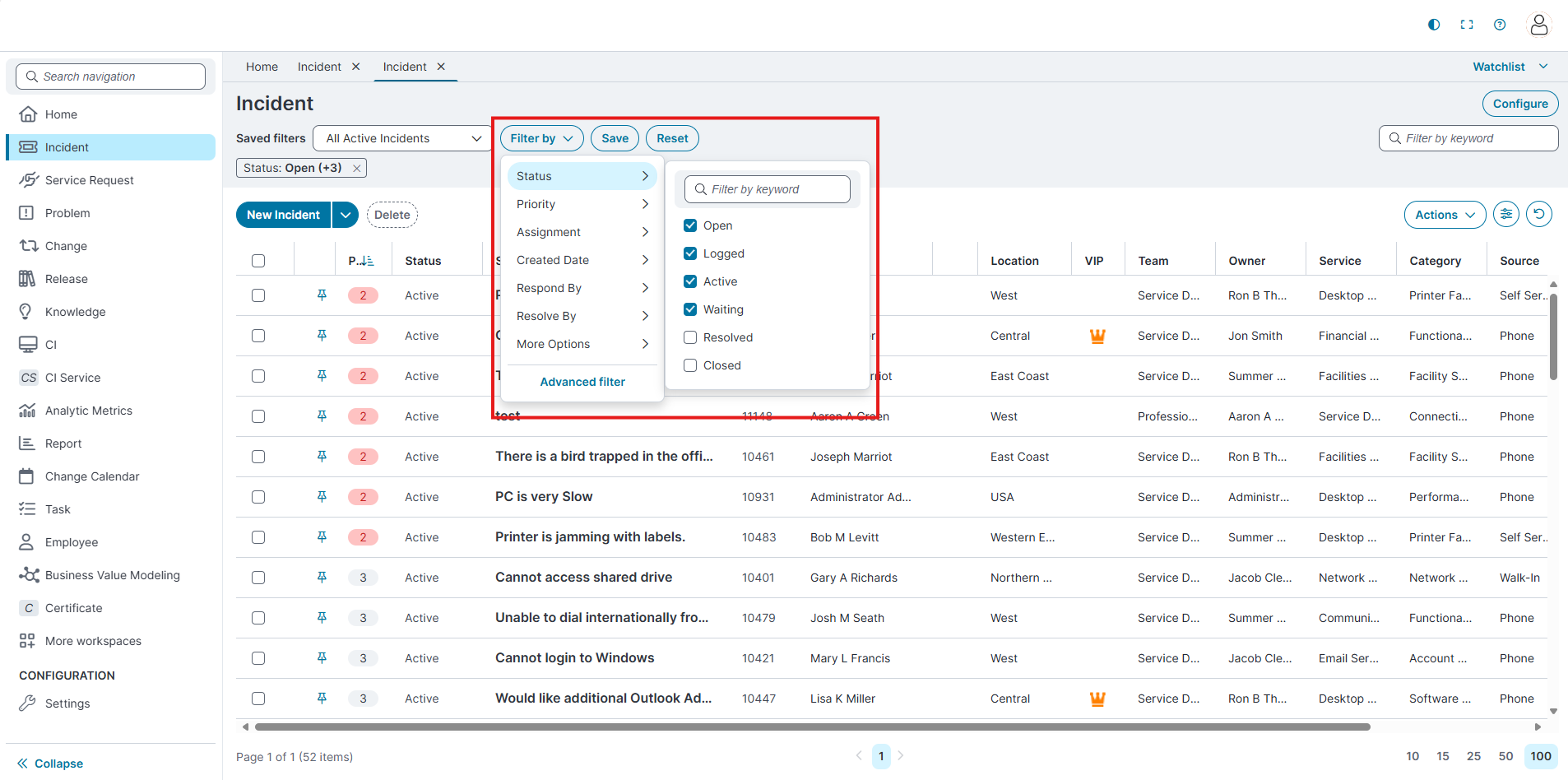
The Filter by dropdown includes common filter options such as Status, Priority, Assignment, Created date, Respond by, Resolve by and More Options.
-
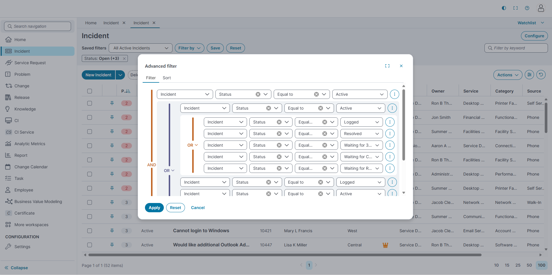
Selecting Advanced filter opens the saved filter configuration window.
- Filter
-
In the Filter tab, define the conditions for the filter:
-
Use the dropdowns to select fields, operators, and values.
-
Use AND or OR to delete multiple conditions.
-
-
Select Apply, Cancel or Reset the filter to clear the fields.
-
-
Sorting
-
In the Sort tab, choose the field to sort by from the Sort by dropdown.
-
Options include Category, Created On, Customer, Incident, Location, Modified On, Owner, Priority, Service, Source, and Status.
-
-
Select the sort order: Ascending or Descending.
-
Select Apply, Cancel or Reset the filter to clear the fields.
-
- Filter
Configure Filter Searches (Configuration Console)
Filter Searches control options appear in the Filter by menu for a business object (for example, Incident). The text box filter control (example: Summary contains) is now supported in the Ivanti Service Management Portfolio UI V3 filter panel.
To configure Filter Searches
-
Go to Settings >Build.
-
Expand Search Tools, select Filter Searches.
-
In the list, select the business object you want to configure (for example, Incident).
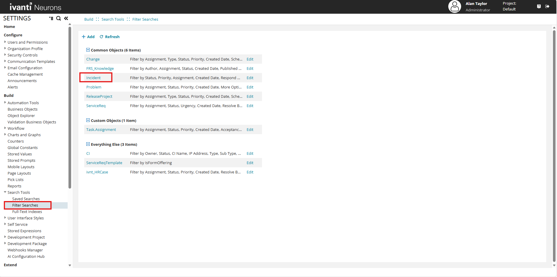
The Business Object Filter Configuration page appears.
Business Object Filter Configuration page
The Business Object Filter Configuration page displays all predefined filter criteria available for the selected business object. Each filter category (such as Status, Priority, Assignment, Created Date, Respond By, Resolve By, and More Options) appears as a separate section.
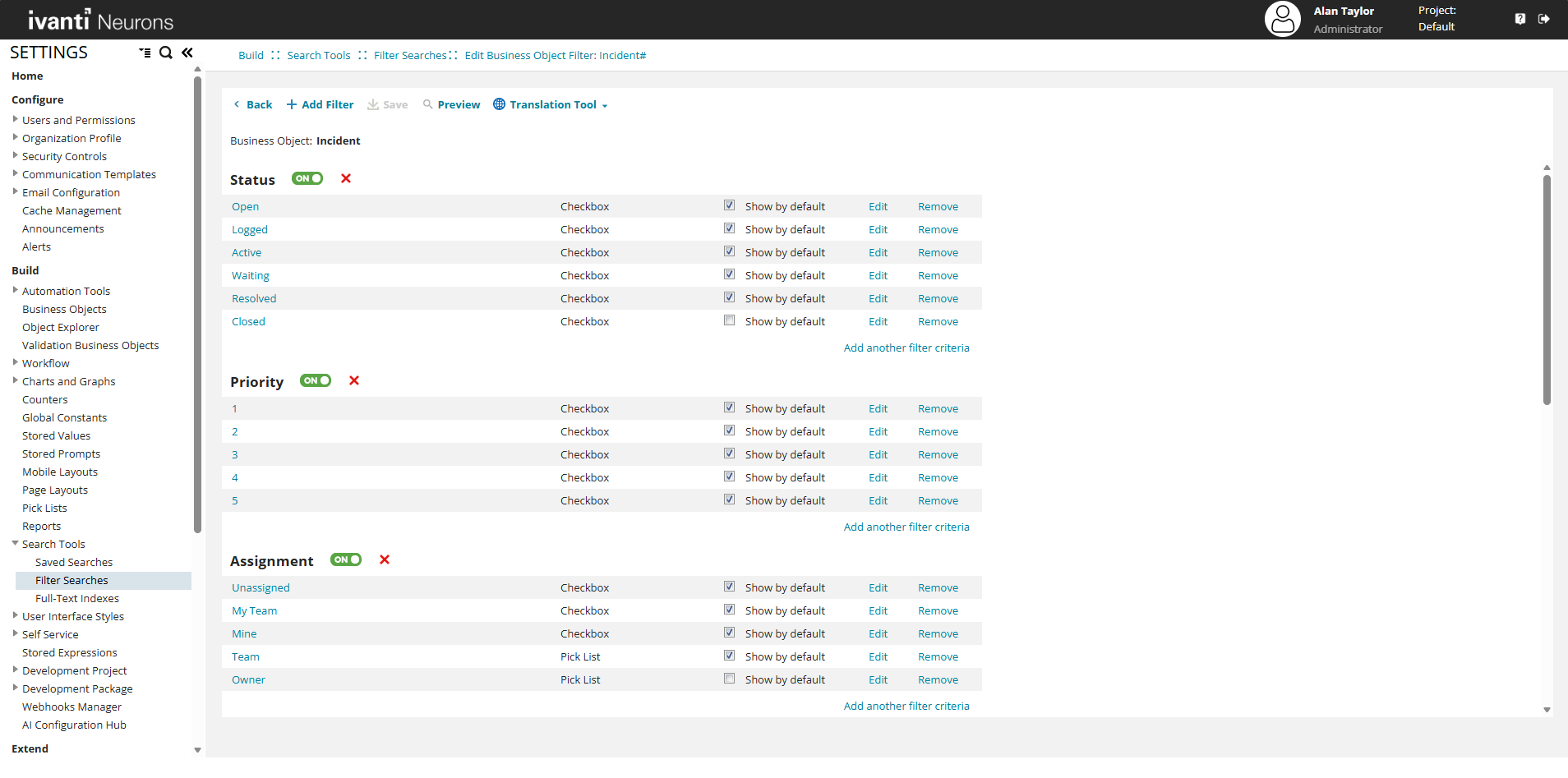
For each filter category, you can:
-
Enable or disable the category using the ON/OFF toggle.
-
View the available filter values and their control types (for example, Checkbox, Pick List, or Calendar).
-
Specify whether a filter value is shown by default.
-
Edit or remove individual filter values.
-
Add additional filter criteria within the category.
These filter definitions determine which options appear in the Filter by menu and Advanced filter dialog in the Ivanti Service Management Portfolio UI V3 workspace.
Edit Filter Criteria
When you select Edit for a filter criterion, the Filter Criteria dialog box opens.
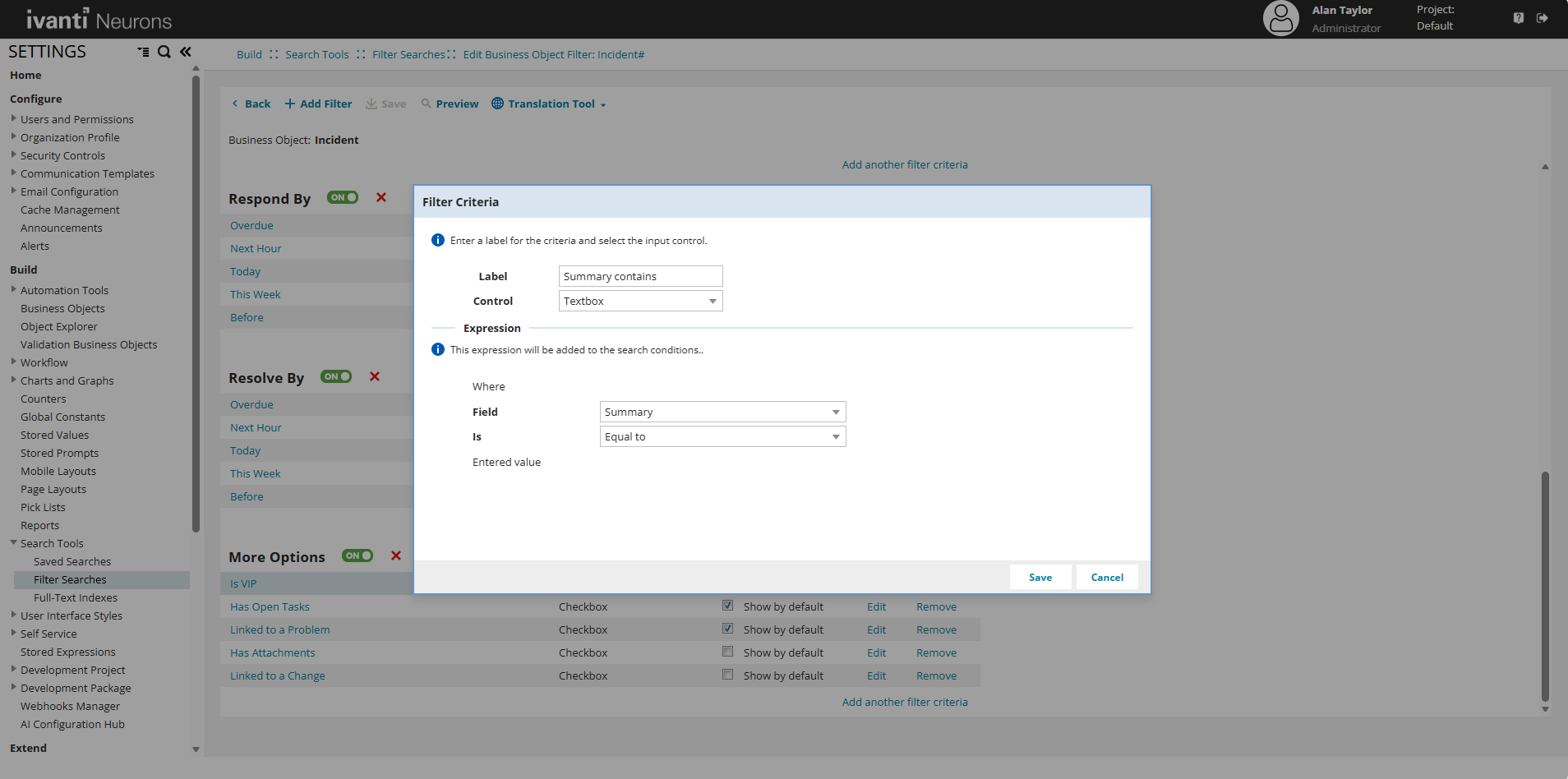
Label: Enter the text that appears in the filter UI (for example, Summary contains).
Control: Select the input control used to capture user input, selecting Textbox enables free-text search input.
Expression
Defines the condition added to the search logic.
-
To Configure the following fields, do the following fields:
-
Field: Select the business object field to evaluate (for example, Summary).
-
Is: Select the comparison operator (for example, Contains).
-
Select Save to apply the changes, or select Cancel to discard them.
-
Filters configured with a Textbox control are supported and available in the Ivanti Service Management Portfolio UI V3.
After you save the filter criteria, navigate to the Home page.
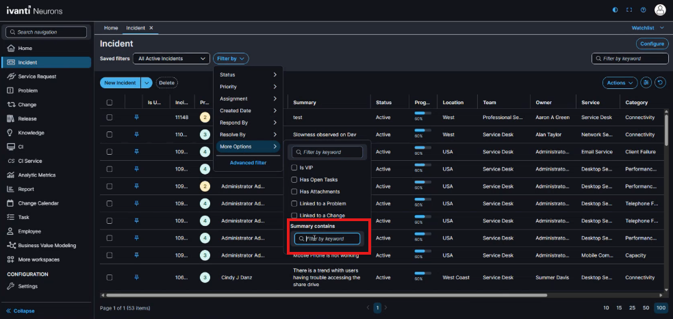
Open the relevant workspace (for example, Incident) and verify that the updated filter appears in the Filter by menu. Under More options, confirm that the Summary contains text box is available.
AI Search
AI Search allows you retrieve records. The system interprets the query and generates filter criteria automatically.
The AI search field is available in:
-
the List View
-
the Advanced filter dialog
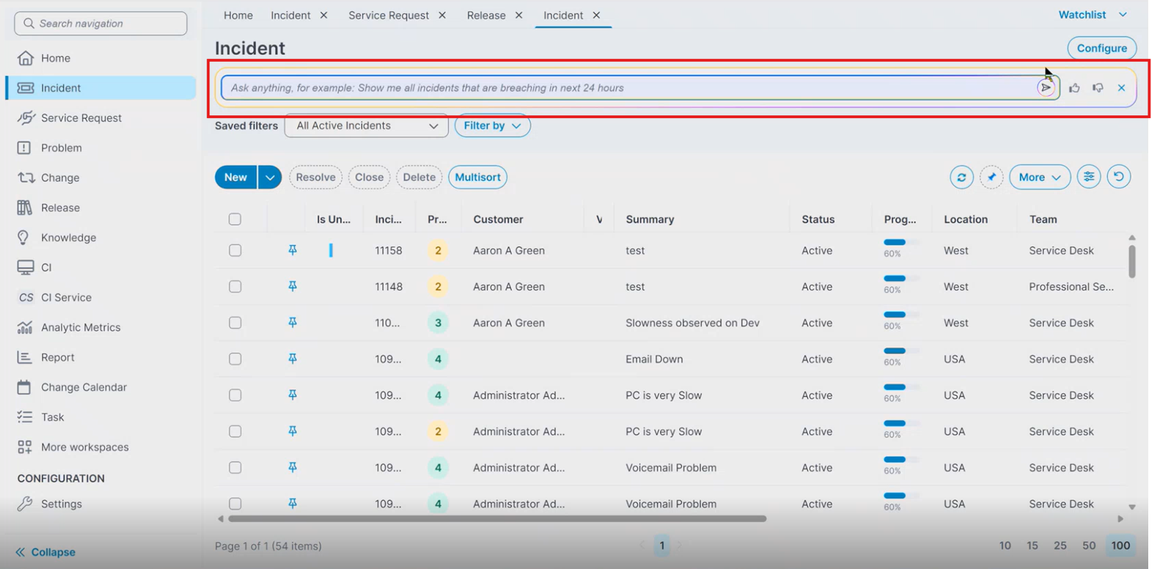
The search field displays an example prompt such as:
Ask anything, for example: Show me all incidents that are breaching in next 24 hours.
To learn supported and non-supported user queries, refer User Query Patterns.
Enable AI Search
Refer AI Search for more information.
AI Search in List View
You can run AI Search directly from the List View.
-
Open a workspace such as Incident, Service Request or any other workspace.
-
In the List View, locate the search area.
-
Select the AI search icon next to the search field.
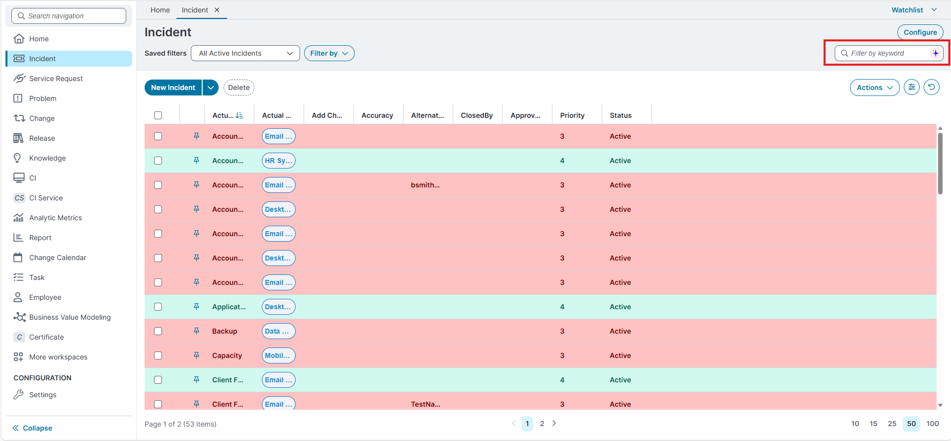
The AI search field appears.
-
Enter the following prompt in the text box - "Show me all incidents with status Logged or Active".
-
Run the search.
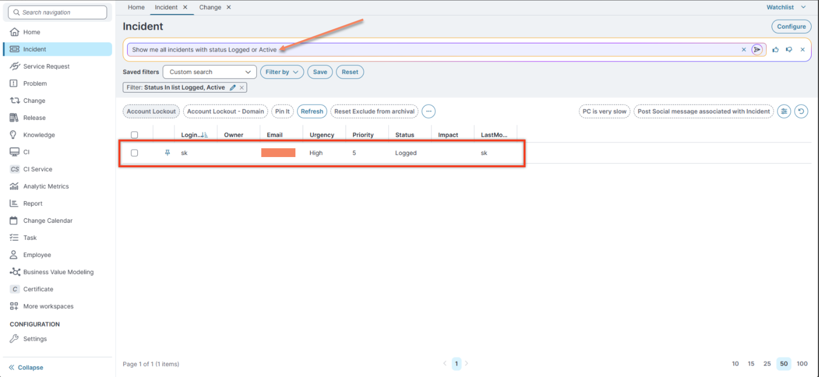
By default, the same search criteria are reflected in the Advanced Filter.
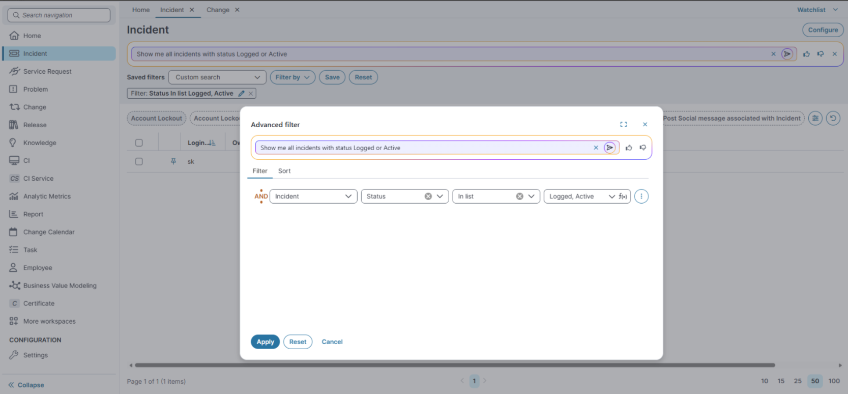
The system processes the query and generates filter criteria.
AI Search in the Advanced Filter Dialog
You can also run AI Search from the Advanced filter dialog.
-
Open the Advanced filter dialog.

-
In the AI search field, enter a query.
-
Run the search.
The system generates filter criteria.
The generated filters appear in the Filter tab.
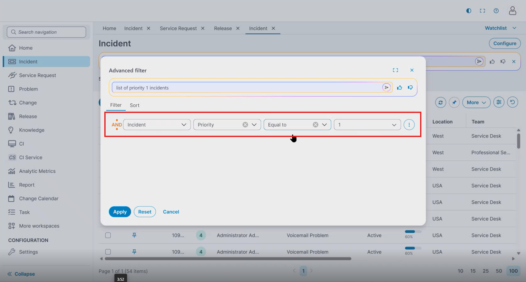
The Advanced filter dialog includes the following options:
-
Apply
-
Reset
-
Cancel
Select Apply to run the search using the generated filters.
-
After running an AI search query, the system generates filter criteria.
-
The generated filters appear in the Filter section of the Advanced filter dialog.
-
Review the filter criteria before applying the search.
-
Select Apply to run the search using the generated filters.
Manage Applied Filters
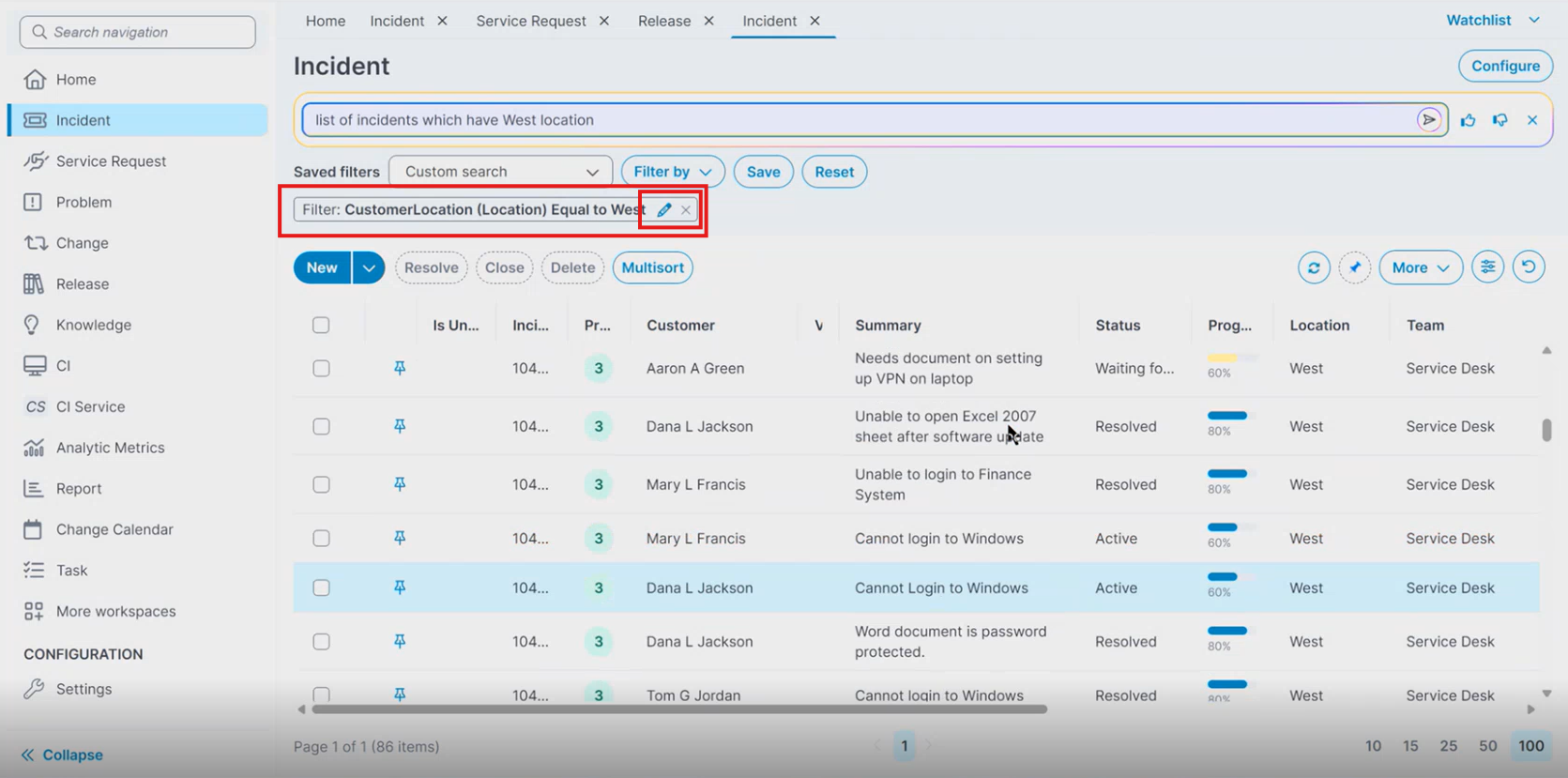
After you apply the filter, the system displays the filter in the List View as a filter label.
The filter label shows the applied condition. You can edit or delete the applied filter.
Edit and Delete a Filter
-
Locate the filter label in the List View.
-
Select the Edit
 icon or Delete
  icon next to the filter.
The system opens the Advanced filter dialog.
-
Modify the filter criteria.
-
Click Apply.
The system updates the filter and refreshes the list results.
After the system generates filters, you can save the search.
From the Advanced filter dialog, you can:
-
update the existing saved search, or
-
create a new saved search
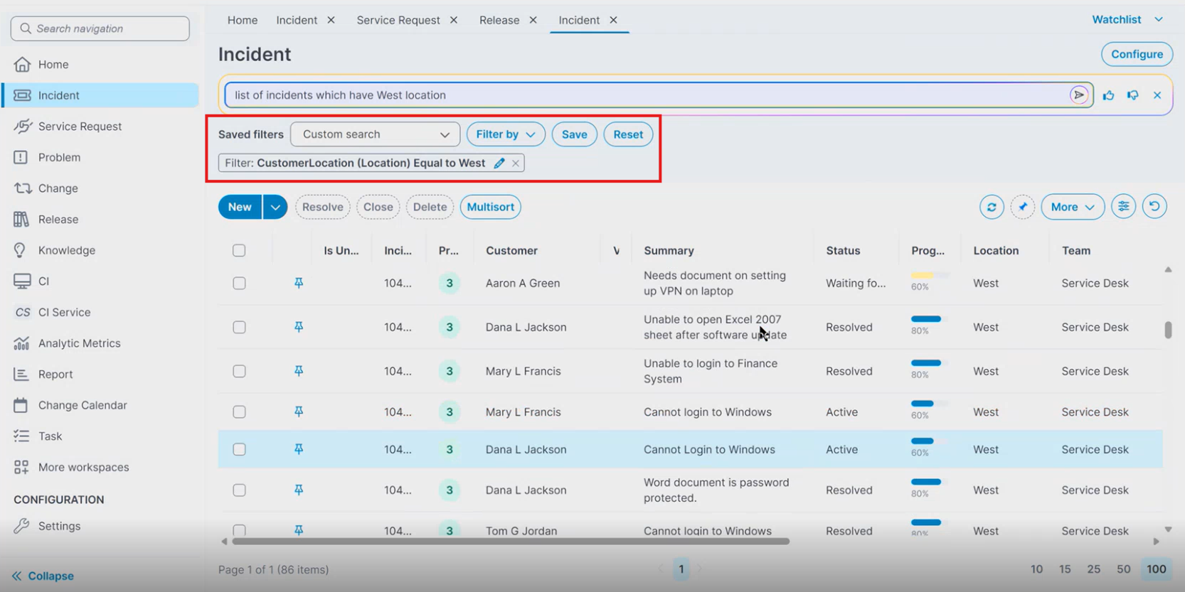
The system stores the generated filters as part of the saved search.
Provide Feedback for AI Search
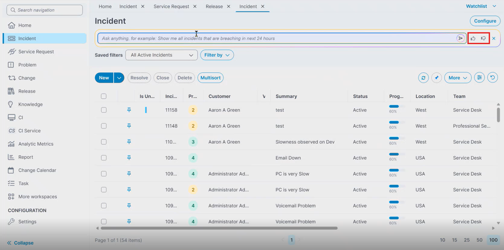
You can provide feedback for AI Search results from:
-
the List View
-
the Advanced filter dialog

The AI search field includes the following feedback options:
-
Thumbs up
-
Thumbs down
Submit Feedback
-
Enter a query in the AI search field.
-
Run the search.
-
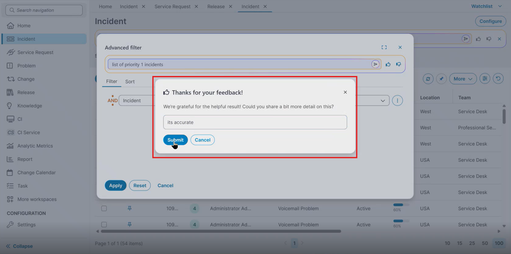
Select a feedback icon.
A feedback dialog appears.
-
Enter additional feedback in the text box.
-
Click Submit.
Alternatively, select Cancel to close the dialog without submitting feedback.
AI Search Availability in UI V3
The availability of the AI Search field in Ivanti Service Management Portfolio UI V3 depends on the search configuration defined in the Modern Page Designer.
Administrators can configure whether the search field appears in the List View, the Advanced filter dialog, or both.
Behavior Based on Search Configuration
When the Enable simple search checkbox is cleared
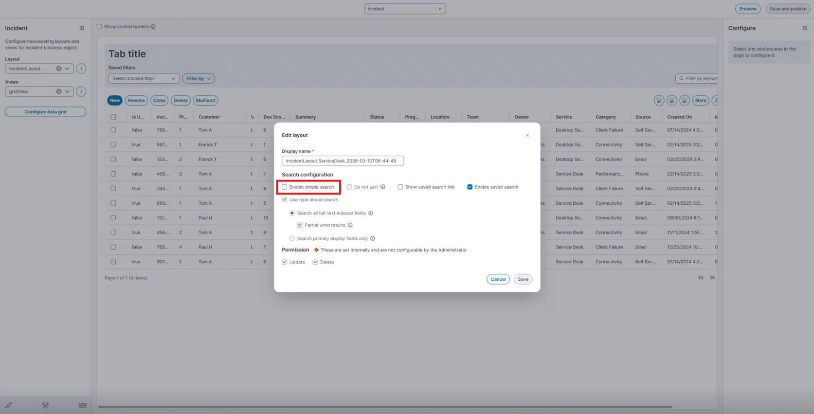
If the Enable simple search checkbox is cleared in the Modern Page Designer and the configuration is saved and published, refresh the Ivanti Service Management Portfolio UI V3 page:
-
The simple search bar with AI is not displayed in the List View.
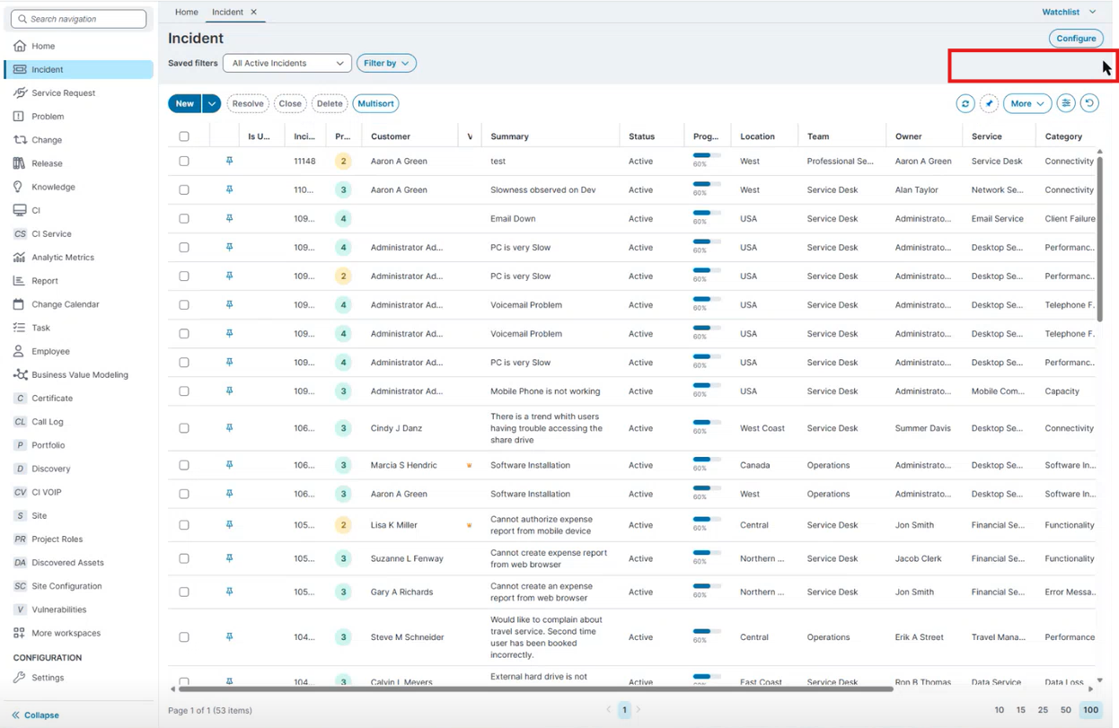
-
But the AI Search remains available in the Advanced filter dialog.
When the Enable saved search checkbox is cleared
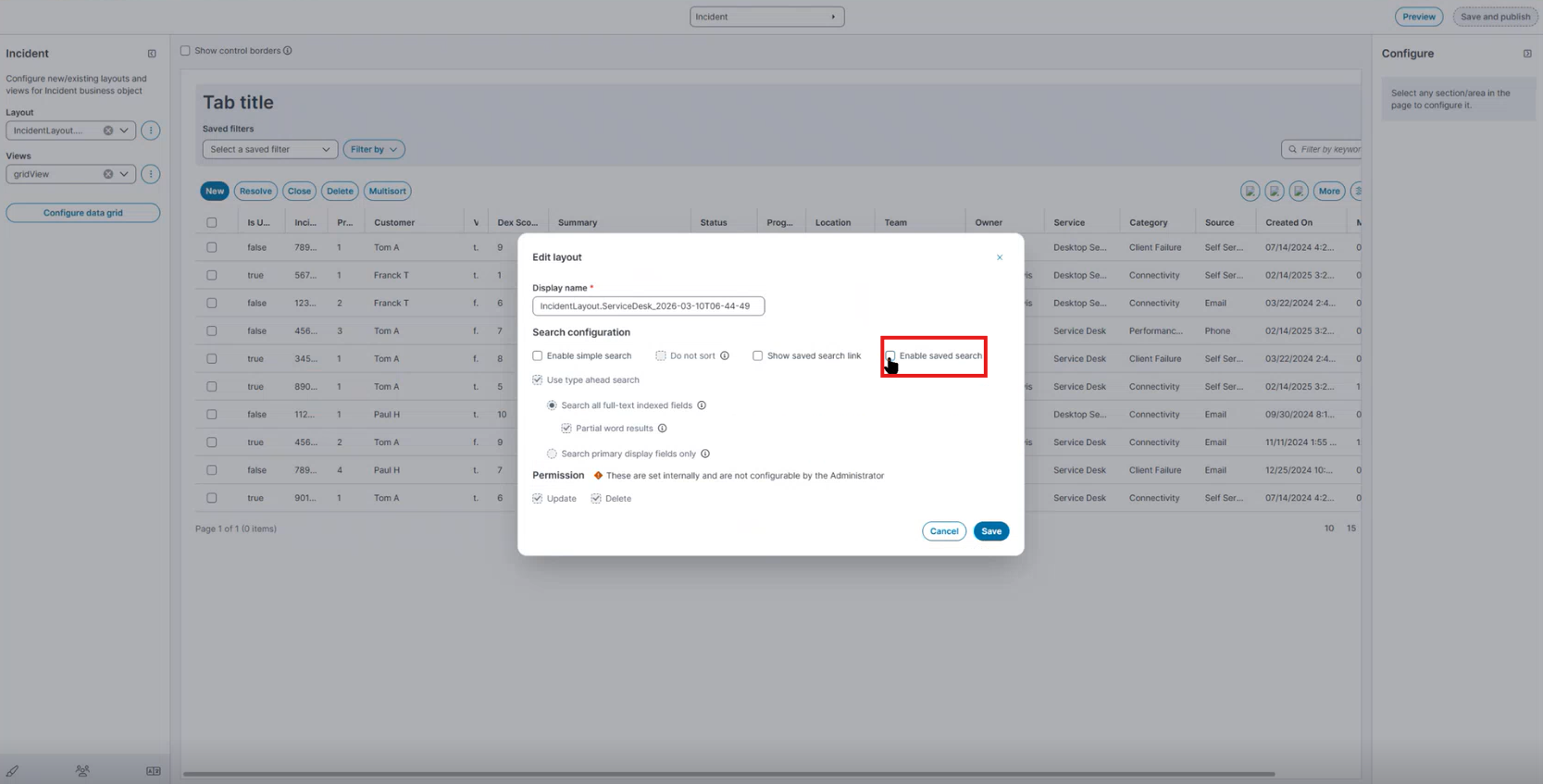
If the Enable saved search checkbox is cleared and the configuration is saved and published, refresh the Ivanti Service Management Portfolio UI V3 page:
-
The AI search field is not available in the Advanced filter dialog.
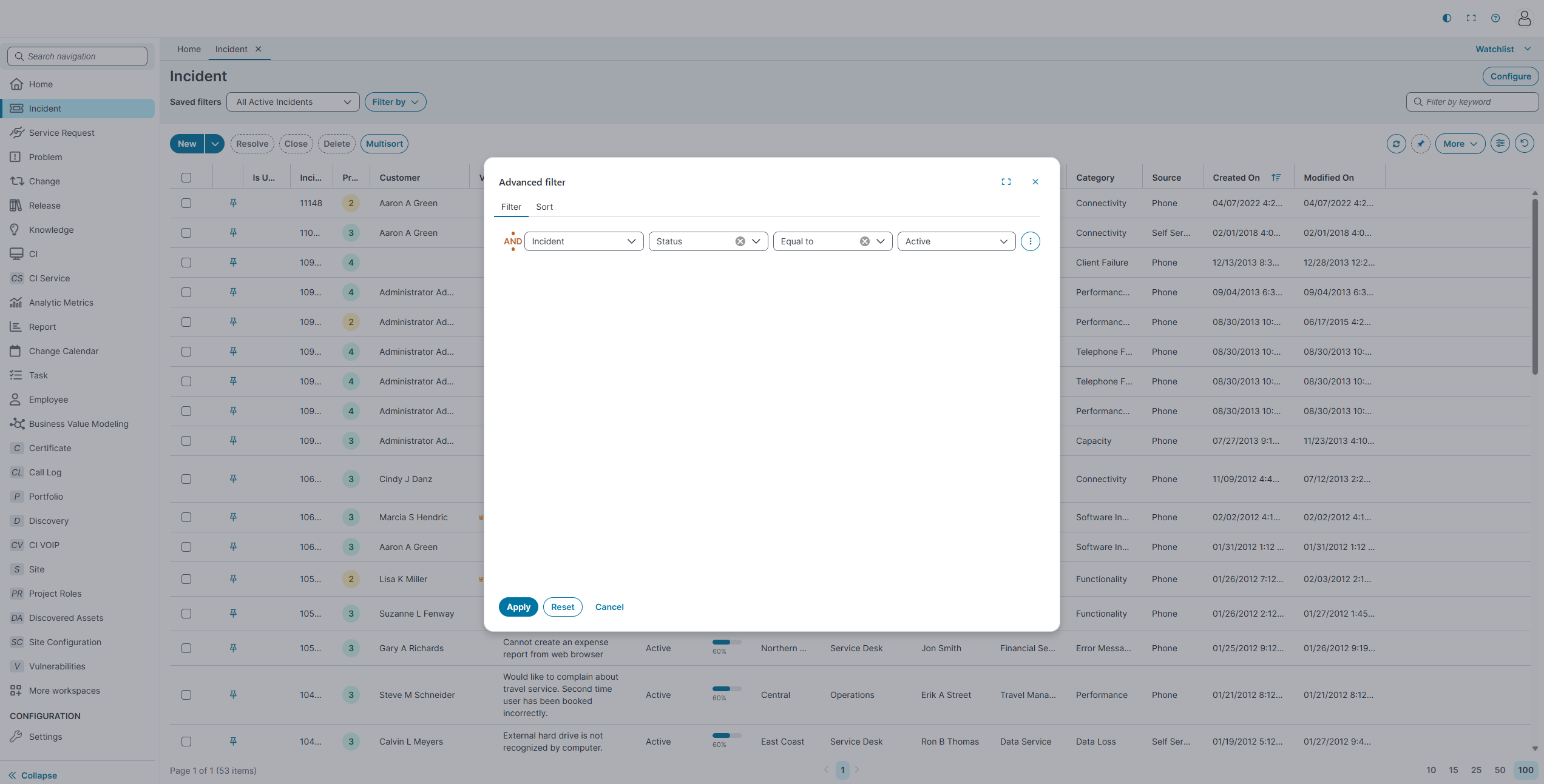
In this case, the AI search capability is removed from the workspace UI.
Using the Link Field Controls in the Ivanti Service Management Portfolio UI V3
A Link Field associates the record on the current form with a related record from another business object. For example, the Incident form uses link fields such as Customer, Org/Acct, and Employee to display data from those objects.
Context Menu Actions
Select the ellipsis (⋮) to open the context menu.
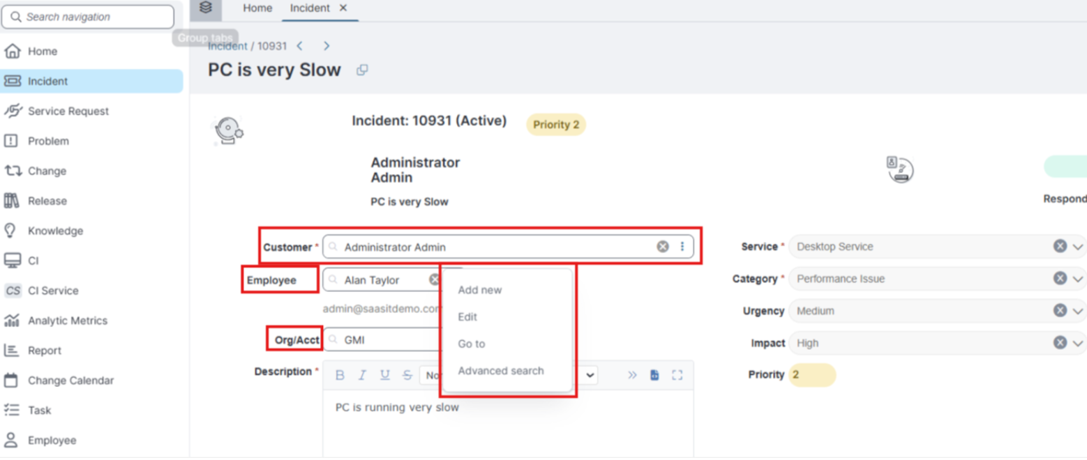
| Action | Description |
|---|---|
| Add new | Opens a new-record form for the linked object in a dialog box. The application selects the saved record in the field automatically. |
| Edit / View | Opens the linked record in a dialog box for editing or for viewing. |
| Go to | Navigates directly to the full page of the linked record. |
| Advanced search | Opens the Advanced search dialog box so that you can filter and browse the full list of linked records. |
Select a Record
Use type-ahead search to find and select a related record.
-
Select the field, and then start typing.
-
After you type three characters, a dropdown displays matching records. Each row shows fields from the linked object (for example, LoginID and Email) to help you identify the correct record, along with a View details (eye) icon.
-
Select a row, or use the keyboard to navigate the results and press Enter to select the highlighted row.
The field displays the display name of the selected record.
The dropdown also includes the following actions:
-
View details (eye icon): Opens the record on the highlighted row so that you can review it without selecting it.
-
Advanced search: Opens the Advanced search dialog box to filter and browse the full list of linked records.
-
Add new: Opens a new-record form for the linked object.
Add or Edit a Linked Record
When you select Add new or Edit from the context menu, the application opens a form for the linked record in a dialog box. The form that opens depends on how the layout was created:
-
Migrated layouts: The application opens the form in a dialog box configured in the original (Classic) layout.
-
New layouts: The application opens the default form defined for the linked business object in the Modern Page designer.
The Add new and Edit actions otherwise behave as they do in the Classic UI. When the field property editable is set to "NO" in the Modern Page designer, the context menu displays View instead of Edit, so you can inspect the linked record without making changes.
When a link field is rendered in a dialog box, only the Go To and Advanced Search options are available. The Edit and Add New options are not supported.
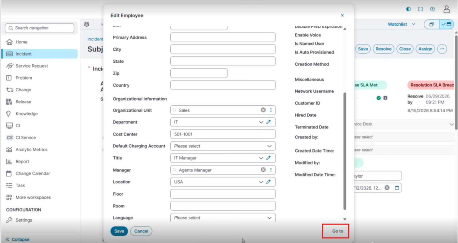
The linked-record form includes a Go to button. The application enables Go to only when the form has no pending (unsaved) changes. When the form has unsaved changes, Go to is disabled. Select Go to to navigate to the full page of the linked record.
Use Advanced Search
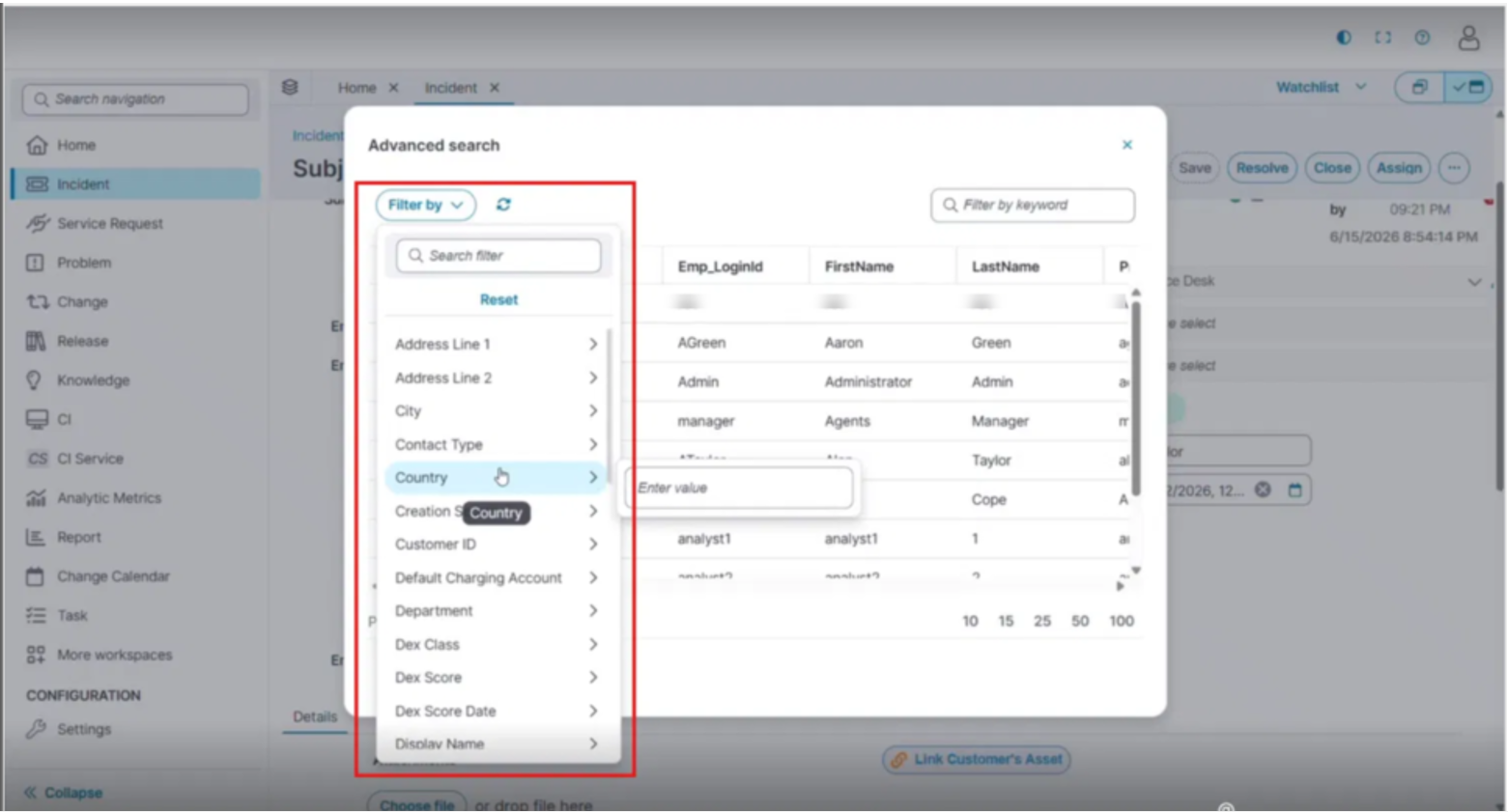
Advanced search opens a full grid of the linked object's records with filtering capabilities.
-
Select the ellipsis (⋮), and then select Advanced search.
-
In the Advanced search dialog box, do any of the following:
-
Enter text in the Filter by keyword search box to run a full-text search across all records.
-
Select Filter by to apply column-level filters.
-
Select the Refresh icon to reload the results.
-
Select a column header to sort by that column.
-
Use the pagination controls to page through the results.
-
-
Select a row to highlight it, and then select Select. Alternatively, double-click a row to select it immediately.
To close the dialog box without selecting a record, select Cancel.
Filter Search Results Using Filter By
The Filter by control filters the search grid by any column of the linked object.
-
In the Advanced search dialog box, select Filter by.
A scrollable list of available columns appears.
-
(Optional) Enter text in the Search filter box to find a column by name.
-
Point to a column name, or press the Right arrow, to open a sub-panel with an input for that column's data type.
-
Enter or select a value. The application applies the filter to the grid immediately.
Use the Hierarchical Picker
When the Hierarchical Picker property is set to Yes in the Modern Page designer and the linked object is organized in a parent-child hierarchy (for example, a Category tree or an Organization Unit structure), the application opens a Hierarchical Picker dialog box.
Working with Attachments
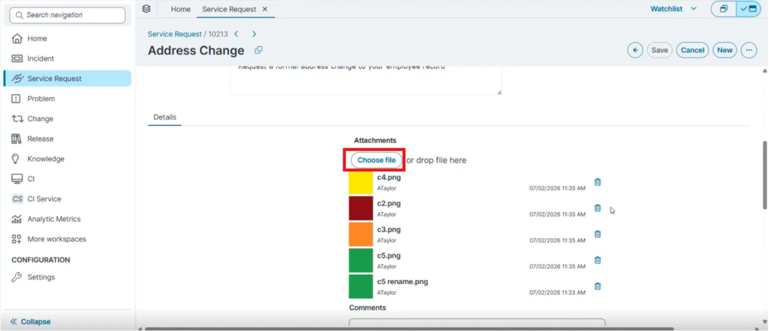
The Attachment control lets you upload, manage, and download file attachments on a record. It appears on the record's Details tab and supports both file uploads and URL-based attachments. The actions available to you depend on how the administrator configured the control.
Display Modes
The Attachment control appears in one of two display modes, which the administrator sets in the Modern Page designer:
-
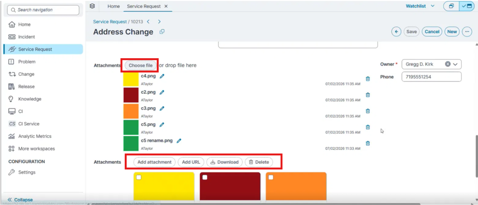
Compact mode (default): Shows the Choose file / or drop file here upload zone and a vertical list of attachments. Each row shows a thumbnail or file icon, the file name, the uploader, a timestamp, and a delete icon.
-
Extended mode — Adds a rename icon to each row and a toolbar with Add attachment, Add URL, Download, and Delete, followed by a card grid with selection checkboxes for bulk actions.
Add a URL Attachment
Adding a URL is available in extended mode when the administrator enables Enable to add URL.
-
In the Attachment toolbar, select Add URL.
-
The application displays a dialog box.
-
Enter a valid URL.
-
Select Save.
The application adds the URL to the attachment list with a link icon. Selecting the URL opens it in a new browser tab.
Rename an Attachment
Renaming is available for uploaded (non-URL) attachments when the administrator enables Allow editing file name and the form is not read-only.
In the attachment list, select the rename (pencil) icon next to the file.
-
The application displays a dialog box with the current file name, without the extension.
-
Enter a new name.
-
Save the change.
Download an Attachment
The application downloads the selected files to your Downloads folder. URL attachments open in a new browser tab instead of downloading.
-
To download a single file, select the file name in the attachment list.
-
To download several files at once (extended mode), select the checkbox on each card, and then select Download in the toolbar.
Delete an Attachment
Deleting is available when the administrator sets Can delete to Yes and the form is not read-only.
-
To delete a single file, select the delete (trash) icon next to the file.
-
To delete several files at once (extended mode), select the checkbox on each card, and then select Delete in the toolbar.
The application displays a confirmation dialog box before it deletes the attachments.
For attachment concepts, URL handling, and administrator limits, see Working with Attachments and URLs