Open topic with navigation
Asset form controls
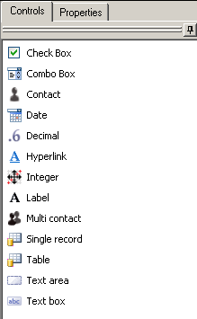
Use the following form controls while designing asset forms.
All form controls share one or more of these common settings on their Properties tab:
- Display name: The unique identifier for the control. This is the name that other parts of the Design console will use when referring to the control, such as in the audit history. This name is visible to users in the summary view and when creating a view for the form.
- Required: If users must provide data for the control, check this option. Users can't submit the form until all required form data has been provided. You can only make a control required if there are no existing form instances.
- Unique: Requires that data entered into this control must be unique. If a user enters data that matches previously entered data, the form won't submit. This is useful to help error-check fields containing information like social security numbers or employee ID numbers. You can only make a control unique if there are no existing form instances. If Unique is selected, a default value can't be entered for the control, nor can users perform a bulk update.
- Visible: If you want the control to be visible, check this option. When enabled, users can see the control. Disable this for controls that users shouldn't edit or that you don't want them to see, such as system fields that track internal form data. If a control is required and doesn't have a default value, you won't be able to clear the Visible option.
- Read only: Makes the control non-editable. If a control is required and doesn't have a default value, you won't be able to check the Read only option.
- Show column in table: Makes the data from that control visible in the Web console summary views. You can control the summary view column order. To do this, use the Column order tab in the form's Properties dialog.
- Include in tab ordering: Allows users to use the keyboard Tab key to access the control. The Tab order number is the order in the tab sequence. The tab order numbering begins at 0, with zero being the first control highlighted when a user presses Tab.
- Relationship filter: Lets users filter the relationships that are displayed in the Relationship viewer in the Web console. Users can categorize relationships in the Combo, Contact, Multi-contact, Single record, and Table controls by High (default), Medium, and Low. The filter level is displayed in the viewer by dark 3-pixel line (High), medium-dark 2-pixel line (Medium), and light 1-pixel line (Low).
By default, all filterable controls are assigned the High filter level. If you are upgrading from ALM 3.0, you will need to specify the relationship levels (High, Medium, and Low) in the form properties to enable the filters to be displayable in the Relationship viewer.
Settings unique to each control are described below.
Check box
Use this control to add a check box to a form.
- Text: The text you want to appear to the right of the check box.
Combo box
Use this control to add a combo box to a form. A combo box lets users select one item from a predefined list of items.
- Data list: The asset data list that contains the items you want to use as available selections. Configure data lists in the Asset tab's Data lists panel. After instances exist for a form, you can't change the associated data list.
- Default value: The default value from the data list that's visible in the combo box. You can leave the default blank or select a value from the data list.
Contact
Use this control to add a combo box that lets users select one contact, which can be a user, group, or role, from a list of contacts. You can configure available users and groups in the Settings utility's Users/Groups tab (Tools > Settings). You can configure roles in the Settings utility's Roles tab.
- Contact types: The types of contacts available in the combo box. You can select any combination of Users, Groups, or Roles.
Date
Use this control to add a combo box that lets users select a date from a graphical calendar. Users can also type a date delimited by slashes (/) or periods (.) in the format of MM/DD/YYYY.
- None: Leaves the form's date field blank.
- Current date: Displays the user's current date in the form.
- Offset: Displays a date that is the number of days before or after the current date.
Decimal
Use this control to add a data field that lets users enter a decimal value within a range you specify. Users won't be able to submit the form if the value they enter isn't in that range.
- Default value: The default value visible in the data field.
- Min: The minimum value that the data field will accept.
- Max: The maximum value that the data field will accept.
Hyperlink
Use this control to show hyperlink text that launches a URL when clicked.
- Text: The hyperlink text that's visible to users. This text will be blue and underlined.
- URL: The URL that launches when the hyperlink text is clicked. You can pass parameters from another field on the form into the URL. This works for all fields except tables.
Integer
Use this control to add a data field that lets users enter an integer value within a range you specify. Users won't be able to submit the form if the value they enter isn't in that range.
- Default value: The default value visible in the data field.
- Min: The minimum value that the data field will accept.
- Max: The maximum value that the data field will accept.
Label
Use this control to add a static text label to a form. Generally, every control you add to a form will need a label that tells users what information that control displays or needs.
- Text: The text you want for the label.
Multi contact
Use this control to let users select multiple contacts from a list of contacts. You can configure available users and groups in the Settings utility's Users/Groups tab (Tools > Settings). You can configure roles in the Settings utility's Roles tab.
- Contact types: The types of contacts available in the combo box. You can select any combination of Users, Groups, or Roles.
Single record
Use this control to let users select a single record from a data list. This control gives users additional search features when selecting a record that the combo box control does not have. We recommend using this control when the data list populating the control is very large.
- Data list: The data list from an asset, form, or supporting resource containing the items you want to list in the control. The asset data list isn't necessarily an asset data list, it can also be a data list from forms or supporting resources that contains the items you want to use as available selections. Configure data lists in the Asset tab's Data lists panel. Only dynamic data lists can be selected for a single record control.
- Default value: The default selection for users that's visible in the control from the data list you selected. You can leave the default blank or select a value from the data list.
- SQL filter: Users can enter a SQL "where" clause that is used to filter the dynamic data list that populates the table control. The word “where” must be left out of the statement. For example, entering "ALM_Location = 'Salt Lake City'" will only display assets with the location set to Salt Lake City in the table control.
- Test SQL: This button tests the "where" clause entered in the SQL filter. If the statement is returning errors, the test button will return the error. If the statement is written correctly, the button will report success.
- Column: The column button allows you to insert a column name into the SQL filter from the form that the data list points to.
- Value: The value button allows users to insert a dynamic value into the SQL filter based on a control on the form. This allows you to filter the data in the selection on a value that is populated on the current form. For example, you could create a text box called "Location" and only display locations in the table control based on the selected location. This SQL filter would look like this: ALM_Location = {'Location'}
Table
Use this control to display the contents of a data list.
- Data list: The data list from an asset, form, or supporting resource containing the items you want to list in the table. The asset data list isn't necessarily an asset data list, it can also be a data list from forms or supporting resources that contains the items you want to use as available selections. Configure data lists in the Asset tab's Data lists panel. Only dynamic data lists can be selected for a table control.
- Display Select button: Displays a button that users can use to select an item from the associated data list. If this item isn't selected, the button won't be visible on the table control in the Web console.
- Display Remove button: Displays a button that users can use to remove an item from the table. Removing an item doesn't remove it from the associated data list.
If this item isn't selected, the button won't be visible on the table control in the Web console.
- Display New button: Displays a button that users can use to add items to the table.
If this item isn't selected, the button won't be visible on the table control in the Web console.
- Display Edit button: Displays a button that users can use to edit an existing table item.
If this item isn't selected, the button won't be visible on the table control in the Web console.
- Display Copy button: Displays a button that users can use to copy the details from an existing instance into a new instance. This is useful when the user is creating several instances that share most of the same data. If this item isn't selected, the button won't be visible on the table control in the Web console.
- SQL filter: Users can enter a SQL "where" clause that is used to filter the dynamic data list that populates the table control. The word “where” must be left out of the statement. For example, entering "ALM_Location = 'Salt Lake City'" will only display assets with the location set to Salt Lake City in the table control.
- Test SQL: This button tests the "where" clause entered in the SQL filter. If the statement is returning errors, the test button will return the error. If the statement is written correctly, the button will report success.
- Column: The column button allows you to insert a column name into the SQL filter from the form that the data list points to.
- Value: The value button allows users to insert a dynamic value into the SQL filter based on a control on the form. This allows you to filter the data in the selection on a value that is populated on the current form. For example, you could create a text box called "Location" and only display locations in the table control based on the selected location. This SQL filter would look like this: ALM_Location = {'Location'}
Text area
Use this control to let users enter multiple lines of text in a box-shaped text area.
- Default text: The default text visible in the text area.
- Length: The maximum text character length allowed. The default is 1024.
Text box
Use this control to let users enter a single line of text in a single-line text box.
- Default text: The default text visible in the text area.
- Length: The maximum text character length allowed. The default is 1024.
- Input mask: An input mask is used to force users to enter in numbers or letters in a specific format that the administrator can define. For example, it can be used to force users to enter in a telephone number in the US format of 000-000-000. Use A for letters and # for numbers. For the US telephone number example, enter in an input mask of ###-###-####.