Splunk Dashboard
Splunk dashboard application for Ivanti Policy Secure uses the indexed data to render various charts and to show useful information on dashboard. The Ivanti Policy Secure app for Splunk allows you to view Ivanti Policy Secure data in a dedicated, customizable Splunk dashboard. The Ivanti Policy Secure integration with Splunk allows security managers to quickly monitor the current operational/security posture.
The Ivanti Policy Secure syslog add on for Splunk provides value to the Ivanti Policy Secure syslog data, it extracts various event types and additional fields from syslog data. The Ivanti Policy Secure dashboard app for Splunk uses this data to provide various charts for compliance, login type, endpoint by categories, endpoint by OS and so on. It analyzes the contextual data from Ivanti Policy Secure to help administrators analyze and cross-correlate events on endpoints.
For multiple Ivanti Policy Secure sending data to Splunk at a time, Splunk app provides dashboard for multiple Ivanti Policy Secure servers. The user must select the IP/Hostname of multiple Ivanti Policy Secure server from the IP/Hostname field to view the dashboard.
For clustering, all the IP/Hostnames must be selected in the IP/Hostname field for viewing the dashboard.

The Splunk application for Ivanti Policy Secure provides a dashboard with various types of authentication, Host Checker compliance, endpoint classification details. The dashboard presents 12 charts based on the endpoint properties reported by Ivanti Policy Secure by default.
|
Label |
Description |
|---|---|
|
Login Type |
This panel shows the results of endpoint based on the login. The graph shows the number of endpoints connected using Ivanti Secure Access Client or through Web browser (Agentless). For example, Agentless L3 Auth, Pulse L3 Auth, Pulse L2 Auth, Mac Auth, Native Supplicant L2 Auth.
Admin can also drill down to view the login details such as Username, IP address, MAC address, realm, roles, sign-in time, agent type, agent version, login type in a tabular format.
You can click the visualization tab and modify the visualization. |
|
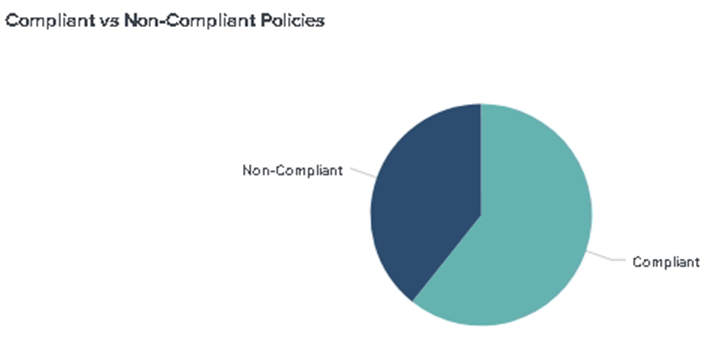
Compliant vs Non-Compliant Policies |
This panel displays the results of compliance and non-compliant policies. The graph shows the relative prevalence of compliant/non-compliant policies during the charted period, as a percentage of all endpoints within the reporting scope.
The Admin can also drill-down to view the details of compliant and non-compliant policies/users (IP address, MAC address, Username, realm, HC Policy, HC result, compliance result, current HC time, etc.) in a tabular format.
|
|
LoginType -Trends |
This panel tracks the results of login type over time. The graph shows the number of endpoints connected using Ivanti Secure Access Client or through Web Browser (Agentless) over the specified period. Trending analysis can be useful for multiple reasons. For example, for active users, it could be useful to know the workload at different time of the day and different day of the week. Then this information can be used for capacity planning and troubleshooting purpose.
|
|
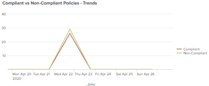
Compliance vs Non-Compliance Policies- Trends |
This panel tracks the results of compliance policies over time. The graph shows the number of endpoints that were compliant or non-compliant over the specified period. The trending analysis for compliance can be used to know the compliance of devices over the period of time for regulatory purpose.
|
|
Endpoint by OS |
This panel tracks the results of endpoint information based on Operating System (OS).
Admin can also drill down to view the details for endpoints with OS and other contextual information (device ID i.e. MAC address, IP address, host name, OS, Category and other attributes) if available to Splunk via Ivanti Policy Secure/Profiler.
|
|
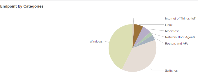
Endpoint by Categories |
This panel shows the endpoint by category or device manufacturer.
Admin can also drill down to view device category details such as Windows, Linux, Mac, Routers, Network Boot Agents and so on.
|
|
Endpoint by OS- Trends |
This panel tracks the results of endpoint information based on Operating System (OS) over the specific period.
|
|
Endpoint by Categories - Trends |
This panel shows the endpoint by category or device manufacturer over the specific period. Trending analysis for endpoint by OS/Category could be useful to know the devices with various category and OS getting connected to network over the period of time. It could also be useful to know how frequently particular category (for example, IoT devices) of devices are getting connected to corporate network.
|
|
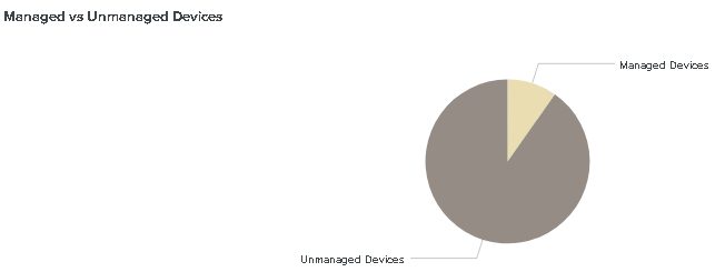
Managed vs Unmanaged Devices |
This panel shows the managed and unmanaged devices.
The Admin can drill-down to view the details (various available device attributes known to Splunk. For example, device MAC address, IP address, host name, OS, Category, Manufacturer etc.) of managed and unmanaged devices.
|
|
Device Classification vs Profile Change |
This panel shows the comparison between the number of devices classified and the number of devices with profile changed.
The Admin can also view the details (various available device attributes known to Splunk e.g. device MAC address, IP address, host name, OS, Category, Manufacturer etc.) of classified and profile change devices.
|
|
Managed vs Unmanaged Devices - Trends |
This panel shows the managed and unmanaged devices over the specific period.
|
|
Device Classification vs Profile Change - Trends |
This panel shows the comparison between the number of devices classified and the number of devices with profile changed over the specific period.
|
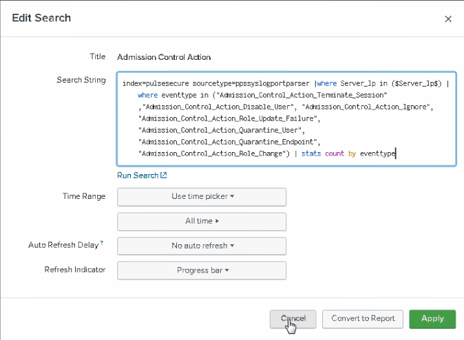
Experienced Splunk users can customize the searches and dashboards provided with the Ivanti Policy Secure Syslog Add-On. The Admin must click the Edit option from the dashboard and then choose either to edit directly from the source, or from UI using Add Panel, Add Input.
To customize the dashboard:
-
Open the Dashboard editor and from the Dashboards listing page.
-
Click Edit to open the dashboard editor.
-
Select UI or Source to change the editing mode.
-
(Optional) Preview dashboard edits as you make them and click Save to save changes. Click Cancel at any point to discard changes.
-
At the top right of each panel, editing icons appear. The first editing icon represents the search for the panel. The search icon varies to represent the type of search being used.
-
Click Add Panel, select the type of chart.
-
Enter the Content Title, Enter the required index query in the Search String.
-
Click Add to Dashboard.
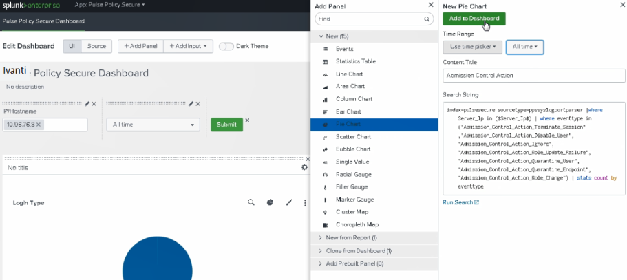


You can also choose to edit the search string, time range (i.e last 24 hours, 7 days, 30 days or All), refresh interval (i.e. 5 minutes, 10 minutes, 30 minutes, 60 minutes, No auto refresh to disable auto refresh of chart data is also provided), refresh indicator.
