Velocity powered by Wavelink
This page refers to an older version of the product.View the current version of the User Guide.
Key Details Panel
The Key Details panel allows you to set labels and values, upload custom images, and change key coloring styles on a key-by-key basis. When you select a key from the Editor panel or the Custom tab in the Keys panel, you can change the key's behaviors through the Key Details panel. If no key is selected, the form cannot be used. This panel cannot be used to edit keys from the Keys panel, except for those found on the Custom tab.
In the Key Details panel you can perform the following actions:
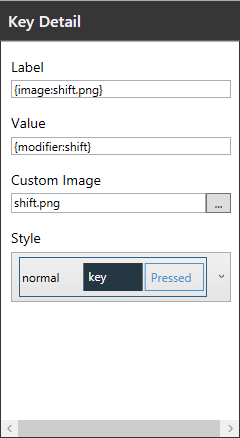
•Label. The text that appears on the key to identify its intended function.
•Value. The action that occurs when a specific key is tapped. Values are commonly text, like numbers or letters. If you enter multiple letters, numbers, or symbols for a key value, the application will only use the first letter or number in this field. Keys can also include additional values for special functions. For example, a key with the letter a would have a value of a, whereas a key with the label CLEAR would have a value of {hex:0003} to delete all text in a field. Supported values include:
•{hex:0000} - This value associates the key with a specific hex code, which allows for actions such as clearing all text in a field. All supported hex values are included as predefined keys in the Keys panel. For a list of all accepted hex values, see Keyboard Codes and Commands.
•{special:scan} - This activates and deactivates the device's camera or scanner.
•{modifier:shift,normal} - This value creates the Shift key function, switching between the shift and normal states for a keyboard. For example, if you want to change to the shift state of your keyboard, you use the value {modifier:shift}. To return to the normal state of your keyboard from the shifted state, you use the value {modifier:normal}.
•{lock:shift} - This locks the keyboard into its Shift state, like the Caps Lock key on a standard computer keyboard.
•{layout:keyboardName} - This allows you to change to another custom keyboard from the current keyboard. The keyboard name should be entered as it appears in the Keyboards panel. For example, if you wanted to display another custom keyboard called "123," you type {layout:123} to create a value for that keyboard. When a user taps the key on a mobile device, the 123 keyboard displays.
•Long Press Label. The text that appears when a user taps and holds a key. This field can only be edited when the Long Press button is selected in the Editor panel.
•Long Press Value. The action that occurs when a specific key is tapped and held. This field supports the same values as the Value field. This field can only be edited when the Long Press button is selected in the Editor panel.
•Custom Image. Upload a custom image to display as the button label. Images must be in .png format and should contain a transparent background. By default, clicking the browse button opens a folder in Keyboard Editor that lists all predefined button images. When you upload a new custom image, it is automatically copied to the Images folder in your Keyboard Editor library. Smaller images are recommended as large file sizes may impact the performance of keyboards in the Ivanti Velocity Client.
•Style. The color of a button and text when static or tapped. Preset styles can be accessed from here on a per-key basis or the default can be edited by navigating to View > Styles. This field can only be edited when the Default or Shift options are selected in the Editor panel. To edit and create styles, see Using the Style Editor.
This page refers to an older version of the product.View the current version of the User Guide.
The topic was:
Inaccurate
Incomplete
Not what I expected
Other
Copyright © 2018, Ivanti. All rights reserved.