Form builder tab
By default, a form has some elements built in, even if you start without a template. Each form has a Cancel and a Submit button, a header for the form title, and the option to add a logo to the top of the form. These elements cannot be removed, although adding a logo is not required.
There is also a list of elements on the left side that can be added to the form. These include headings and paragraphs, text fields, radio buttons, check boxes, and dropdown lists. Click or drag-and-drop an element to add it to the page.
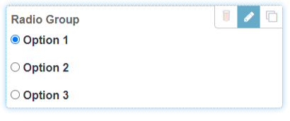
After an element has been added to the form, click the Edit button to configure the element options.

The options available depend on the purpose of the element. While you are editing an element, a panel on the right side of the Console explains the options available for the element.
Values in the fields (for example, if you type something in a text box or select a radio button) are not retained when the form is previewed, saved, or published. To automatically populate a field with data when the form is loaded by the Client, use the Autofill feature.
If you want the form to have a black background, enable the Dark mode option in the top right corner of the Form builder. When a form is published with Dark mode enabled, all devices that load the form will load it in Dark mode.