Dashboard Editor Toolbar
Use the Dashboard Editor toolbar to quickly access common operations for formatting the appearance and behaviors of a dashboard and its widgets.
The toolbar is made up of four smaller toolbars:
- Label toolbar: Displays options for defining widget labels and wrapping.
- Formatting toolbar: Displays options for formatting widget text (font, style, size, and alignment), widget colors/styles (foreground, background, and border), and widget behaviors (visibility, anchoring, and image). Also displays options for accessing dashboard properties, selecting a dashboard background color and accessing editing buttons (Cut/Copy/Paste, Undo/Redo, Grid/Guide snaps, and Zoom).
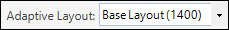
- Adaptive Layout toolbar: Displays options for Adaptive Layouts. Choose the specified layout from the drop-down list or create, edit, or delete an Adaptive Layout.
- Layout toolbar: Displays options for aligning and placing widgets.


Good to know:
- Move a toolbar by double-clicking the Grab bar
 , or by grabbing the Grab bar and then dragging the
toolbar to a new location.
, or by grabbing the Grab bar and then dragging the
toolbar to a new location.
- Re-dock a toolbar to its default location by double-clicking the header banner of an undocked toolbar.
- Hide a toolbar by right-clicking anywhere in the toolbar area, and then clearing the check box for the toolbar.
- Many of the toolbar options are also available from the Dashboard Editor context (right-click) menu.
- See Dashboard Editor Behaviors for tips on working with widgets on dashboards.
Label Toolbar (Label Text, Wrap, Style, and Gloss)
| Button | Action | Description |
|---|---|---|

|
Label Text Box |
Defines the text that appears on the currently selected widget. Type the text into the Text toolbar. Note: This value only affects the primary selected widget.
|

|
Expression |
Conditionally defines the text that appears on the currently selected widget. You can use either:
|

|
Wrap | Toggles text wrap On and Off. |
Formatting Toolbar (Text, Color/Style, and Behaviors)
| Button | Action | Description |
|---|---|---|
| Widget Text | ||
|
Font (classic themes toolbar only) |
There are two different font modes for widget text:
To switch to Theme mode, select Theme Font from the top of the list. To switch to Explicit mode, select a font in the drop-down list. |

|
Font Size (classic themes toolbar only) |
Explicitly sets the widget font size (example: 10 points). Note: This option is available when using explicit font mode
and classic themes only.
|

|
Font selection and style (universal themes toolbar only) |
Opens the Font settings dialog. Associates the dashboard control with the theme font, or an explicit font you select in the Font drop-down list. Additional text formatting selections are available (example: Size, bold, underline and alignment). |

|
Font Style (classic themes toolbar only) |
Adds style to the widget font (bold, underlined, or italics). Note: This option is available only when using Theme Font
mode.
|

|
Font Size (classic themes toolbar only) |
Relatively sets the widget font size to be small, medium, or large. Note: This option is available only when using Theme Font
mode.
|

|
Horizontally Align Text (classic themes toolbar only) |
Aligns text left, center, or right on a horizontal axis within the widget bounding box. Note: Applicable for link, button, and text widgets.
|

|
Vertically Align Text (classic themes toolbar only) |
Aligns text top, middle, or bottom on a vertical axis within the widget bounding box. Note: Applicable for link, button, and text widgets.
|
| Widget Color/Style | ||

|
Background color |
Sets the background color of the widget. Classic theme: Select the button to use the most recently used color (assuming you have set a color). To explicitly apply a color, select the drop-down arrow, and then select a solid color or a gradient. You can use an expression to conditionally change the color. Universal theme: Select the button to open the Color Selector dialog, and then select a color association as defined in your theme color palette. To use a custom color, select (Custom) in the drop-down list, and then select a Web color, or create a Custom color. |

|
Foreground color |
Sets the text color for the widget. Classic theme: Select the button to use the most recently used color (assuming you have set a color). To explicitly apply a color, select the drop-down arrow, and then select a solid color or a gradient. You can use an expression to conditionally change the color. Universal theme: Select the button to open the Color Selector dialog, and then select a color association as defined in your theme color palette. To use a custom color, select (Custom) in the drop-down list, and then select a Web color, or create a Custom color. |

|
Border color |
Sets the color of the border around the widget, if there is a border. Classic theme: Select the button to use the most recently used color (assuming you have set a color). To explicitly apply a color, select the drop-down arrow, and then select a solid color or a gradient. You can use an expression to conditionally change the color. Universal theme: Select the button to open the Color Selector dialog, and then select a color association as defined in your theme color palette. To use a custom color, select (Custom) in the drop-down list, and then select a Web color, or create a Custom color. |

|
Border style |
Sets the style of the border around the widget (No Border, 3D, or Pixel width), if there is a border. Select the button to use the most recently set style (assuming you have set a style). To explicitly apply a style, select the drop-down arrow, and then select a style. Note: While you can select 3D borders for any dashboard
control, rounded shapes do not allow 3D settings.
|
| Style (available from context menu only). | Background style |
Changes the background shape of the widget. Select options such as square, rounded corner, tab and rounded tab. Note: Not all styles are compatible with all types of
widgets.
|
| Glossy (available from context menu only). | Background gloss | Makes a widget background glossy (adds a slightly glowing and reflective background). |
| Widget Behavior | ||

|
Show or hide tab index |
Shows or hides the display of the tab index values for all selected widgets. |

|
Tab stop on or off |
Turns the tab stop on or off for all selected widgets. Select the button to enable tab stops, or clear it when you want to disable tab stops. Note: The tab stop property for all selected widgets changes
based on the state of the primary selected widget. The primary selected widget
is the last one selected when selecting multiple widgets.
|
|
Clear tab stops |
Clears all tab index values from the dashboard. |

|
Tab index order |
Sets the number for the tab order sequence for all selected widgets. Note: The tab index order for all selected widgets changes
based on the order of the primary selected widget. The primary selected widget
is the last one selected when selecting multiple widgets.
|

|
Visibility |
Conditionally controls when the widget appears and disappears. The visibility is based on an expression. Select the button to define a custom expression. Select the drop-down arrow to access options for creating a custom expression, selecting a stored expression, or clearing the expression. |

|
Anchoring |
Sets the anchoring behavior of the widget. Select the button to use the most recently set anchoring options (assuming you have set an option). To explicitly select anchoring options, select the drop-down arrow to open the Anchoring window, and then select your preferred anchoring options (Left, Right, Top and Bottom). You can select multiple options (example: Top and Left). |

|
Image |
Defines the image to display on the widget, as well as alignment. Select the button to open the Image Manager, and then select an image to show on the dashboard control. Select the drop-down arrow to access options for creating a custom expression, selecting a stored expression, clearing the expression, aligning the image, or removing the image (None). |
| Dashboard Properties | ||

|
Dashboard Properties |
Opens the Dashboard Properties window. Change the name, description, title text, Business Object association, scope, image, Display options, Filter options, and Refresh options. |

|
Dashboard Background Color |
Sets the dashboard background color. Classic theme: Select the button to use the most recently used color (assuming you have set a color). To explicitly apply a color, select the drop-down arrow, and then select a solid color or a gradient. You can use an expression to conditionally change the color. Universal theme: Select the button to open the Color Selector dialog, and then select a color association as defined in your theme color palette. To use a custom color, select (Custom) in the drop-down list, and then select a Web color, or create a Custom color. |
| Editing Buttons | ||

|
Cut |
Moves the selected item to the clipboard, and then paste the item into a new location. Note:Ctrl+X also works. Multiple
widgets can be cut at one time. Select multiple widgets by rubber-banding or by
holding down the
Shift key while selecting.
|

|
Copy |
Creates a new item whose properties are the same as the copied item. The new item can then be named and customized. Note:Ctrl+C also works. Multiple
widgets can be copied at one time. Select multiple widgets by clicking and
dragging (rubber-banding) or by holding down the
Shift key while selecting.
|

|
Paste |
Inserts an item from the clipboard to a new location. Note:Ctrl+V also works. Multiple
widgets can be copied at one time. Select multiple widgets by clicking and
dragging (rubber-banding) or by holding down the
Shift key while selecting.
|

|
Undo |
Undoes the last operation. Unlimited per session. |

|
Redo | Repeats the last operation. Unlimited per session. |

|
Snap to Grid | Precisely aligns a widget on a grid. Select the drop-down arrow to define the grid snap width. |

|
Snap to Guide |
Precisely aligns a widget to other items. Note: Select
Shift+Drag to ignore snapping.
|
Adaptive Layout Toolbar
| Button | Action | Description |
|---|---|---|
|
Adaptive Layout Selector | Selects the specific Adaptive Layout being edited. |

|
Edit, Add, or Delete |
|
Layout Toolbar (Alignment, Size, and Order)
For most of the alignment operations, you must select at least two widgets. The last selected widget is the controlling widget, and the widget against which all other selected widgets are sized and aligned. The controlling widget is identified by black boxes around its border when selected. All other selected widgets are identified by white boxes around their borders when selected.
| Button | Action | Description |
|---|---|---|

|
Line up horizontally | Lines up all the selected widgets against the left, center, or right edge of the controlling widget. |

|
Line up vertically | Lines up all the selected widgets against the top, middle, or bottom edge of the controlling widget. |


|
Size width Size height |
Sizes all the selected widgets to be the same width or height as the controlling widget. |

|
Make same size | Sizes all the selected widgets to be the same size (width and height) as the controlling widget. |

|
Auto-size | Sizes a text widget to be exactly the right size to hold all its contained text. Sizes an Image widget to be its original size. |

|
Bring to Front |
Moves a widget in front of other widgets. You can use this if you are creating various layering effects. Note: Not all widgets are allowed to be in front or behind
all other widgets (example: Most shapes cannot be on top of most graphical
widgets, such as charts and gauges).
|

|
Send to Back |
Moves a widget behind other widgets. Use this if creating various layering effects. Note: Not all widgets are allowed to be in front of or behind
all other widgets (example: Most shapes cannot be on top of most graphical
widgets, such as charts and gauges).
|