Define Y-Axes for a Chart Widget
Use the Y-Axes page (accessed from within the Chart Widget Properties window) to define how one or more y-axes look and behave in a Chart Widget. A Chart Widget can have two y-axes:
- Primary Y-axis (Y1): Left side of chart.
- Secondary Y-axis (Y2): Right side of chart. A secondary y-axis can
distinguish the types of mixed data (from different series) being compared
against a common category (x-axis). For example, when comparing two series of
data against a common time period (x-axis), use a primary y-axis for a series
that uses
Number of Incidents as its unit of measure, and a secondary
y-axis for a series that uses an
Average Customer Satisfaction (rating)
as its unit of measure.
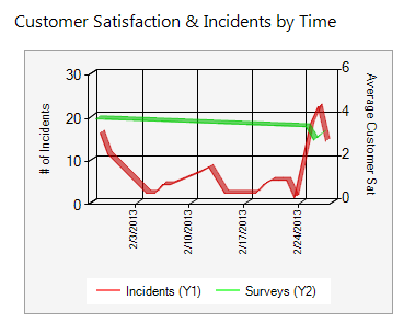
The following figure shows a chart that plots two series of data against a common time period. Two y-axes are used to distinguish the different units of measure (# of Incidents and Average Customer Sat).
Properties for each axis include:
- Label: Text to display on the y-axis.
- Automatic Scaling: Whether to automatically calculate or manually
specify ("fix") the scale values on the y-axis. If you manually specify the
scale values, you must provide a minimum and maximum value.
Note: The Chart Widget Properties window is accessed from within the Widget Manager when you create or edit a Chart Widget.
Good to know:
- A secondary y-axis is optional.
- Scale values on the y-axes can be automatically calculated or "fixed."
- The y-axis values themselves are defined as part of the series (see Define a Series for a Chart Widget).
To define one or more y-axes for a Chart Widget:
- Create a Widget
- In the Type drop-down, select Chart.
- Click the Y-Axes page.
- Define the following properties for your primary and secondary
y-axes:
- Label: Provide the text to display on the y-axis.
- Use automatic scaling: Select this check box to automatically
calculate the scale values on the y-axis. Clear this box to manually define or
"fix" the axis, and then define the fixed minimum and maximum scale values for
the axis.
Note: A fixed scale makes sense when you have a clear idea of your range. For example, if you are showing percentages, and the highest current value is 10%, when automatically scaled, 10% will be the maximum value, and will appear to fill the entire chart, when really you want to see that 10% is only a small fraction of the expected value.
-
Select OK.