Adding a Chart
The Chart for the Dashboard provides visual representation of your data. The example Chart created using this tutorial is a Bar chart that displays Users and Sales totals.
Adding a Chart consists of the following tasks:
■ To Add a Chart Dashboard Part
To Add a Chart Dashboard Part
| 1. | Click and drag the Chart Dashboard Part from the Palette to the upper-left corner on the canvas below the Label. |
Leave enough room between the Label and the Chart. You will need to have enough space to insert a Drop-down List (see To Add a Drop-down List Dashboard Part) later in this tutorial.
| 2. | Use the Arrow keys on the keyboard to move the Chart, or place the cursor on the part and then click and drag the part to refine the location. |
NOTE: You can use the canvas’ grid points to help align the various components on the Canvas.
| 3. | the shape by placing the cursor over any of the resize points around the active Dashboard Part, then click and drag the resize point to the desired size. |
Chart properties must be set after adding the Chart (see To Set the Chart Properties).
To Set the Chart Properties
| 1. | Click the Chart Dashboard Part to select it. |
| 2. | In the Properties pane, make the following changes: |
Property
○ 3D Depth: 20
○ 3D Mode: True
○ Back Color: Control
○ Color Scheme: Solid
○ Colored Values: True
○ Girdlines: None
○ Inside Color: Window
○ Key Axis Title: User Name
○ Stacked: No
○ Title: Closed Sales by Users
○ Value Axis Title: Total Sales
○ View Mode: Bar
Data
○ DataBinding: Closed Sales by Users (see To Bind Data to the Chart)
○ Retain Source Order: True
Format
○ Keys: None
○ Keys Decimals: 0
○ Values: Number
○ Values Decimals: 0
General
○ Name: Closed Sales Chart
Layout
○ Anchors: False, False, False, False
| 3. | Click the View button to preview the Chart. |
| 4. | Click the Design button to return to the Designer. |
| 5. | Make any changes to the size or position of the Chart and preview it again until satisfied. |
To Bind Data to the Chart
| 1. | Click the ellipsis button (...) to the right of the Data Binding field. |
| 2. | Click the Mode tab and select Multiple Series in Multiple Columns. |
| 3. | Click the Details tab and set the following: |
○ Data source category: Closed sales
○ Data source: Closed Sales by Users
○ Data are summarized by: USERID
○ Summarized values: Amount
| 4. | Click OK to set the Chart Data Binding. |
To Create a Stacked Chart
A typical chart is defined by X and Y coordinates (Key and Values) as defined in the Action![]() The Automated Process action is the activity performed when triggered.’s Properties (see Viewing the Events and Actions Dialog Box). You can also create a “stacked” chart, like the one located on the Closed sales tab on predefined Lead Dashboard. A “stacked” chart is one that uses the Series field, which is defined on the Action’s properties for a Drill down Action.
The Automated Process action is the activity performed when triggered.’s Properties (see Viewing the Events and Actions Dialog Box). You can also create a “stacked” chart, like the one located on the Closed sales tab on predefined Lead Dashboard. A “stacked” chart is one that uses the Series field, which is defined on the Action’s properties for a Drill down Action.
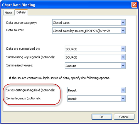
When you want to create a “stacked” chart you must set options on the Action’s Properties and Chart Data Binding Properties dialog boxes.
Action’s Properties

■ On the Action’s properties dialog box:
○ Select any Action from the drop-down list that contains the options to set the Runtime Parameter(s).
- Refresh a dashboard part based on user selection
- Set runtime parameter for a dashboard part without refreshing
- Drill Down
○ In the Runtime Parameter area, select the Runtime (from part) option.
○ Select Series from the Field from drop-down list (right-click the dashboard part, select Event![]() Step-by-step instructions contained in an Automated Process, or track, that GoldMine must evaluate to perform a specified series of activities. An event consists of a trigger and an action. An Automated Process consists of a sequence of one or more events. to add/edit the action.
Step-by-step instructions contained in an Automated Process, or track, that GoldMine must evaluate to perform a specified series of activities. An event consists of a trigger and an action. An Automated Process consists of a sequence of one or more events. to add/edit the action.
Chart Data Binding Properties

■ On the Chart Data Binding dialog box, click the Details tab:
○ Set the Series distinguishing (optional) field as Result.
○ Set the Series legends (optional) field as Result.
