You use the Dashboard Center to create, modify, and delete dashboards.
1.
From the Configuration Console, click Build > Charts and Graphs > Dashboards to open the Dashboards workspace. The system displays a list of dashboards.
2.
Click New Dashboard. The system displays the Dashboard Center.
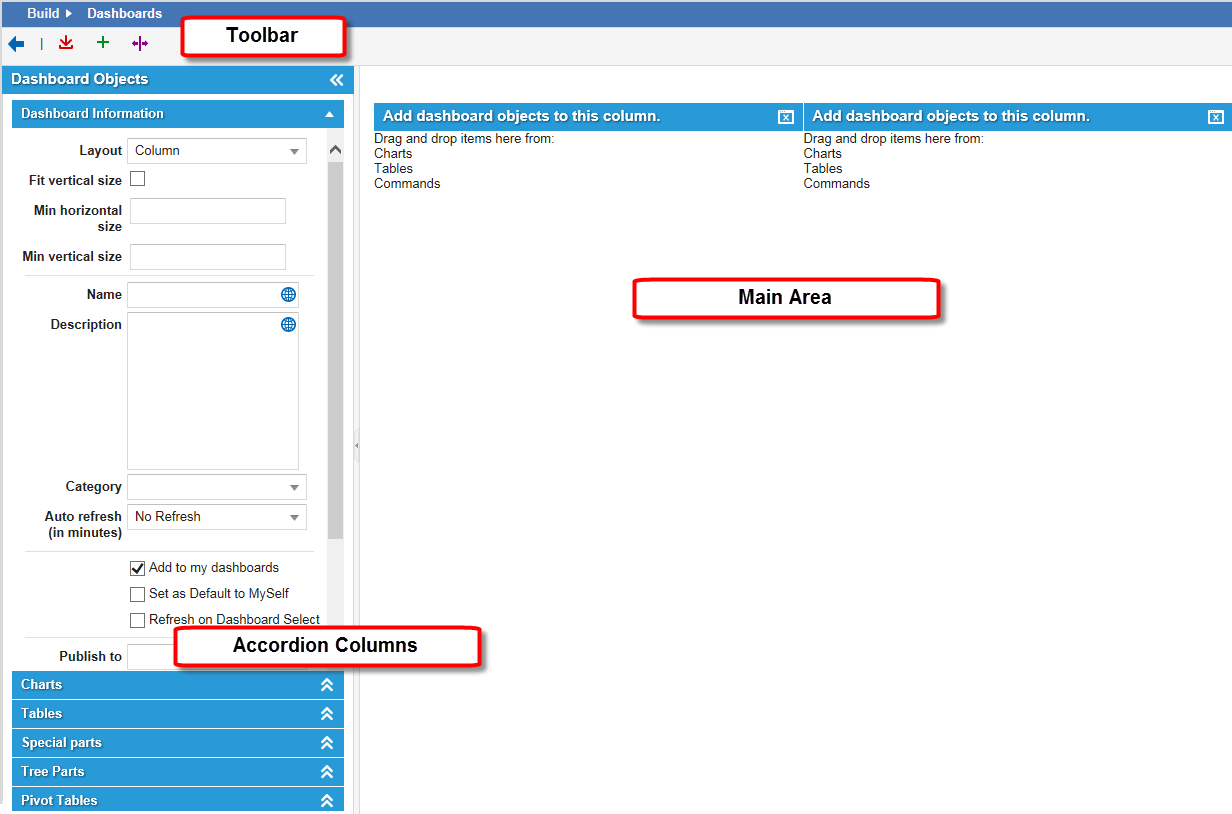
Parts of the Dashboard Center
The Dashboard Center contains the following parts:
■
A toolbar (at the top of the page) for saving the dashboard and for customizing the layout of dashboard parts.
■
Accordion style columns (on the left side) for creating and editing your dashboard and dashboard parts.
■
A workspace (in the main area of the window) for previewing dashboards before saving them to your home tab.
Dashboard Center
Dashboard Buttons
■
To refresh a dashboard part, click the refresh icon .
■
To export the information from a dashboard part to a Microsoft Excel spreadsheet, click the Export to Excel icon .
You can only export to Microsoft Excel from a table dashboard part.
■
To maximize a dashboard part, click the maximize icon .
■
To minimize a dashboard part that is maximized, click the minimize icon . If you click this icon when it is not maximized, it removes the dashboard part.
■
To edit a dashboard part, click the edit icon .
Using Saved Search Parts
Saved searches create a search list table on the dashboard. You can add a saved search from the list of previously created saved searches. See Using Saved Searches on how to create a saved search.
1.
From the Configuration Console, click Build > Charts and Graphs > Dashboards to open the Dashboards workspace. The system displays a list of dashboards.
2.
Click New Dashboard. The system displays the Dashboard Center.
3.
From the Dashboard Center accordion columns, click Tables. The system displays a list of defined tables.
4.
From the bottom of the Tables list, click the Add dashboard item icon. The system displays the Create New Table Dashboard Part dialog box.
5.
Enter information into the fields.
Field
Description
Name
A unique name for the dashboard part. This appears in the title bar of the part.
Description
Optional. A description about how this part is used. These details do not appear on the part and are merely used for reference.
Object
The business object that this saved search runs against.
Saved Search
The saved search gathers the information that populates the table. Available saved searches depend upon the business object you select.
List
The dashboard or list that this saved search appears in.
For example, to have the Saved Search table appear on the Incident dashboard, select HomepageIncident.
Open record in parent object, if possible
Specifies if the saved search opens in the parent business object.
6.
Click Preview to run the search and see how the results appear. You might need to click the Refresh button within the preview toolbar to view actual data.
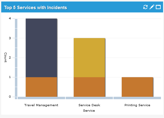
Use the chart dashboard part to graphically show data about your system. After you create a chart, you can drag and drop it onto the main workspace area.
You can choose from many chart types, such a pie charts, vertical or horizontal bar charts, line charts, and pivot tables. You can also stack bar charts and group bar and line charts.
The system automatically resizes charts to fit in the space allotted on screen. Charts that contain a lot of data points might be harder to read if they are placed in a small area. You can maximize a chart to see more detail.
HTML charts do not render correctly if the data contains many items. For example, the Summary field of the Incident business object is a text field that contains unique data for each record. If you attempt to group by this field, every record appears in the bar item and does not render in HTML.
Chart Parts
About Derived Data
You can hover over parts of a chart to see derived data.
Derived Data
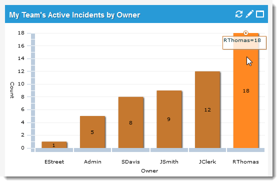
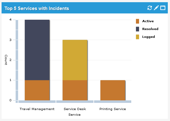
About Dashboard Legends
Chart dashboard parts contain legends that you can toggle to show or hide it. When the legend is visible, the system shrinks the chart to accommodate the legend.
A Chart with a Visible Legend
A Chart with the Legend Toggled Off
Toggling the Chart Legend
From the chart toolbar, click the toggle legend icon .
Adding a Chart Part
1.
From the Configuration Console, click Build > Charts and Graphs > Dashboards to open the Dashboards workspace. The system displays a list of dashboards.
2.
Click New Dashboard. The system displays the Dashboard Center.
3.
From the Dashboard Center accordion columns, click Charts. The system displays a list of defined chart parts.
4.
From the bottom of the chart list, click the add chart icon . The system displays the Ivanti Service Manager Chart Wizard.
5.
Enter information into the fields.
From the "Standard" Tab
Field
Description
Chart Title
A unique name for the dashboard part. This appears in the title bar of the part.
Type
The type of chart to display. The following types are available:
■
Horizontal Bar
■
Vertical Bar
■
Line
■
Pie
■
Pivot Table
■
(Grouped) Stacked Horizontal Bar
■
(Grouped) Stacked Vertical Bar
■
Grouped Horizontal Bar
■
Grouped Vertical Bar
■
Grouped Line
Object
The business object for which this chart is created.
Header
The chart title.
Footer
A footnote for the chart.
Data Labels
Pie charts only. Check to show labels. Uncheck to show percentages.
Show Legend
Check to enable.
Shows the legend of values.
Aggregate by
The aggregator.
Select count, sum, or average. The default is count.
Group By
The field by which to group the dashboard parts.
Order By
Specifies whether the chart displays its data by the Aggregate By field or by the Group By field. The default is Aggregate by.
Select if the data should display in ascending (lowest to highest) or descending (highest to lowest) order. The default is ascending.
Results
The number of items to display: all, top, or bottom.
If you select top or bottom, select a number, which means that the system displays the top or bottom <selected number> of matches.
Then Group By
(For all chart types starting with grouped.) The second group to order the results by.
Order
(For all chart types starting with grouped.) Specifies if the results are ascending or descending.
Axis Scale
The axis scale. Select Linear or Logarithmic.
From the "Drill-downs" Tab
You can create a maximum of three drill downs, which means that you can double-click the dashboard part and filter the search results to open the parent business object from the specified business object. You specify the drill-down values the same way that you set the fields on the Standard tab.
The Drill-downs tab is not enabled for pivot tables. HTML5 charts do not support drill down when labels contain special characters, such as ".
■
Click the add icon to add more drill-down fields.
From the "Advanced" Tab
■
Filter Using Saved Search: Select an existing saved search to filter the data that is shown.
■
Runtime Filters: Select a business object to filter your search against.
6.
Click Save.
7.
To use a chart, drag it onto the main dashboard window.
Using Table Parts
You can add tables to dashboards, showing lists of business objects with selected information.
1.
From the Configuration Console, click Build > Charts and Graphs > Dashboards to open the Dashboards workspace. The system displays a list of dashboards.
2.
Click New Dashboard. The system displays the Dashboard Center.
3.
From the Dashboard Center accordion columns, click Tables. The system displays a list of defined table parts.
4.
To filter the list, select a business object from the drop-down list. The system only displays those tables associated with the business object.
5.
From the bottom of the chart list, click the add dashboard item icon . The system displays the Create New Table Dashboard Part dialog box.
Create a New Table Dashboard Part
6.
Enter information into the fields.
Field
Description
Name
A unique name for the table.
Description
Optional. A description about how this part is used. These details do not appear on the part and are merely used for reference.
Object
The business object from which the data is derived. Select from the drop-down list.
Saved Search
The saved search gathers the infomation that populates the table. Available saved searches depend upon the business object you select.
List
The list type. The values vary depending on the business object that you select. Select from the drop-down list.
Open record in parent object, if possible
Opens the record from the list in the parent business object if possible.
7.
Click Save. The system displays the new table in the Tables list.
8.
To use the new table, drag it onto the main dashboard window.
After your table is created, there are many ways to manage the data reported in its list. See Using Lists
Special dashboard parts, with the exception of report list and variance reports, appear on the Self-Service Portal. The Self-Service Portal is already configured to show these special parts. You can edit these parts using the available parameters, add icons, and change the text of the links or button, if the option is enabled.
Dashboard Special Parts
Creating a Special Part
1.
From the Configuration Console, click Build > Charts and Graphs > Dashboards to open the Dashboards workspace. The system displays a list of dashboards.
2.
Click New Dashboard. The system displays the Dashboard Center.
3.
From the Dashboard Center accordion columns, select Special parts. The system displays a list of defined special parts.
4.
At the bottom of the list, click one of the following:
Add My Items/Report List/Variance Report/Display URL
Adding My Items, Report Lists, Variance Reports, and Display URLs
1.
From the Configuration Console, click Build > Charts and Graphs > Dashboards to open the Dashboards workspace. The system displays a list of dashboards.
2.
Click New Dashboard. The system displays the Dashboard Center.
3.
From the Dashboard Center accordion columns, select Special parts. The system displays a list of defined special parts.
4.
Click the Add My Items/Report List/Variance Report/Display URL icon . The system displays the Create New Command Link List Dashboard Part dialog box.
5.
Enter information into the fields:
Field
Description
Name
A unique name for the dashboard part. This appears in the title bar of the part.
Description
Optional. A description about how this part is used. These details do not appear on the part and are merely used for reference..
Dashboard parts
Choose an option from the drop-down list.
■
My Items
■
Variance List
■
Display URL
■
Report List
The system displays the default parameters for this part in the Parameters field.
Parameters
The parameters associated with the dashboard part. You can edit the default parameters.
For example, when you choose Top 5 Questions from the dashboard parts menu, the parameter is {count:5}. To show more than five top questions, replace the 5 with another number.
To make the My Items list show only the open items (meaning it does not show incidents in the closed status, service requests in the fulfilled status, and approvals that have been dealt with), enter {ignoreStatus: ['closed', 'fulfilled', 'approved', 'denied']}. The items with these statuses do not appear in the My Items list. To make all items appear, enter {ignoreStatus: ['']}.
Top Icon
The icon to appear next to the dashboard part name.
Select from the list.
Button Text
The button text. If this field is disabled, this option is not available for the selected dashboard part.
Link Text
The link data. If this field is disabled, this option is not available for the selected dashboard part.
Commandlist Icon
Select an image from the list.
The icon you select appears next to each of the items in the list.
6.
Click Save.
Adding a List
1.
From the Configuration Console, click Build > Charts and Graphs > Dashboards to open the Dashboards workspace. The system displays a list of dashboards.
2.
Click New Dashboard. The system displays the Dashboard Center.
3.
From the Dashboard Center accordion columns, select Special parts. The system displays a list of defined special parts.
4.
Click the add list icon. The system displays the Dashboard List editor dialog box.
5.
Enter information under each tab.
From the "Main" Tab
Field
Description
Title
A unique name for the dashboard part. This appears in the title bar of the part.
Description
Optional. A description about how this part is used. These details do not appear on the part and are merely used for reference.
Title icon
The title icon. Choose from the drop-down list.
Part frame
The color of the outline of the dashboard part. Choose from the drop-down list.
Enable Refresh button
Displays the Refresh button. Users can click this to refresh the dashboard part.
Header button
Adds a button to the header. Users click this button to perform an action. If you check this option, the system displays the Command button editor dialog box. See Using the Dashboard Center for information about the fields.
From the "Data" Tab
Field
Description
Business Object
The business object to use for this list. Select from the drop-down list.
Saved Search
The saved search gathers the information that populates the list. Available saved searches depend upon the business object you select.
List
The list to use. Select from the drop-down list. The list is based on the chosen business object.
Sort Column
The default sort column. Select from the drop-down list.
Sort Direction
The default direction for the sort column. Select either Ascending or Descending.
From the "Toolbar" Tab
You can configure the toolbar from the Toolbar tab.
Toolbar Tab
■
Click Create New to create a new button. The system displays the Command button editor dialog box.
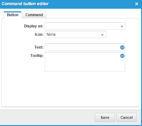
Command Button Editor Dialog Box
■
Drag a button from the list to one of the areas.
■
Double click a button to edit its properties.
■
Drag a button to the trash can to delete it.
From the "Button" Tab of the Command Button Editor
Set the following:
Field
Description
Display as
Specifies if the header contains an icon, text, or both.
Icon
If you select either Icon or Icon and Text in Display as. Choose an icon from the drop-down list to display in the toolbar.
Text
If you select either Text or Icon and Textin Display as. Enter the text to appear in the toolbar.
Tooltip
Optional text that displays when the mouse pointer is on the toolbar.
From the "Command" Tab of the Command Button Editor
Field
Description
Command
The command to execute when the user clicks the toolbar icon.
Ask for confirmation
Asks for confirmation before executing the command.
■
Select or enter other command-specific parameters, depending on the command you selected.
From the "List Configuration" Tab
List Style
Choose a style option:
■
Normal: The default list style.
■
Small transparent: The list appears in a smaller frame and is partially transparent.
Odd background color
A color for the odd-numbered rows. Choose None to use the default list settings.
Even background color
A color for the even-numbered rows. Choose None to use the default list settings.
Row Action
The action to open a record from the list. Can be either single click or double click.
Edit command
Used to edit commands. Displays the Command Editor/Designer dialog box.
1.
In the Command field, select a command from the drop-down list. See Edit Command Actions.
2.
Check Ask for confirmation to ask for confirmation.
3.
If you check this option, enter the confirmation message in the following field.
4.
In the Opened workspace Id field, select the workspace to open.
5.
Click Save.
Column options
Allow reorder
Allows you to change the order of the list columns.
Allow sorting
Allows you to sort the columns.
The field list at the bottom of the dialog box lists the fields for the chosen business object. For each field in the bottom half of the dialog box, from the drop-down list, select how the field appears in the list:
■
As link: Users can click the field value to perform an action. See Edit Command Actions for more information.
■
As text: The system displays the field value as text.
■
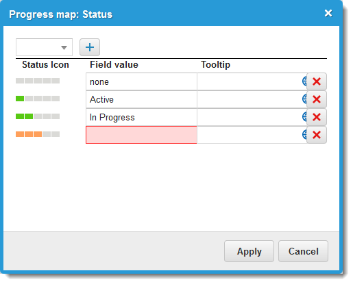
Progress Indicator: The field shows a progress bar, based on the record status. Click Progress Map to assign the indicators to use for each value of the field.
Progress Map
Within the progress map, select an icon from the drop-down list and click the add icon. The system displays a new line. Enter a value in the Field value field and optionally, enter a tooltip in the Tooltip field. Continue to add more icons. After you have added all the icons for the progress map, click Apply.
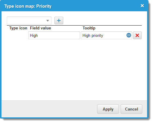
■
Type Icon: Click Type Icon Map to select the icon type.
Type Icon Map
Edit Command Actions
■
Close tab
■
Current tab - Run report
■
Home - Run report
■
Knowledge - Open Knowledge Search
■
Knowledge - Show Knowledge Base Article
■
Logout Current User
■
My Items - Action
■
My Items - Create New
■
My Items - New issue
■
My Items - Open
■
My Items - Search
■
My Items - Show all
■
My Items - Show record
■
My Items - Show request
■
Object Workspace - Load record
■
Object Workspace - Show all records of type
■
Object Workspace - Show record
■
Object Workspace - Show record of type
■
Object Workspace - State
■
Open custom tab with custom URL
■
Open link field
■
Open new window
■
Open workspace by object ID
■
Reload tab
■
Reload the page
■
Service Catalog - New external request
■
Service Catalog - New service request
■
Service Catalog - New service request by offering ID
■
Service Catalog - Search offering
■
Service Catalog - Show all service catalog
■
Service Catalog - Show category
1.
Click Preview to view the data.
2.
Click Save.
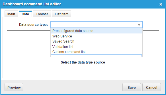
Adding a Command List
1.
From the Configuration Console, click Build > Charts and Graphs > Dashboards to open the Dashboards workspace. The system displays a list of dashboards.
2.
Click New Dashboard. The system displays the Dashboard Center.
3.
From the Dashboard Center accordion columns, select Special parts. The system displays a list of defined special parts.
4.
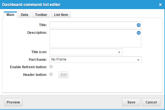
Click the add command list icon. The system displays the Dashboard command list editor dialog box.
Formats the content and appearance of list items. The system disables this tab if you select Custom command list from the Data source type field under the Data tab.
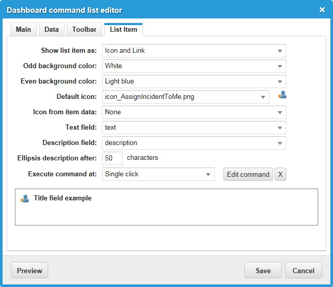
List Item Tab
Field
Description
Show list item as
Select how each list item is formatted:
■
Link: Each list item is a link formatted as a single line of text.
■
Icon and Link: Each list item is a link formatted as a single line of text with an icon at the beginning of the line.
■
Icon and Link and Description: Each list item is a link formatted with a selectable title on one line and a description on a second line.
Odd background color
The background color for odd-numbered list items.
Even background color
The background color for even-numbered list items.
Default icon
The icon to display to the left of every list item.
Icon from item data
Displays this icon to the left of every list item.
NOTE: This feature is not yet fully implemented.
Text field
The text to display as a link.
Description field
The text to display as a description.
Ellipsis description after
Specifies the maximum number of characters each list item can contain. Values can range from 50 to 3000 characters.
Execute command at
Specifies whether the link requires a single- or double-click to execute.
The Tree Parts dashboard part presents data in a hierarchical (tree) structure. A tree consists of nodes. The topmost node is the root. The node under the root is called a parent. The node under the parent is called the child. A parent can have only one child node. The root node does not have a parent.
From a node, you can click to go directly to the record if there is an available workspace for the record. For example, you can click a computer name on the tree and open the configuration item record for that computer.
Creating a Tree Part
1.
From the Configuration Console, click Build > Charts and Graphs > Dashboards to open the Dashboards workspace. The system displays a list of dashboards.
2.
Click New Dashboard. The system displays the Dashboard Center.
3.
From the Dashboard Center accordion columns, click Tree Parts. The system displays a list of defined tree parts.
4.
From the bottom of the list, click the add dashboard item icon. The system displays the Tree Designer dialog box.
5.
Enter information into the fields.
Field
Description
Tree Title
A unique name for the dashboard part. This appears in the title bar of the part.
Show Node Name
Specifies if name of the node appears in the tree.
6.
Create a parent node. Highlight Root, then from the Tree Actions drop-down list, select Add Node. The system enables the fields in the Node Properties section.
7.
Enter information into the node fields:
Field
Description
Node Name
A descriptive name.
Object
A business object.
Field
A field from the business object that you selected.
Object Icon
The icon that appears next to the node.
8.
Enter data into other fields if they appear in the workspace area.
9.
Click Update. Your node now appears on the tree under the root node.
10.
Create a child node. Right-click the node you just created and select Add Node. The system displays blank node properties fields.
11.
Enter information into the node fields.
Field
Description
Node Name
A descriptive name.
Object
The corresponding business object from the menu.
Field
A field from the business object that you selected.
Object Icon
The icon that appears next to the node.
12.
Click Update. The system now displays the node on the tree under the previous node.
13.
Continue adding child nodes.
14.
From the Tree Actions drop-down list, click Preview tree to view the tree results in the far right area.
You can set up a filter for the parent node or for each child node. You can set up filters either while you are designing the tree or after you are done.
1.
From the Configuration Console, click Build > Charts and Graphs > Dashboards to open the Dashboards workspace. The system displays a list of dashboards.
2.
Click New Dashboard. The system displays the Dashboard Center.
3.
From the Dashboard Center accordion columns, click Tree Parts. The system displays a list of defined tree parts.
4.
Click the edit icon next to the tree part to create a filter for. The system displays the Tree Designer dialog box.
5.
Highlight and then right-click a node and select Edit Node from the pop-up menu. The system enables the node fields.
6.
Enter criteria in the filter fields. Click the add icon to add filter criteria. You can add as many criteria as you want.
7.
Click Update.
8.
Click Save.
Deleting a Filter from a Tree Part
1.
From the Configuration Console, click Build > Charts and Graphs > Dashboards to open the Dashboards workspace. The system displays a list of dashboards.
2.
Click New Dashboard. The system displays the Dashboard Center.
3.
From the Dashboard Center accordion columns, click Tree Parts. The system displays a list of defined tree parts.
4.
Click the edit icon next to the tree part to create a filter for. The system displays the Tree Designer dialog box.
5.
Highlight and then right-click a node and select Edit Node from the pop-up menu. The system enables the node fields.
6.
Click the delete icon next to the filter to delete.
7.
Click Update.
8.
Click Save.
You might need to add a filter line before you can delete a filter. You cannot have zero filter lines on the workspace, but you can have a filter line with no information.
Modifying a Tree Part
You can change any part of a tree, including the title and any of the nodes.
1.
From the Configuration Console, click Build > Charts and Graphs > Dashboards to open the Dashboards workspace. The system displays a list of dashboards.
2.
Click New Dashboard. The system displays the Dashboard Center.
3.
From the Dashboard Center accordion columns, click Tree Parts. The system displays a list of defined tree parts.
4.
Click the edit icon next to the tree part to modify. The system displays the Ivanti Service Manager Tree Designer.
5.
Enter changes into the fields as needed.
6.
Click Save.
Deleting a Tree Part
You can remove a tree part from the Tree Parts list.
1.
From the Configuration Console, click Build > Charts and Graphs > Dashboards to open the Dashboards workspace. The system displays a list of dashboards.
2.
Click New Dashboard. The system displays the Dashboard Center.
3.
From the Dashboard Center accordion columns, click Tree Parts. The system displays a list of defined tree parts.
4.
Select a tree part from the list, then from the bottom of the list, click the delete icon. The system displays the Delete dashboard part confirmation window.
Pivot tables display complex data in tabular form. Most tasks can be shown using a simple pivot table. You can show data from multiple data sets by using a hybrid pivot table. You can also filter data when designing a pivot table to limit the results that users can see.
Creating a Pivot Table
1.
From the Configuration Console, click Build > Charts and Graphs > Dashboards to open the Dashboards workspace. The system displays a list of dashboards.
2.
Click New Dashboard. The system displays the Dashboard Center.
3.
From the Dashboard Center accordion columns, click Pivot Tables. The system displays a list of defined pivot tables.
4.
From the bottom of the list, click the add dashboard item icon . The system displays the Pivot Table Wizard dialog box.
5.
Enter information into the fields.
Field
Description
Title
A unique name for the pivot table. This appears in the title bar of the part.
Object
The business object to view data for.
Templates
Templates for creating the pivot table. The first three buttons are for creating simple pivot tables. The button on the right is for a hybrid pivot table. The template buttons provide the following options:
■
Single-column table
■
Two-column table
■
Three-column table
■
Enables you to add up to two more columns.
Aggregate by
Data aggregation method. Choose from the drop-down list: Count, Sum, Average, Minimum, Maximum, or Percentage.
Measure
Business object being aggregated. Choose from the drop-down list. Available choices depend on the type of aggregation.
Left Axis 1
Business object selected as the heading of the left column of a two- or three-column table.
Left Axis 2
Business object selected as the heading of the middle column of a three-column table.
Top Axis 1
Business object selected as the heading of the table of a single-column table; or the heading of the right column multi-column table.
6.
If you selected a hybrid table for the template, click the add new column icon to add data sets. You can have a maximum of three data sets. Enter information into the Field Title, Top Axis, Aggregate by, and Measure fields for each column.
7.
Click Refresh to preview the results.
8.
Click Save.
Filtering the Data in Pivot Tables
You can set filters to allow users to view only a subset of the data. For example, if you are creating a pivot table showing incident priority by owners and you only want to show those incidents worked on by specific owners, you can set up a filter such as Incident# Owner in list select_owner_names.
However, when you apply the filter, you do not see the incidents by owner name. Only those incidents that are worked on by the selected owners appear.
1.
From the Configuration Console, click Build > Charts and Graphs > Dashboards to open the Dashboards workspace. The system displays a list of dashboards.
2.
Click New Dashboard. The system displays the Dashboard Center.
3.
From the Dashboard Center accordion columns, click Pivot Tables. The system displays a list of defined pivot tables.
4.
From the bottom of the list, click the add dashboard item icon . The system displays the Pivot Table Wizard dialog box.
5.
Click the Filters tab.
6.
Within each field, choose the criteria for the data. The fields are different depending on which business object the pivot table is based on.
 .
.  .
.  .
. . If you click this icon when it is not maximized, it removes the dashboard part.
 .
. icon. The system displays the Create New Table Dashboard Part dialog box.
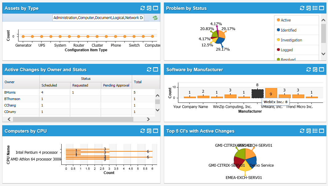
 .
.  . The system displays the Ivanti Service Manager Chart Wizard.
  icon to add more drill-down fields.
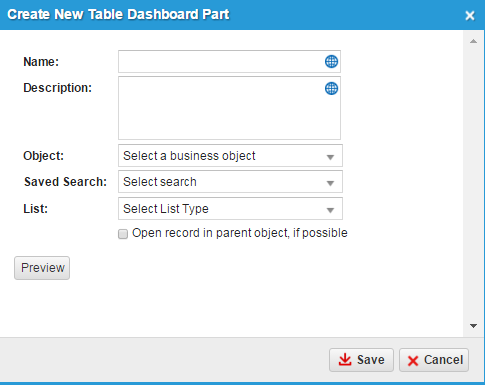


 icon. The system displays the Dashboard List editor dialog box.
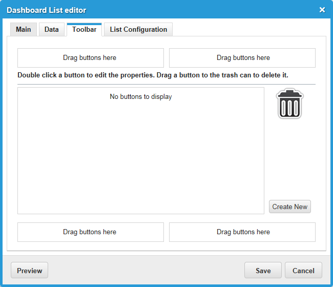
 to the left of every list item.
 icon. The system displays the Tree Designer dialog box.
 icon next to the tree part to create a filter for. The system displays the Tree Designer dialog box.
 next to the filter to delete.
  icon. The system displays the Delete dashboard part confirmation window.