Service Manager
This is the latest version of the help for Ivanti Service Manager 2018. If you cannot find some of the features described in the help, you may be using an older version of the application. To upgrade the application, click here.To view the help for the latest version of Service Manager, click here
Using Forms
•Adding Fields with Multiple Choices (Radio Buttons)
•Customizing a Form with Images
•Using Expressions as Filters on a Form
•About the "Other" Form Controls
•Adding Related Business Object Lists to a Form
•About the Tab Order on a Form
About Forms
A form is a graphical view of record and field information. On a form, each field is represented by a field control and often a label. Forms can also have other components, such as images, to enhance their usability.
Forms are used to collect object data for storage and retrieval for use in dashboards, layouts, and reports.
Service Manager includes several default forms designed for common business needs. You can use these forms (including editing and deleting), or create your own using the Form Editor.
You can define a style for the overall form when creating or modifying a form. Styles applied to specific controls in the form supersede styles applied to the entire form.
Viewing a List of Forms
Forms are found within each business object, under the Forms tab.
1.From the Configuration Console, click Build > Business Objects to open the Business Objects workspace.
2.Open a business object.
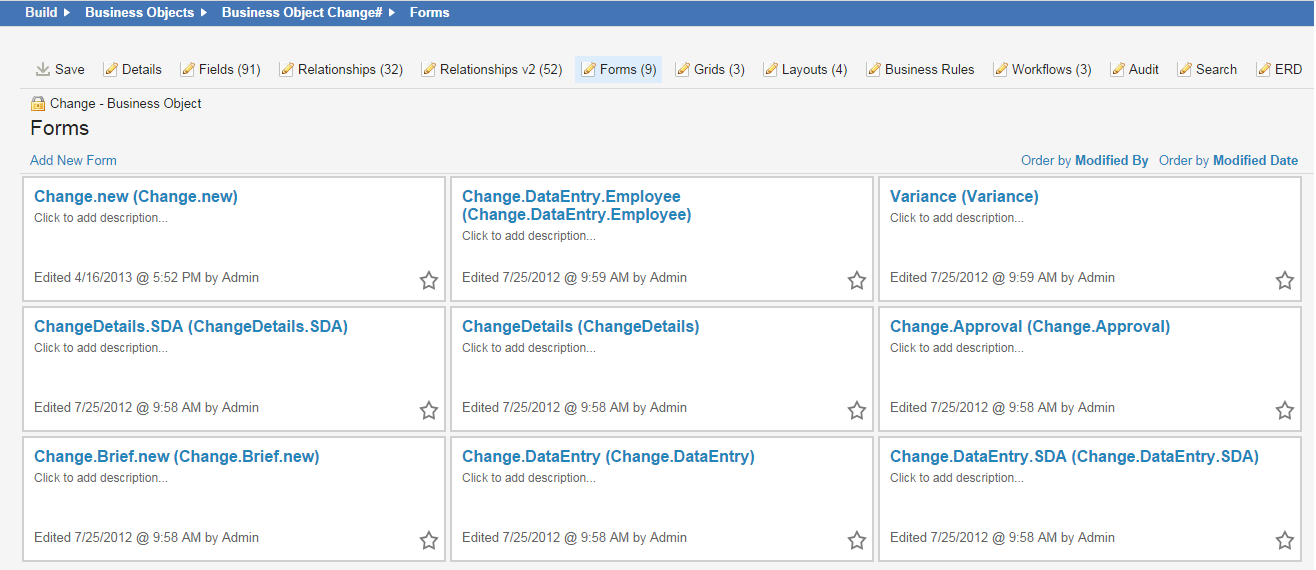
3.Select the Forms tab. A list of forms for that business object appear. For example, the Change business object has the following forms:
Forms for the Change Business Object
Creating a Form
Forms are created within the Form Editor. You create a form associated with a business object, which in turn is used within a layout for users to view.
Notes for designing forms
While you can add more than one component to a form table cell, it can have an adverse effect on your form display. Adding elements causes the width and height of adjacent cell to increase.
Columns expand to the width of their largest field name or control.
1.From the Configuration Console, click Build > Business Objects to open the Business Objects workspace.
2.Open a business object.
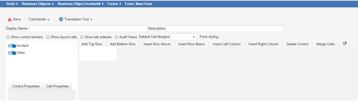
3.Click Add New Form. The system shows a blank form with a single cell.
Blank Form
4.Enter information into the fields. These options apply to the entire form, not individual components.
| Field | Description |
|---|---|
| Display Name | A unique name for this form |
| Description | A brief description of what the form is used for. |
|
Show control borders |
Shows the boundaries of the controls you insert. |
|
Show layout cells |
Shows the outline of each cell in a list format. |
| Show tab indexes | Shows the tab indexes. |
| Audit Views | Logs each time the form is viewed. |
| Default Cell Margins | The number of pixels for each cell to have. The order is top, right, bottom, left, or click the down arrow to enter the values in the diagram. |
5.To apply a style to the form, click Form styling..., enter values from the pop-up window, then click Save.
Styles defined here are superseded by styles defined in individual controls. See also Example: Using the SelectorFormat Property to Change a Style on Hover
| Field | Description |
|---|---|
| Form Style | The style used for the overall form. Choose a style from the drop-down list. See Using Highlighter Styles. |
| Label Style | The style used for the labels in the form. |
| Control Style | The style used for the controls in the form. |
6.Drag a field, relationship, or other control onto the form. You can drop the component when you see the green check mark.
•Fields: Includes all fields defined for this business object. For example, the Urgency field has been added to an incident form called Incident.DataEntry. The system stores a value entered in the Urgency field on the Incident.DataEntry form in the incident business object.
•Relationships: You can add a field from a business object relationship provided the relationship is one-to-one or many-to-one. This includes all business objects linked with this business object through defined relationships. For example, the IncidentDetails form includes a Customer Name field allowing you to search through the display names returned from the Employee business object. When you select a name, the system automatically populates the rest of the customer information.
•Other: Includes controls and graphical elements. For example, the Incident.Brief form includes a pair of lists displaying recently updated tasks and recent activities. See About the "Other" Form Controls.
Available fields and components are derived from the business object associated with the form.
•Drop in the blue area to place the component next to an existing component in the same cell.
•Drop below the blue area to place the component in a new row below the existing cell.
•Drop to the right of the blue area to place the component in a new column next to the existing cell.
•To remove a control, select the component and press Delete on your keyboard.
7.Adjust individual cell properties from the Cell Properties tab. These properties pertain to the entire cell, no matter how many components are in the cell and no matter what properties each control has defined.
Cell Properties Tab
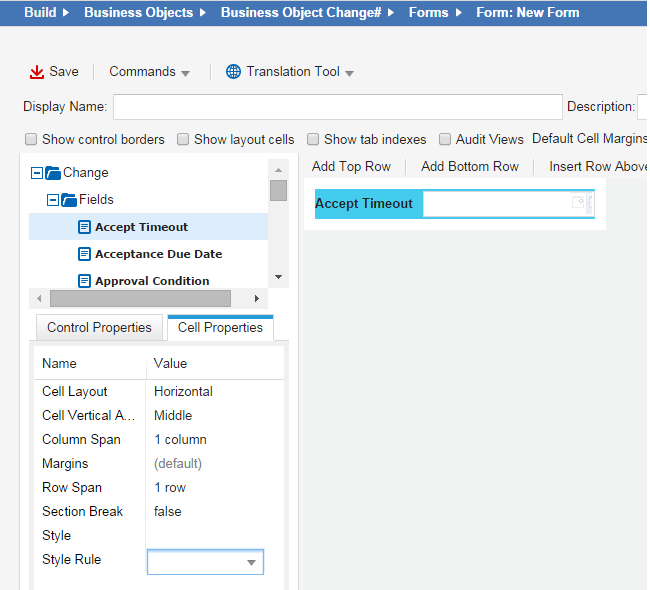
| Property | Description |
|---|---|
| Cell Layout |
How the cell is laid out: Horizontal: Pads left and right cell borders. Vertical: Pads top and bottom of cell. |
| Cell Vertical Alignment | How the contents align in the cell. |
| Column Span | By default, each column is only one column wide. However, you can define a cell to span across multiple columns. This is useful when designing forms with merged cells. Enter the number value here. |
| Margins | Overrides the default margins for the form. Enter the number of pixels for each cell to have. The order is top, right, bottom, left, or click the down arrow to enter the values in the diagram. |
| Row Span | By default, each row is only one row high. However, you can define a cell to span down multiple rows. Enter the number value here. |
| Section Break | Makes this cell a section break. |
| Style |
Defines a style. |
| Style Rule | Applies an expression to this style. You can define what existing style (bold, header, etc.) to apply to a control based on a condition. See Example: Showing Fields in Different Colors Based on Value for an example on how this could work. |
8.Edit the properties of the component using the Control Properties tab in the left panel. The control properties listed depend on the component you are working with. The properties are listed in alphabetical order.
| Property | Description |
|---|---|
|
Control Type |
The type of control depends on the component: Attachments Cancel Button Check Box Color bar indicator Image Label List Link Field Object Matching Control Read-only Text Field Related Objects List Text Field UI Command Button URL Button |
|
Custom Mask |
Custom masks are useful for fields requiring a specific value format, such as a phone number, percentage value or serial number. This control becomes available if you select Custom from the Edit Mask field. Enter a custom expression using the following characters: U: Upper-case characters only. A: Alphanumeric characters only. l: Lower-case characters only. 9: Numeric characters only. For example, an ISSN (International Standard Serial Number, a unique eight-digit number used to identify a print or electronic periodical publication) is formatted as an eight-digit number, separated by a hyphen into two four-digit numbers. By using a custom mask of 9999-9999, the required format is displayed, and invalid characters cannot be entered. This type of edit mask permits entering less than the required number of characters as placeholders. For example, you can enter five or less digits as characters for a custom mask of 999.99. |
|
Disable Uploading |
The default upload state for the uploader control. |
| Editable | Specifies if you can edit the control. |
|
Edit Mask |
Specifies an expression that forces the user to enter a specific character set: Custom mask: A custom mask. IP Address: 999.999.999.999 MAC Address: AAAAAAAAAAAA None: No mask US Phone: (999)999-9999 Zip Code: AAAAA When using an edit mask, a placeholder is displayed in the form for each character in the expression. Using an edit mask also prevents the entry of invalid characters. |
|
Extension Field |
The extension of the file to upload to the Knowledge Base. |
|
Field Name |
Contains the name of the associated business object field. |
|
File Name Field |
The name of the file to upload to the Knowledge Base. |
|
Height |
The control height in ems. |
|
Label |
The text to appear on the field or control label. |
|
Label Expression |
An expression to apply to this label, if needed. For example, on the KnowledgeSelfService form, the following expression has been added to the Details cells: $(("Article ID: " + KnowledgeNumber)). This adds the label Article ID to the label and the Knowledge Base number assigned to this record. |
|
Label Pos |
The label position. Select from the drop-down list. |
| Label Style Rule |
An expression to apply to this label, if needed. For example, on the KnowledgeSelfService form, the following expression has been added to the Details cells: $(("Article ID: " + KnowledgeNumber)). This adds the label Article ID to the label and the Knowledge Base number assigned to this record. |
|
List Name |
The name of the embedded list to display in the form. |
|
List Relation |
The name of the business object relationship associated with the embedded list. |
|
Max Rows |
Defines the maximum number of rows to be displayed in an embedded list (embedded in the form). This limits the number of records displayed, superseding the values created in the list editor. |
| Name of Relationship with Parent | Optional. Applies to schedules. |
|
Owner Expression |
An expression associated with the owner of a software installation. |
|
Package Expression |
An expression associated with software package installed. |
|
Read Only Expression |
An expression associated with this read-only state. For example, you can set a field to be displayed as read-only when its status changes. |
|
Read Only Rule |
The read-only status of the component. |
| Required Expression | An expression is required in this field. |
|
Required Rule |
Marks this field as required. |
| Searchable | You can search for the name or item in this field. |
| Size in | KB or MB. Used with attachments. |
|
A display style for this control: Default: Default settings for the label and cell in accordance with the theme. Black Combo Box: Adds a combo box with a black background. Makes the label bold. Blue Text: Makes field entries blue. Bold Highlighted: Makes field entries bold. Bold Label: Makes the label bold. Bold w/Horizontal Rule: Makes field entries bold and underlined. Counter: Sets the cell as a counter. When a new record is added, the system increments the counter by 1. Header: Applies larger text style to label for use as a form heading. Highlighted Row: Enhances the cell with a highlight color. Horizontal Rule: Adds a horizontal rule to a cell. Uses rules to organize sets of fields and controls. Horizontal Rule Header: Sets the label against a shaded background. Light Blue Text: Makes field entries light blue. Light Blue Text Right: Makes field entries light blue and right-aligns them when displayed in the field. Link (button): Provides custom styling for a link button. Panel Body: Creates a body section in a panel form component. Panel Body (First Row): Creates a body section as the top row in a panel form component. Panel Body (No Border): Creates a body section with no border in a panel form component. Panel Footer: Creates a footer in a panel form component. Panel Header: Creates the heading in a panel, which can serve as a component in a complex form. Red Label: Makes field labels red. Right Label: Sets the label flush right against the field. Therm labels bottom: Provides custom styling for the bottom portion of an escalation thermometer. Therm labels top: Provides custom styling for the top portion of an escalation thermometer. Vertical Rule: Adds a vertical rule to a cell. Vertical Rule (long): Adds a vertical rule to a cell, with the top of the rule running into the cell padding. VIP: Provides custom styling for a VIP cell. YellowBox: Highlights the label in a yellow color. SmallGreyFont: Sets label font in small grey color. RedRightLabel: Sets label font in red color and aligns to the right. RedLabel: Sets label font in red color. RedHeaderLabel: Sets label font size big and in red color suitable for header. RedBox: Highlights label in red color. PurchaseItemsNotLinkedToSKU: Highlights the Purchase Items not Linked to Stock Keeping Items label in yellow color. IntegrationStatusRunning: Highlights Integration of Status Running label in yellow color. IntegrationStatusCompleted: Highlights Integration of Status Completed label in green color. IntegrationStatusAborting: Highlights Integration of Status Aborting label in orange color. IncidentSLAThirdEscalation: Highlights Incident SLA Third Escalation label in yellow color. IncidentEscalationBreach: Highlights Incident Escalation Breach label in red color. HighlightUnlicensedProductsCompanyWide: Highlights Unlicensed Products Company Wide label in yellow color. HighlightUnlicensedProducts: Highlights Unlicensed Products label in red color. Heights80px: Sets label height at 80 pixel Heights50px: Sets label height at 50 pixel. Heights200px: Sets label height at 200 pixel. GreenLabel: Sets label font in green color. GreenBox: Highlights label in green color. DarkBlueBackgroundSectionHeader: Highlights the section header in dark blue color. DarkBlueBackgroundRightLabel: Highlights label in dark blue color and aligns to right. DarkBlueBackgroundHeader: Highlights the header in dark blue color. DarkBlueBackground: Highlights label in dark blue color. ClosedProjectItem: Sets the Closed Project Item label font in green color. BlueLabel: Highlights label in blue color. See About Using Expressions in Styles for information about these controls. |
|
|
Style Rule |
An expression to be applied to this style, if needed. You can define what existing style (bold, header, etc.) to apply to a control based on a condition. |
| Tab Index | The tab order of the field. See About the Tab Order on a Form |
| URL | URL that this control calls. |
| Use Like Expression for Autocomplete | True or false. For service level agreement links. |
| Use Timezone Control | True or false. For schedules. |
|
Visible Expression |
Accepts the expression $(true) to make the expression control visible, or $(false) to hide it from the user. |
|
Width |
The control width (ems). |
9.To add a cell, select a cell on the form, then do one of the following:
•From the toolbar go to Commands > Insert . then choose a command.
•Select a command from the top of the form:
•Add Top Row: Inserts a blank row at the top of the form.
•Add Bottom Row: Inserts a blank row at the bottom of the form.
•Insert Row Above: Inserts a blank row above the selected row.
•Insert Row Below: Inserts a blank row below the selected row.
•Insert Left Column: Inserts a column to the left of the selected column.
•Insert Right Column: Inserts a column to the right of the selected column.
•Delete Item: Deletes the selected item.
•Merge Cells: Combines the selected cells into a single cell.
10.Click the open icon  to open the Form Editor Commands window, then click a command:
•Delete Control: Deletes the selected control.
•Merge Cells: Combines the selected cells into a single cell.
•Add Row At the End: Inserts a blank row at the bottom of the form.
•Insert Row Above Selection: Inserts a blank row above the selected row.
•Insert Row Below Selection: Inserts a blank row below the selected row.
•Delete Row: Deletes the selected row and its contents.
•Insert Column to Right: Inserts a column to the right of the selected column.
•Insert Column to Left: Inserts a column to the left of the selected column.
•Delete Column: Deletes the selected column.
•Show tab order
•Apply left-to-right tab order
•Apply top-to-bottom tab order
•Clear - Let browser decide
•Complete index assignments
Another empty cell appears.
11.Repeat for more cells, using the appropriate commands for your form.
For example, to modify the vertical alignment of a cell, next to Cell Vertical Alignment, choose an alignment setting from the drop-down list.
You can manipulate these styles to add powerful structure and design elements to the form. Examples include:
•Adding buttons to initiate an action.
•Defining control actions when selected or manipulated (for example, run a report).
•Defining control behaviors (for example, contents or lack of content, use of a pick list, accompanying tool tips).
•Adding a free-floating label to identify a control or other item.
•Formatting the appearance of a control by adding styles.
•Adjusting control size and alignment.
12.Click Save. Frequently saving your changes is recommended as you construct the form.
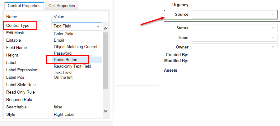
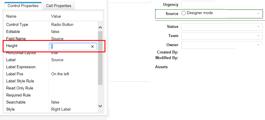
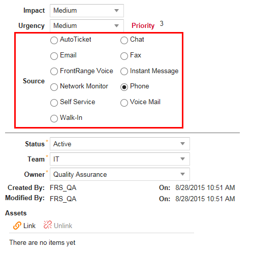
Adding Fields with Multiple Choices (Radio Buttons)
Many form fields have drop-down menus, where you click the menu and all of the choices appear. In some cases, you may leave a field at its default setting. To encourage users to make the right choice, you can display the field as radio buttons.
The following example shows how to change the Source field in an Incident business object.
Source Field is a Text Field
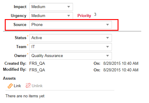
To change the Source field to radio buttons:
Source Field Displays Radio Buttons
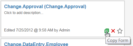
Duplicating a Form
1.From the Configuration Console, click Build > Business Objects to open the Business Objects workspace.
2.Open a business object.
3.Click the Forms tab. The system displays a list of forms for the business object.
4.Move your mouse pointer over a form name and click Copy Form.
Copy Form Button
The system displays the Enter the Name window.
5.Enter a unique name for the new form.
6.Click Save. The system displays the new form in the form list.
Customizing a Form with Images
•Adding an Icon to a Form Button
•Adding a Conditional Image to a Form
About Customizing Forms
A business object can use several forms for different purposes and audiences. For instance, by assigning forms to roles, one form can be used for managers and another for technicians. When designing forms, first customize the default panel, the brief panel, and then add new forms if necessary.
Forms employ a tabular layout with rows of cells. Customizing forms involves these basic steps:
•Adding fields: Clicking and dragging business object fields from the navigator bar to a form cell.
•Editing field position and appearance: Aligning fields and refining their aesthetic properties to enhance form usability.
Adding an Icon to a Form Button
Buttons that support icons include Address Book, Command, Cancel, Declare Master Incident, Resolve Incident, and URL.
1.From the Configuration Console, click Build > Business Objects to open the Business Objects workspace.
2.Open a business object.
3.Click the Forms tab.
4.Open the form to edit.
5.Click the button to edit.
6.Under Control Properties, in the Image field, click the function icon  .
.
Control Properties
7.In the Expression Editor, click Image Manager.
8.In the Image Manager, click the icon to use and then click Select.
9.In the Expression Editor, click Save.
10.In the Form Editor, click Save.
11.To verify that the icon appears, do the following:
| a. | Log into the Service Manager Application. |
| b. | Refresh the browser. |
| c. | Select a record associated with the business object from the list. |
The icon that you selected now appears on that button in the form.
Adding an Icon to a Form
Adding a Conditional Image to a Form
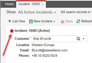
You can specify expression to show an image that corresponds to the value of a particular field. In this example, we add a status icon. If the incident status is active, the icon is red. For any other status, the icon is green.
1.From the Configuration Console, click Build > Business Objects to open the Business Objects workspace.
2.Open a business object.
3.Click the Forms tab.
4.Open the form to edit.
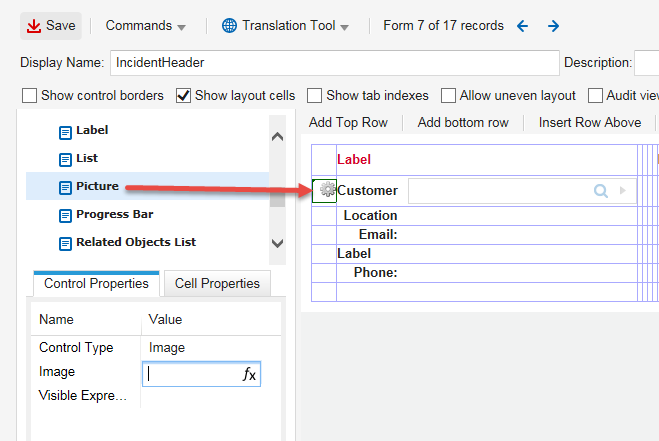
5.From the Related Objects list, choose Other folder and drag Picture to a cell in the form.
6.Click the Picture field to select it.
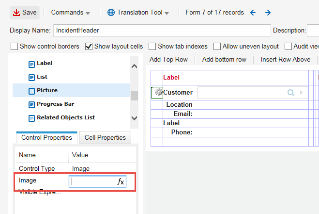
7.Under Control Properties, in the Image field, click the function icon .
8.In the Expression Editor, enter an expression to create the desired behavior. For example, enter the following: $(if Status == "Active" then "red_light.png" else "green_light.png").
9.Click Save.
10.In the Form Editor, click Save.
11.To verify that the image appears, do the following:
| a. | Log into the Service Manager Application. |
| b. | Refresh the browser. |
| c. | Select a record associated with the business object from the list. |
An image now appears according to the value set for its field. Since the status of this incident is active, the red_light.png image is displayed.
Adding a Conditional Image to a Form
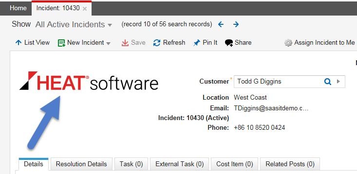
Adding a Logo to a Form
Before performing this procedure, save the logo.
1.From the Configuration Console, click Build > Business Objects to open the Business Objects workspace.
2.Open a business object.
3.Click the Forms tab.
4.Open the form to edit.
5.From the Related Objects list, choose Other folder and drag Picture to a cell in the form.
Related Objects List
6.Click the Picture field to select it.
7.Under Control Properties, in the Image field, click the function icon .
Image Field
8.In the Expression Editor, click Image Manager.
9.In the Image Manager, click Add.
10.Navigate to the logo to use and double-click the logo.
11.In the Image Manager, click the logo and then click Select.
12.In the Expression Editor, click Save.
13.In the Form Editor, click Save.
14.To verify that the logo appears, do the following:
| a. | Log into the Service Manager Application. |
| b. | Refresh the browser. |
| c. | Select a record associated with the business object from the list. |
The logo you added now appears in the form.
Adding a Logo to a Form
Adding a Picture to a Form
•Adding the Image Field to a Form
•Adding a Picture to a Business Object that Uses the Form
This procedure adds an image field to a form, so that you can add a picture to an incident. This example uses an incident but the procedure applies to other business objects.
Creating an Image Field
1.From the Configuration Console, click Build > Business Objects to open the Business Objects workspace.
2.Open a business object.
3.Click the Forms tab.
4.Click Add new....
5.Click Binary.
6.Under Setting Field Details, enter a field name and a display name.
7.Click Add This Field. The system displays the new field in the list and is marked with "(new)".
8.In the Fields list, click Save.
Adding the Image Field to a Form
1.From the Configuration Console, click Build > Business Objects to open the Business Objects workspace.
2.Open a business object.
3.Click the Forms tab.
4.Open the form to edit.
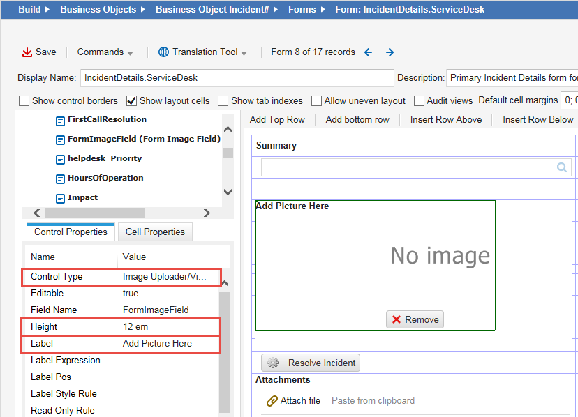
5.From the Related Objects list, choose Incident > Fields folder, find the field that you just created, and drag it to a cell in the form.
Dragging a Cell to a Form
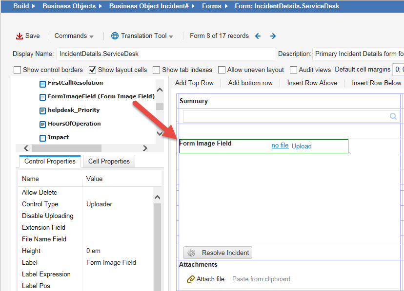
6.Click the field to select it.
7.Under Control Properties, click Control Type and choose Image Uploader/Viewer.
8.Under Control Properties, click Height and input the value appropriate for the picture.
9.Under Control Properties, click Label and input the value appropriate for the picture.
Updating the Control Properties
10.Click Save.
Adding a Picture to a Business Object that Uses the Form
1.Perform the procedure in Adding the Image Field to a Form.
2.Log into the Service Manager Application.
3.Refresh the browser.
4.Select a record from the list.
5.In the record, click the newly added image field. The field displays "No image".
Before Adding a Picture to a Business Object
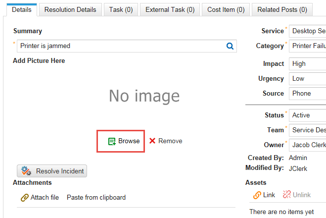
6.Below the image, click Browse.
7.Navigate to the picture file and double-click it. The picture that you selected now appears in the record.
After Adding a Picture to a Business Object
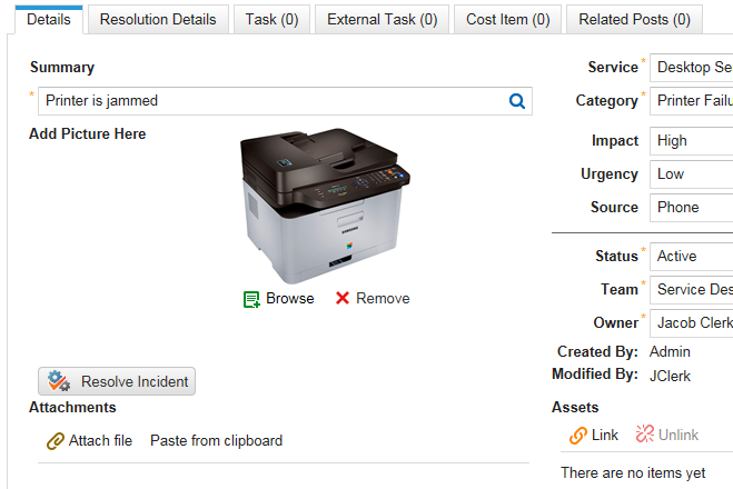
8.Click Save.
9.To delete the picture, click Remove.
10.To change the picture, click Browse and choose the picture file you want. The new picture replaces the previous one.
Using Expressions as Filters on a Form
•Using Hidden Expressions on a Form
•About Using Expressions as Filters on a Form
•Example: Adding an Expression Filter to the Customer Field for Incidents
Using Hidden Expressions on a Form
1.From the Configuration Console, click Build > Business Objects to open the Business Objects workspace.
2.Open a business object.
3.Click the Forms tab.
4.Open a form.
5.Highlight a field and click the Control Properties tab.
6.Click the Visible Expression field and click the expression button. The system displays the Expression Editor.
7.Enter an expression such as $(if Status == "Logged" then true else false).
8.Click Save.
9.Save the form.
About Using Expressions as Filters on a Form
Each link field on a form displays a specific business object that you select in the Display Field field under the Control Properties tab. Any business object supports a selection of fields by which you can filter instances of the business object. In some cases, however, the business object does not support the field that you need.
For example, when you create a new incident, you click the search icon  on the Customer field to view a list of customers (or users). By default, all customers appear in this list whether their status is set to active or otherwise. If you only want to see active customers, you need a way to filter the list. You do that by adding an expression to the Customer field.
Example: Adding an Expression Filter to the Customer Field for Incidents
To add an expression filter to the Customer field of an Incident form, do the following:
1.From the Configuration Console, click Build > Business Objects to open the Business Objects workspace.
2.Open the Incident business object.
3.Click the Forms tab.
4.Open the Incident.CustomerOwnershipForm form.
5.Highlight the Customer field and click the Control Properties tab.
6.Click the Filter Expression field and enter $([OtherObject]Status == "Active").
Filter Expression Field
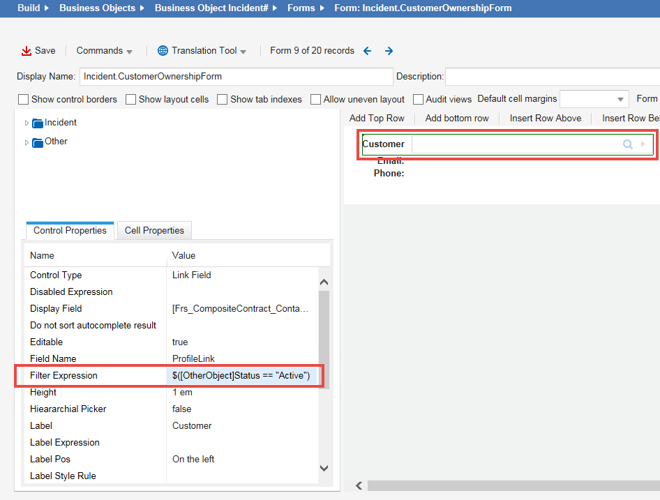
7.Click Save.
8.From the Service Manager Application, click Refresh on the Incident workspace to refresh the Incident workspace.
Now, when you search for a customer name in a new incident, only the names of active customers appear in the list.
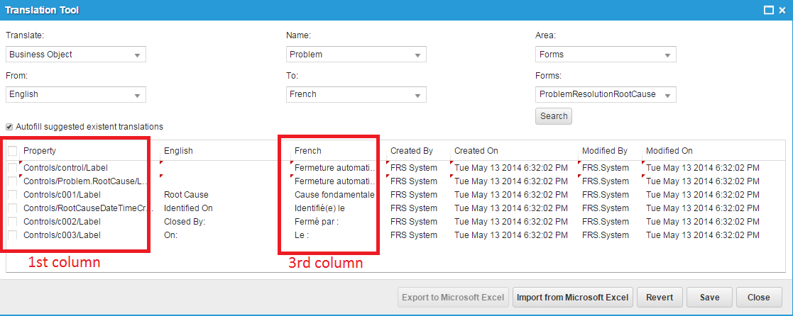
Localizing a Form
When you work with forms in a language other than English, you might observe a word or phrase that is not properly translated.
To add or correct a translated word or phrase, do the following:
1.Click Translation Tool next to the business object to translate.
2.Select a language from the drop-down list. The system displays the Translation Tool workspace. It is preset for the form that you are working on.
Translation Tool
3.Optional. To view words and phrases from all forms, choose All in the Forms field.
4.Click Search to view the words and phrases from the current form. The system displays the search results.
•The first column shows the property, that is, the specific place, where a word or phrase is used in the current form.
•The third column shows the word or phrase as it appears right now for the language that you selected.
5.In the third column, click a translated string to open it for editing.
6.Do one of the following:
•Select a string from the drop-down list, if the system lists any suggestions.
•Enter new text.
7.Press Enter to record (but not save) the change. The system displays a red triangle next to the unsaved text string. This marks the changed string for reference.
8.Change additional strings as necessary.
9.Do one of the following:
•To save your changes, click Save.
•To remove all of the changes that made, click Revert. The system returns the strings to their original settings.
You can also export the words or phrases to a Microsoft Excel spreadsheet, make your changes, and then import the translated spreadsheet. For more information, see Importing or Exporting a Translation Spreadsheet.
Deleting a Form
1.From the Configuration Console, click Build > Business Objects to open the Business Objects workspace.
2.Open a business object.
3.Click the Forms tab. The system displays a list of forms for that business object.
4.Move your mouse pointer over a form name and click Delete Form.
Delete a Form
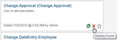
The system displays the Delete confirmation dialog box.
5.Click Yes.
The system checks whether the form is used in another business object. If so, a validation message informs you that the form cannot be deleted and where the form is used. If this form is not used in another object, the system deletes the form.
Was this article useful?
The topic was:
Inaccurate
Incomplete
Not what I expected
Other
Copyright © 2018, Ivanti. All rights reserved.