Service Manager
Configuring the Application User Interface
The Application tab is used to customize the Service Manager user interface. The settings that you configure on the Application tab affect all roles in Service Manager except Self Service Mobile. See Configuring the Self Service Mobile User Interface.
•Configuring the Styles for a Role
•Adding a New Logo to the Header or Footer
•Working with Vanity URLs for Managed Service Providers
Configuring the Styles for a Role
The interface for a specific user role can be configured. Changes made to the default role affect all roles, except for any roles that were configured individually. For more information on roles, see Working with Roles.
To configure the style for a role:
- In the Configuration, click Build > User Interface Styles > Style Editor. The application displays the Style Editor.
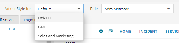
- From the Role drop-down menu, choose a role.
The Remove Customization icon
disappears from the page on selecting a role. However, after saving the customizations, the icon reappears.
- Configure the color specifications for the selected role. See also Working with Roles.
- Click Save. The drop-down menu lists this role as customized.
_in_list.png)
The Save button is only enabled when a value is entered for any of the parameters.
To restore a role to its default style, do the following:
- In the Configuration, click Build > User Interface Styles > Style Editor. The application displays the Style Editor.
The Application tab is selected by default.
- From the Role drop-down menu, select a customized role.
A customized role is identifiable from the rest of the roles in the list. For example, Administrator (customized).
- Click the Remove Customization icon next to the Role drop-down list. The colors for this role are restored back to its default settings. So in our example, the role is now listed as Administrator. See also Working with Roles.
Configuring the Theme
- In the Configuration, click Build > User Interface Styles > Style Editor. The application displays the Style Editor.
The Application tab is selected by default.
- In the Select Theme field, CDL2 is selected by default. Each theme has its own set of color specifications. Existing customers who have already defined their branding colors need to manually set color specifications for the themes. Given below are the specifications for each theme:
Section Parameter Description
Color Specifications CDL2
CDL
Light
Common Text Text color of all items in the home page, including dashboard panels.
#262626FF #222222FF
#222222FF
Background Background color of the home page.
#E5E5E5FF #F5F5F5FF
#F5F5F5FF
Link Text color of any links on the home page.
#007FA2FF #2286BBFF
#2286BBFF
Border The color of all borders on the home page, including borders around dashboard panels and borders under headings.
#FFFFFFFF #FFFFFFFF
#D9D9D9FF
Mouseover Background color of text when you hover your mouse over it.
#D8D8D8FF #F4F4F4FF
#F4F4F4FF
Active Background color of text when it is the active line in a list.
#D9E4EAFF #DEEDFCFF
#DEEDFCFF
Panels
Background Background color of all panels and dialog windows.
#FFFFFFFF #FFFFFFFF
#FFFFFFFF
Header Color Text color of the text in all panel headers.
#222222FF #222222FF
#FFFFFFFF
Header Background Background color of all panel headers.
#FFFFFFFF #FFFFFFFF
#289AD7FF
Grid Background
Color of all grids in forms.
#F2F2F2FF
#F2F2F2FF
#F2F2F2FF
Buttons
Text Text color of buttons.
#2286BBFF #2286BBFF
#333333FF
Background Background color of buttons.
#FFFFFFFF #FFFFFFFF
#EBEBEBFF
Highlighted Color Background color of buttons that are highlighted.
#2286BBFF #2286BBFF
#289AD7FF
Highlighted Text Text color of buttons when they are highlighted.
#FFFFFFFF #FFFFFFFF
#FFFFFFFF
Disabled Text
Color of all texts on buttons when they are disabled.
#A6A6A6FF
#A6A6A6FF
#A6A6A6FF
Header & Footer
Logo Displays the default logo and enables you to substitute your own logo.
- -
-
Text
Text color of the header bar area.
#FFFFFFFF
#2286BBFF
#222222FF
Background For a gradient texture, use different colors for the Background and Background Center fields. For a solid texture, use the same color for both.
#262626FF #FFFFFFFF
#FFFFFFFF
Background Center #262626FF #FFFFFFFF
#ECECF0FF
Link
Color of links in the header bar.
#FFFFFFFF
#2286BBFF
#2286BBFF
Link Mouseover
Background color of text when you hover your mouse over it.
#FFFFFFFF
#2286BBFF
#FF0000FF
Role Text Color
Color of the name of the role text.
#FFFFFFFF
#FFFFFFFF
#FFFFFFFF
Workspace Tabs Text Color of text in the workspace area, including inactive tab labels.
#262626FF #333333FF
#FFFFFFFF
Background Background color of the workspace bar.
#FFFFFFFF #FFFFFFFF
#555555FF
Active Color of the top of the active tab. The active tab itself takes the Common Background color.
#2286BBFF #2286BBFF
#FF0000FF
Sub Tab Active Color of the sub tabs.
#000000FF #000000FF
#000000FF
Tab Border Border color of all tabs.
#BFBFBFFF #BFBFBFFF
#BFBFBFFF
For information on making color changes, see Working with Colors in the Style Editor.
The application does not support backward compatibility with Themes. For example, if a theme is changed from CDL2 to Light, all parameters need to be entered manually according to their respective color specifications mentioned in the above table.
- Whenever a theme is selected from the Select Theme drop-down list, the following message is displayed.
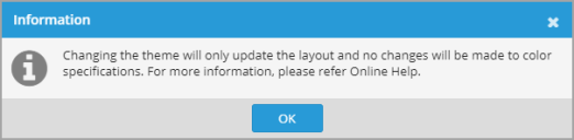
- Click OK.

- Click Save to save the configuration changes.
Adding a New Logo to the Header or Footer
In Service Manager, logos are scaled to fit a 50-pixel vertical space in the header. Because scaling reduces image quality, the preferred logo dimensions are 50 pixels high and up to 200 pixels wide. The maximum logo dimensions are 650 pixels high by 650 pixels wide.
You cannot upload a new logo if you are using Microsoft Internet Explorer Release 9 or earlier.
To add a new logo to the header or footer in Service Manager, do the following:
- In the Configuration, click Build > User Interface Styles > Style Editor. The application displays the Style Editor.
The Application tab is selected by default.
- Under Header & Footer > Logo, click the image.
The image is enlarged.

Users can upload only JPEG or PNG image formats. No other formats are accepted by the application.
- Click the select file icon
 to upload the image.
The image size must be less than or equal to 256 KB.
- Navigate to the file and double-click the file name. In the right pane, the new logo replaces the existing logo on the top-left side of the header.
- In the Select Theme field, the application marks the unsaved value with a red triangle
 at the left and the revert icon
  at the right.
 - Click Save.
Restoring the Default Logo
To restore the default logo in the header or footer in Service Manager:
- In the Configuration, click Build > User Interface Styles > Style Editor. The application displays the Style Editor.
The Application tab is selected by default.
- Under Header & Footer, click the current logo.
- Click the delete uploaded file icon
 . The application deletes the current logo and displays the default Service Manager logo in its place.
 - In the Logo field, the application marks the unsaved value with a red triangle at the left and the revert icon at the right.
- Click Save.
Working with Vanity URLs
Managed Service Providers (MSPs) can create vanity URLs to make it easier to configure the user interface for a specific tenant. They can then select and configure the user interface for a specific tenant, instead of having all tenants look the same. After creating the vanity URL, the application displays both a Tenant field and a Role field in the Style Editor. This means that you can configure both styles for a tenant and styles for different roles for the selected tenant.
To begin, the alternate login URL must be set for the MSP tenant to configure, in the Service Manager Configuration Database. See the Configuration Database Guide for Ivanti Service Manager for information about using the ConfigDB, including information about setting the alternate login URL.
•Adding a Vanity URL for a Tenant
Adding a Vanity URL for a Tenant
To add a vanity URL for a tenant, do the following:
1.Log in to the Service Manager application.
2.Open the Org Unit workspace.
3.Select and open a tenant that does not have a parent org unit assigned to it.
4.On the Details tab, ensure that Is Primary MSP Tenant is checked.
5.Enter information into the Vanity URL field. The information that you enter here is visible from the Tenant drop-down in the Style Editor, so that you can configure the application, login, and Self Service pages.
6.Click Save.
Configuring a Tenant
To configure a specific tenant, do the following:
1.In the Configuration, click Build > User Interface Styles > Style Editor. The application displays the Style Editor.
The Application tab is selected by default.
2.From the Tenant drop-down menu, choose the tenant to configure the application, login, and Self Service pages for.
Choosing an MSP Tenant to Configure
3.Make changes, including changes to specific roles if necessary and click Save. The drop-down menu shows that you have configured this tenant by adding (customized) to the tenant name.
4.To restore a tenant role to the default configuration, do the following:
| a. | From the Tenant drop-down menu, select the tenant and the role. |
| b. | Click the remove customization icon at the top of the Style Editor. The drop-down menu shows that the tenant role has been restored to the default settings. |
Was this article useful?
Copyright © 2019, Ivanti. All rights reserved.