About Analytic Metrics Dashboards and Charts
•Modifying a Dashboard Name or Icon
Creating a Dashboard
1.Log into the Service Desk console.
2.Open the Analytic Metrics workspace.
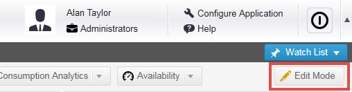
3.Click Edit Mode. The application displays edit options at the top of the window.
Analytic Metrics Edit Mode
4.From the upper left side of the window, click the add dashboard icon  . The application displays the Create Dashboard dialog box.
5.Enter information into the fields.
| Field | Description |
|---|---|
| Title | A title for the dashboard. The title appears in the tab. |
| Icon | The icon that appears in the tab before the title. Choose an icon from the drop-down list. If you do not choose an icon, the application uses the default dashboard icon. |
| Snap | Determines height and width of charts on the dashboard. Both is a fully automatic setting. |
| Width (px) | Appears when there is no horizontal snap. |
| Height (px) | Appears when the is no vertical snap. |
6.Click Save. The application create a new, blank dashboard. Next, add charts to the dashboard.
Adding Charts to a Dashboard
1.Log into the Service Desk.
2.Open the Analytic Metrics workspace.
3.Choose the dashboard to which you want to add a chart.
4.Do one of the following:
•From the top right side of the window, drag and drop Drag me to Add Chart onto the chart.
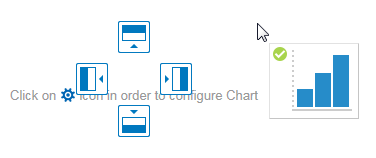
•If a chart already occupies the dashboard, the position icons appear. Drop your chart over a position: top, left, bottom, or right of the existing chart.
Dashboard Position Icons
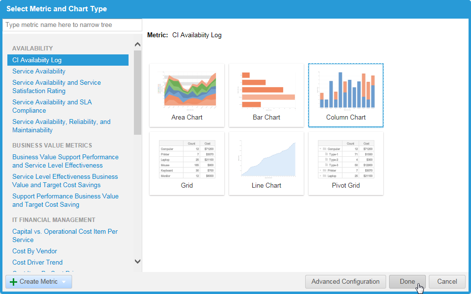
The application displays the Select Metric and Chart Type dialog box.
5.Choose a metric template from the list on the left side. The application displays various chart types that are relevant to your data.
6.Choose a chart type and then click Advanced Configuration to further define your chart. See Chart Types.
7.Click Done. The application generates the chart.
Select Metric and Chart Type Dialog Box
8.Click Edit Mode again to turn off edit mode. The application automatically saves the dashboard.
Chart Types
•Grid
The selection of available charts depends on the metric that the chart represents.
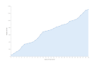
Area Chart
Area Chart for Analytic Metrics
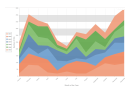
The area chart shows graphically quantitative data. Based on the line chart, it compares an area with two or more quantities.
| Option | Description |
|---|---|
| Chart Title and Description | |
| Title |
The title of the chart, which appears above the chart. The application automatically generates this, but you can edit it. |
| Description |
Optional. A description of the chart. Describes why the chart was created and what data it contains. This information does not appear on the chart. |
| Visualization |
Count, Total Cost, and Average. Each tab is configured separately. |
| Visualization and colors | Double-click the color sample to change the color. Move the slider to set saturation value, 10% to 100%. |
| Before Value | Check to enable. Append text before the reported value. Example: $. |
| After Value | Check to enable. Append text after the reported value. Example: %. |
| Precision | Displays 0 to 5 places to the right of the decimal point. |
| Use 1000 Separator | Check to enable. Inserts a comma (,) before every 3 places to the left of the decimal point. |
| Period Type |
Choose from the drop-down menu. Displays the reported value as a period of time. Choose a period in days, hours, minutes, or seconds. NOTE: Use this option only when the reported value is a period of time. |
| Format | Appears when you choose a period type. Choose the format best suited to your needs. |
| Series Name |
Includes the series type (such as count or average) in the hover-over information. |
| Source Name |
Includes the chart title in the hover-over information. |
| Label |
Includes the field name in the hover-over information. |
| Options | |
| Use Logarithmic Y scale |
Specifies to use a logarithmic Y scale. |
| Axes and Labels | |
| Horizontal Axis Title |
The label for the horizontal axis. |
| Vertical Axis Title |
The label for the vertical axis. |
| Labels Font Size | The font size for the labels. 1 is the smallest, 10 is the largest. |
| Labels Orientation |
Specifies orientation of the labels: Horizontal: Labels may overlap in some cases. Vertical: Rotated 90 degrees. Diagonal: Rotated 45 degrees. |
| Legend | |
| Legend Font Size | The font size for the legend. 1 is the smallest, 10 is the largest. |
| Legend Presence |
Specifies where the legend appears in relation to the chart: None: Does not display the legend. Left: Displays the legend at the left of the chart. Right: Displays the legend at the right of the chart. Top: Displays the legend above the chart. Bottom: Displays the legend below the chart. |
Bar Chart
Bar Chart for Analytic Metrics
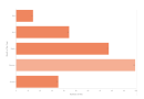
The bar chart shows data horizontally or vertically. It compares two or more fields; each bar can be separate or accumulative.
| Option | Description |
|---|---|
| Chart Title and Description | |
| Title |
The title of the chart, which appears above the chart. The application automatically generates this, but you can edit it. |
| Description |
Optional. A description of the chart. Describes why the chart was created and what data it contains. This information does not appear on the chart. |
| Visualization |
Count, Total Cost, and Average. Each tab is configured separately. |
| Values in a range from Minimum to Maximum should have color |
The chart colors. These are based on the threshold values. To add ranges and define colors, click Add Threshold. The application displays a new line where you define the threshold values. |
| Value Format | |
| Before Value | Check to enable. Append text before the reported value. Example: $. |
| After Value | Check to enable. Append text after the reported value. Example: %. |
| Precision | Displays 0 to 5 places to the right of the decimal point. |
| Use 1000 Separator | Check to enable. Inserts a comma (,) before every 3 places to the left of the decimal point. |
| Period Type |
Choose from the drop-down menu. Displays the reported value as a period of time. Choose a period in days, hours, minutes, or seconds.
NOTE: Use this option only when the reported value is a period of time. |
| Format | Appears when you choose a period type. Choose the format best suited to your needs. |
| Series Name |
Includes the series type (such as count or average) in the hover-over information. |
| Source Name |
Includes the chart title in the hover-over information. |
| Label |
Includes the field name in the hover-over information. |
| Drill Down | |
| None | Does not open a workspace. Uncheck to enable the other options. |
| Open 2nd Group By Data if Available | Check to enable. When you click the chart, the workspace of the second data group opens and displays all records. |
| Open BO Name Workspace | Check to enable. When you click the chart, the workspace opens and displays all records. |
| And Filter Using Label and Series | Check to enable. When you click the chart, the workspace opens and displays records filtered by label and series as defined under Settings > Manage Metrics. |
| Confirm Navigation | Check to enable. Displays a confirmation dialog box before going to the workspace. |
| Options | |
| Stack in one column |
Stacks the data within each column, as opposed to showing the data in individual columns. |
| Use Logarithmic X scale |
Uses a logarithmic X scale. |
| Axes and Labels | |
| Horizontal Axis Title | The label for the horizontal axis. |
| Vertical Axis Title |
The label for the vertical axis. |
| Labels Font Size |
The font size for the labels. 1 is the smallest, 10 is the largest. |
| Labels Orientation |
Specifies orientation of the labels: Horizontal: Labels may overlap in some cases. Vertical: Rotated 90 degrees. Diagonal: Rotated 45 degrees. |
| Legend | |
| Legend Font Size | The font size for the legend. 1 is the smallest, 10 is the largest. |
| Legend Presence |
Specifies where the legend appears in relation to the chart: None: Does not display the legend. Left: Displays the legend at the left of the chart. Right: Displays the legend at the right of the chart. Top: Displays the legend above the chart. Bottom: Displays the legend below the chart. |
Column Chart
Column Chart for Analytic Metrics
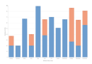
The column chart shows data stacked vertically and is similar to the bar chart. It compares two or more fields; each column can be separate or accumulative.
| Option | Description |
|---|---|
| Chart Title and Description | |
| Title |
The title of the chart, which appears above the chart. The application automatically generates this, but you can edit it. |
| Description |
Optional. A description of the chart. Describes why the chart was created and what data it contains. This information does not appear on the chart. |
| Visualization |
Count, Total Cost, and Average. Each tab is configured separately. |
| Show As | Choose Line or Column. |
| Values in a range from Minimum to Maximum should have color |
The chart colors. These are based on the threshold values. To add ranges and define colors, click Add Threshold. The application displays a new line where you define the threshold values. |
| Value Format | |
| Before Value | Check to enable. Append text before the reported value. Example: $. |
| After Value | Check to enable. Append text after the reported value. Example: %. |
| Precision | Displays 0 to 5 places to the right of the decimal point. |
| Use 1000 Separator | Check to enable. Inserts a comma (,) before every 3 places to the left of the decimal point. |
| Period Type |
Choose from the drop-down menu. Displays the reported value as a period of time. Choose a period in days, hours, minutes, or seconds.
NOTE: Use this option only when the reported value is a period of time. |
| Format | Appears when you choose a period type. Choose the format best suited to your needs. |
| Series Name |
Includes the series type (such as count or average) in the hover-over information. |
| Source Name |
Includes the chart title in the hover-over information. |
| Label |
Includes the field name in the hover-over information. |
| Drill Down | |
| None | Does not open a workspace. Uncheck to enable the other options. |
| Open 2nd Group By Data if Available | Check to enable. When you click the chart, the workspace of the second data group opens and displays all records. |
| Open BO Name Workspace | Check to enable. When you click the chart, the workspace opens and displays all records. |
| And Filter Using Label and Series | Check to enable. When you click the chart, the workspace opens and displays records filtered by label and series as defined under Settings > Manage Metrics. |
| Confirm Navigation | Check to enable. Displays a confirmation dialog box before going to the workspace. |
| Options | |
| Stack in one column |
Stacks the data within each column, as opposed to showing the data in individual columns. |
| Use Logarithmic Y scale |
Specifies to use a logarithmic Y scale. |
| Axes and Labels | |
| Horizontal Axis Title | The label for the horizontal axis. |
| Vertical Axis Title |
The label for the vertical axis. |
| Labels Font Size |
The font size for the labels. 1 is the smallest, 10 is the largest. |
| Labels Orientation |
Specifies orientation of the labels: Horizontal: Labels may overlap in some cases. Vertical: Rotated 90 degrees. Diagonal: Rotated 45 degrees. |
| Legend | |
| Legend Font Size | The font size for the legend. 1 is the smallest, 10 is the largest. |
| Legend Presence |
Specifies where the legend appears in relation to the chart: None: Does not display the legend. Left: Displays the legend at the left of the chart. Right: Displays the legend at the right of the chart. Top: Displays the legend above the chart. Bottom: Displays the legend below the chart. |
Gauge Chart
Gauge Chart for Analytic Metrics
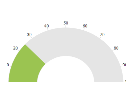
The gauge chart shows the data relative to a larger number and is used for a single field. This is useful to see the data relative to a defined threshold.
| Option | Description |
|---|---|
| Chart Title and Description | |
| Title |
The title of the chart, which appears above the chart. The application automatically generates this, but you can edit it. |
| Description |
Optional. A description of the chart. Describes why the chart was created and what data it contains. This information does not appear on the chart. |
| Visualization | |
| Values in a range from Minimum to Maximum should have color |
The chart colors. These are based on the threshold values. To add ranges and define colors, click Add Threshold. The application displays a new line where you define the threshold values. |
| Value Format | Value format |
| Before Value | Check to enable. Append text before the reported value. Example: $. |
| After Value | Check to enable. Append text after the reported value. Example: %. |
| Precision | Displays 0 to 5 places to the right of the decimal point. |
| Use 1000 Separator | Check to enable. Inserts a comma (,) before every 3 places to the left of the decimal point. |
| Period Type |
Choose from the drop-down menu. Displays the reported value as a period of time. Choose a period in days, hours, minutes, or seconds.
NOTE: Use this option only when the reported value is a period of time. |
| Format | Appears when you choose a period type. Choose the format best suited to your needs. |
| Maximum |
The top number (maximum amount) of the gauge. |
| Drill Down | |
| None | Does not open a workspace. Uncheck to enable the other options. |
| Open BO Name Workspace | Check to enable. When you click the chart, the workspace opens and displays all records. |
| Confirm Navigation | Check to enable. Displays a confirmation dialog box before going to the workspace. |
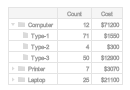
Grid
Grid Chart for Analytic Metrics
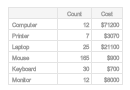
The chart shows data in a tabular format. Multiple fields can be listed.
| Option | Description |
|---|---|
| Chart Title and Description | |
| Title |
The title of the chart, which appears above the chart. The application automatically generates this, but you can edit it. |
| Description |
Optional. A description of the chart. Describes why the chart was created and what data it contains. This information does not appear on the chart. |
| Visualization | |
| Column Names | Depends on the business object chosen. |
| Values in a range from Minimum to Maximum should have color |
The chart colors. These are based on the threshold values. To add ranges and define colors, click Add Threshold. The application displays a new line where you define the threshold values. |
| Value Format | |
| Before Value | Check to enable. Append text before the reported value. Example: $. |
| After Value | Check to enable. Append text after the reported value. Example: %. |
| Precision | Displays 0 to 5 places to the right of the decimal point. |
| Use 1000 Separator | Check to enable. Inserts a comma (,) before every 3 places to the left of the decimal point. |
| Period Type |
Choose from the drop-down menu. Displays the reported value as a period of time. Choose a period in days, hours, minutes, or seconds.
NOTE: Use this option only when the reported value is a period of time. |
| Format | Appears when you choose a period type. Choose the format best suited to your needs. |
| Alignment |
Choose text alignment in the columns: Left Center Right |
| Drill Down | |
| None | Does not open a workspace. Uncheck to enable the other options. |
| Open 2nd Group By Data if Available | Check to enable. When you click the chart, the workspace of the second data group opens and displays all records. |
| Open BO Name Workspace | Check to enable. When you click the chart, the workspace opens and displays all records. |
| And Filter Using Label and Series | Check to enable. When you click the chart, the workspace opens and displays records filtered by label and series as defined under Settings > Manage Metrics. |
| Confirm Navigation | Check to enable. Displays a confirmation dialog box before going to the workspace. |
Line Chart
Line Chart for Analytic Metrics
The line chart shows graphically quantitative data based on a single field.
| Option | Description |
|---|---|
| Chart Title and Description | |
| Title |
The title of the chart, which appears above the chart. The application automatically generates this, but you can edit it. |
| Description |
Optional. A description of the chart. Describes why the chart was created and what data it contains. This information does not appear on the chart. |
| Visualization | |
| Show As |
Choose from the drop-down list: Line Column |
| Smooth Line | Check to smooth the line from point to point. |
| Filled | Check to fill in the chart under the line. The color for the data. Move the slider to set the color intensity value. 100% is full color, while 10% is very light. |
| Marker Type |
Choose from the drop-down list: Circle Cross |
| Value Format | |
| Before Value | Check to enable. Append text before the reported value. Example: $. |
| After Value | Check to enable. Append text after the reported value. Example: %. |
| Precision | Displays 0 to 5 places to the right of the decimal point. |
| Use 1000 Separator | Check to enable. Inserts a comma (,) before every 3 places to the left of the decimal point. |
| Period Type |
Choose from the drop-down menu. Displays the reported value as a period of time. Choose a period in days, hours, minutes, or seconds.
NOTE: Use this option only when the reported value is a period of time. |
| Format | Appears when you choose a period type. Choose the format best suited to your needs. |
| Series Name |
Includes the series type (such as count or average) in the hover-over information. |
| Source Name |
Includes the chart title in the hover-over information. |
| Label |
Includes the field name in the hover-over information. |
| Precision |
The number of digits used after the decimal symbol in the data value that appears in the hover-over information. Zero shows only whole numbers. |
| After Value |
The string that appears after the data value in the hover-over information. |
| Before Value |
The string that appears before the data value in the hover-over information. |
| Drill Down | |
| None | Does not open a workspace. Uncheck to enable the other options. |
| Open 2nd Group By Data if Available | Check to enable. When you click the chart, the workspace of the second data group opens and displays all records. |
| Open BO Name Workspace | Check to enable. When you click the chart, the workspace opens and displays all records. |
| And Filter Using Label and Series | Check to enable. When you click the chart, the workspace opens and displays records filtered by label and series as defined under Settings > Manage Metrics. |
| Confirm Navigation | Check to enable. Displays a confirmation dialog box before going to the workspace. |
| Options | |
| Use Logarithmic Y scale |
Specifies to use a logarithmic Y scale. |
| Axes and Labels | |
| Horizontal Axis Title | The label for the horizontal axis. |
| Vertical Axis Title |
The label for the vertical axis. |
| Labels Font Size |
The font size for the labels. 1 is the smallest, 10 is the largest. |
| Labels Orientation |
Specifies orientation of the labels: Horizontal: Labels may overlap in some cases. Vertical: Rotated 90 degrees. Diagonal: Rotated 45 degrees. |
| Legend | |
| Legend Font Size | The font size for the legend. 1 is the smallest, 10 is the largest. |
| Legend Presence |
Specifies where the legend appears in relation to the chart: None: Does not display the legend. Left: Displays the legend at the left of the chart. Right: Displays the legend at the right of the chart. Top: Displays the legend above the chart. Bottom: Displays the legend below the chart. |
Pie Chart
Pie Chart for Analytic Metrics
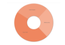
The pie chart gives a snapshot of the value of several fields totally 100%.
| Option | Description |
|---|---|
| Chart Title and Description | |
| Title |
The title of the chart, which appears above the chart. The application automatically generates this, but you can edit it. |
| Description |
Optional. A description of the chart. Describes why the chart was created and what data it contains. This information does not appear on the chart. |
| Visualization | |
| Value Format | |
| Before Value | Check to enable. Append text before the reported value. Example: $. |
| After Value | Check to enable. Append text after the reported value. Example: %. |
| Precision | Displays 0 to 5 places to the right of the decimal point. |
| Use 1000 Separator | Check to enable. Inserts a comma (,) before every 3 places to the left of the decimal point. |
| Period Type |
Choose from the drop-down menu. Displays the reported value as a period of time. Choose a period in days, hours, minutes, or seconds.
NOTE: Use this option only when the reported value is a period of time. |
| Format | Appears when you choose a period type. Choose the format best suited to your needs. |
| Drill Down | |
| None | Does not open a workspace. Uncheck to enable the other options. |
| Open BO Name Workspace | Check to enable. When you click the chart, the workspace opens and displays all records. |
| And Filter Using Label and Series | Check to enable. When you click the chart, the workspace opens and displays records filtered by label and series as defined under Settings > Manage Metrics. |
| Confirm Navigation | Check to enable. Displays a confirmation dialog box before going to the workspace. |
| Options | |
| Make donut | Makes the center of the pie an empty circle. |
| Axes and Labels | |
| Labels Font Size | The font size for the labels. 1 is the smallest, 10 is the largest. |
| Labels Type |
Select the items to display: Label and Value: Displays the label by name and the numerical value. Absolute Value: Displays the numerical value. Percent Value: Displays the value as a percentage of the total.
NOTE: When Absolute Value is selected, you can mouse-over the chart to see the label name. When Percent Value is selected, you can mouse-over the chart to see the label name and numerical value. |
| Labels Location |
Select how you want to display the labels: Inside: All labels appear inside their segments. Outside: All labels are displayed horizontally outside their segments. Rotate: Labels that fit inside their segments are displayed inside their segments. Labels that do not fit are displayed horizontally outside. None: No labels. |
Pivot Grid
Pivot Grid Chart for Analytic Metrics
Similar to a grid, the pivot grid chart lists data and subdata. Multiple fields can be listed.
| Option | Description |
|---|---|
| Chart Title and Description | |
| Title |
The title of the chart, which appears above the chart. The application automatically generates this, but you can edit it. |
| Description |
Optional. A description of the chart. Describes why the chart was created and what data it contains. This information does not appear on the chart. |
| Column Names | Depends on the business object chosen. |
| Visualization | |
| Values in a range from Minimum to Maximum should have color |
The chart colors. These are based on the threshold values. To add ranges and define colors, click Add Threshold. The application displays a new line where you define the threshold values. |
| Value Format | |
| Before Value | Check to enable. Append text before the reported value. Example: $. |
| After Value | Check to enable. Append text after the reported value. Example: %. |
| Precision | Displays 0 to 5 places to the right of the decimal point. |
| Use 1000 Separator | Check to enable. Inserts a comma (,) before every 3 places to the left of the decimal point. |
| Period Type |
Choose from the drop-down menu. Displays the reported value as a period of time. Choose a period in days, hours, minutes, or seconds.
NOTE: Use this option only when the reported value is a period of time. |
| Format | Appears when you choose a period type. Choose the format best suited to your needs. |
| Drill Down | |
| None | Does not open a workspace. Uncheck to enable the other options. |
| Open BO Name Workspace | Check to enable. When you click the chart, the workspace opens and displays all records. |
| And Filter Using Label and Series | Check to enable. When you click the chart, the workspace opens and displays records filtered by label and series as defined under Settings > Manage Metrics. |
| Confirm Navigation | Check to enable. Displays a confirmation dialog box before going to the workspace. |
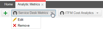
Modifying a Dashboard Name or Icon
1.Log into the Service Desk.
2.Open the Analytic Metrics workspace.
3.Click Edit Mode. The application displays the edit options at the top of the window.
4.Click the down arrow next to the name of the dashboard you want to modify and then choose the edit icon  .
.
Clicking the Down Arrow Next to the Dashboard Name
The application displays the Edit Dashboard window.
5.Enter information into the fields.
| Field | Description |
|---|---|
| Title | The title for the dashboard. |
| Icon | The icon to display. Choose an icon from the drop-down list. |
| Snap | Determines height and width of charts on the dashboard. Both is a fully automatic setting. |
| Width (px) | Appears when there is no horizontal snap. |
| Height (px) | Appears when the is no vertical snap. |
6.Click Save. The application displays the new name and icon in the tab.
Modifying a Chart
You can modify a chart at any time.
Some charts, such as the Weekly Average Response and Resolution Times chart, are designed to show weekly data for the last 3 months based on the current selection. Weekly reports require some recursive query and cannot scale to year. You can modify the report to monthly, then customize the query.
1.Log into the Service Desk.
2.Open the Analytic Metrics workspace.
3.Click Edit Mode. The application displays edit options at the top of the window.
4.Choose the dashboard for which to modify the chart.
5.Hover over the top right corner of the chart, then click the edit icon . The application displays the Configure Chart dialog box, showing the advanced options.
6. Modify the chart as desired.
7.Click Save.
Deleting a Chart
Removing a chart from a dashboard deletes it.
1.Log into the Service Desk.
2.Open the Analytic Metrics workspace.
3.Click Edit Mode. The application displays edit options at the top of the window.
4.Choose the dashboard from which to remove the chart.
5.Hover over the top right corner of the chart and click  . The application displays the Delete Confirmation window.
6.Click Yes. The application deletes the chart.
Deleting a Dashboard
1.Log into the Service Desk.
2.Open the Analytic Metrics workspace.
3.Click the down arrow next to a dashboard name.
4.Click Remove. The application displays the Delete Confirmation window.
5.Click Yes. The application deletes the dashboard and its tab.