Pivot components
The Pivot component supports a multi-dimensional pivot based on a row and a column, enabling you to report on two different aspects of your data in one chart. The rows are provided by one field from the data source, and the columns display data from another field. Three types of pivots are possible:
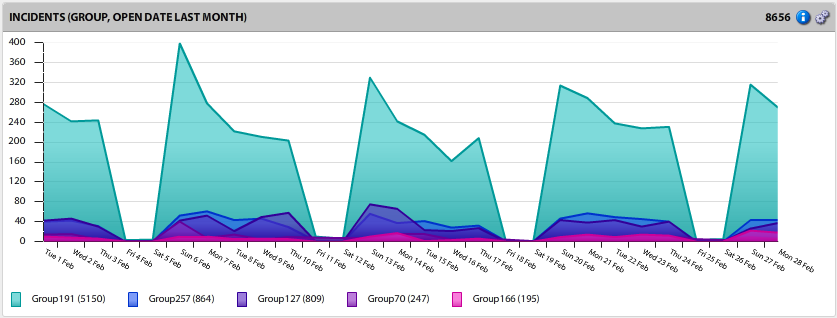
•Group: Works like the group component, summarizing data using a specified field from the data source.
•Time: Works like a time component, summarizing data over a date range and splitting up the data based on a specified time interval.
•Time Group: Combines aspects of both group and time components, summarizing data using fields and dates.
If you're not already connected to a data source, click the ![]() icon in the left navigation pane and connect to one.
icon in the left navigation pane and connect to one.
1.From the navigation pane, drag and drop a pivot component onto a pane in the layout. If you're using a group pivot, you'll be prompted to select a field.
2.Click the ![]() icon in the component header. The Pivot Component dialog displays the following options:
icon in the component header. The Pivot Component dialog displays the following options:
•General tab
•Title: Title for the pivot component as it will display in the pane header.
•Data source: Data source used for the component, which you can change here if needed.
•Row: Pivot to use for the rows (or series in a chart-based output). For details about setting up row pivots, see the next procedure.
•Column: Pivot to use for the columns (or X axis in a chart-based output). For details about setting up column pivots, see the next procedure.
•Summary type/field: Summary conditions to apply to the sourced data.
•Output tab
•View type: The display method for the data (area, column, bar, line, plot, bubble, or grid).
•Value format: Format used when displaying numerical values. For example, Decimal (3) would return a number such as "4.567."
•X axis label: Label displayed on the X axis.
•Y axis label: Label displayed on the Y axis.
•Y axis range: A secondary range for the Y axis rather than the default range. Specify a secondary range when the data values are too different to display on the same Y axis.
•Export chart labels: Select whether to display chart labels for each data point appearing on any exported graphs.
•Show value: Select to display summarized data values.
•Show title summary: Xtraction creates a title summary of what the component does, along with your own title. If you clear this option, the default summary is removed. For example, the title "Incidents (Last Month)" becomes just "Incidents."
•Show row total: Select if you want the row total column to display.
•Show percent (row): Select to display summarized data percentages (based on row values).
•Show percent (col): Select to display summarized data percentages (based on column values).
•Hide 0’s: Hide data slices that display only a zero (no real data value) when the output is a grid.
•Show collapsed: Select if you want the grid view to be collapsed by default.
•Filter tab
•Criteria used to filter the data from the data source. Right-click in the blank area to add a filter condition or open a saved one. For details about filters, see Filters.
•Criteria used to filter the data from the data source, which will be used in combination with the date condition set up for the time pivot.
•Colors tab
•Add a text description and color to use in the results triggered by values within the data. Right-click in the blank area and select Add color to enter a value (which is text describing the results) and color. For example, if your data contains the summarized value "Very High," you can define the output to display in red for these values.
•Lines tab
•Add one or more fixed lines of text to display when a pivot component is output to a chart-based format. Right-click in the blank area and select Add line to enter the text, a value, and a color. For example, you can enter "Very High" for the text with a value of "100" and select the color red to visually show when data exceeds that value.
•Alert rules tab
•Select colors to use in the results triggered by values within the data. Right-click in the blank area and select Add rule to enter an operation, value, colors for text and background, and notes about the rule if needed. Any added notes will display in the component header when you mouse hovers over the ![]() icon. For details about alerts, see Alerts.
icon. For details about alerts, see Alerts.
•Notes tab
•Enter explanatory text directly into the blank area, which will display when your mouse hovers over the ![]() icon for the component. If Show notes is selected for an export, these notes are included in the component export.
icon for the component. If Show notes is selected for an export, these notes are included in the component export.
3.Click OK to save.
1.In the Pivot Component dialog, open the General tab.
2.In the Row area, right-click and select Add Group Pivot or Add Time Pivot.
•Group Pivot
•Group field: The field being grouped from the data source.
•Count: The number of unique values to return in the display.
•Sort: How to sort the field: by text ascending/descending or by value ascending/descending.
•Show as group header: Enables the field to be a summary of other fields below it, so the data will group by this field.
•Time Pivot
•Date condition: A filter for specifying the time period of the time pivot.
•Interval: The period of time to be used in the display.
•Axis format: The format for displaying the data values on the X axis.
•Show as group header: Enables the field to be a summary of other fields below it, so the data will group by this field.
3.In the Column area, right-click and select Add Group Pivot or Add Time Pivot. The options in step 2 also apply for setting up columns for a group or time pivot.
4.Click OK to save.