Time components
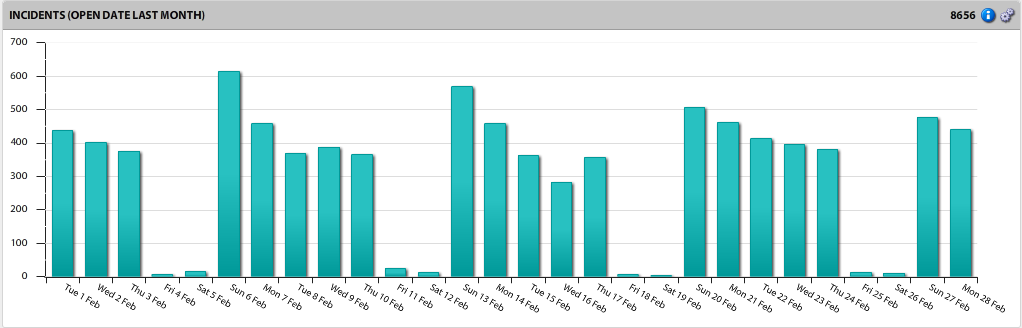
Time components visually represent data via time slices segregated by hours, days, weeks, and more. You can display and present time components in many formats including area, bar, and line charts. They're also available in stacked and 100% stacked formats, which enable you to portray the data in comparative context.
Within a single time component, you can display multiple series of data that are independent of each other, each retrieved from a different data source. You also have the option of defining a separate calculated series that aggregates the data across those same data sources, which is recommended when you need a more complete analysis of key performance indicators.
If you're not already connected to a data source, click the ![]() icon in the left navigation pane and connect to one.
icon in the left navigation pane and connect to one.
1.From the navigation pane, drag and drop a time component onto a pane in the layout.
2.Click the ![]() icon in the component header and select Component. The Time Component dialog displays the following options:
icon in the component header and select Component. The Time Component dialog displays the following options:
General tab
•Title: Title for the time component as it will display in the pane header.
•Series: A list of series defined for the component. For details about setting up a series, see "Time component series" below.
Output tab
•X axis format: Format for the label to use on the X axis of the time component.
•X axis label: Label displayed on the X axis.
•Y axis label: Label displayed on the Y axis.
•Y axis range: A specified range for the Y axis rather than the default range. Specify a secondary range when the data values are too different to display on the same Y axis.
•Series summaries: Summary text to display on the component header such as total, average, min, and max.
•Hide 0’s: Hide data slices that display only a zero (no real data value) when the output is a grid.
•Show title summary: Xtraction creates a title summary of what the component does, along with your own title. If you clear this option, the default summary is removed. For example, the title "Incidents (Last Month)" becomes just "Incidents."
•Show value: Select to make summary values visible.
•Show percent (series): Select to calculate a percentage based on the data across a series.
Lines tab
•Add one or more fixed lines of text to display across any of the time component formats, indicating when data exceeds a value. Right-click in the blank area and select Add line to enter the text, a value, and a color. For example, you can enter "Very High" for the text with a value of "100" and select the color red to visually show when data exceeds that value.
Alert Rules tab
•Select colors to use in the results triggered by values within the data. Right-click in the blank area and select Add rule to enter an operation, value, colors for text and background, and notes about the rule if needed. Any added notes will display in the component header when you mouse hovers over the ![]() icon. For details about alerts, see Defining alerts.
icon. For details about alerts, see Defining alerts.
•Note that alert rules at the series level will override alert rules at the component level
Notes tab
•Enter explanatory text directly into the blank area, which will display when your mouse hovers over the ![]() icon for the component. If Show notes is selected for an export, these notes are included in the component export.
icon for the component. If Show notes is selected for an export, these notes are included in the component export.
3.Click OK to save.
Time component series
A single time component can support multiple series of data that are independent of each other, each retrieved from a different data source if needed.
When more than one series is defined, you can sort the list in the Time Component dialog by using the sort icon. By default, the first series in the list will be the one to display.
1.Click the ![]() icon in the component header and select Component.
icon in the component header and select Component.
2.In the Time Component dialog > General tab > Series area, right-click and select Add series.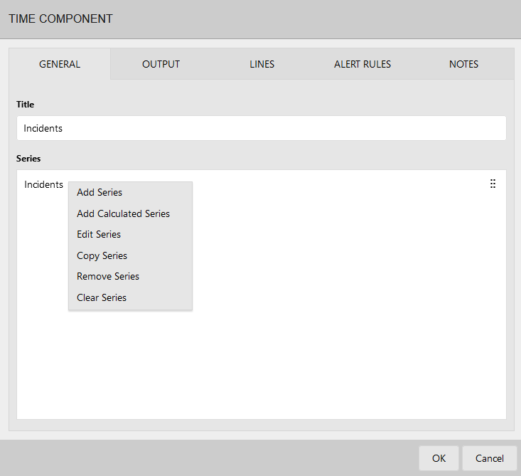
3.The Time Component Series dialog displays with these options:
General tab
•Title: Title for the time series.
•Name: Optional name, useful if you're going to reference this series in a calculated series.
•Data source: Data source used for this series.
•Date condition: The upper and lower limits of data displayed in the series, such as "Last 12 months."
•Time interval: Determines the size of the time slice. The default is 1 day, but you may want to set it to 1 month or 3 months if you have a date condition of "Last 12 months," for example.
•Summary: Summary conditions to apply to the source data. The top drop-down list is for the Summary type, and the bottom list is for the Summary field. In the Summary (type) drop-down list:
•Count returns the COUNT of the number of records that match the filter conditions set in the series. The Summary (field) drop-down list must be set to Not Applicable.
•Sum returns the SUM of the Summary field for all records that match the filter conditions set in the series.
•Average returns the AVERAGE of the Summary field for all records that match the filter conditions set in the series.
•Min returns the MINIMUM value of the Summary field for all records that match the filter conditions set in the series.
•Max returns the MAXIMUM value of the Summary field for all records that match the filter conditions set in the series.
Output tab
•View type: The display method for the data (area, column, and so on).
•Value format: Format for displaying numerical values. For example, Decimal (3) would return a number such as "4.567."
•Color: Color to use for the series. Use contrasting colors to easily distinguish one series from another in the display.
•Chart on secondary axis: Select to have the data charted accordingly.
•Show trendline (linear): A straight line that's used with simple, linear data sets, usually showing that data is increasing or decreasing at a steady rate.
•Show trendline label: A text label for the trendline to prevent confusion with other chart lines.
•Show trendline end-point values: Y values at the start and end of the trendline.
•Trendline color: A color for the trendline to prevent confusion with other chart lines.
•Visible: Select if you want the series to be visible in the output.
•Export chart labels: Select whether to display chart labels for each data point appearing on any exported graphs.
Filter tab
•Criteria used to filter the data from the data source. This data is used in combination with the date condition you set up under the General tab. Right-click in the blank area to add a filter condition or open a saved filter. For details about filters, see Creating filters.
Alert rules tab
•Select colors to use in the results triggered by values within the data. Right-click in the blank area and select Add rule to enter an operation, value, colors for text and background, and notes about the rule if needed.
•Note that alert rules at the series level will override alert rules at the component level.
4.Click OK to save.
Column tab
This procedure assumes that a Group Component is already displayed within a dashboard or document.
Calculated series
You can define a calculated series that performs a mathematical calculation using values from the other series defined for the time component. In doing so, a new series is created that aggregates the data, providing a more complete analysis of key performance indicators. When using a calculated series, you have the option of hiding the other series used in the calculation.
Several mathematical expressions are available for creating a calculated series, as described below.
For more guidance on how to define a calculated series for time, group, and scoreboard components, see the Calculated Series video on the Ivanti community website.
This procedure assumes you already have a time component displayed as part of a dashboard or document.
1.Click the ![]() icon in the component header and select Component.
icon in the component header and select Component.
2.In the Time Component dialog > General tab > Series area, right-click and select Add calculated series.
3.The Time Component Series dialog displays with these options:
General tab
•Title: Title for the series.
•Name: Name of the series for use within the calculated series expressions.
•Expression: A mathematical expression used to calculate the required value. For details, see "About expressions" below. To ensure your entry is valid, click the  icon.
icon.
Output tab
•View type: The display method for the data (area, column, and so on).
•Value format: Format for displaying numerical values. For example, Decimal (3) would return a number such as "4.567."
•Color: Color to use for the series. Use contrasting colors to easily distinguish one series from another.
•Chart on secondary axis: Select to have the data charted accordingly.
•Show trendline (linear): A straight line that's used with simple, linear data sets, usually showing that data is increasing or decreasing at a steady rate.
•Show trendline label: A text label for the trendline to prevent confusion with other chart lines.
•Show trendline end-point values: Y values at the start and end of the trendline.
•Trendline color: A color for the trendline to prevent confusion with other chart lines.
•Visible: To hide any of the series used in the calculation, clear this option.
Alert rules tab
•Select colors to use in the results triggered by values within the data. Right-click in the blank area and select Add rule to enter an operation, value, colors for text and background, and notes about the rule if needed.
4.Click OK to save.
Use expressions to calculate values for your calculated series. Expressions can use values from other series as parameters. Currently, expressions are limited to returning only numerical values.
You can use the following items within an expression:
Parameters
Parameters are case sensitive, and you need to enclose them in square brackets.
•[S1]: Current value for series one.
•[S1_TOTAL]: The total for series one.
Expressions can use values from other series when being evaluated. There are two ways to refer to another series—by using the series index, or by using the series name (if set up):
•Series index: You can refer to another series by using its index. The index for the first series is 1 and the second series is 2. For example, when adding two series together: [S1]+[S2]
•Series name: If you've set up the series with a name, you can refer to it by that name in an expression. For example, [INCIDENTS]+[REQUESTS]
Operators
Use operators in between parameters as shown, without spaces:
•Add (+): [S1]+[S2]
•Subtract (-): [S1]-[S2]
•Multiply (*): [S1]*[S2]
•Divide (/): [S1]/[S2]
•Modulus (%): [S1]%[S2]
•Primary ((,)): ([S1]*([S2]+[S3])
Functions
•Abs: Returns the absolute value of a specified number: Abs(-1), Result: 1
•Ceiling: Returns the smallest integer greater than or equal to the specified number: Ceiling(1.5), Result: 2
•Floor: Returns the largest integer less than or equal to the specified number: Floor(1.5), Result: 1
•if: Returns a value based on a condition: if(condition, true-value, false-value) if(True, 1, 2), Result: 1