Editing screen elements
After you capture your host screens and import them, edit the screen elements so they look the way you want them to. If you haven't captured and imported screens yet, see Capturing screens.
By default, Velocity applies predictive formatting. You can edit the predictive formatting, or overwrite it with rapid modernization and custom CSS. This topic describes the screen elements and explains how to edit the predictive formatting. For information about customizing screens, see Rapid Modernization in the Velocity Scripting Guide.
A few concepts you'll need to understand before you start editing screens:
•Predictive and template screens. After importing screens to the Velocity Console, the black-and-green screens are automatically translated to a mobile-friendly appearance. These screens are labeled as Predictive, because all of the reformatting has been done by Velocity's rendering engine and its universal styles.
When manual changes are made to a screen, those changes become a named template. A template is applied to screens that have the same key text and cursor zones. If two screens share the same template but you want them to use different templates, create key text areas on one screen but not on the other.
•Theme. By default, the Predictive screens use blue headers, a dark gray background, and white or gray text. To change colors or text styles for all the screens at the same time, make changes to the theme. For example, when you change the color for headers in the theme, it changes the colors for all the header elements on all the pages. For more information on themes, see Configuring the settings for host profiles.
If you want to make changes to just one header and not all of them, edit the individual element instead.
•Key text and cursor zones. Key text and cursor zones are a way for Velocity to determine which template to apply. If the key text matches and the cursor is in the cursor zone, a template is applied. Key text is text that must be present on the imported screen in order for a template to be applied. Screens containing the selected key text in the same order will use the same template. If you want the key text to only be recognized when it is in a specific position on the screen, enable the Anchor Key Text option. When the option is enabled, all key text on the screen must be in that exact position for the screen to be a match. The option is enabled on an per-template basis, and not for the entire project.
A cursor zone defines the area that the cursor must be in for a template to be applied. You can also create cursor zones to establish multiple template rules on a single screen that change the template as users move from field to field.
When editing a screen, you can click the Preview button at the bottom of the UI to open a dialog that displays how the screen will generally look to Client users.
While in Preview mode, you can enter the viewable area (screen aspect ratios that do not include the keyboard), zoom in or out (for use while developing the screen only), and enter screen resolution density (generally 1, 1.5, 2, 3, or 4) for the device type being used. The view size and density settings are saved with the project and are viewable from the Session Details on the Client device. You can also right-click on the screen and select Display Keyboard to show the area the keyboard would take.
To preview multiple screens in Preview mode, you can move to the next or previous screen by clicking the up or down arrows on your keyboard.
Editing Elements
Individual screen elements are interactive, allowing you to manipulate the styling elements or even create new elements not already present on your imported screen.
 To add a screen element
1.Click the Add Element button below the Reformatted Screen pane. A new element appears at the bottom of the page.
-Or-
Click and drag to highlight where you want to add the new screen element on the Imported Screen pane. You can only select one line at a time.
2.Click the New element button.
3.Set up the screen element as needed.
4.Click Save to retain the changes.
The new element won't appear on the imported screen, only the reformatted screen.
To edit a screen element
1.Click the desired screen element on the Reformatted Screen pane.
2.Edit the screen element properties.
3.Click Save to retain the changes.
To create element spanning
1.Select an existing element and drag it onto another element.
2.When a red > appears to indicate placement next to the stationary element, release the element.
The element you dragged appears next to the existing element. You can span additional elements, and they will automatically wrap to the next line when enough elements are placed side-by-side.
You cannot add headers or menu items for element spanning.
To change the order of screen elements
1.In the Reformatted Screen pane, drag-and-drop a screen element to the new location on the page.
A red arrow appears along the left-hand side of the pane to indicate where the element will be placed when dropped. Data Labels, Data Values, and Fields can be placed within one another for horizontal spanning, displaying the elements side-by-side on devices.
2.Click Save to retain the changes.
To add a table
1.Click the Add Table button below the Reformatted Screen pane. A two-column-by-two-row table appears at the top of the screen.
2.Move it to the desired location on the reformatted screen.
3.Click and drag elements to the individual cells to add them to the table. You cannot add more than one element to a cell.
Imported Screen
The original black-and-green screens captured from the Client display in this column. By default, text fields are identified and rendered using the Velocity built-in HTML and CSS engine.
While the majority of actions in Velocity are performed from the Reformatted Screen and Screen Element columns, you can still perform functions from here such as matching templates, adding cursor zones, and creating new elements. You can also hover over the screen to show the current position of the mouse, or select a portion of the screen to copy the row, column, and length positioning information.
To add key text for template matching
You can add multiple key text fields for template matching. Other screens are compared against this screen, and if the identified key text is found, those screens will become attached to the same template.
If you create two text fields side-by-side, they automatically combine into one key text field.
1.Click and drag to highlight the text on the Imported Screen pane that must be matched.
2.Click the Add key text button.
3.Click Save to retain the changes.
To add cursor zones
1.Click and drag to highlight the cursor zone on the Imported Screen pane that must be matched.
2.Click the Add cursor zone button.
3.Click Save to retain the changes.
The first cursor zone you add to a screen must be where the cursor is currently located on the imported screen. Likewise, you cannot remove the cursor zone with the cursor located in it until all other cursor zones are deleted.
To add an element
1.Click and drag to highlight the part of the green screen that you want the new element to correspond with. Try to choose an area of the screen relative to where the element will be on the new screen.
2.Click the New element button.
3.Select the type of element you want to create from the Type drop-down list and configure the options for the element.
Reformatted Screen
This column shows the imported screen with the built-in HTML and CSS rendering engine applied. The black-and-green screens on the Imported Screen column are now mobile-friendly fields, labels, and buttons. You can select each element and edit their properties from the Screen Elements column.
|
Template
|
Assigns a name to the template when changes are made to a screen. All screens with the same template display the same template name. If another screen with the same template is altered, a new template is created to prevent making changes to other screens.
When key text is added or cursor zones are removed, and it causes a previously-matched template to no longer match, then a new template is created. Likewise, if you perform any changes to individual fields, this creates a new template. To match a previous template, the previously-added changes must be removed or cursor zones re-added. Upon doing so, users are alerted of the change and asked to confirm. If confirmed, the original template is overwritten with the current template. When you create a new template from changes made, it receives a higher priority over other templates. What this means is that modified templates will always overrule previous templates.
If you wish to return to the previous template, click the Delete Template button on the Screens tab.
Template names are used when creating screen-specific scopes. By creating a screen name, you can associate scripts that execute only when this screen (and any others sharing the same template name) is accessed.
You can manually change the template name as needed.
When you're working with a script, use the template name shown here to define scopes for the script.
|
|
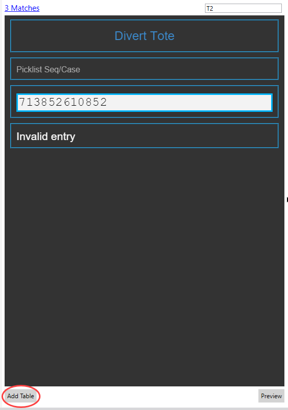
Add Table
|
Adds a table container element that allows you to drag existing elements and place them side-by-side within a container with rows and columns. Tables can include all element types. Tables are especially useful for presenting multiple elements such as data labels and fields, or even multiple menu items.
|
|
Preview
|
View an approximation of how the screen will appear on a device. Change the dimensions of the preview window to see how the screen may appear on devices with landscape orientation, for example.
|
Screen Elements
This column offers all settings and options for manipulating reformatted elements. From here, you can alter element formatting, add context menu items, and create screen banners. Simply select an element from the Reformatted Screen column and begin editing its properties here.
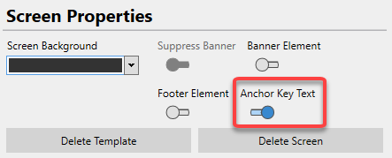
Screen
|
Screen Background
|
Sets the background color of the entire screen. This can be set on a screen-by-screen basis or using themes.
|
|
Suppress Banner
|
Hides a global banner from the individual screen. If a banner is created at the theme level, this option allows you to hide it for select screens. Until a global banner is set, this option cannot be altered.
|
|
Banner Element
|
Activates a banner element that appears at the top of the screen. When set to On, the application navigates you to the Elements tab to apply styling, set a banner title, or upload a logo image. This can be set on a screen-by-screen basis or using themes.
|
|
Footer Element
|
Adds a footer to the bottom of the screen. You can drag and drop new or existing elements into this element. The footer and any elements included within it are fixed to the bottom of the screen, even while scrolling.
|
|
Footer Background
|
Sets the background color of the footer element. This can only be done if the Footer Element is enabled.
|
|
Delete Template
|
Removes the selected screen's template and resets the screen's formatting.
|
|
Delete Screen
|
Removes the selected screen from your project.
|
Elements
|
Table Properties
|
|
|
To create a table in the Reformatted Screen, click on the screen where you want the table to be and then click the Add Table button at the bottom of the Reformatted Screen.
|
|
Rows
|
Sets the total number of rows contained within the table. By default, this is set to 2.
Reducing the number of rows on a table doesn't delete any elements located on the cells being deleted. These elements are removed from the table and placed below.
|
|
Columns
|
Sets the total number of columns contained within the table. By default, this is set to 2.
Reducing the number of columns on a table doesn't delete any elements located on the cells being deleted. These elements are removed from the table and placed below.
|
|
Width
|
Defines how much of the screen the table takes up horizontally. By default, this is set to 100%.
The table is always left justified.
|
|
Background Color
|
Sets the background color of this element. This can be set at the table or theme level.
|
|
Alternating Row Color
|
Sets the background color of every other row in the table, starting with the second row. This can be set at the table or theme level.
|
|
Dynamic
|
Allows you to treat a table as dynamic with selectable fields. Activating this option gives you access to Navigate Up Command, Navigate Down Command, and Select Command options. Selected rows are distinguished from others to alert users which row is being used.
|
|
Navigate Up Command
|
Sends a keystroke value to navigate up a row within a dynamic table.
|
|
Navigate Down Command
|
Sends a keystroke value to navigate down a row within a dynamic table.
|
|
Select Command
|
Sends a keystroke value to select the current field for entering data on a dynamic table.
|
|
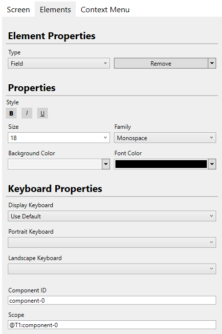
Element Properties
|
|
Element Type
|
Specifies the type or class of an element. When a theme is set, elements of the same type are subject to the same styles. You can only edit element types on a screen-by-screen basis.
The types of elements available include:
•Header. Heading text that identifies the screen currently active. A header cannot be added to spanned elements.
•Data Label. Static sub-header text that is used to label fields. This element allows you to change the label for a reformatted screen, but will not alter the black-and-green version of this label.
•Data Value. Static sub-header text that is used to label fields. This text for this value cannot be altered.
•Field. Empty text fields that end users can manually enter text.
•Menu Item. Buttons that navigate end users to different screens. A menu item cannot be added to spanned elements.
•Button. Buttons that navigate end users to different screens. These are similar to Menu Items, but are formatted for display on screens. These can be added to spanned elements and footers.
Each element has its own default styles associated, as set by Velocity's predictive formatting. For more information, see Predictive formatting.
|
|
Remove\Remove All
|
•By selecting Remove, you remove the selected screen element from the reformatted screen. By selecting Remove All, you remove all elements from the reformatted screen. To add a screen element, see the steps below. This cannot be set at the theme level.
|
|
Banner Properties
|
|
Title
|
Creates a header element that appears at the top of each screen. The text entered here will appear within that element. When an image is also uploaded, the text in this field appears to the right of the logo image. This option only appears when Banner Element is enabled.
|
|
Image
|
Uploads a logo image and places it at the top of every screen. Images should not be wider than 100 pixels or taller than 60 pixels. This option only appears when Banner Element is enabled. If you want to add an image somewhere other than the banner, create an image element and style it from the Element Properties.
|
|
Font Properties
|
|
Bold
|
Bolds the element text. By default, this is not selected.
|
|
Italics
|
Italicizes the element text. By default, this is not selected.
|
|
Underline
|
Underlines the element text. By default, this is not selected.
|
|
Alignment
|
Determines if the text is right, left, or center aligned.
|
|
Size
|
Sets the size of the element's font text. This can be adjusted from 10 to 20 points. The default value is dependent on the element type selected.
|
|
Family
|
Specifies the font family to use for the element. When a theme is set, elements of the same type use the same font family styles.
•Serif
•Sans-serif
•Monospace
|
|
Background Color
|
Sets the background color of this element.
|
|
Font Color
|
Sets the color of the visible text for this element.
|
|
Text
|
The text that appears for this element on the reformatted screen. This setting does not override any text for the standard black-and-green screens. This cannot be set at the theme level.
|
|
Command
|
Associates a specific key press with a menu item. When selected, the associated behavior with that key press is sent to the host profile. For example, on the demo server, the command for a menu item might be the number 3. When sent, the user is navigated to the next screen. This cannot be set at the theme level.
Accepted commands include the following key presses:
•Text, such as ABC
•Any named keys, like {F1} through {F24}
•Keycode hex values, such as {hex:E03B} for F1)
•Macros (for example: {hex:E050}{hex:E04D}{pause}{Enter} for "down," "right," a 250-millisecond pause, and then "Enter" keystrokes)
For a list of supported values, see Keyboard codes and commands.
|
|
Image Properties
|
|
Alignment
|
Aligns the image inside the parent element.
|
|
Background Color
|
A background color that is shown if the image has any transparency.
|
|
Image URL
|
The URL to the image, including the filename and extension. The path to the URL can use 3 formats:
•velocity://resources/ A path to a resource associated with the project.
•file:/// A path to a file stored somewhere on the device. Note that this uses an extra forward slash. This is not supported in iOS or Android 10 or newer.
•http:// or https:// A path to a file stored on a remote server that can be accessed using http or https.
There are 3 types of variables that you can use in the image URL:
•A component variable uses the exact text from the original screen, in the format of {component:the Component ID}. For example:
velocity://resources/{component:added_636511066245633526}.jpg
uses the text found in the component as the image name, whatever the text is for each page.
•A script variable which returns a text string, in the format of {script:function()}. For example:
file:///{script:FindImage()}
uses the path and filename returned by the script FindImage.
•A screen variable specifies the row, column, and length of the text in the format of {screen:row,column:length}. For example:
http://172.27.0.21/warehouse/images/{screen:4,1:12}.png
would use 12 characters starting from line 4 column 1 on the current screen as the filename.
Variables can be used for the filename or for other portions of the URL, and you can use multiple variables in the URL if needed.
|
|
Component ID
|
The component ID associated with the image element.
|
|
Keyboard Properties
|
|
Display Keyboard
|
Sets the behavior of the keyboard pop-up when a Field element is selected. This cannot be set at the theme level.
•Show. The keyboard automatically appears when tabbing to the field.
•Hide. If the keyboard is active, it automatically hides when tabbing to the field.
•Disable. Both custom and default keyboards cannot be used when tabbing to the field.
|
|
Portrait Keyboard
|
Sets the default custom keyboard to use when a screen is displaying in portrait mode. This cannot be set at the theme level.
If left blank, the default custom keyboard is used, which is the top-most keyboard listed on the Keyboards Panel of the Keyboards screen.
|
|
Landscape Keyboard
|
Sets the default custom keyboard to use when a screen is displaying in landscape mode. This cannot be set at the theme level.
If left blank, the default custom keyboard is used, which is the top-most keyboard listed on the Keyboards Panel of the Keyboards screen.
|
|
Component ID
|
Specifies the field identifier. This field cannot be altered and is automatically assigned upon creation of the element. The purpose of this value is for reference in scripts that affect specific fields.
|
|
Scope ID
|
Specifies the screen and field scope. This cannot be altered and is immediately assigned upon creation of the element.
The value here consists of the template name and component ID, separated by a colon and preceded by the @ symbol. You should copy and paste this field value when setting a field-specific scope from the Scripts tab.
|
Context Menu
|
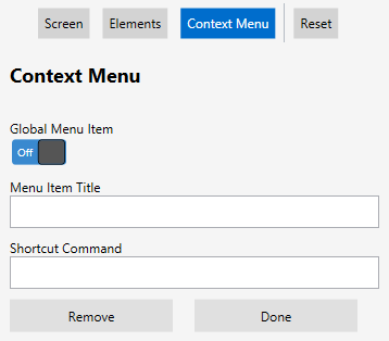
Add New
|
Adds a new context menu item, allowing you to specify a Menu Item Title and Shortcut Command. Menu items cannot be added at the theme level.
|
|
Add Voice
|
Enables text-to-speech and speech-to-text capabilities for that menu item. Additionally, this adds the Matching Phrase field, which requires a voice macro in Shortcut Command to complete a specific voice action. Voice functionality requires the Speakeasy tool. For more information, see Using Speakeasy.
|
|
Global Menu Item
|
Specifies the menu item as screen-specific or global. If set to On, the menu item appears on the context menu for every screen. If set to Off, the menu item appears only on the context menu for the current screen.
|
|
Menu Items
|
Creates and edits menu items for the context menu.
From this section, you can configure the following settings:
•Menu Item Title. The text that appears as label for a context menu item.
•Shortcut Command. Associates a specific key press with a menu item. For examples of accepted commands, see Keyboard codes and commands.
•Remove. Deletes the selected menu item.
•Done. Applies the changes to the context menu, which are visible on the Reformatted Screen pane.
|
|
Voice Enabled
|
Enables the use of voice-activated phrases to access context menu functions. This makes the Matching Phrase field visible.
|
|
Matching Phrase
|
Sets the voice command to activate the menu item. Any phrase can be entered here, provided the Client can pronounce it. Matching phrases can only be created for context menu items.
When this matching phrase is detected, it automatically executes any macro, text, or script assigned to the Shortcut Command field. For more information about shortcut commands, see Voice shortcut commands.
|