Chart Widgets
A Chart Widget displays one or more data series as a data graph.
Use a Chart Widget to display:
- Number of records created today.
- Number of Incidents by status or department.
- Mean Time to Resolve (MTTR) by priority.
- Number of open and resolved Incidents this week.
- Workload by Team.
The following figure shows several example Chart Widgets.
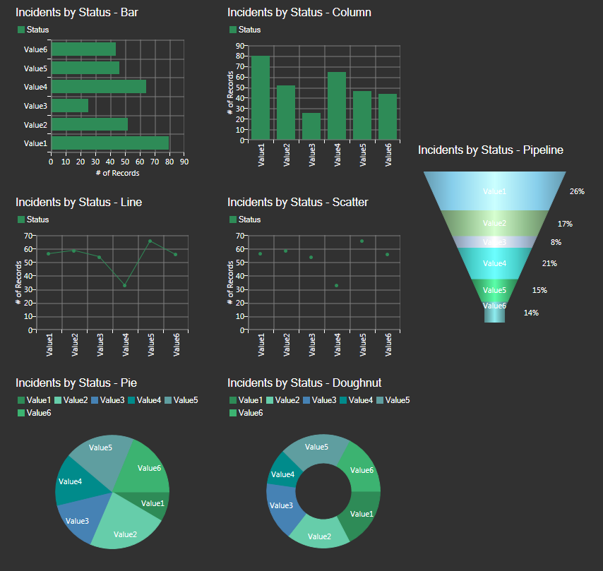
CSM provides the following types of charts:
| Chart Type | Description | Example |
|---|---|---|
| Bar | A bar chart is a chart with horizontally-plotted bars (categories) with lengths proportional to the values that they represent. Use a bar chart to compare values. |
|
| Column | A column chart is a chart with vertically-plotted bars (categories) with columns proportional to the values that they represent. Use a column chart to compare values. |
|
| Line | A line chart is a chart that displays information as a series of data points connected by straight line segments. Use a line chart to track patterns. |
|
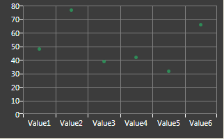
| Scatter | A scatter chart is a chart that plots two axes of data points (an x-axis and y-axis) as a set of points scattered on a graph. Use a scatter chart to track correlations within an interval. |
|
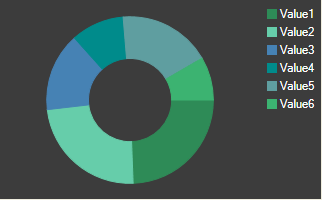
| Doughnut | A doughnut chart is a circular chart with a hole in the center that is divided into sectors (often called slices), each of which represents a proportion to a whole. The size of each slice is determined by the series value as a percentage of the total of all values. |
|
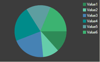
| Pie | A pie chart is a circular chart that is divided into sectors (often called slices), each of which represents a proportion to a whole. The size of a slice is determined by the series value as a percentage of the total of all values. |
|
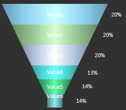
| Pipeline | A pipeline chart is a funnel chart that displays values as progressively decreasing proportions. The size of the area is determined by the series value as a percentage of the total of all values. |
|
Good to know:
- A Chart Widget is highly configurable. You can define general properties (example: Title, refresh rate, and filter exclusion), data series properties (example: Chart type, Business Object association, data to include, values for the x- and y-axes, grouping options, custom colors, combine values (clustered, stacked, or stacked 100), analysis formulas, and drill-down behaviors), x- and y-axes properties, legend properties, and display properties (example: Labels, grid lines, tooltips, color palette for items in the chart).
- By default, a Chart Widget acquires its font, colors, background style, and border style from the defined Dashboard Theme; define your own properties, if needed.
- Series combinations must be valid. Bar, doughnut, pie, and pipeline series should be the only data series in their Chart Widget. Column, line, and scatter can be combined in any way or number but you cannot mix field types (date, number, or text). For more information about data series, see Define a Series for a Chart Widget.
- Bar and column series can be stacked (series atop each other). For more information about stacking, see Stacked Bar/Column Charts.
- Typically, on a Chart Widget, the x-axis is the horizontal axis and the y-axis is the vertical axis. On bar charts, the axes are opposite.
- Bar, column, line, and scatter work the same way, differing only in the way the data is presented. Pie and doughnut are also similar. Pipeline charts are unique.
-
A preview of the Widget (with randomly generated data) is available at the top of the window. Use this to preview your Widget as you build it.
-
Refresh executes only when a Widget is active and being displayed. If you leave a dashboard and come back to it, the data will be automatically refreshed and the refresh timer will start over.
- Use refresh on Widgets where the data is likely to change (example: A Widget displaying Incident data).
- A Dashboard's refresh properties determine whether or not to 1) use the Dashboard's scheduled refresh instead, and/or 2) allow its Widgets to refresh themselves in addition to the Dashboard's scheduled refresh.
- For more information about Chart Widgets, refer to the Modifying Chart Widgets course available in theCherwell Video Learning Library (subscription-based).