Service Manager
Using the Style Editor
•Working with Colors in the Style Editor
•Customizing the User Interface
•Customizing the Self Service Mobile User Interface
About the Style Editor
Use the Style Editor to customize your workspaces with different colors of backgrounds, fields, menus, buttons, and text, as well as changing the logo. When you make a change in the left pane of the Style Editor, you can view the result in the right pane. This feature enables you to experiment with different color combinations, logos, and images for your Service Manager and Self Service Mobile user interfaces, and the login page.
Accessing the Style Editor
To access the Style Editor, do the following:
1.From the Configuration Console, click Build > User Interface Styles > Style Editor. The application displays the Style Editor.
2.Click the tab corresponding to the item to customize:
•Application: Configures the Service Manager user interface.
•Self Service: Configures the Self Service Mobile user interface.
•Login Page: Configures the Service Manager login page.
Working with Colors in the Style Editor
•About Using Colors in the Style Editor
•Changing a Color Using the Color Picker
•Changing a Color by Entering a Value
•Changing a Color by Copying and Pasting a Color Value
About Using Colors in the Style Editor
The Style Editor identifies colors by their hexadecimal values and adds two more characters at the right to identify opacity. For example, gray has a hex value of #808080. In the Style Editor, gray is shown as #808080FF. Opacity is applied to a color that is placed above another color in the user interface.
•FF means 100 percent opacity: You see only the upper color.
•80 means 50 percent opacity: You see an even blend of the upper and lower colors.
•00 means zero opacity: You see only the lower color.
See Working with the Color Picker.
Changing a Color Using the Color Picker
To change the current color of any item, do the following:
1.Choose an item in the left pane and click its hex value link.
2.Click the eyedropper icon. The application displays the color picker. See Working with the Color Picker.
Color Picker
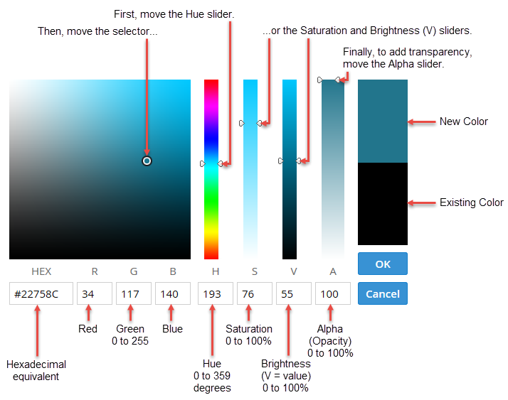
3.Select a color and click OK.
4.To see the color change, click away from the hex value link. The application marks the unsaved value with a red triangle  at the left and the revert icon
  at the right.
5.Click Save.
Changing a Color by Entering a Value
To change the current color of any item, do the following:
1.Choose an item in the left pane and click its hex value link.
2.Press Backspace to erase the current value.
3.Enter a new value.
4.To see the color change in the right pane, click away from the Hex Value link.
Changing a Component's Color
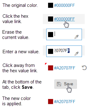
The application marks the unsaved value with a red triangle at the left and the revert icon at the right.
5.Click Save.
Changing a Color by Copying and Pasting a Color Value
If you want to apply the color from one item to another, you can copy the color value from the source item and paste it to the target item. To change the current color of any item, do the following:
1.On a source item with the color to use, select the hex value and choose Copy from the pop-up menu.
2.For the target item to change, select the hex value and choose Paste from the pop-up menu.
3.To see the color change in the right pane, click away from the hex value link. The application marks the unsaved value with a red triangle at the left and the revert icon at the right.
4.Click Save.
Customizing the User Interface
•About Customizing the User Interface
•About the Options on the Application Tab
•Customizing the Styles for a Role
•Adding a Vanity URL for a Tenant
•Adding a New Logo to the Header or Footer
•Restoring the Default Logo in the Header or Footer
About Customizing the User Interface
Use the Application tab to customize the Service Manager user interface. The settings that you configure on the Application tab affect all roles in Service Manager except for Self Service Mobile. See Customizing the Self Service Mobile User Interface.
About the Options on the Application Tab
For information on making color changes, see Working with Colors in the Style Editor.
| Section | Parameter | Description |
|---|---|---|
| Common | Text | Text color of all items in the home page, including dashboard panels. |
| Background | Background color of the home page. | |
|
Image |
Add a background image to customize the user experience. |
|
| Link | Text color of any links on the home page. | |
| Border | The color of all borders on the home page, including borders around dashboard panels and borders under headings. | |
| Mouseover | Background color of text when you hover your mouse over it. | |
| Active | Background color of text when it is the active line in a list. | |
| Panels | Background | Background color of all panels and dialog windows. |
| Header Color | Text color of the text in all panel headers. | |
| Header Background | Background color of all panel headers. | |
| Buttons | Text | Text color of buttons. |
| Background | Background color of buttons. | |
| Highlighted Color | Background color of buttons that are highlighted. | |
| Highlighted Text | Text color of buttons when they are highlighted. | |
| Header & Footer | Logo |
Displays the default logo and enables you to substitute your own logo. |
| Text | Text color of the header bar area. | |
| Background |
For a gradient texture, use different colors for the Background and Background Center fields. For a solid texture, use the same color for both. |
|
| Background Center | ||
| Link | Color of links in the header bar. | |
| Link Mouseover | Background color of text when you hover your mouse over it. | |
| Workspace Tabs | Text | Color of text in the workspace area, including inactive tab labels. |
| Background |
Background color of the workspace bar. |
|
| Active |
Color of the top of the active tab. The active tab itself takes the Common Background color. |
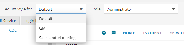
Customizing the Styles for a Role
You can also customize the interface for a specific user role. See Working with Roles. Changes you make to the default role affect all roles, except for any roles that were customized individually.
To customize the style for a role, do the following:
1.Access the Style Editor. See Accessing the Style Editor.
2.From the Role drop-down menu, choose a role.
3.Make your changes.
4.Click Save. The drop-down menu shows this role has been customized, in this example, Administrator (customized).
To restore a role to its default style, do the following:
1.Access the Style Editor. See Accessing the Style Editor.
2.From the Role drop-down menu, choose a role.
3.Click the remove customization icon  at the top of the Style Editor. The drop-down menu shows this role has been restored to default.
See also Working with Roles.
Working with Vanity URLs for Managed Service Providers
•About Using Vanity URLs for Managed Service Providers
•Adding a Vanity URL for a Tenant
About Using Vanity URLs for Managed Service Providers
Managed Service Providers (MSPs) can create vanity URLs to make it easier to customize the user interface for a specific tenant. They can then select and customize the user interface for a specific tenant, instead of having all tenants look the same. After creating the vanity URL, the application displays both a Tenant field and a Role field in the Style Editor. This means that you can customize both styles for a tenant and styles for different roles for the selected tenant.
Before you begin, you must set the alternate login URL for the MSP tenant to customize. You do this in the Service Manager Configuration Database. See the Configuration Database Guide for Ivanti Service Manager for information about using the ConfigDB, including information setting the alternate login URL.
Adding a Vanity URL for a Tenant
To add a vanity URL for a tenant, do the following:
1.Log in to the Service Manager Application.
2.Open the Org Unit workspace.
3.Select and open a tenant that does not have a parent org unit assigned to it.
4.On the Details tab, ensure that Is Primary MSP Tenant is checked.
5.Enter information into the Vanity URL field. The information that you enter here is visible from the Tenant drop-down in the Style Editor, so that you can customize the application, login, and Self Service pages.
6.Click Save.
Customizing a Tenant
To customize a specific tenant, do the following:
1.Access the Style Editor. See Accessing the Style Editor.
2.From the Tenant drop-down menu, choose the tenant to customize the application, login, and Self Service pages for.
Choosing an MSP Tenant to Customize
3.Make changes, including changes to specific roles if necessary and click Save. The drop-down menu shows that you have customized this tenant.
4.To restore a tenant role to the default configuration, do the following:
| a. | From the Tenant drop-down menu, select the tenant and the role. |
| b. | Click the remove customization icon at the top of the Style Editor. The drop-down menu shows that the tenant role has been restored to the default settings. |
Adding a New Logo to the Header or Footer
In Service Manager, logos are scaled to fit a 50-pixel vertical space in the header. Because scaling reduces image quality, the preferred logo dimensions are 50 pixels high and up to 200 pixels wide. The maximum logo dimensions are 650 pixels high by 650 pixels wide.
You cannot upload a new logo if you are using Microsoft Internet Explorer Release 9.
To add a new logo to the header or footer in Service Manager, do the following:
1.Access the Style Editor. See Accessing the Style Editor.
2.Click the HEAT Application tab.
3.Under Header & Footer, click the default logo.
Clicking the Default Logo
4.Click the select file icon  .
.
5.Navigate to the file of the logo to add and double-click the file name. The application displays the new logo in place of the default logo on the header in the right pane.
Adding a Logo to the Header or Footer
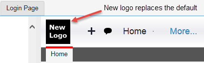
The application marks the unsaved value with a red triangle at the left and the revert icon at the right.
6.Click Save.
Restoring the Default Logo in the Header or Footer
To restore the default logo to the header or footer in Service Manager, do the following:
1.Access the Style Editor. See Accessing the Style Editor.
2.Click the HEAT Application tab.
3.Under Header & Footer, click the current logo.
4.Click the delete uploaded file icon  . The application deletes the current logo and displays the default Service Manager logo in its place.
The application marks the unsaved value with a red triangle at the left and the revert icon at the right.
5.Click Save.
Customizing the Self Service Mobile User Interface
•About Customizing the Self Service Mobile User Interface
•About the Options on the Self Service Tab
•Adding a New Logo to the Self Service Mobile User Interface
•Restoring the Default Logo for the Self Service Mobile User Interface
About Customizing the Self Service Mobile User Interface
Use the Self Service tab to configure the Self Service Mobile user interface. See Customizing the Responsive User Interface. In the current Service Manager release, the Self Service tab affects the Self Service Mobile role.
To restore the Self Service Mobile user interface to its default configuration, click the remove customization icon at the top of the Style Editor.
To change the theme:
- Under Select Theme, click CDL2 and select Light or CDL from the drop-down list. CDL2 is the default theme that is shown in the list.
- Each theme has its own set of color specifications. Existing customers who have already defined their branding colors will need to set color specifications for the themes manually. Given below are the specifications for each theme:
Section Parameter Color Specifications CDL2
CDL
Light
Common Text #262626FF #222222FF
#222222FF
Background #E5E5E5FF #F5F5F5FF
#F5F5F5FF
Link #007FA2FF #2286BBFF
#2286BBFF
Border #FFFFFFFF #FFFFFFFF
#D9D9D9FF
Mouseover #D8D8D8FF #F4F4F4FF
#F4F4F4FF
Active #D9E4EAFF #DEEDFCFF
#DEEDFCFF
Panels
Background #FFFFFFFF #FFFFFFFF
#FFFFFFFF
Header Color #222222FF #222222FF
#FFFFFFFF
Header Background #FFFFFFFF #FFFFFFFF
#289AD7FF
Grid Background
#F2F2F2FF
#F2F2F2FF
#F2F2F2FF
Buttons
Text #2286BBFF #2286BBFF
#333333FF
Background #FFFFFFFF #FFFFFFFF
#EBEBEBFF
Highlighted Color #2286BBFF #2286BBFF
#289AD7FF
Highlighted Text #FFFFFFFF #FFFFFFFF
#FFFFFFFF
Disabled Text
#A6A6A6FF
#A6A6A6FF
#A6A6A6FF
Header & Footer
Text #FFFFFFFF #2286BBFF
#222222FF
Background #262626FF #FFFFFFFF
#FFFFFFFF
Background Center #262626FF #FFFFFFFF
#ECECF0FF
Link
#FFFFFFFF
#2286BBFF
#2286BBFF
Link Mouseover
#FFFFFFFF
#2286BBFF
#FF0000FF
Role Text Color
#FFFFFFFF
#FFFFFFFF
#FFFFFFFF
Workspace Tabs Text #262626FF #333333FF
#FFFFFFFF
Background #FFFFFFFF #FFFFFFFF
#555555FF
Active #2286BBFF #2286BBFF
#FF0000FF
Sub Tab Active #000000FF #000000FF
#000000FF
Tab Border #BFBFBFFF #BFBFBFFF
#BFBFBFFF
- If you want to revert the theme setting, select the revert icon
 .
. - Click Save.
About the Options on the Self Service Tab
For information on making color changes, see Working with Colors in the Style Editor.
| Section | Parameter | Description |
|---|---|---|
| Common | Text | Text color of all items in the home page, including dashboard panels. |
| Background | Background color of the home page. | |
| Link | Text color of any links on the home page. | |
| Border | Color of all borders on the home page, including borders around dashboard panels and borders under headings. | |
| Mouseover | Background color of text when you hover your mouse over it. | |
| Active | Background color of text when it is the active line in a list. | |
| Panels | Background | Background color of all panels and dialog windows. |
| Header Color | Text color of the text in all panel headers. | |
| Header Background | Background color of all panel headers. | |
| Buttons | Text | Text color of buttons. |
| Background | Background color of buttons, such as in the chat area. | |
| Highlighted Color | Background color of a selected button. | |
| Highlighted Text | Text color of a selected button. | |
| Header (and Loading Screen) |
Logo |
Displays the default logo and enables you to substitute your own logo. See Adding a New Logo to the Self Service Mobile User Interface. |
| Text | Color of the Menu icon and IT Support Portal. | |
| Background | Color of the header background. | |
| Accent (Header) | Visible |
The accent is a horizontal line at the bottom of the header. True means visible. False means not visible. |
| Width |
Width of the accent line, from 0 to 38 pixels. The accent paints over the header. |
|
| Color | Color of the accent line. | |
| User Panel Info | Text | Color of the menu button and IT Support Portal. |
| Background | Color of the user panel background. | |
| Accent (User Panel) | Visible |
The accent is a horizontal line at the bottom of the user panel. True means visible. False means not visible. |
| Width |
Width of the accent line. The first 200 pixels paints over the user panel. Additional pixels paint over the navigation menu. |
|
| Color | Color of the accent line. | |
|
Navigation Menu
|
Text |
Color of the text in the navigation menu. |
|
Background |
Color of the background in the navigation menu. |
|
|
Mouseover |
Background color of text when you hover your mouse over it. |
|
|
Active |
Background color of text when it is the active line in the menu. |
If the user panel and navigation menu are not visible in the right pane, click the menu icon  to display them.
Adding a New Logo to the Self Service Mobile User Interface
In the Self Service Mobile user interface, logos are scaled to fit a 27-pixel vertical space in the header. Because scaling reduces image quality, the preferred logo dimensions are 27 pixels high and up to 200 pixels wide. The maximum logo dimensions are 650 pixels high by 650 pixels wide.
The settings you make under Header also affect the Self Service Mobile user interface loading screen.
Self Service Mobile User Interface Loading Screen

To add a new logo to the Self Service Mobile user interface, do the following:
1.Access the Style Editor. See Accessing the Style Editor.
2.Click the Self Service tab.
3.Under Header, click Upload file.
4.Click the select file icon .
5.Navigate to the file of the logo to add and double-click the file name. The application displays the new logo in place of the default logo and on the header in the right pane.
Self Service Mobile User Interface Logo
The application marks the unsaved value with a red triangle at the left and the revert icon at the right.
6.Click Save.
Restoring the Default Logo for the Self Service Mobile User Interface
To restore the default logo for the Self Service Mobile user interface, do the following:
1.Access the Style Editor. See Accessing the Style Editor.
2.Click the Self Service tab.
3.Under Header, click the current logo.
4.Click the delete uploaded file icon . The application deletes the current logo and displays the default Service Manager logo in its place.
The application marks the unsaved value with a red triangle at the left and the revert icon at the right.
5.Click Save.
Customizing the Login Page
•About Customizing the Login Page
•About the Options on the Login Page Tab
•Adding a Background Image to the Login Page
•Restoring the Default Background to the Login Page
•Editing the Title Text on the Login Page
•Adding a New Logo to the Login Page
•Restoring the Default Logo on the Login Page
•Adding Customized Text Above the Copyright on the Login Page
•Adding an Image to the Left Bar on the Login Page
•Restoring the Default Left Bar on the Login Page
•Adding an Image to the Top Bar of the Login Page
•Restoring the Default Top Bar on the Login Page
About Customizing the Login Page
Use the Login Page tab to configure the Service Manager login page. The same login page is displayed for all roles and user interfaces.
For Cloud: The customizations to the login page are saved in the tenant that you are configuring. Use the URL that is configured for the Tenant record in the ConfigDB in order to access the login page
For On-Premise: The application will select which customizations to displayed based on the address used in the browser. For the customizations to be correctly displayed, you must use the URL that is configured in the ConfigDB in order to access the customized login page
To restore the login page to its default configuration, click the remove customization icon at the top of the Style Editor.
About the Options on the Login Page Tab
For information on making color changes, see Working with Colors in the Style Editor.
| Section | Parameter | Description |
|---|---|---|
| Common | Layout |
The name of the current layout to display the drop-down menu. Legacy (original Service Manager login page design) Cloud Fancy Enterprise |
| Links | Text color of the Forgot Password? link. | |
| Background | Color | Background color of the login page. |
| Image |
An image for the background. Click Upload file to add an image. |
|
| Title | Show |
Cloud, fancy, and enterprise layouts only. True means visible. False means not visible. |
| Text Title |
The text title. See Editing the Title Text on the Login Page. NOTE: You cannot localize the title text. |
|
| Text Color | Color of the title text. | |
| Size | Size of the title text. | |
| Logo | Show |
Cloud, Fancy, and Enterprise layouts only. True means visible. False means not visible. |
| Scale | Display size of the logo as a percentage of the original image. | |
| Image |
The logo image. Click Upload file to add a logo. |
|
| Form | Border Color | For legacy layouts only. The color of the border. |
| Border Width | For legacy layouts only. A wide border displaces other objects on the form. To hide the border, set the width to zero. | |
| Field Text | Color of the text in the User name and Password fields. | |
| Field Background | Background color of the fields. | |
| Field Border | Color of the of the border around the fields. | |
| Field Text Size | Size of the text in the User name and Password fields. | |
| Label | Color of the words User name and Password. | |
| Button Background | Color of the Login button. | |
| Button Text | Color of the word Login. | |
| Copyright | Additional Text |
Additional text for your implementation, such as your copyright text. Click this link to enter text above the copyright. See Adding Customized Text Above the Copyright on the Login Page. NOTE: You cannot localize the copyright. |
| Text Color | Color of the copyright text. | |
| Links | Color of the hyperlinks in the copyright text. | |
| Bars | Height |
For legacy layouts only. Height of the top and bottom bars in pixels. To hide the background, set the width to zero. For the background to appear, set the bar height to be greater than the border width. |
| Background Color |
Color of the space above the top bar and below the bottom bar. The background has a gradient with white. |
|
| Border Width |
Width of the top and bottom bars in pixels. To hide the bars, set the width to zero. |
|
| Border Color | Color of the top and bottom bars. | |
| Left Bar | Background | For cloud layouts only. Color of the left bar. |
| Width |
Width of the left bar in 15-pixel increments. To hide the bar, set the width to zero. |
|
| Image |
An image for the left bar. Click Upload file to add an image. |
|
|
Top Bar
|
Background |
For enterprise layouts only. Color of the top bar. |
|
Height |
Height of the top bar in pixels. To hide the bar, set the height to zero. |
|
|
Image |
An image for the top bar. Click Upload file to add an image. |
Adding a Background Image to the Login Page
When you fill a background using an imported image, Service Manager anchors the image at the upper left corner and either repeats the image to fill the background or crops the image to fit the background.
When using a small image, such as a logo, you expect the background to be repeated, so the login page should look OK regardless of its background size.
When using a large image, such as a landscape, you want the image to fill the background of the login page without repeats or excessive cropping.
In the table below, we show the background image size of the Service Manager login pages in a maximized browser window on two common monitor resolutions, without any cropping or repeating of the image.
| Layout | 1680 x 1050 Monitor | 1920 x 1080 Monitor |
|---|---|---|
| Legacy | 1680 x 871 pixels | 1920 x 901 pixels |
| Others | 1680 x 991 pixels | 1920 x 1021 pixels |
To add a new background image to the login page, do the following:
1.Access the Style Editor. See Accessing the Style Editor.
2.Click the Login Page tab.
3.Under Background, click Upload file.
4.Click the select file icon .
5.Navigate to the file of the image to add and double-click the file name. The application displays the image in place of the default background. This example shows the legacy layout.
Background Image on the Login Page

The application marks the unsaved value with a red triangle at the left and the revert icon at the right.
6.Click Save.
Restoring the Default Background to the Login Page
To restore the default background on the login page, do the following:
1.Access the Style Editor. See Accessing the Style Editor.
2.Click the Login Page tab.
3.Under Background, click the current image.
Restoring the Default Background Image to the Login Page
4.Click the delete uploaded file icon . The application deletes the current image and displays the default background image in its place.
The application marks the unsaved value with a red triangle at the left and the revert icon at the right.
5.Click Save.
Editing the Title Text on the Login Page
To edit the title text on the login page, do the following:
1.Access the Style Editor. See Accessing the Style Editor.
2.Click the Login Page tab.
3.Under Title, click in the Title Text field.
4.Edit the information.
The application provides a title in English. You cannot localize this text.
The application marks the unsaved value with a red triangle at the left and the revert icon at the right.
5.To keep your text changes, click OK.
6.Click Save.
Adding a New Logo to the Login Page
The maximum logo dimensions are 650 pixels high by 650 pixels wide. You can scale your logo to fit the login page.
To add a new logo in the login page, do the following:
1.Access the Style Editor. See Accessing the Style Editor.
2.Click the Login Page tab.
3.Under Logo, verify that Show is set to true.
4.Click Upload file.
5.Click the select file icon .
6.Navigate to the file of the logo to add and double-click the file name. The application displays the new logo in place of the default logo on the login page. This example shows the cloud layout.
Changing the Logo on the Login Page
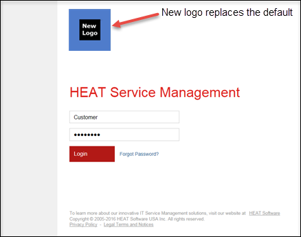
7.Adjust the scale of the logo.
If a logo is too large, it displaces the other objects on the login page, forcing users to scroll to enter their user names and passwords.
Scaling a logo greater than 100% reduces its image quality.
The application saves the value with a red triangle at the left and the revert icon at the right.
8.Click Save.
Restoring the Default Logo on the Login Page
To restore the default logo in the Self Service tab:
1.Access the Style Editor. See Accessing the Style Editor.
2.Click the Login Page tab.
3.Under Logo, click the current logo.
4.Click the delete uploaded file icon . The application deletes the current logo and returns the default Service Manager logo in its place.
The application marks the value is marked with a red triangle at the left and the revert icon at the right.
5.Click Save.
Adding Customized Text Above the Copyright on the Login Page
You cannot edit the Service Manager copyright statements. But you can add text that appears above them on the login page. To add text above the Service Manager copyright, do the following:
1.Access the Style Editor. See Accessing the Style Editor.
2.Click the Login Page tab.
3.Under Copyright, click in the Additional Text field to open the Copyright dialog box.
4.Edit or add copyright text.
To access the other text tools, click the menu icon  . You can also widen the Translation window until all text tools are visible.
5.Enter your text:
•To apply a text style, highlight the text to be styled and then click the appropriate text tool.
•To enter text in a different language, click the Language menu and choose a language.
•To add a hyperlink, highlight a word or phrase in the text and click the hyperlink tool  . Enter the link in the pop-up window and click OK.
6.Click OK.
7.Optional: To view a hyperlink, in the right pane, mouse-over the link to see the address in a pop-up message at the bottom of your screen.
Viewing a Hyperlink

8.Optional: To test a hyperlink, in the right pane, right-click the link and choose Open in new tab. If the address is valid, the destination site opens in the new browser tab.
The application marks the value with a red triangle at the left and the revert icon at the right.
9.Click Save.
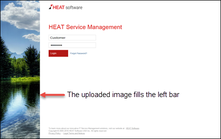
Adding an Image to the Left Bar on the Login Page
When you fill the left bar using an imported image, Service Manager anchors the image at the upper left corner and crops the image to fit the bar or enlarges the image to fill the bar. You can set the width of the left bar but not its height:
•On a 1680 x 1050 monitor, the left bar can be up to 991 pixels high.
•On a 1920 x 1080 monitor, the left bar can be up to 1021 pixels high.
First determine the dimensions of the left bar as it appears on your production servers. Then choose an image, without excessive enlargement or cropping, to fill the left bar.
To add a new background image to the login page, do the following:
1.Access the Style Editor. See Accessing the Style Editor.
2.Click the Login Page tab.
3.Under Left Bar, click Upload file.
4.Click the select file icon .
5.Navigate to the file of the logo to add and double-click the file name. The application fills the left bar on the login page with the uploaded image.
Uploaded Image for the Left Bar on the Login Page
The application marks the value with a red triangle at the left and the revert icon at the right.
6.Click Save.
Restoring the Default Left Bar on the Login Page
To restore the default image for the left bar on the login page, do the following:
1.Access the Style Editor. See Accessing the Style Editor.
2.Click the Login Page tab.
3.Under Left Bar, click the current image.
4.Click the delete uploaded file icon . The application deletes the current image and displays the default background image in its place.
The application marks the value with a red triangle at the left and the revert icon at the right.
5.Click Save.
Adding an Image to the Top Bar of the Login Page
When you fill the top bar using an imported image, Service Manager anchors the image at the upper left corner and either repeats the image to fill the bar or crops the image to fit the bar. You can set the height of the top bar but not its width.
•On a 1680 x 1050 monitor, the top bar can be up to 1680 pixels wide.
•On a 1920 x 1080 monitor, the top bar can be up to 1920 pixels wide.
If you plan to fill the top bar with a single image, such as a landscape, first determine the dimensions of the top bar as it appears on your production servers. Then, choose an image without repeats or excessive cropping to fit the top bar.
To add a new background image to the login page, do the following:
1.Access the Style Editor. See Accessing the Style Editor.
2.Click the Login Page tab.
3.Under Top Bar, click Upload file.
4.Click the select file icon .
5.Navigate to the file of the logo to add and double-click the file name. The application displays the uploaded image in the top bar on the login page.
Uploaded Image for the Top Bar on the Login Page
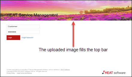
Note that the application superimposes the title (in this instance, HEAT Service Management) over the image. In this example, the text color was darkened for better contrast against the background image. See Editing the Title Text on the Login Page.
The application marks the value with a red triangle at the left and the revert icon at the right.
6.Click Save.
Restoring the Default Top Bar on the Login Page
To restore the default background on the login page, do the following:
1.Access the Style Editor. See Accessing the Style Editor.
2.Click the Login Page tab.
3.Under Top Bar, click the current image.
4.Click the delete uploaded file icon . The application deletes the current image and displays the default background in its place.
The application marks the unsaved value with a red triangle at the left and the revert icon at the right.
5.Click Save.
Was this article useful?
Copyright © 2019, Ivanti. All rights reserved.