Adding a Pie Chart
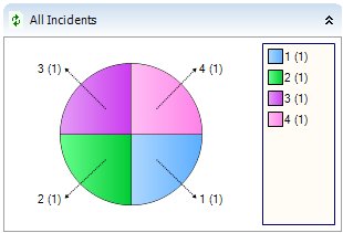
Pie charts represent the results of a query grouped by one of the attributes.
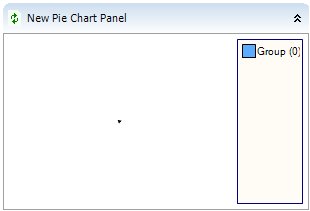
To add a Pie Chart panel to a dashboard:
- Right-click the relevant column, then click Add Pie Chart Panel.
The new panel appears.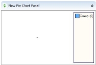
- Firstly, you should add the relevant query to the panel, so expand the Queries tree (
 ), and drag the required query onto the panel.
The Panel Title is automatically updated to the name of the query that you added.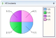
The colors that you see initially are the default colors that are specified in the System Settings. You can change these as required.
For more information, see Default Colors for Pie Charts and Bar Charts.
- Right-click the panel, then click Panel Properties.
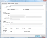
- On the Panel Properties tab, if required, you can rename the Title for the panel, and you configure the colors for the Panel header as described in Modifying the appearance of panel headers.
- Click the Chart General tab.
- In the Chart Title box, type the title of the chart.
This appears above the chart.
If you add this panel to a Multiple Panel, then you would probably want to specify a Chart Title, as the title specified in the Panel Properties will be the title for all of the panels contained within it.
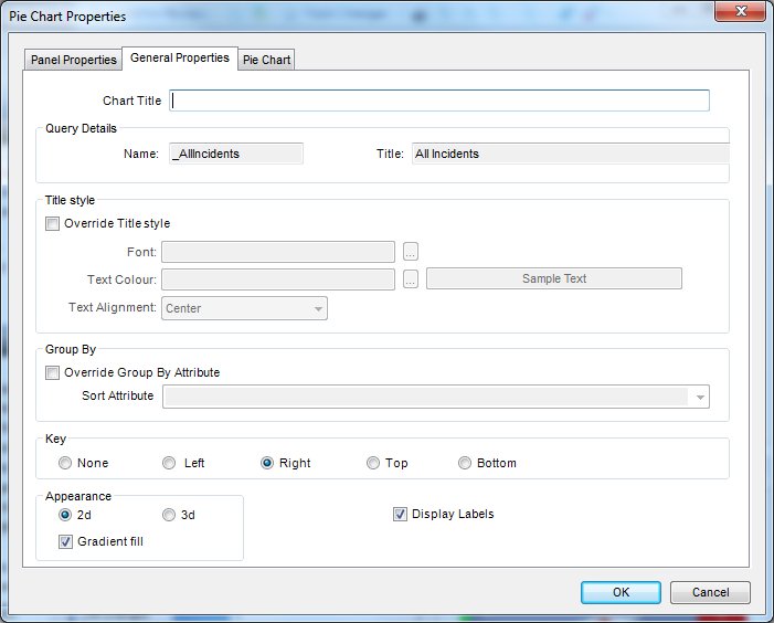
You can choose the attribute by which the attribute is grouped, as by default, this is taken from the query itself.
- On the Chart General tab, in the Group By group box, select the Override Group By Attribute, and then in the Sort Attribute list, select the attribute by which you want to group the chart. For example, Status.Title.
The attributes listed are all of those attributes that have been added to the query.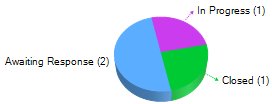
If you move your mouse over each section, a number appears telling you how many items are at that status.
- If you want to add a Key to your chart, then on the Chart General tab, select the required option. You can choose between: None, Left, Right, Top and Bottom.
- Within the Appearance group box, you can also chose whether to display your chart as 2d or 3d.
By default, labels are automatically added to the Pie Chart. In certain circumstances labels might clutter the chart, so you can choose to remove them.
If you select 2d, then you can specify that a gradient is used on the chart by selecting the Gradient Fill check box. The gradient is calculated automatically from the colors specified in the System Settings. If you have not specified a set of colors, then random colors are used. For more information about system settings, see the Administrator Guide.
- Select or clear the Display Labels check box as required.
- If you want to separate the segments of the Pie Chart, click the Pie Chart tab.
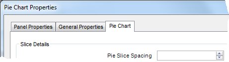
- In the Pie Slice Spacing box, either type the number of pixels you want the spacing to be, or use the up and down arrows.
- Click OK to save the changes you have made.
You can double-click a slice of the Pie Chart to bring up the Query Results list for that query.