Dashboards in Workspaces
Dashboards that appear in Self Service also appear in Workspaces, and are published to the same users. Changes made to the design of a Self Service dashboard are reflected in the design of the corresponding Workspaces dashboard. However, in Workspaces, these dashboards are displayed in a different manner and on a responsive grid. You cannot edit these dashboards in Workspaces.
If you create a new Self Service dashboard, and run the database upgrade in Configuration Center, then a matching dashboard for Workspaces is also created with the same publishing rules as the Self Service dashboard.
Currently, not all gadgets are supported for Workspaces: only the Query, Bar chart, Pie chart, Content, and Links gadgets are supported. If a migrated dashboard includes an unsupported gadget, then that gadget does not appear in Workspaces, and the dashboard design rearranges to take its space.
Query gadget
The number of columns displayed in the results list for a Query gadget in Workspaces depends on the width of the device or browser window you are using. There is no paging on Query gadgets in Workspaces – all of the results are returned on a single page with a scroll bar. If the query is grouped, the groups appear as tiles that include the title of the group and the number of items in the group. Clicking one of these groups displays the contents of the group as a query results list. Clicking a row opens the corresponding record, unless the Prevent launch option has been selected in Self Service.
You can change the appearance of Query gadgets in Workspaces using Report Templates. However, specifying fixed widths can affect the responsive nature of Workspaces, so we recommend that you avoid specifying fixed widths in Report Templates used by Workspaces.
For information about creating Report Templates, see Creating report templates for Web Access and Workspaces. For information about using Report Templates, see Viewing queries as reports.
Column/bar chart gadget
If you have a grouped query in Self Service, you can choose the option View as Bar Chart from the gadget menu. In Workspaces, these gadgets are more accurately called Column charts. Clicking a column displays the contents of the group as a query results list, unless the Prevent launch option has been selected in Self Service.
For information about creating bar charts and pie charts in Web Access, see Grouping query results and creating charts.
Pie chart gadget
Up to six sectors are displayed in a Pie chart gadget in Workspaces. If the corresponding query contains more than six groups, the largest five groups are displayed, with the other groups combined into a final sector called Other. Clicking the Other sector or legend displays a new Pie chart containing only its groups. To return to the original Pie chart from the Other Pie chart, click  on the chart.
Clicking a sector or its corresponding legend in a Pie chart displays the contents of the group as a query results list, unless the Prevent launch option has been selected in Self Service. If the Prevent launch option has been set, you can still drill down to the Other Pie chart, however.
The colors used for column charts and pie charts are automatically selected from a standard palette. The title of the pie chart is the title of the attribute that the chart is grouped by.
Links gadget
The Links gadget provides links that enable you to log a new instance of a process, open a query results list, or open a link to a different web page. If a Links gadget contains one link or two links, these links appear directly on the dashboard; if a Links gadget contains more than two links, clicking the Links gadget displays all of the links separately on a new page.
On the Create Links Gadget dialog and the dialogs for the individual links on the gadget, you can specify the Title, Description, Color (from a predefined palette), and Image that are used in Workspaces.
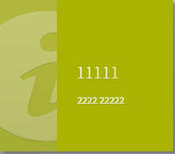
Links gadget:

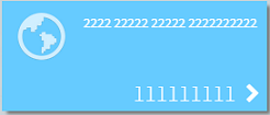
Link:

1 = Title, 2 = Description
Although a number of images are provided for you to choose from, you can also add your own images to use on Link gadgets and Links in Workspaces by adding a shortcut in Web Access to create a new User Interface Web Image.
To add an image to use on a Link gadget or Link in Workspaces:
- In Web Access, right-click the shortcut bar, then click Add process or object shortcut.
The Create process dialog appears. - Type a Shortcut title, such as New icon, and select the Add to shortcut bar? check box.
- In the Module list, select User Interface.
- In the Object list, select Web Image, then click OK.
The shortcut is added to the shortcut bar. - Click the shortcut that you just created.
The New Web Image window appears. - In the Type list, select Icon.
- Type a unique Title for the new image, then click Browse.
- Browse to and select the image you want to add, then click Save and close.
The image is added and can be selected from the Links gadget and Link dialogs.
Content gadget
The Content gadget enables you to view text, including images and hyperlinks on a dashboard. If the content contains fixed widths or images that are wider than the smallest width allowed by the gadget then scroll bars appear. To get the greatest benefit from the responsive nature of Workspaces, we recommend that you avoid specifying fixed widths in any Content gadgets used by Workspaces.