Understanding the Keyboard Editor
Creating and editing keyboards is done through the Keyboards tab in the Velocity Console. This tool allows you to directly edit a keyboard within a project, create custom keys for use between multiple keyboards, edit individual key details and values, and export keyboards to another project.
To get started with a custom keyboard, click the Add button in the Keyboards panel in the bottom right. After you have created a custom keyboard, you can edit the layout and keys.
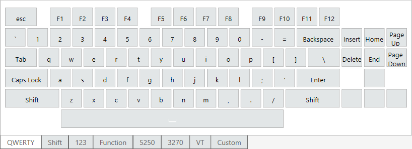
The Editor panel displays the keyboard as it appears on a mobile device. You can drag and drop keys from the Keys panel into this panel to customize the organization of your keyboard. In addition, individual keys are configurable from the Key Detail panel when the key is selected in the Editor panel.
In the top-right corner of the Editor panel is a row of options that perform the following actions:
•Default. Displays and allows you to edit all keys containing normal states.
•Shift. Displays and allows you to edit all keys containing shift states.
•Long Press. Allows you to edit the details of a key with a long press label and value.
•Preview. Displays the keyboard in both landscape and portrait modes on a mobile device-sized screen. The keys can still be selected and edited from this viewing mode.
•Settings. Displays all options for defining a keyboard's behaviors, defaults, and tags. The options listed below are controlled on a keyboard-by-keyboard basis:
•Default Keyboard State. Displays the specified state of the keyboard. For example, if Shift is selected, when the keyboard is opened in the Ivanti Velocity Client, it defaults to the shifted state.
•Rotate To Keyboard. Changes to a different keyboard when switching between landscape and portrait viewing mode. Enter the full name of a desired keyboard as it appears in the project. If your keyboard is assigned to both Landscape and Portrait viewing modes in Allowed Modes, it still changes to the specified keyboard when rotated. The keyboard you specify here must have the alternate viewing orientation assigned in Allowed Modes or it will not load the new keyboard. A Rotate To Keyboard value must be provided for both your designated portrait and landscape keyboards, or else you cannot alternate between the two.
•Auto Return. Returns you to the default state after the user taps a key. For example, if a user taps the Shift key to display the shift state of each key and then they tap the N key, the keyboard would revert to the non-shifted state after registering the key press.
•Allowed Modes. Assigns predefined modes to a keyboard for specific emulation and orientation types.
A mode must be selected for emulation type and orientation or the custom keyboard cannot be used in the Velocity Client.
•Background Color. Sets the color for the background of a keyboard. The space between the keys displays this color.
•Default Style. Sets the default style of all keys. If you change the default to a different style, all keys using the old default style will automatically change to the new default. This field is set to the normal style by default. To edit and create styles, see Using the keyboard style editor.
•Edit Template. Launches the Edit Template dialog, where you to alter the layout and size of keys as well as add and remove keys on a template. For more information, see Editing keyboard templates.
The Keys panel displays all available key values you can add to a keyboard. From this section of the Velocity Console, you can use predefined keys or create your own custom keys to use on multiple keyboards. The keys displayed here are available across all projects and allow you to add the most-common alpha and numeric values as well as symbols and application-specific custom keys.
To add a key to a keyboard, select the key from the Keys panel and drag and drop it on the desired location in the Editor panel. If you drop a key in the Editor panel on a key with a pre-existing label and value, the original key is overwritten.
The Keys panel consists of multiple tabs that categorize the types of buttons you can add to a keyboard:
•QWERTY tab. Displays all keys commonly found on a standard QWERTY keyboard in their normal state. If the Enable Shift State option is selected in the Edit menu drop-down and you drag a key from this tab, its shifted state is also applied to the keyboard in the Editor panel. If you want to disable this setting and not create the shifted state of each key you drag to your keyboard, click Edit > Disable Shift State.
•Shift tab. Displays all keys commonly found on a standard QWERTY keyboard in their shifted state.
•123 tab. Displays all pre-generated numbers and symbols.
•Function tab. Displays all available function keys and their associated function, from F1 to F24.
•5250 tab. Displays all pre-generated keys available for IBM 5250 terminal emulation.
•3270 tab. Displays all pre-generated keys available for IBM 3270 terminal emulation.
•VT tab. Displays all pre-generated keys available for VT terminal emulation.
•Custom tab. Displays all custom keys you've created. You can create more custom keys by clicking Add Key. This creates a new key in the tab that you can edit in the Key Detail panel. You can add special actions to custom keys, which are described in Key Details Panel. Custom keys do not need to be added to a keyboard in the Editor panel to edit them. Any custom keys you create here can be used in all other projects.
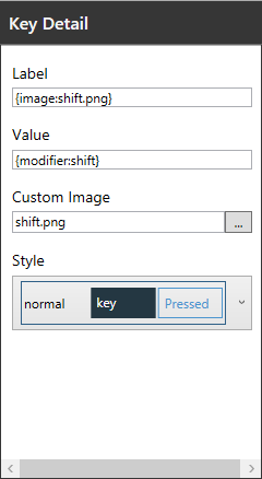
The Key Details panel allows you to set labels and values, upload custom images, and change key coloring styles on a key-by-key basis. When you select a key from the Editor panel or the Custom tab in the Keys panel, you can change the key's behaviors through the Key Details panel. If no key is selected, the form cannot be used. This panel cannot be used to edit keys from the Keys panel, except for those found on the Custom tab.
In the Key Details panel you can modify the following values:
•Label. The text that appears on the key to identify its intended function.
•Value. The action that occurs when a specific key is tapped. Values are commonly text, like numbers or letters. If you enter multiple letters, numbers, or symbols for a key value, the application will only use the first letter or number in this field. Keys can also include additional values for special functions. For example, a key with the letter a would have a value of a, whereas a key with the label CLEAR would have a value of {hex:0003} to delete all text in a field. Supported values include:
•{hex:0000} - This value associates the key with a specific hex code, which allows for actions such as clearing all text in a field. All supported hex values are included as predefined keys in the Keys panel. For a list of all accepted hex values, see Keyboard codes and commands.
•{special:scan} - This activates and deactivates the device's camera or scanner.
•{modifier:shift/normal} - This value creates the Shift key function, switching between the shift and normal states for a keyboard. For example, if you want to change to the shift state of your keyboard, you use the value {modifier:shift}. To return to the normal state of your keyboard from the shifted state, you use the value {modifier:normal}.
•{lock:shift} - This locks the keyboard into its Shift state, like the Caps Lock key on a standard computer keyboard.
•{layout:keyboardName} - This allows you to change to another custom keyboard from the current keyboard. The keyboard name should be entered as it appears in the Keyboards panel. For example, if you wanted to display another custom keyboard called "123," you type {layout:123} to create a value for that keyboard. When a user taps the key on a mobile device, the 123 keyboard displays.
•Long Press Label. The text that appears when a user taps and holds a key. This field can only be edited when the Long Press button is selected in the Editor panel.
•Long Press Value. The action that occurs when a specific key is tapped and held. This field supports the same values as the Value field. This field can only be edited when the Long Press button is selected in the Editor panel.
•Custom Image. Upload a custom image to display as the button label. Images must be in .png format and should contain a transparent background. By default, clicking the browse button opens a folder in Keyboard Editor that lists all predefined button images. When you upload a new custom image, it is automatically copied to the Images folder in your Keyboard Editor library. Smaller images are recommended as large file sizes may impact the performance of keyboards in the Ivanti Velocity Client.
•Style. The color of a button and text when static or tapped. Preset styles can be accessed from here on a per-key basis or the default can be edited by navigating to View > Styles. This field can only be edited when the Default or Shift options are selected in the Editor panel. To edit and create styles, see Using the keyboard style editor.
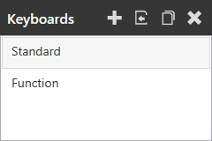
The Keyboards panel allows you to import, view, and edit custom keyboards from within your project. Importing a custom keyboard only links the file from its current project to your open project. A single keyboard can be linked to and edited in multiple projects.
Within this panel, a keyboard associated with your project can be selected, and then altered in the Editor panel.
In the top-right corner of this panel you can perform the following actions:
•New. Adds a keyboard from a template to your project. When adding a keyboard you must provide a unique name for the keyboard. Once a name is entered, a custom keyboard is created based on the template and its name appears in the Keyboards panel.
•Import. Imports a local custom keyboard to your project. After adding the keyboard, it appears in the list of keyboards associated with your project. Changing an imported keyboard's name will change its name in any other projects that use the keyboard. If no other projects contain custom keyboards, you cannot import a keyboard.
•Clone. Creates a copy of the selected keyboard with a new name. This option is recommended when making changes to a custom keyboard used in other projects that you don't want to affect.
•Delete. Removes the active link to the keyboard from the project. You can also remove a keyboard from your project by navigating to Edit > Remove Keyboard. To delete a keyboard permanently, you must navigate to [User documents folder]\AppData\Local\Velocity Console\KeyboardEditor\Library\KeyboardLibrary.xml, open the file, and delete all text for that keyboard between the <layout></layout> tags that contain the name of your keyboard.
Keyboards appear in the order they are created. When a keyboard bundle is deployed to the Client, users can swipe left or right through all keyboards associated with the project. The order of the keyboards within the Velocity Client is based their order in this panel.
To change the order of your keyboards, click Edit > Reorder Keyboards. The Reorder Keyboards dialog appears. Drag and drop the title of the keyboard you want to move within the list of keyboards. This new order will be reflected within the Terminal Emulation Client when device users swipe between keyboards.
To change keyboard settings such as the height, width, transparency, or docking position, see Keyboard settings.


