Form Editor Toolbar
Use the Form Editor toolbar to quickly access common commands for formatting the appearance and behaviors of a form and its form controls. The toolbar is made up of smaller toolbars:
Form Editor toolbar displayed when using a classic theme. 
Form Editor toolbar displayed when using a universal theme. 
| 1 |
Clipboard Controls Toolbar Options to cut, copy, paste and delete form controls. When using the Form Editor, these options are only displayed in the Form Editor toolbar and not the Blueprint Editor toolbar. These options are also available from the Edit menu bar item on the Blueprint Editor toolbar. |
| 2 |
Formatting Toolbar Options for formatting form control text/label (font, style, size, and alignment), colors/styles (foreground, background, and border), and behaviors (visibility, anchoring, and image). Also displays options for accessing a form background color. |
| 3 |
Label Toolbar Options for defining form control labels and wrapping. |
| 4 |
Desgin Toolbar Options for aligning and placing form controls. |
| 5 |
Snapping Settings Toolbar Options for enabling a grid to which you can snap form controls. |
| 6 |
Adaptive Layouts Toolbar Options for managing a form's adaptive layouts. |
Good to know:
- Move a toolbar by grabbing the grab bar
 and dragging the toolbar to a new location.
 - Many of the toolbar options are also available from the Form Editor context (right-click) menu.
Clipboard Controls Toolbar
| Button | Action | Description |
|---|---|---|

|
Cut |
Moves the selected item to the clipboard, so you can then paste the item elsewhere. Disabled until you make a selection in the Form Editor. |

|
Copy |
Copies the selected item to the clipboard, so you can then paste the item elsewhere. Disabled until you make a selection in the Form Editor. |

|
Paste |
Inserts an item from the clipboard. When pasting to the same form, the item is pasted in an offset position (slightly overlaid on the original item). When pasting to a different form, the item is pasted in the original item's position. The pasted item's properties are the same as the copied item. You can name and customize the pasted item. Disabled until you cut or copy a selection in the Form Editor. |

|
Delete |
Deletes the current selection. Disabled until you make a selection in the Form Editor. |
Formatting Toolbar
The Formatting toolbar offers multiple options for text, color/style, and behaviors. Specifically:
- Form control text/label
- Control color/style
- Control behavior
- Form background color
Form Control Text/Label:
| Button | Action | Description |
|---|---|---|
|
Form control text (classic themes toolbar)
Form control text (universal themes toolbar) |
Classic theme: For forms using a classic theme there are two different font modes for form control text:
To switch to theme mode, select Theme Font from the top of the list. To switch to explicit mode, select a font in the drop-down. Universal theme: For forms using a universal theme, the theme association fonts are listed. Select a theme association font to apply the selected form control text (example: Label, banner, list text, etc). |

|
Font size (classic themes toolbar only) |
Explicitly sets the form control font size (example: 10 points). This option is only available when using explicit font mode and classic themes. |

|
Font selection and style (universal themes toolbar only) |
Opens the Font Settings dialog. Associates the form control with the theme font, or an explicit font you select in the Font drop-down list. Additional text formatting selections are available (example: size, bold, underline and alignment). Selecting an explicit font changes the entry in the Form Control Text drop-down list to (Custom), indicating that the font selected is not a theme font.
This option is only available when using universal themes. |

|
Font style (classic themes toolbar only) |
Adds style to the form control font (bold, underlined, or italics). This option is only available when using explicit font mode and for classic themes only. |

|
Horizontally align text (classic themes toolbar only) | Aligns text left, center, or right on a horizontal axis within the form control bounding box. |

|
Vertically align text (classic themes toolbar only) | Aligns text top, middle, or bottom on a
vertical axis within the form control bounding box.
Select the drop-down arrow to define the alignment option. |
Control Color/Style
For further information on expressions, see Expressions
| Button | Action | Description |
|---|---|---|

|
Background color |
Classic theme: Select the button to use the most recently used color (assuming you have set a color). To explicitly apply a color, select the drop-down arrow, and then select a solid color or a gradient. You can use an expression to conditionally change the color. Universal theme: Select the button to open the Color Selector dialog, and then select a color association as defined in your theme color palette. To use a custom color, select (Custom) in the drop-down list, and then select a Web color, or create a custom color. |

|
Text color |
Classic theme: Select the button to use the most recently used color (assuming you have set a color). To explicitly apply a color, select the drop-down arrow, and then select a solid color or a gradient. You can use an expression to conditionally change the color. Universal theme: Select the button to open the Color Selector dialog, and then select a color association as defined in your theme color palette. To use a custom color, select (Custom) in the drop-down list, and then select a Web color, or create a Custom color. |

|
Border color |
Classic theme: Select the button to use the most recently used color (assuming you have set a color). To explicitly apply a color, select the drop-down arrow, and then select a solid color or a gradient. You can use an expression to conditionally change the color. Universal theme: Select the button to open the Color Selector dialog, and then select a color association as defined in your theme color palette. To use a custom color, select (Custom) in the drop-down list, and then select a Web color, or create a Custom color. |

|
Border style |
Sets the style of the border around the form control (No Border, 3D, or Pixel width), if there is a border. Select the button to use the most recently set style (assuming you have set a style). To explicitly apply a style, select the drop-down arrow, and then select a style. While you can select 3D borders for any form control, rounded shapes do not allow 3D settings. |
Control Behavior
For further information on expressions, see Expressions
| Button | Action | Description |
|---|---|---|

|
Visibility |
Conditionally controls when the form control appears and disappears. The visibility is based on an expression. Select the drop-down button to define a custom expression. Select the drop-down arrow to access options for creating a custom expression, selecting a stored expression, or clearing the expression. |

|
Visibility by Expression |
Conditionally controls when the form control is available. The visibility is based on an expression. Select the drop-down button to define a custom expression. Select the drop-down arrow to access options for creating a custom expression, selecting a stored expression, or clearing the expression. |
|
Localization options |
Enables you to:
|

|
Control anchor |
Sets the anchoring behavior of the form control. Select the button to use the most recently set anchoring options (assuming you have set an option). To explicitly apply an anchoring option, select the drop-down arrow next to the button to open the Anchoring window, and then select an anchoring option. |

|
Control image |
Defines the image to display on the form control, as well as alignment. Select the button to open the Image Manager, and then select an image to show on the form control. Select the drop-down arrow to access options for creating a custom expression, selecting a stored expression, clearing the expression, or aligning the image. |
Form Background Color
| Button | Action | Description |
|---|---|---|

|
Form background |
Sets the form background color. Select the button to use the most recently set color (assuming you have set a color). To explicitly apply a color, select the drop-down arrow, and then select a single color or a gradient (gradients are available for classic themes only). With classic themes, you can use an expression to conditionally change the color.
The drop-down is available for classic themes only. For universal themes you select a color association as defined in your theme color palette, or create a custom color. |
Label Toolbar
| Button | Action | Description |
|---|---|---|

|
Label Text Box |
Defines the text/label that appears on the currently selected form control. Type the text into the Label text box. This value only affects the primary selected form control. |

|
Expression |
Conditionally defines the text that appears on the currently selected form control. You can use either:
|

|
Tooltip | Defines the tooltip that appears when a user hovers over the form control. |
Design Toolbar
The Alignment toolbar controls alignment, size, and order.
For most alignment operations, you must select at least two form controls. The last selected control is the controlling control (the control against which all other selected controls are sized and aligned). The controlling control is identified by black handles. All other selected controls are identified by white handles.
| Button | Action | Description |
|---|---|---|

|
Line up horizontally | Lines up all the selected form controls against the left, center, or right edge of the controlling form control. |

|
Line up vertically | Lines up all the selected form controls against the top, middle, or bottom edge of the controlling form control. |


|
Sizing | Sizes all the selected form controls to be the same width, the same height, or both the same height and same width as the controlling form control. |

|
Auto-size | Sizes a text form control to be exactly the right size to hold all its contained text. Sizes an image to be its original size. |

|
Bring to Front |
Moves a form control in front of other form controls. Use this if creating various layering effects. Not all form controls are allowed to be in front or behind all other form controls (example: Most shapes cannot be on top of most fields). |

|
Send to Back |
Moves a form control behind other form controls. Use this if you are creating various layering effects. Not all form controls are allowed to be in front of or behind all other controls (example: Most shapes cannot be on top of most fields). |
Snapping Settings Toolbar
| Button | Action | Description |
|---|---|---|
|
Snap to a grid |
Select to display a grid in the form preview. If enabled, when you move form controls, they automatically align with the grid. When disabled (default), you can move form controls anywhere. Enabling the grid does not affect existing form controls on the form preview. To update the grid width, select the drop-down arrow and enter a grid snap width in pixels, then Select. |
|
Use guide snaps |
Select to activate guide snapping. If enabled, a red guideline is displayed when you move form controls. The guideline suggests the optimal locations on the form to maintain alignment with other form controls. You can use guide snapping with single or multiple form controls. |
Adaptive Layouts Toolbar
For further information, see Managing Adaptive Layouts
| Button | Action | Description |
|---|---|---|
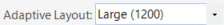
|
Select an Adaptive Layout | Activates the selected Adaptive Layout in the Form Editor so that you can change its design, edit its properties, or delete it. |
|
Edit an Adaptive Layout | Edit the properties of the selected Adaptive Layout. |
|
Create an Adaptive Layout | Create a new Adaptive Layout for the form. |
|
Delete an Adaptive Layout | Delete the selected Adaptive Layout. |