Each TE screen consists of multiple elements, including key text, cursor fields, data labels, fields, headers, and menu items. Each of these are editable through the Velocity Console, which offers multiple configuration options to create unique or branded styling that is applied via the app's built-in HTML and CSS rendering engine.
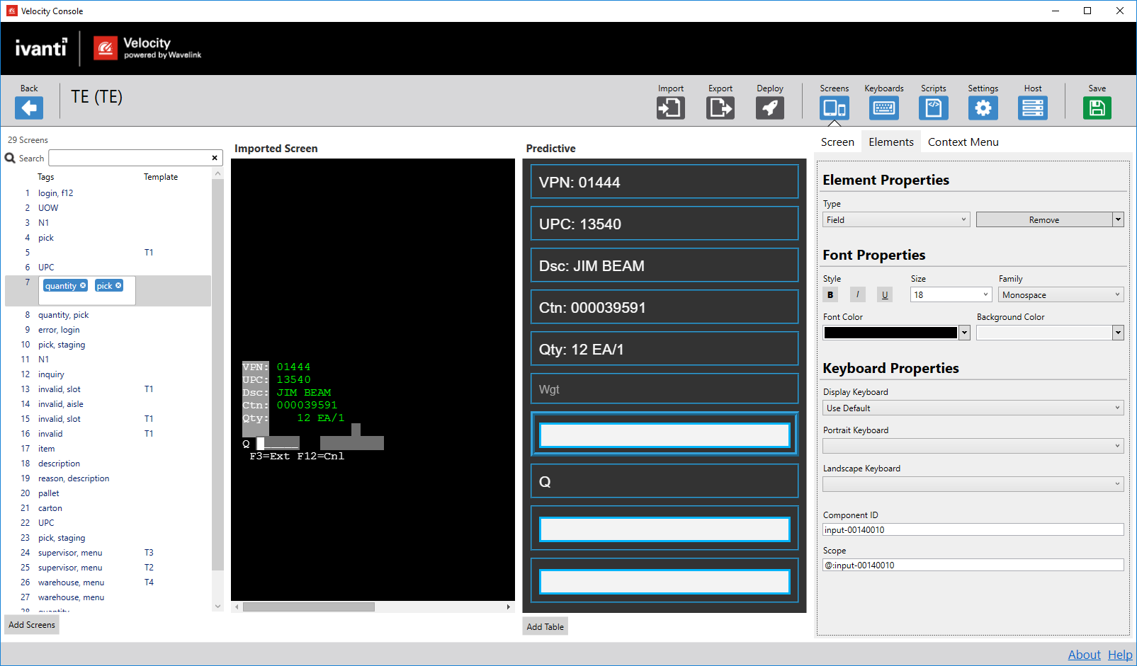
1.Screen List. All screens associated with a project, along with tags and template names are listed here. You can navigate between screens by selecting a numbered screen from here.
2.Imported Screen. The traditional black-and-green screen captured from the TE client. This column shows the screen prior to any modern reformatting.
3.Reformatted Screen. Screens captured in TE are rendered with Velocity's built-in HTML and CSS engine to show more modern screen designs. Individual elements can be selected from here and their properties edited from the Screen Elements column..
4.Screen Elements. From here, you can manipulate properties of individual reformatted elements.
The following features for editing screen elements are available to you through the Velocity Console:
•Predictive and template screens. After importing screens to the Velocity Console, the black-and-green screens are automatically translated to a mobile-friendly appearance. These screens are labeled as "Predictive," meaning untouched by any manual changes and subject to Velocity's built-in HTML and CSS rendering engine and its universal styles. When manual changes are made to a screen, it becomes a named "Template," with styles and formatting unique to that page. To import screens to your project to edit individual screen element styles, see Importing Screens.
•Themes. Elements on a screen can be edited on a per-screen basis, meaning the changes you make to a single screen element won't be applied to all elements of a similar type. Or, through the use of themes, you can create formatting styles for each element type that is applied across all screens. Changing the global theme for a project does not change a screen's "Predictive" status to "Template." For more information on themes, see Configuring Project Settings.
Themes set from the Theme tab are overridden when individual elements are edited on the Screens tab.
•Key text and cursor zones. Through the use of key text, you can create a screen template upon which reformatting changes are based. If other screens contain the selected key text, that screen is automatically reformatted to the styles applied to the screen that the key text is currently located on. You can also create cursor zones to establish multiple template rules on a single screen that change the template as users move from field to field.
•Spanning. You can move individual elements and place them side-by-side for element spanning. For example, on an Android device you could span the username and password text fields with their data labels to have them appear side-by-side.
•Tables. Structure the layout of elements in rows and columns by adding a table to the reformatted screen. When a table is created, it consists of empty container cells, which you can then drag and drop elements within. This is especially useful for presenting multiple elements such as data labels and fields, or even multiple menu items.
All screens associated with a project display here in an list ordered in which they were captured from the TE client. Additionally, this list displays associated tags and the applied template. The purpose of tags is to allow you to organize tags based on unfinished screens, specific groups of screens, and screen functions, to name a few.
To assist with grouping similar screens together or to more easily locate a specific screen, you can use tags to describe a screen's content. You can manually add tags by double-clicking the space to the right of the screen number. Add any relevant tag words, separated by a comma.
You cannot include symbols with tags.
If you associate the same tag with multiple screens, you can use the search bar to filter based on individual or multiple tags. You may use logical operators such as + and - to include or exclude tags from a search.
Add Screens
Launches a dialog through which you can select screens imported from the TE client. If you've captured screens through the TE client, these should appear as a single file containing all screens added. When you add this file, all screens associated will display in the Screen List column.
When you select a screen, its original black-and-green contents appear on the Imported Screen column, whereas the rendered version appears on the Reformatted Screen.
You can add multiple screen capture files to a project. Any new screens added are joined at the bottom of the screen list.
Imported Screen
The original black-and-green screens captured from the TE client display in this column. All text fields here are identified and rendered using the Velocity built-in HTML and CSS engine.
While the majority of actions in Velocity are performed from the Reformatted Screen and Screen Element columns, you can still perform functions from here such as matching templates, adding cursor zones, and creating new elements.
1.From the Imported Screen pane, double-click or click and drag where you want to add the cursor zone.
2.Click the Add cursor zone button.
3.Click Save to retain the changes.
The first cursor zone you add to a screen must be where the cursor is currently located on the imported screen. Likewise, you cannot remove the cursor zone with the cursor located in it until all other cursor zones are deleted.
Reformatted Screen
This column shows the imported screen with the built-in HTML and CSS rendering engine applied. What is black and green screens on the Imported Screen column is now mobile-friendly fields, labels, and buttons. You can select each element and edit their properties from the Screen Elements column.
Template
Assigns a name to the template when changes are made to a screen. All screens with the same template display the same template name. If another screen with the same template is altered, a new template is created to prevent making changes to other screens.
When key text is added or cursor zones are removed, and it causes a previously-matched template to no longer match, then a new template is created. Likewise, if you perform any changes to individual fields, this creates a new template. To match a previous template, the previously-added changes must be removed or cursor zones re-added. Upon doing so, users are alerted of the change and asked to confirm. If confirmed, the original template x0is overwritten with the current template. When you create a new template from changes made, it receives a higher priority over other templates. What this means is that modified templates will always overrule previous templates.
If you wish to return to the previous template, click the Delete Template button on the Screens tab.
Template names are used when creating screen-specific scopes. By creating a screen name, you can associate scripts that execute only when this screen (and any others sharing the same template name) is accessed.
You can manually change the template name as needed.
The template name is used from the Scripts tab to identify template-specific scopes for a script. Use the value here, preceded by the @ symbol.
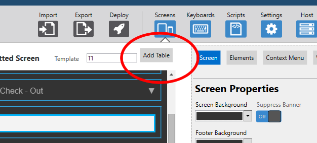
Add Table
Adds a table container element that allows you to drag existing elements and place them side-by-side within a container with rows and columns. Tables can include all element types.
Screen Elements
This column offers all settings and options for manipulating reformatted elements. From here, you can alter element formatting, add context menu items, and create screen banners. Simply select an element from the Reformatted Screen column and begin editing its properties here.
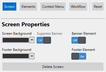
Sets the background color of the entire screen. This can be set on a screen-by-screen basis or using themes.
Suppress Banner
Hides a global banner from the individual screen. If a banner is created at the theme level, this option allows you to hide it for select screens. Until a global banner is set, this option cannot be altered.
Banner Element
Activates a banner element that appears at the top of the screen. When set to On, the application navigates you to the Elements tab to apply styling, set a banner title, or upload a logo image. This can be set on a screen-by-screen basis or using themes.
Footer Element
Adds a footer to the bottom of the screen. You can drag and drop new or existing elements into this element. The footer and any elements included within it are fixed to the bottom of the screen, even while scrolling.
Footer Background
Sets the background color of the footer element. This can only be done if the Footer Element is enabled.
Delete Template
Removes the selected screen's template and resets the screen's formatting.
Sets the total number of rows contained within the table. By default, this is set to 2.
Reducing the number of rows on a table doesn't delete any elements located on the cells being deleted. These elements are removed from the table and placed below.
Columns
Sets the total number of columns contained within the table. By default, this is set to 2.
Reducing the number of columns on a table doesn't delete any elements located on the cells being deleted. These elements are removed from the table and placed below.
Width
Defines how much of the screen the table takes up horizontally. By default, this is set to 100%.
The table is always left justified.
Background Color
Sets the background color of this element. This can be set at the table or theme level.
Alternating Row Color
Sets the background color of every other row in the table, starting with the second row. This can be set at the table or theme level.
Dynamic
Allows you to treat a table as dynamic with selectable fields. Activating this option gives you access to Navigate Up Command, Navigate Down Command, and Select Command options. Selected rows are distinguished from others to alert users which row is being used.
Navigate Up Command
Sends a keystroke value to navigate up a row within a dynamic table.
Navigate Down Command
Sends a keystroke value to navigate down a row within a dynamic table.
Select Command
Sends a keystroke value to select the current field for entering data on a dynamic table.
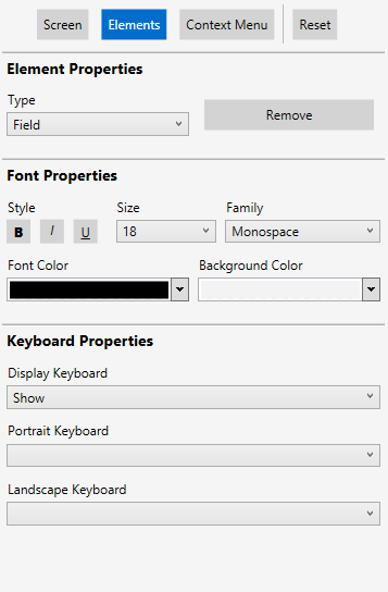
Element Properties
Element Type
Specifies the type or class of an element. When a theme is set, elements of the same type are subject to the same styles. You can only edit element types on a screen-by-screen basis.
The types of elements available include:
•Header. Heading text that identifies the screen currently active. A header cannot be added to spanned elements.
•Data Label. Static sub-header text that is used to label fields. This element allows you to change the label for a reformatted screen, but will not alter the black-and-green version of this label.
•Data Value. Static sub-header text that is used to label fields. This text for this value cannot be altered.
•Field. Empty text fields that end users can manually enter text.
•Menu Item. Buttons that navigate end users to different screens. A menu item cannot be added to spanned elements.
•Button. Buttons that navigate end users to different screens. These are similar to Menu Items, but are formatted for display on screens. These can be added to spanned elements and footers.
Each element has its own default styles associated, as set by Velocity's predictive formatting. For more information, see Predictive Formatting.
Remove\Remove All
•By selecting Remove, you remove the selected screen element from the reformatted screen. By selecting Remove All, you remove all elements from the reformatted screen. To add a screen element, see the steps below. This cannot be set at the theme level.
Banner Properties
Title
Creates a header element that appears at the top of each screen. The text entered here will appear within that element. When an image is also uploaded, the text in this field appears to the right of the logo image. This option only appears when Banner Element is enabled.
Image
Uploads a logo image and places it at the top of every screen. Images should not be wider than 100 pixels or taller than 60. This option only appears when Banner Element is enabled.
Font Properties
Family
Specifies the font family to use for the element. When a theme is set, elements of the same type are subject to the same font family styles.
•Serif
•Sans-serif
•Monospace
Size
Sets the size of the element's font text. This can be adjusted from 10 to 20 points. The default value is dependent on the element type selected.
Bold
Selecting this option bolds the element text. By default, this is not selected.
Italics
Selecting this option italicizes the element text. By default, this is not selected.
Underline
Selecting this option underlines the element text. By default, this is not selected.
Font Color
Sets the color of the visible text for this element.
Background Color
Sets the background color of this element.
Text
The text that appears for this element on the reformatted screen. This setting does not override any text for the standard black-and-green screens. This cannot be set at the theme level.
Command
Associates a specific key press with a menu item. When selected, the associated behavior with that key press is sent to the host profile. For example, on the demo server, the command for a menu item might be the number 3. When sent, the user is navigated to the next screen. This cannot be set at the theme level.
Accepted commands include the following key presses:
•F1 through F24
•CTRL-[single letter, upper or lower case]
•Keycode hex values (e.g., {hex:E03B}for F1), without a \ or 0x preceding the hex value
•Macros (e.g., {hex:E050}{hex:E04D}{pause}{AutoEnter} for "down," "right," a 250-millisecond pause, and then "Enter" keystrokes)
Sets the behavior of the keyboard pop-up when a Field element is selected. This cannot be set at the theme level.
•Show. The keyboard automatically appears when tabbing to the field.
•Hide. If the keyboard is active, it automatically hides when tabbing to the field.
•Disable. Both custom and default keyboards cannot be used when tabbing to the field.
Portrait Keyboard
Sets the default custom keyboard to use when a screen is displaying in portrait mode. This cannot be set at the theme level.
If left blank, the default custom keyboard is used, which is the top-most keyboard listed on the Keyboards Panel of the Keyboards screen.
Landscape Keyboard
Sets the default custom keyboard to use when a screen is displaying in landscape mode. This cannot be set at the theme level.
If left blank, the default custom keyboard is used, which is the top-most keyboard listed on the Keyboards Panel of the Keyboards screen.
Component ID
Specifies the field identifier. This field cannot be altered and is automatically assigned upon creation of the element. The purpose of this value is for reference in scripts that affect specific fields.
Scope ID
Specifies the screen and field scope. This cannot be altered and is immediately assigned upon creation of the element.
The value here consists of the template name and component ID, separated by a colon and preceded by the @ symbol. You should copy and paste this field value when setting a field-specific scope from the Scripts tab.
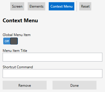
Adds a new context menu item, allowing you to specify a Menu Item Title and Shortcut Command. Menu items cannot be added at the theme level.
Add Voice
Enables text-to-speech and speech-to-text capabilities for that menu item. Additionally, this adds the Matching Phrase field, which requires a voice macro in Shortcut Command to complete a specific voice action.
Global Menu Item
Specifies the menu item as screen-specific or global. If set to On, the menu item appears on the context menu for every screen. If set to Off, the menu item appears only on the context menu for the current screen.
Menu Items
Creates and edits menu items for the context menu.
From this section, you can configure the following settings:
•Menu Item Title. The text that appears as label for a context menu item.
•Shortcut Command. Associates a specific key press with a menu item. Examples of accepted commands can be found on the Keyboard Codes page. For values accepted in this field, read the description for Command in the Elements section above, or see Keyboard Codes for acceptable macro, script, and voice commands.
•Remove. Deletes the selected menu item.
•Done. Applies the changes to the context menu, which are visible on the Reformatted Screen pane.
Voice Enabled
Enables the use of voice-activated phrases to access context menu functions. This makes the Matching Phrase field visible.
Matching Phrase
Sets the voice command to activate the menu item. Any phrase can be entered here, provided the Client can pronounce it. Matching phrases can only be created for context menu items.
When this matching phrase is detected, it automatically executes any macro, text, or script assigned to the Shortcut Command field.
Voice Shortcut Commands
When using the Velocity Client with Speakeasy, it comes preloaded with default commands. To invoke these commands, they must be included in the global or screen context menu with the value listed below. These commands do not require any additional grammars.
Matching Phrase
Named Value
Volume Up
{voice:volumeUp}
Volume Down
{voice:volumeDown}
Say Again
{voice:repeat}
Speak Faster
{voice:faster}
Speak Slower
{voice:slower}
Calibrate
{voice:calibrate}
Editing Elements
Individual elements on the Reformatted Screen pane are interactive, allowing you to manipulate the styling elements or even create new elements not already present on your imported screen.
1.Select and drag the desired screen element from the Reformatted Screen pane.
A red arrow appears along the left-hand side of the pane to indicate where the element will be placed when dropped. Data Labels, Data Values, and Fields can be placed within one another for horizontal spanning, displaying the elements side-by-side on devices.
1.Select an existing element and drag it onto another element.
2.When a red > appears to indicate placement next to the stationary element, release the element.
The element you dragged appears to the side of the existing element. You can span additional elements, and they will automatically wrap to the next line when enough elements are placed side-by-side.
You cannot add headers or menu items for element spanning.
 To add key text template matching