Standard Form Controls
A standard control is a form control that enhances form design and data entry.
CSM provides the following standard controls:
- Banner: Displays a title (text) and image (example: Company name and logo, title and icon, permanent contact information, etc.).
- Button: Executes a single Action when clicked (example: Open a rich text Zoom window, launch a Visualization, view related Knowledge Articles, move to the next form in a multi-form process, etc.).
- Group Box/Tabbed Group Box: Organizes other controls in containers to enhance a form's appearance and usability.
- Image: Displays a custom image (example: Company logo, team icon, personal photo, etc.).
- Label: Textually identifies or enhances other form elements. Often, a label is tied to and identifies a field control.
- Link Label: Executes a single Action when clicked (example: Move a record through a workflow, send a customer e-mail, submit resolution details to the Knowledge Base, etc.).
- List Box: Displays multiple values from which a user can select (example: Call sources, list of services, distribution list, etc.).
- Radio Button: Presents a list of choices and stores a value for the selection (example: Show all tabs or just related tabs in a form arrangement, toggle between embedded forms, etc.).
- Shapes (Ellipse, Line, and Rectangle): Organizes other controls to enhance a form's appearance and usability.
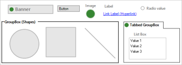
The following figure shows the standard form controls on a form.
Good to know:
- By default, a standard control's font, colors (background, foreground, and border), border style, and background style properties come from the defined form theme; however you can define your own properties, if needed.
- Image controls do not support text, background, foreground, or border colors; therefore no colors, styles, or fonts can be applied.
- To include an ampersand character (&) in a label or link label control, enter two ampersands (&&). One ampersand is used to designate a keyboard accelerator, so entering a double ampersand escapes the accelerator and ensures that a single ampersand is displayed.
- After a standard form control is added to a form, you can define how the control looks and behaves on the form (example: Size, alignment, visibility, etc.).
