About components
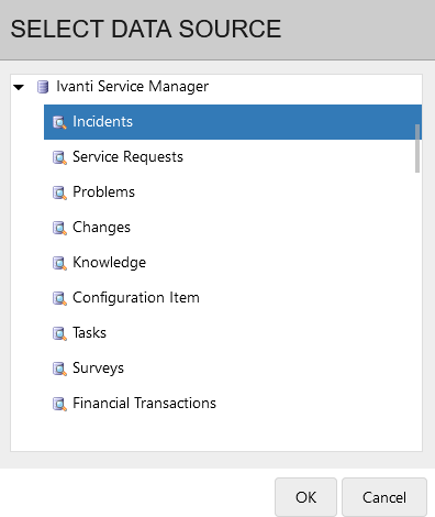
The data available for viewing in Xtraction depends on the type of data source you're connected to. When selecting a data source, you must also specify a "view" into that source that contains the data you want to add to your dashboards and documents. For example, a typical service desk database contains distinct views for incidents, service requests, problems, and more.
Once a data source and view are selected, you can begin creating a dashboard or document using various components. Components provide the method for viewing your data in the form of graphs, charts, and lists. The Components list is located in the navigation pane, and the data source you're connected to determines the types of components you can work with.
For example, a time component can display open incidents over a period of time via columns, bar charts, or a calendar view. A group component can summarize incidents from one or more fields (such as Priority, Status, or Time to Resolve) via pie charts, columns, or bar charts.
To create a dashboard, drag and drop one component at a time onto each pane of the design canvas. The image below shows how this occurs in the Dashboard Designer:
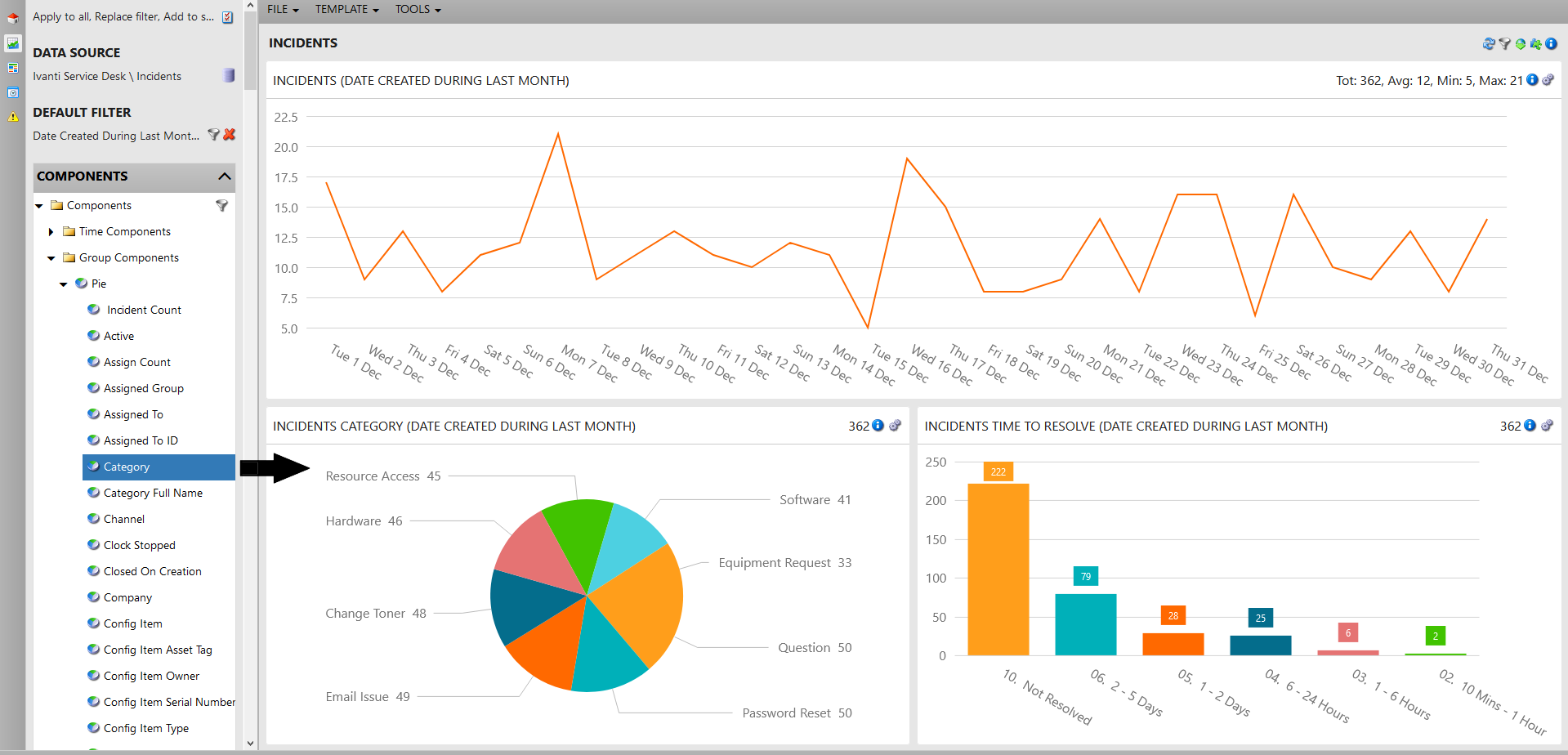
The resulting data on the dashboard is displayed in real time and is immediately interactive. To change a component in a pane, simply drag and drop a new one on top of it. A dashboard can contain one or more components selected from the eight types defined below.
Component types
Each component type has its own design attributes. Some types (time, group, tree, and scorecard) enable you to create multiple, independent series of data from separate data sources. With these same components, you can also define a calculated series that aggregates the data across those data sources, providing a more complete analysis of the key performance indicators you're interested in viewing.
Available component types are:
•Time components: Visually represent data using selected time slices. Available formats include column, grid, calendar, as well as stacked and 100% stacked formats, which enable you to portray the data in comparative context.
•Group components: Summarize data by one or more fields from a data source (available formats include pie, bar, bubble, and more).
•Tree components: Summarize data by one or more fields from a data source and display the results in a hierarchical list.
•Pivot components: Report on two different aspects of your data using rows and columns. Group and time pivots are supported.
•Scorecard components: Summarize an entire data set that provides a single result instead of slicing by time or groups.
•List (record) components: Display raw data retrieved directly from a data source, without summation. For the list components of each data source, your administrator may have created a default list of columns that narrows the viewable data.
•Text components: Display simple text, such as when you need to display a large heading on a monitor or projector. You have the option of formatting the text as a URL to be opened in a new browser window.
•Image components: Display images retrieved from the Xtraction server or from a URL, such as vendor logos if a dashboard is combining data from separate data sources.
Filtering a large components list
With large data sources, you may find that the navigation pane's components list is too cumbersome to scroll through. You can filter the list to reduce the number of viewable items.
1.In the navigation pane's Components panel, click the filter ![]() icon.
icon.
2.A text box will open. Type your filter text and press the Enter key. Your components list will filter out all items except those that include the text you entered.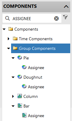
To remove the filter, click the x icon in the text box.