Each screen consists of multiple elements, including key text, cursor fields, data labels, fields, headers, and menu items. Each of these are editable through the Velocity Console, which offers multiple configuration options to create unique or branded styling that is applied via the app's built-in HTML and CSS rendering engine.
The following features for editing screen elements are available to you through the Velocity Console:
• Predictive and template screens. After importing screens to the Velocity Console, the black-and-green screens are automatically translated to a mobile-friendly appearance. These screens are labeled as "Predictive," meaning untouched by any manual changes and subject to Velocity's built-in HTML and CSS rendering engine and its universal styles. When manual changes are made to a screen, it becomes a "Template," with styles and formatting unique to that page. To import screens to your project to edit individual screen element styles, see Importing Screens.
• Themes. Elements on a screen can be edited on a per-screen basis, meaning the changes you make to a single screen element won't be applied to all elements of a similar type. Or, through the use of themes, you can create formatting styles for each element type that is applied across all screens. Changing the global theme for a project does not change a screen's "Predictive" status to "Template." For more information on themes, see Configuring Project Settings.
Themes set from the Settings tab are overridden when individual elements are edited on the Screens tab.
• Key text and cursor zones. Through the use of key text, you can create a screen template rule upon which reformatting changes are based. If other screens contain the selected key text, that screen is automatically reformatted to the styles applied to the screen that the key text is currently located on. You can also create cursor zones to establish multiple template rules on a single screen that change the template as users move from field to field.
• Spanning. You can move individual elements and place them side-by-side for element spanning. For example, on an Android device you could span the username and password text fields with their data labels to have them appear side-by-side.
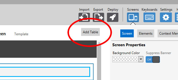
• Tables. Structure the layout of elements in rows and columns by adding a table to the reformatted screen. When a table is created, it consists of empty container cells, which you can then drag and drop elements within. This is especially useful for presenting multiple elements such as data labels and fields, or even multiple menu items.
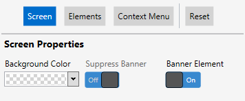
Sets the background color of the entire screen. This can be set on a screen-by-screen basis or using themes.
Suppress Banner
Hides a global banner from the individual screen. If a banner is created at the theme level, this option allows you to hide it for select screens. Until a global banner is set, this option cannot be altered.
Banner Element
Activates a banner element that appears at the top of the screen. When set to On, the application navigates you to the Elements tab to apply styling, set a banner title, or upload a logo image. This can be set on a screen-by-screen basis or using themes.
Adds a table container element that allows you to drag existing elements and place them side-by-side within a container with rows and columns. Tables can include all element types.
Table Properties
Rows
Sets the total number of rows contained within the table. By default, this is set to 2.
Reducing the number of rows on a table doesn't delete any elements located on the cells being deleted. These elements are removed from the table and placed below.
Columns
Sets the total number of columns contained within the table. By default, this is set to 2.
Reducing the number of columns on a table doesn't delete any elements located on the cells being deleted. These elements are removed from the table and placed below.
Width
Defines how much of the screen the table takes up horizontally. By default, this is set to 100%.
The table is always left justified.
Background Color
Sets the background color of this element. This can be set at the table or theme level.
Alternating Row Color
Sets the background color of every other row in the table, starting with the second row. This can be set at the table or theme level.
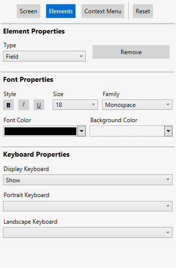
Element Properties
Element Type
Specifies the type or class of an element. When a theme is set, elements of the same type are subject to the same styles. You can only edit element types on a screen-by-screen basis.
The types of elements available include:
• Header. Heading text that identifies the screen currently active. A header cannot be added to spanned elements.
• Data Label. Static sub-header text that is used to label fields. This element allows you to change the label for a reformatted screen, but will not alter the black-and-green version of this label.
• Data Value. Static sub-header text that is used to label fields. This text for this value cannot be altered.
• Field. Empty text fields that end users can manually enter text.
• Menu Item. Buttons that navigate end users to different screens. A menu item cannot be added to spanned elements.
Each element has its own default styles associated, as set by Velocity's predictive formatting. For more information, see Predictive Formatting.
Remove
Removes the selected screen element from the reformatted screen. To add a screen element, see the steps below. This cannot be set at the theme level.
Banner Properties
Title
Creates a header element that appears at the top of each screen. The text entered here will appear within that element. When an image is also uploaded, the text in this field appears to the right of the logo image. This option only appears when Banner Element is enabled.
Image
Uploads a logo image and places it at the top of every screen. Images should not be wider than 100 pixels or taller than 60. This option only appears when Banner Element is enabled.
Font Properties
Family
Specifies the font family to use for the element. When a theme is set, elements of the same type are subject to the same font family styles.
• Serif
• Sans-serif
• Monospace
Size
Sets the size of the element's font text. This can be adjusted from 10 to 20 points. The default value is dependent on the element type selected.
Bold
Selecting this option bolds the element text. By default, this is not selected.
Italics
Selecting this option italicizes the element text. By default, this is not selected.
Underline
Selecting this option underlines the element text. By default, this is not selected.
Font Color
Sets the color of the visible text for this element.
Background Color
Sets the background color of this element.
Text
The text that appears for this element on the reformatted screen. This setting does not override any text for the standard black-and-green screens. This cannot be set at the theme level.
Command
Associates a specific key press with a menu item. When selected, the associated behavior with that key press is sent to the host profile. For example, on the demo server, the command for a menu item might be the number 3. When sent, the user is navigated to the next screen. This cannot be set at the theme level.
Accepted commands include the following key presses:
• F1 through F24
• CTRL-[single letter, upper or lower case]
• HEX code value (e.g., 3b00 for F1), without a \ or 0x preceding it
Keyboard Properties
Display Keyboard
Sets the behavior of the keyboard pop-up when a Field element is selected. This cannot be set at the theme level.
• Show. The keyboard automatically appears when tabbing to the field.
• Hide. If the keyboard is active, it automatically hides when tabbing to the field.
• Disable. Both custom and default keyboards cannot be used when tabbing to the field.
Portrait Keyboard
Sets the default custom keyboard to use when a screen is displaying in portrait mode. This cannot be set at the theme level.
If left blank, the default custom keyboard is used, which is the top-most keyboard listed on the Keyboards Panel of the Keyboards screen.
Landscape Keyboard
Sets the default custom keyboard to use when a screen is displaying in landscape mode. This cannot be set at the theme level.
If left blank, the default custom keyboard is used, which is the top-most keyboard listed on the Keyboards Panel of the Keyboards screen.
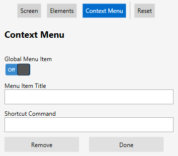
Adds a new context menu item, allowing you to specify a Menu Item Title and Shortcut Command. Menu items cannot be added at the theme level.
Global Menu Item
Specifies the menu item as screen-specific or global. If set to On, the menu item appears on the context menu for every screen. If set to Off, the menu item appears only on the context menu for the current screen.
Menu Items
Creates and edits menu items for the context menu.
From this section, you can configure the following settings:
• Menu Item Title. The text that appears as label for a context menu item.
• Shortcut Command. Associates a specific key press with a menu item. For values accepted in this field, see the description for Command in the Elements section above.
• Remove. Deletes the selected menu item.
• Done. Applies the changes to the context menu, which are visible on the Reformatted Screen pane.
Removes all custom changes made to each screen and screen element, reverting them to their default values. Any elements removed are added back to the reformatted screens, and any custom screen elements added are likewise removed.
Editing Elements
Individual elements on the Reformatted Screen pane are interactive, allowing you to manipulate the styling elements or even create new elements not already present on your imported screen.
1Select and drag the desired screen element from the Reformatted Screen pane.
A red arrow appears along the left-hand side of the pane to indicate where the element will be placed when dropped. Data Labels, Data Values, and Fields can be placed within one another for horizontal spanning, displaying the elements side-by-side on devices.
1Select an existing element and drag it onto another element.
2When a red > appears to indicate placement next to the stationary element, release the element.
The element you dragged appears to the side of the existing element. You can span additional elements, and they will automatically wrap to the next line when enough elements are placed side-by-side.
You cannot add headers or menu items for element spanning.
1From the Imported Screen pane, double-click or click and drag where you want to add the cursor zone.
2Click the Add cursor zone button.
3Click Save to retain the changes.
The first cursor zone you add to a screen must be where the cursor is currently located on the imported screen. Likewise, you cannot remove the cursor zone with the cursor located in it until all other cursor zones are deleted.
For an overview of editing screen elements in the Velocity Console, see the video below.
 To change the order of screen elements: