Using the Insights Menu to Monitor User Activity and Service Usage
Introduction
Ivanti Neurons for Zero Trust Access (nZTA) provides visibility of user activity and service usage across your enterprise through network activity analytics, gateway performance graphs, application usage metrics, and stored activity logs.
After you log in to the Tenant Admin Portal following successful completion of the Onboarding Wizard, nZTA displays the Network Overview page. This page presents a top-down overview of your application infrastructure, providing an opportunity to monitor user and ZTA Gateway activity, and to identify problems and compliance issues as they occur. For more information, see Reviewing Your Network Activity.
Through the nZTA menu, use the Insights menu icon to:
View graphs, metrics, and logs concerning user activity, see Reviewing User Activity.
See details and usage of applications configured in your nZTA service, see Reviewing Application Usage.
Monitor ZTA Gateway activity, see Monitoring ZTA Gateway Activity.
Review policy failures, see Reviewing Policy Failures.
View activity logs, see Checking the Logs.
Configure actionable insights, see Actions.
Obtain reports of activity and usage across your services, see Reports.
View events and notifications, see Viewing Alerts and Notifications.
Note
nZTA provides both a light theme and a dark theme for the UI display. To learn more, see Changing the UI Theme.
Using Filters and Selectors to Monitor Specific Services
Each page in the Insights menu allows data filtering through the filter bar (see Using the Filter Bar), enabling you to observe and monitor only the analytics and log data you want. Filters fall broadly into two categories, and are applied as applicable to the page you are viewing:
Summary page filters: high-level filters and selectors such as time period and Gateway, user, or application, that apply across both summary and detail insights pages. Filters applied here can affect the data on all Insights pages that you visit. For example, the same selected time period remains in place across every page.
Detail page filters: filters that are applied at a chart detail page view that are applied to the log data constituting the chart being interrogated. For more details, see Viewing Detailed Logs for a Chart.
Note
The Logs page uses a separate time period selection filter from other Insights pages. A time period selected here is not applied elsewhere, and vice versa, yet is retained across login sessions in the same way.
Filters and selection criteria are persistent across all relevant Insights pages, and are retained across login sessions. When you log back in, the same selection criteria remain applied. Settings are stored per admin user, such that each admin maintains their own view of the analytics data.
You can remove applied filters and return to the default setting through the reset option in most filter controls. For example:
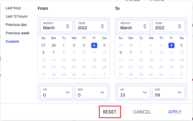
FIGURE 271 Resetting your selected time period filter (indicated) back to the default “Last Hour” active data view
Or in the case of each chart detail or log page, the log filter bar typically includes a reset icon. For example:
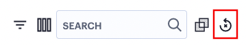
FIGURE 272 Using the Reset icon (indicated) to reset log filters to their default state
Information on the filters and data selection options available on each page is provided throughout this guide. Refer to the page-specific help and documentation for more details.
Note
To perform a global reset of all applied filters and selection criteria on all pages, in a single action, use the Settings menu Reset Filters option. To learn more, see Resetting All Filters and Selections.
Reviewing Your Network Activity
The Network Overview page shows real-time analytics data for your application infrastructure, providing a one-page dashboard of activity across your organization.
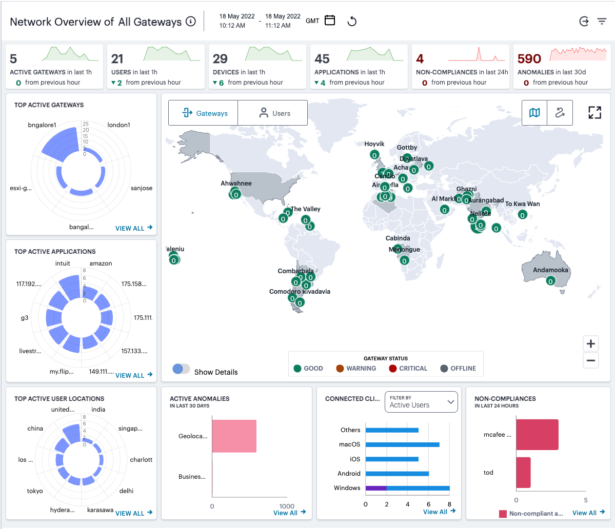
FIGURE 273 An overview of Network activity across your enterprise
To access the Network Overview page:
Log into the Controller as a Tenant Admin, see Logging in as a Tenant Administrator.
The Network Overview page appears by default.
To return to the Network Overview page at any time, select Insights > Overview from the left-hand menu. Alternatively, select the Ivanti banner at the top.
Understanding the Display
The primary components of the Network Overview page are the following:
Filter bar, allowing the selection of active or historic data. For details, see Using the Filter Bar.
Summary ribbon, showing totals for active Gateways, Users, Devices, Applications, Compliance Failures, and Anomalies. For more details, see Using the Summary Ribbon.
Switchable World Map and Sankey chart, showing active Gateway or user locations:
In the world map view, each indicated location provides a summary of the activity observed there. For more details, see Using the World Map.
In the Sankey chart view, you can view the relationships between user groups, device types, ZTA Gateways, and applications. For more details, see Using the Sankey Chart View.
Radar charts, providing top usage data for Gateways, Applications, and User Locations. For more details, see Using the Top Active Breakdown Charts.
Bar chart breakdowns showing Active Anomalies, Connected Clients Version, and Non-compliance activity. For more details, see Using the Active Anomaly, Connected Clients Version, and Non-Compliance Charts.
Note
The data in this page refreshes automatically every 5 minutes.
With each chart, click the View all link to view a page of detailed log records for that category. To learn more about using the chart detail page, see Viewing Detailed Logs for a Chart.
The following principles apply to all elements of the page:
A user can have one or more devices.
Each device can have only one active secure access session.
One session can connect to multiple applications.
One session can be associated with multiple ZTA Gateways.
One ZTA Gateway can have multiple applications registered with it.
One application instance can be registered with only one ZTA Gateway.
Using the Filter Bar
nZTA uses the top part of the display on all Insights data analysis pages to show the current page title, the selected time period and timezone, and options to:
Select the date and time period for which data is displayed
Manually refresh the data
View analytics data for a selected user or application
Filter analytics data by a selected ZTA Gateway
To learn more about how filters are applied in the Tenant Admin Portal, see Using Filters and Selectors to Monitor Specific Services.
Note
To configure the default timezone for the data displayed in this admin login account, see Setting the Timezone.
By default, analytics data on all pages is shown for the last hour. To select a previous or specified time period, select the date-time display (indicated):
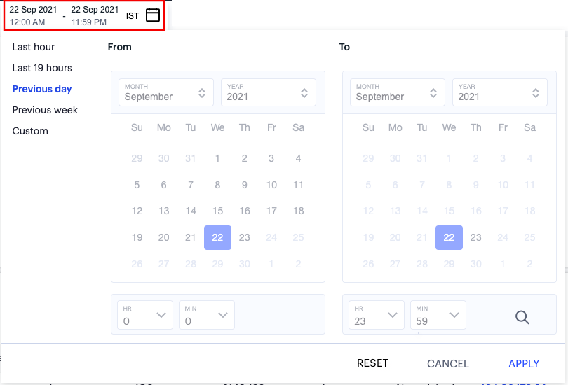
FIGURE 274 Selecting a date and time range
In the date-time selection dialog, choose from the following predefined time period options:
Last hour: Data observed for the previous 60 minutes.
Last <X> hours: Data observed so far in the current day, up to the last hour (in GMT).
Previous day: Data observed for the previous full day.
Previous Week: Data observed for the previous calendar week (for the previous full Sunday-to-Saturday week).
Custom: Data observed for a chosen time period. If you select this option, nZTA enables you to select a custom time period using the From and To date/time calendar controls.
Note
The date/time calendar controls are enabled for only the Custom option. However, the calendar continues to identify the applicable start and end date-time for all predefined time periods.
To reset the selected time period back to the default (Last Hour) view, select Reset. To return to the current page without making any changes, select Cancel.
To apply your changes, select Apply. The selected time period is displayed in the filter bar and data across all Insights pages is updated accordingly.
The data in the display refreshes automatically at 5 minute intervals. To manually refresh the data, click the circular arrow:
FIGURE 275 Refreshing the data
nZTA provides the ability to show focused metrics for individual users or applications. To select a specific user or application, use the following icon:
FIGURE 276 Selecting a specific user or application
Then, from the drop-down menu, select one of the available options:
Select Set User to view data for a selected user. In the search box provided, start typing a user ID. nZTA auto-completes any matching user IDs. Next, select View User.
The User Activity page appears. To learn more, see Showing Activity for a Specific User.
Select Set Application to view usage metrics for a selected application. In the search box provided, start typing an application name. nZTA auto-completes any matching names. Next, select View Application.
The Application page appears. To learn more, see Showing Usage Data for a Specific Application.
Note
You can also access data for individual users or applications by selecting the name of a user or application from the corresponding info-panel, activated through the Summary Ribbon. For more details, see Using the Summary Ribbon.
nZTA also provides the ability to set a Gateway filter on all Network Overview, User, Application, and Policy Failure analytics pages in the Insights section. Applying a Gateway filter means that all dashboards are updated to show only activity relating to the chosen ZTA Gateway. In other words, nZTA shows only analytics for applications that were accessed from that specific ZTA Gateway, along with ZTA Gateway activity for users and devices being active in the selected time period. This filter is persistent across all pages, and remains in place for the duration of the current login session.
By default, the filter is inactive and shows data for All Gateways, as indicated in the title of all pages.
To set a Gateway filter, select the Gateway filter icon:
FIGURE 277 Filtering analytics data by ZTA Gateway
Then, from the Gateway selection panel, choose your ZTA Gateway from the drop-down list:
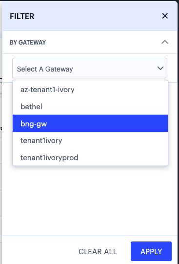
FIGURE 278 Using the Gateway filter panel
To set the Gateway filter, select Apply.
To remove a filter and return to viewing analytics for all gateways, select Clear All.
Note
On detailed log pages for individual charts (see Viewing Detailed Logs for a Chart) you cannot set a Gateway filter directly. Instead, set the Gateway filter on the parent page before you click through to the individual chart logs.
Using the Summary Ribbon
The Summary Ribbon at the top of the page shows data totals for the selected time filter:

FIGURE 279 Viewing the summary ribbon
The ribbon indicates the totals accrued for each category during the displayed time period, as indicated adjacent to the category name.
The following categories are provided in the ribbon:
The number of Active Gateways.
The number of active Users.
The number of active Devices.
The number of in-use Applications.
The number of Non-compliances. In other words, non-compliant attempts to access your applications. For the default time period filter, non-compliance totals shown here are for 24 hours. For other selected time periods, the number reflect the total for that period.
The number of Anomalies detected by nZTA. That is, the total number of geographic and business hours anomalies. For the default time period filter, anomaly totals shown here are for the previous 30 days, and include only unacknowledged anomalies. For other selected time periods, this total includes both acknowledged and unacknowledged anomalies.
Compliance and anomaly counters use the following color scheme to reflect status:
Black: No geographic anomalies or compliance failures are reported
Red:
Non-compliance: if the count is non-zero
Anomalies: if the count is non-zero
If you are currently viewing data for the last hour, each category in the ribbon includes a trend graph (highlighted, top) showing the changes in data during the hour. Also included is a change value (highlighted, bottom) based on the previous hour:
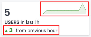
FIGURE 280 Data trends for this hour versus the previous hour
Note
In the default last hour view, while data for Active Gateways, Users, Devices, and Applications is shown as such, non-compliances are shown for the previous 24 hours and anomalies are shown for the previous 30 days. This is as indicated against the Category name.
Additional trend indicators are present for the last hour time period only. All other time periods show only the main data totals for each category.
If you click on any of the categories in the ribbon, nZTA displays a sliding info-panel dialog showing more details for that category. For example, if you click on the Active Gateways category, a panel appears showing the list of active ZTA Gateways. In this case, a summary box is displayed for each ZTA Gateway showing statistics relevant to that instance, such as instance health (disk, CPU, and memory utilization), the number of active users, applications, active devices, non-compliance events.
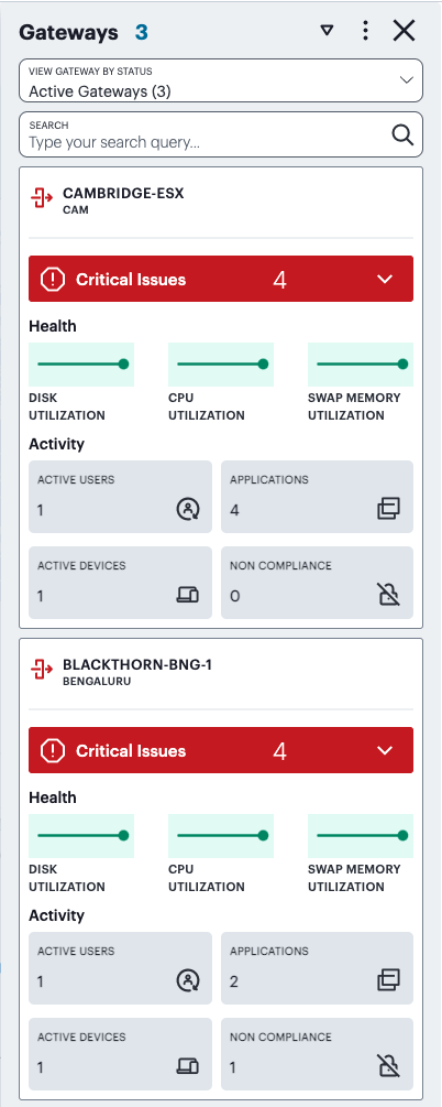
FIGURE 281 Viewing the Gateways info-panel
The following color scheme is used in the icon adjacent to the item listed in the panel:
Black / Green: No issues are reported for the item shown in the info-panel
Red:
Users info-panel: The user has anomalies reported against them in the selected duration
Gateways info-panel: The Gateway is reporting critical issues
Note
When displaying active Gateway data, all non-compliance and unacknowledged anomaly totals are displayed for the previous 24 hours.
The Gateways info-panel displays the following details for each Gateway in your deployment:
Location name and number of Gateways: The descriptor for this location and the number of Gateway instances deployed there.
Warning/Critical Issues: A list of warnings or critical issue messages reported by the Gateways at this location.
Gateway Health: Health indicators for the Gateways at this location.
Active Users: The number of unique users accessing applications through Gateways at the location (as also indicated in the location counter)
Active Applications: The number of applications accessed through Gateways at the location
Active Devices: The number of unique devices used to access applications through Gateways at the location
Non-Compliant: The number of non-compliant access attempts to applications configured for Gateways at the location (note that attempts by the same device to access two applications for which it does not meet compliance requirements increment this total by two)
Note
This version of the info-panel shows details for all Gateway locations. To view an info-panel for a single ZTA Gateway location, click the Gateway location counter in the world map. For more details, see Using the World Map.
Use the View Gateway by Status drop-down list to change the type of Gateways displayed in the panel. Choose from:
All Gateways: All ZTA Gateways regardless of status.
Active Gateways: All active ZTA Gateways. That is, only those ZTA Gateways that are responsive, irrespective of health status, and have observed application accesses during the selected time period. This is the default view.
Offline Gateways: All offline ZTA Gateways. That is, only those ZTA Gateways that are unresponsive.
Online Gateways: All online ZTA Gateways. That is, only those ZTA Gateways that are responsive but have not observed any application accesses.
Unregistered Gateways: All currently unregistered ZTA Gateways. That is, only those ZTA Gateways that are deployed but not yet registered with the Controller.
Note
The number of instances of each type is given in brackets.
For example, by selecting Offline Gateways, the panel updates as follows:
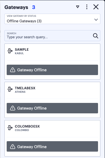
FIGURE 282 Viewing all offline ZTA Gateways in the Gateways info-panel
Use the Search bar at the top to filter the results list. For example, to show only those ZTA Gateways that match a search string. To clear your search, click CLEAR SEARCH RESULTS.
Hover your pointer over the instance health indicators to display a tooltip showing more specific details and values.
Click on any Critical or Warning notification banner to display a drop-down summary of the issues:
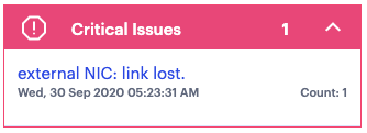
FIGURE 283 Viewing critical issues
You can click on each entry to obtain more details and logs concerning the issue.
Note
For the Active Users info-panel, nZTA displays an average UEBA Threat score. To learn more about UEBA Threat scores, see Showing Activity for a Specific User.
Note
For Non-Compliance and Anomalies info-panels, summaries are displayed on a per-user basis, with the reason for the event shown.
To change the sort order of the items displayed in the info-panel, use the Sorting controls at the top:

FIGURE 284 Changing the info-panel sort order
Use the dots icon to select the sort criteria, then use the arrow icon to toggle between ascending and descending order. The sort criteria varies depending on the category chosen, and is based on the statistics shown for each item. For example, by selecting the Gateways info-panel, you can choose the display order for your ZTA Gateways based on the following statistics:
Active Users
Apps Accessed
Non-compliances
Active Devices
Number of Issues
Gateway Name
City Name
A tick identifies the currently chosen criteria.
For Anomalies, the info-panel provides additional functionality to enable you to:
Acknowledge individual anomalies and remove them from the active total.
Filter on acknowledged, unacknowledged (active), or all anomalies.
Terminate the corresponding active user session, if applicable.
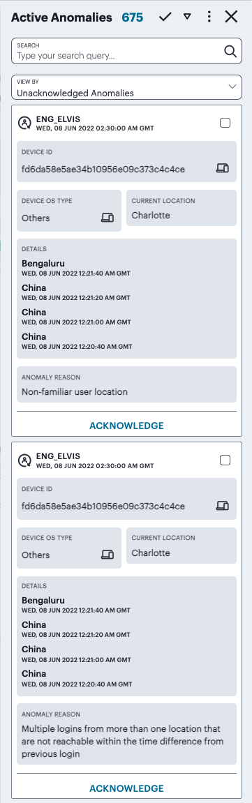
FIGURE 285 Viewing the Anomalies info panel
Each box in the info-panel lists a user and the active anomalies connected to them. For each user, click ACKNOWLEDGE to remove this anomaly from the list. Alternatively, use the tick icon and checkboxes adjacent to each user name to acknowledge multiple, or all, anomalies in a single action. Note that when the default “active” time period filter is selected, the anomalies count in the summary ribbon decreases by 1 for each acknowledgment. To terminate the active session for this user with immediate effect, click END SESSION. Session termination is available only for admin users with full access permissions.
Note
For other selected time period filters, the anomalies total includes both acknowledged and unacknowledged anomalies.
To view (and optionally terminate) sessions for all active users, see Viewing and Terminating User Sessions.
For each version of the info-panel, you can click the name of an item listed in the panel to access further pages that provide usage metrics or configuration details for that item:
For the Gateways info-panel, click a ZTA Gateway name to access the corresponding Gateways Overview page. For more details, see Viewing and Monitoring Gateways in the Controller.
For the Users info-panel, click a user name to access the corresponding Users analytics page. For more details, see Showing Activity for a Specific User.
For the Devices info-panel, click a device type to access the Device Configuration page, filtered by that device type. For more details, see Viewing Currently Enrolled User Devices.
For the Applications info-panel, click an application name to access the corresponding Application analytics page. For more details, see Showing Usage Data for a Specific Application.
For the Non-compliances and Anomalies info-panels, click a user name to access the corresponding Users analytics page. For more details, see Showing Activity for a Specific User.
Using the World Map
The world map provides a geographically-positioned view of your Gateway or user locations, selected through the switcher at the top of the panel:
Select Gateways (the default setting - indicated) to display your Gateway locations on the map as a series of geographically-placed counters.
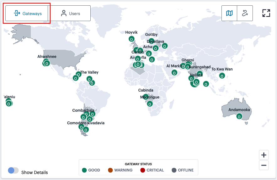
FIGURE 286 Viewing Gateway locations on the world map
Each counter shows the status of the services held there and the number of active user connections. Gateway status is indicated by the color scheme shown in the legend:
Good (Green): All Gateways are functioning normally.
Warning (Amber): One or more of the Gateways at that location is experiencing a warning scenario. This status is triggered by the occurrence of any one of the following conditions:
Gateway device CPU usage is within the range 80% - 90%
Gateway device swap memory usage is within 10% - 50%
Gateway device disk usage is within the range 80% - 90%
Critical (Red): One or more of the Gateways at that location is experiencing an critical alert scenario. This status is triggered by the occurrence of any one of the following conditions:
Gateway device swap memory usage is greater than 50%
Gateway device disk usage is greater than 90%
At least 1 critical error has been reported
Offline (Gray): One or more of the Gateways at that location is offline and/or unresponsive, or is not yet registered with the nZTA Controller.
Hover your pointer over a counter to view a visual representation of the users currently connected to the Gateways at that location. The greater the number of users at an originating location, the larger the indicator on the map:
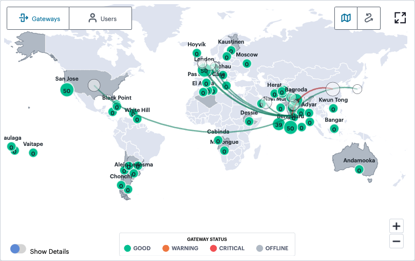
FIGURE 287 Viewing connected users for a selected Gateway
Note
In this view, a red connecting line between a user location and a Gateway location indicates non-compliances exist for those user devices.
In addition, use the Show Details switch to toggle on or off a tooltip summary panel for the Gateway location that overlays the display:
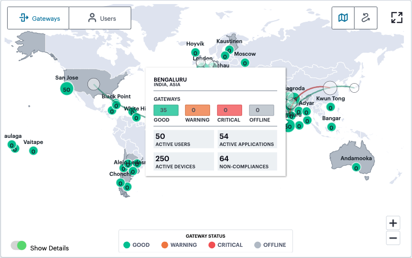
FIGURE 288 Viewing a location status tooltip panel for Gateways
This panel indicates the status of the Gateways at that location and provides metrics concerning the status of the services at that location:
Active Users: The number of unique users accessing applications through Gateways at the location (as also indicated in the location counter)
Active Applications: The number of applications accessed through Gateways at the location
Active Devices: The number of unique devices used to access applications through Gateways at the location
Non-Compliances: The number of non-compliant access attempts to applications configured for Gateways at the location (note that attempts by the same device to access two applications for which it does not meet compliance requirements increment this total by two)
Select a counter to show the Gateways info-panel for the individual location. For more information, see Using the Summary Ribbon.
Note
This view of the info-panel displays data for a single Gateway location. To view an info-panel showing data for all Gateway locations, click the Gateways category in the Summary Ribbon. To learn more, see Using the Summary Ribbon.
Select Users (indicated) to display your user locations on the map:
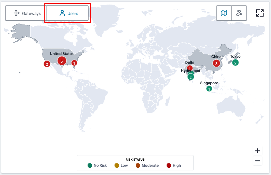
FIGURE 289 Viewing user locations on the world map
In this view, each counter shows the number of users at a geographic location that are connected to your Gateways. Gateway status is indicated by the color scheme shown in the legend:
No Risk (Green): All users at this location have a UEBA Threat score that does not exceed the threshold for zero risk.
Low (Amber): One or more users at this location have a UEBA Threat score that falls in the range defined as a low risk.
Moderate (Orange): One or more users at this location have a UEBA Threat score that falls in the range defined as a moderate risk.
High (Red): One or more users at this location have a UEBA Threat score that falls in the range defined as a high risk.
Hover your pointer over a counter to show a tooltip panel containing the UEBA Threat score summary for those users:
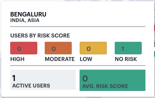
FIGURE 290 Viewing a location status tooltip panel for users
Select a counter in this view to show the Users info-panel. For more information, see Using the Summary Ribbon.
In both views, use the Plus (+) and Minus (-) controls to zoom in and out of the world map, allowing you to select the desired level of detail. Alternatively, use your pointer to manipulate the map display. Double-click/tap an open area of the map to zoom in, or reposition the map display through drag and drop.
To toggle between the Map view and Sankey chart view, use the icons at the top-right:
FIGURE 291 Toggle between Map view and Sankey chart view
The data shown is representative of the currently-selected time period, and by default shows active data (for the previous 1 hour). To learn more about setting time periods for the displayed data, see Using the Filter Bar.
To expand the current view, click the Full Screen icon:

FIGURE 292 Expand the current view
Note
Click the Full Screen icon again to return to the standard view.
Using the Sankey Chart View
The Network Sankey chart provides an alternate visualization of your services, showing directed flow between related objects. The width of each stream in the flow is proportional to the utilization of the object the flow passes through, allowing an administrator to view significant usage and relationships across your user base and application infrastructure.
To activate the Sankey chart view, use the toggle icons at the top-right:
FIGURE 293 Toggle between Map view and Sankey chart view
By clicking the toggle display icon, the Sankey chart replaces the world map in the display. All other components remain unchanged.
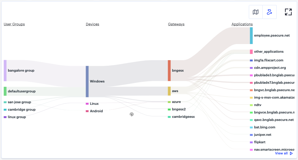
FIGURE 294 Displaying the Network Overview Sankey Chart View
The nZTA Sankey chart maps User Groups > Device Types > Gateways > Applications. By hovering your pointer over a flow of interest, nZTA displays a tooltip confirming the scale of the activity between the two objects connected by the flow.
To focus the display on a specific flow, or to identify related objects that interact with this flow, click the chart at a point of interest. nZTA provides highlighting to all flows that pass through the point selected.
Using the Active Anomaly, Connected Clients Version, and Non-Compliance Charts
The Network Overview page includes bar charts to provide a breakdown of Active Anomalies, Connected Clients Version, and Non-compliance events.
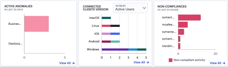
FIGURE 295 Viewing a breakdown of Active Anomalies, Connected Clients Versions, and Non-compliance
The Active Anomalies chart provides totals for the number of Geolocation anomalies and Business Hours anomalies. That is, application accesses that took place from an unexpected geographic location, or that took place outside of normal business hours. Hover your pointer over a particular bar to view a tooltip showing the label and total.
To view a detailed list of events that contributed to the totals in this chart, click View all:
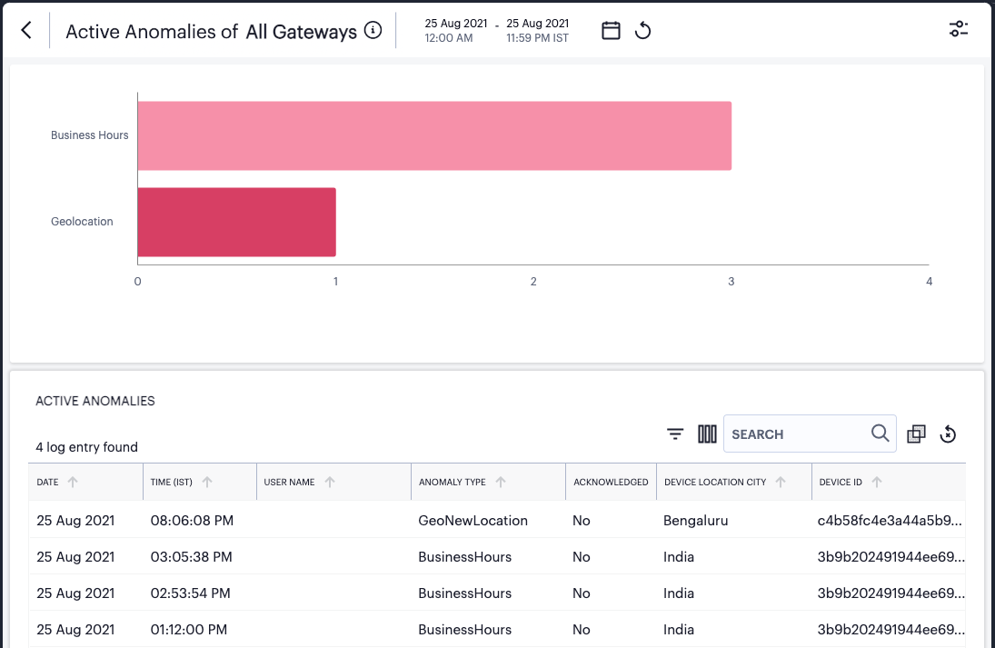
FIGURE 296 Viewing event logs for Active Anomalies
The Connected Clients Version chart shows totals for Ivanti Secure Access Client instances that have a current session on the Controller, broken down by device operating system type. Where more than one Ivanti Secure Access Client version is detected for a specific operating system, the bar is color-coded and relatively sized to represent each identified version and the number of clients using that version. Hover your pointer over a particular bar segment to view a tooltip showing the label and total.
If the currently selected time period is set to “Last Hour”, this graph includes a drop-down control to filter the displayed data between:
Active Users: Connected users during the last hour.
All Users: Users that connected to the Controller in the last 30 days.
In all other time period views, the graph shows only data for all users connected during that time period.
To view a detailed list of events that contributed to the totals in this chart, click View all:
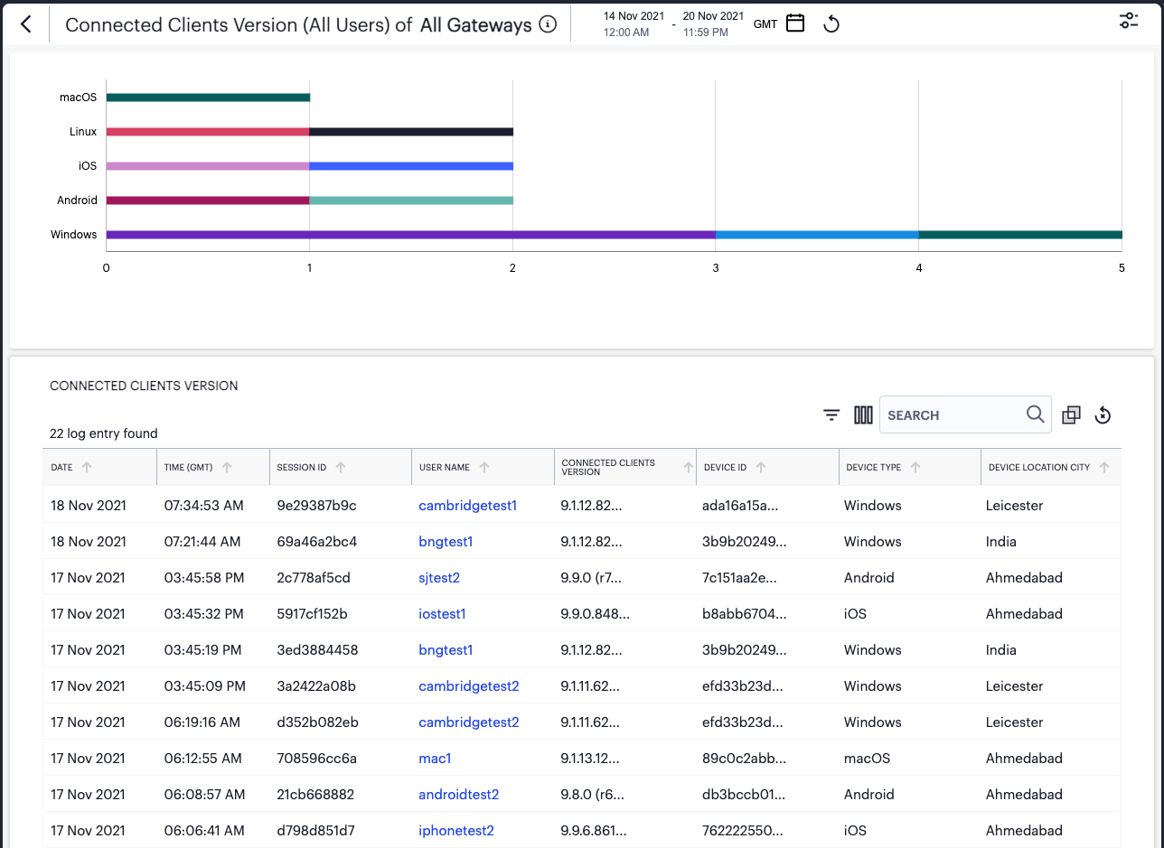
FIGURE 297 Viewing event logs for Connected Clients Versions
The Non-compliance chart provides a breakdown of non-compliant device activity that contravened a configured device policy. Totals are given for the highest policy contraventions recorded during the period.
To view a detailed list of events that contributed to the totals in this chart, click View all:
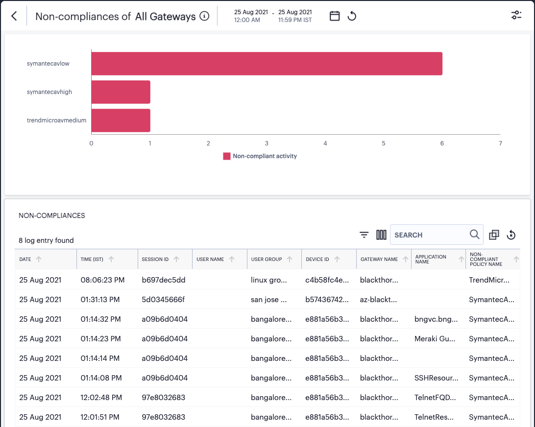
FIGURE 298 Viewing event logs for Non-compliances
To learn more about using the chart detail page, see Viewing Detailed Logs for a Chart.
Using the Top Active Breakdown Charts
The radar charts at the bottom of the page show a breakdown of Gateways, User Locations, and Applications across your organization. Each chart shows the top active items in each category.
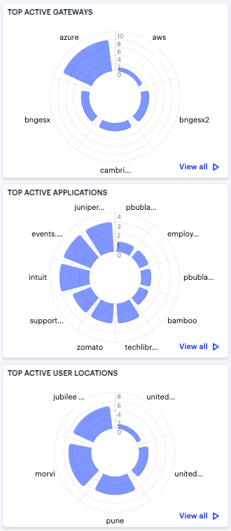
FIGURE 299 Viewing the breakdown radar charts
Hover your pointer over a particular element to view a tooltip showing the label and total. To view more details and a set of log entries that constitute the date in the a chart, click the corresponding View all link. To learn more about using the chart detail page, see Viewing Detailed Logs for a Chart.
Viewing Detailed Logs for a Chart
When you select the View all link for any of the charts or graphs displayed within the Insights pages, the Tenant Admin portal displays a detail page containing a larger version of the selected chart, together with a table showing the event or log records that constitute the data points in the chart.
For example:
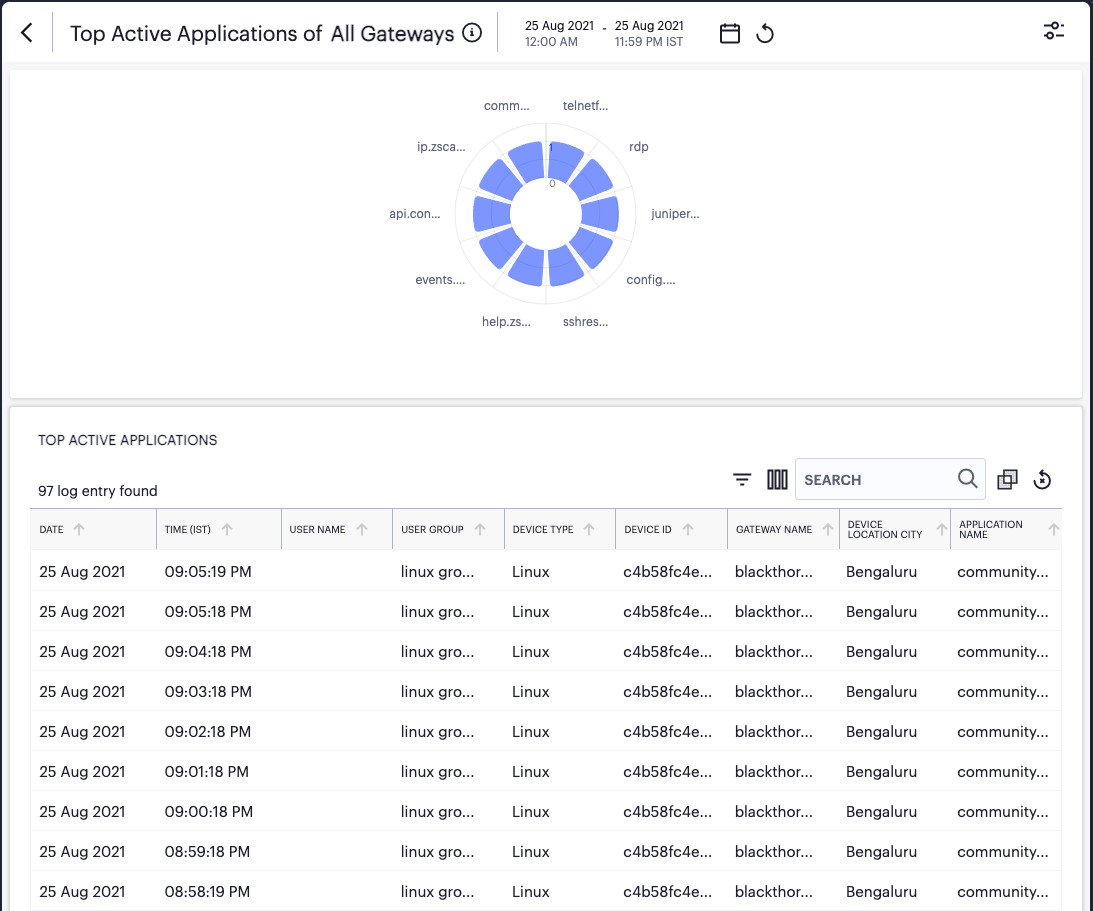
FIGURE 300 Viewing detailed event logs associated with the Top Active Applications chart
In this page:
Hover your pointer over a specific bar in the chart to view a tooltip showing a numeric total for that category.
Where a specific data item in the event table is truncated due to the column width, hover your pointer over the item to view a tooltip containing a full-length description.
Select the name of a column to apply a sort by that criteria. The adjacent arrow shows either ascending or descending sort order, or no sort - select again to switch between each view.
To view a single log entry in a dedicated panel, select the log message text to activate the info-panel view. For example:
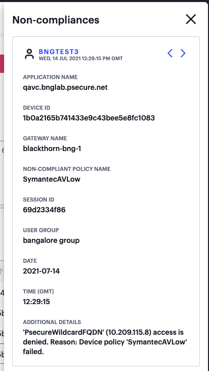
FIGURE 301 Viewing a single non-compliance event in the info-panel
Note
In the info-panel, use the Previous and Next icons to cycle through each event entry in turn.
Use the date-time display at the top of the page (indicated) to apply a specific time period for the displayed data:
FIGURE 302 Selecting a date and time range
From the dialog, select the desired time period. Choose from the following predefined time period options:
Last hour: Data observed for the previous 60 minutes.
Last <X> hours: Data observed so far in the current day, up to the last hour (in GMT).
Previous day: Data observed for the previous full day.
Previous Week: Data observed for the previous calendar week (for the previous full Sunday-to-Saturday week).
Custom: Data observed for a chosen time period. If you select this option, nZTA enables you to select a custom time period using the From and To date/time calendar controls.
Note
The date/time calendar controls are enabled for only the Custom option. However, the calendar continues to identify the applicable start and end date-time for all predefined time periods.
To reset the selected time period back to the default (Last Hour) view, select Reset. To return to the current page without making any changes, select Cancel.
To apply your changes, select Apply. The selected time period is displayed in the filter bar and data across all Insights pages is updated accordingly.
To manually refresh the display, select the following icon:

FIGURE 303 Page refresh
To search for a term in the displayed event data, select the following field:

FIGURE 304 Search term highlighting
nZTA highlights all matches in the event display.
To trigger the advanced filter selection, use the following icon:

FIGURE 305 Advanced Filtering
To learn more, see Filtering the Logs.
To change the fields displayed for each event line, select the following icon:

FIGURE 306 Show or hide event fields
In the field selector, select a field name to toggle between show or hide. A tick icon indicates a displayed field. After you are finished, select the field selector icon to close the selector.
To apply grouping to the event records, select the following icon:

FIGURE 307 Group event records by selected criteria
This feature applies grouping to a selected field, such that event records are accumulated and grouped together under each unique data item identified in that field. Through grouping, an admin can quickly view the number of records of a particular type.
The criteria available for grouping depends on the chart being viewed, and reflects the field headings in that event table. For example, when viewing the Top Active Applications detail page (as shown above), you can choose to group by the following:
Ungrouped
User Name
User Group
Device Type
Device ID
Gateway Name
Device Location City
App Name
By selecting App Name, the event table is reconfigured to show a summary bar for each unique application identified in the logs.
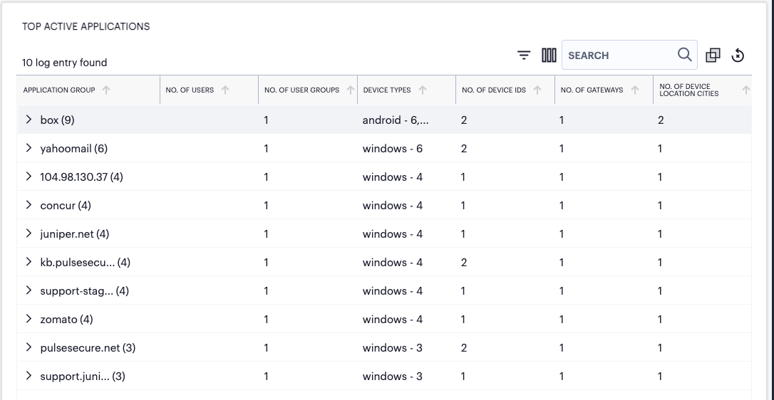
FIGURE 308 Viewing Top Active Application events with grouping by application name applied
In this view, each application is identified together with a count of the number of event lines (in brackets) recorded against it. The event table field headers also adjust to reflect the summary counts recorded for each identified application.
To observe the event records in each grouping, select the arrow icon (indicated) adjacent to each application name in the table:
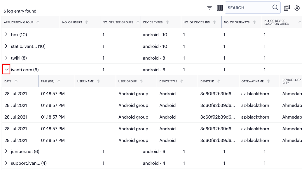
FIGURE 309 Viewing the grouped event records for a single named application
With grouping applied, the info-panel view adapts to reflect whether you selected a group header or an individual event record, such that the panel displays either the group totals or event details.
Note
If you apply a grouping to the event data in this page, the page controls at the bottom (number of records per page and page navigation) have no effect.
To remove any applied filters from the data set, select the following icon:

FIGURE 310 Remove any applied filters from the data
Use the page controls at the bottom to select the number of event records/rows per page:
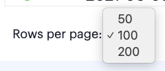
FIGURE 311 Setting the number of event rows per page
Choose from:
50
100 (default)
200
To cycle through the event pages, use the page controls at the bottom-right.
Reviewing User Activity
User activity is available for all users, or for a specific user.
The Users Overview page shows activity relating to all users in your nZTA deployment.
To access the Users Overview page:
Log into the Controller as a Tenant Admin, see Logging in as a Tenant Administrator.
The Network Overview page appears by default.
From the nZTA menu, click the Insights icon, then select Users > All Users.
The Users Overview page appears.
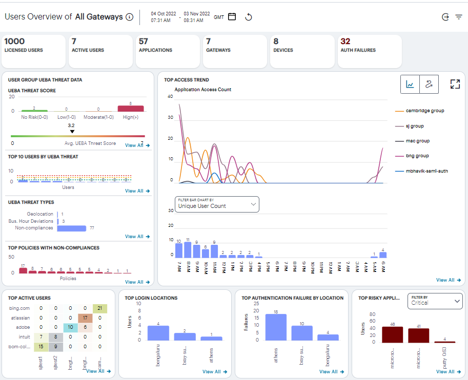
FIGURE 312 An overview of activity for all users
To view data relating to a specific user, see Showing Activity for a Specific User.
Understanding the Display
The Users Overview page contains the following components:
Filter bar, allowing the selection of active or historic data. For details, see Using the Filter Bar.
Summary ribbon, showing metrics for user activity. For more details, see Using the Summary Ribbon.
User Group UEBA Threat data, showing graphs and metrics for UEBA Threat scores across your user groups. For more details, see Viewing a Summary of UEBA Threat Scores for your Users.
Top access trends, showing a timeline chart of application access. For more details, see Viewing Top Access Trends.
Activity charts, showing charts for Top active users, Top login locations, and Top authentication failures by login location. For more details, see Viewing User Activity Charts.
Each chart on this page includes a View all link. To learn more about using the chart detail page, see Viewing Detailed Logs for a Chart.
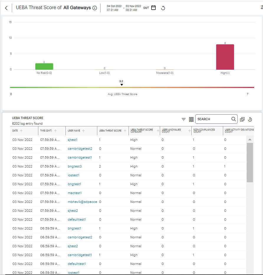
FIGURE 313 Viewing User Group risk detailed logs
Each detail view shows logs for the corresponding chart or category. To learn more about the detail page, including the features available, see Using the Active Anomaly, Connected Clients Version, and Non-Compliance Charts.
Using the Summary Ribbon
The Summary Ribbon at the top of the Users Overview page shows activity totals for the selected time filter:

FIGURE 314 Viewing the summary ribbon
The ribbon indicates the totals accrued for each category during the displayed time period, as indicated adjacent to the category name. Hover your pointer over the category elements to show a descriptive tooltip.
Licensed Users: The total number of licensed users.
Active Users: The number of active users during the selected time period.
Applications: The number of in-use applications.
Gateways: The number of active ZTA Gateways.
Devices: The number of active devices.
Auth failures: The number of authentication failures.
By default, the data presented in the ribbon corresponds to the last hour. To change the time period, use the filter bar (see Using the Filter Bar).
If you are currently viewing data for the last hour, each category in the ribbon includes a trend graph (highlighted, top) showing the changes in data during the hour. Also included is a change value (highlighted, bottom) based on the previous hour:
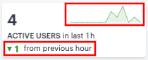
FIGURE 315 Data trends for last full hour versus the previous hour
If you select a historic time period in the filter bar, the ribbon displays only the main data totals for each category. Trend data is hidden.
Viewing a Summary of UEBA Threat Scores for your Users
On the Insights > All Users page, the User Group UEBA Threat data panel displays information concerning UEBA Threat factors across your user base:
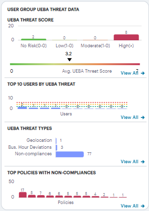
FIGURE 316 Viewing user group UEBA Threat data
The panel provides:
A breakdown of UEBA Threat by user group.
The average UEBA Threat score across all users.
The top-10 users scoring highest for UEBA Threat.
A break-down of UEBA Threat types.
The policies with highest non-compliance.
A user’s UEBA Threat score is calculated from a combination of three factors:
Application access attempts originating from anomalous geographic locations or outside of normal business hours.
Non-compliant user devices that attempted to access your applications.
Activity Deviations.
Each additional incident increments a user’s overall UEBA Threat score.
The No. of users chart provides a visual indication of the number of users that fall into each of the UEBA Threat categories. These categories are shown as percentage ratios of the overall UEBA Threat score and number of users. The upper and lower bands for each category are shown in brackets. The categories are:
No risk (20%)
Low (30%)
Moderate (30%)
High (20%)
Note
Where a particular UEBA Threat category matches no users for the selected time period, that category label is not shown.
Below this chart, nZTA displays the Average UEBA Threat score for all users on a scale between zero UEBA Threat and the highest UEBA Threat score measured at the end of the current time period.
Note
The maximum value shown in the chart corresponds to the highest UEBA Threat score for all users as they stand at the end of the time period, not the highest they have been within that period.
The Top 10 Users by UEBA Threat chart shows the top-10 users with the highest cumulative UEBA Threat score across the selected time period. Hover your pointer over each bar in the chart to see the name of the corresponding user. Where you have configured a UEBA Threat score action trigger (see Actions), this chart also contains a dotted line to indicate the UEBA Threat score threshold set in the action.
The UEBA Threat Type chart provides a breakdown of all geolocation anomalies, business hours deviations, and non-compliances that occurred during the selected time period.
The Top Policies with Non-compliances chart shows the device policies that recorded the highest number of non-compliances during the selected time period. Hover your pointer over each bar in the chart to see the name of the corresponding policy.
Viewing Top Access Trends
nZTA uses this section to show application access trends that occurred during the selected time period:
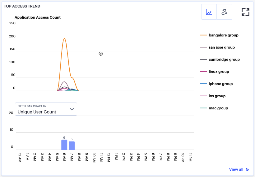
FIGURE 317 Viewing top access trends
You can choose to display this information through line and bar charts (as shown), or in an Sankey chart. Use the toggle icon at the top-right to select the required view:
FIGURE 318 Toggle between line/bar chart view and Sankey chart view
To expand the current view, click the Full Screen icon:
FIGURE 319 Expand the current view
In line/bar chart view, the display is split into two segments:
A line chart showing the number of application accesses by each user group during each hourly period of the day
A bar chart showing one of four data types, selected using the Filter Bar Chart By drop-down control:
Unique User Count
Unique Device Count
Unique Location Count
Anomalies
Note
If you set a Time Period filter than spans more than one day, the data values shown in each hour period are cumulative totals for the same hour in each day during the time period.
In this chart, hover your pointer over each hourly interval to view a tooltip showing the corresponding data totals. Furthermore, you can click and drag a select box across a shorter time period to zoom in on a narrower time window. To return to the full 24 hour period, click the zoom out icon:
FIGURE 320 Zoom out from a selected time period
To toggle on or off the data for a particular user group, click the name of the group in the legend. Or, to view only the data for a specific user group, click the corresponding line in the graph.
In the Sankey chart view, nZTA provides an alternate visualization of application access activity, showing directed flow between related objects.
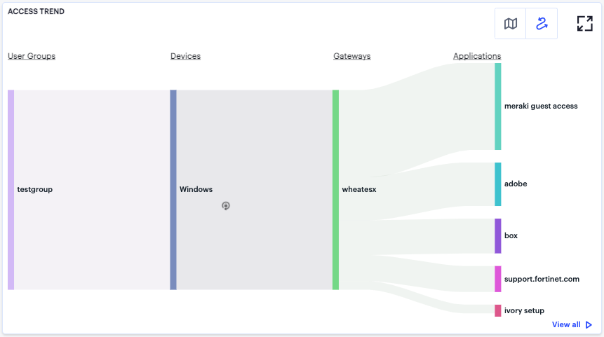
FIGURE 321 User Access Trends Sankey chart
The chart maps User Groups > Devices > Gateways > Applications. By hovering your pointer over a flow of interest, nZTA displays a tooltip confirming the scale of the activity between the two objects connected by the flow.
To focus the display on a specific flow, or to identify related objects that interact with this flow, click the chart at a point of interest. nZTA provides highlighting to all flows that pass through the point selected.
Viewing User Activity Charts
nZTA provides charts to represent user activity:
Top Active Users: a grid showing users that accrued the highest number of successful accesses to your deployed applications. Tooltips show the number of accesses by a user for that application.
Top Login Locations: a chart of the most active user locations per user group. Tooltips show a count of users active in that user group.
Top Authentication Failure by Location: a chart showing totals for authentication failures observed per user location.
Top Risky Applications: a chart showing the total users count for each of the top risky applications.
Hover your pointer over a particular element to view a tooltip showing the label and total.
Click View All to see the detailed metrics.
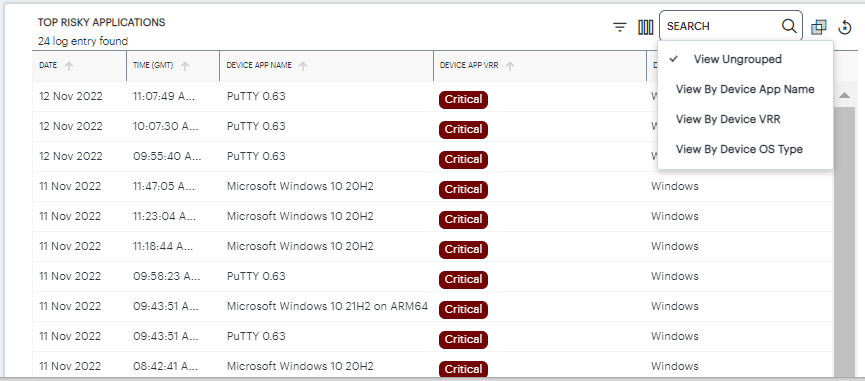
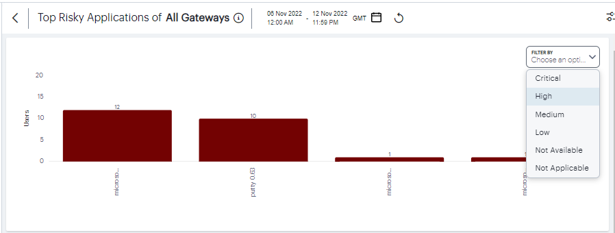
FIGURE 322 Top risky application details
Showing Activity for a Specific User
To view activity for a specific user, use the Set User option in the filter menu:
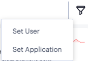
FIGURE 323 Activating the Set User option
Alternatively, from the Network Overview page, access specific user activity from the Users info-panel view. For more details, see Using the Summary Ribbon.
nZTA displays the Users page, showing activity for the selected user:
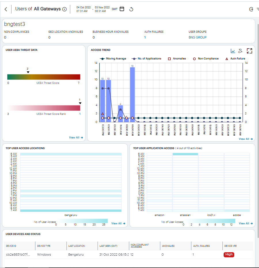
FIGURE 324 Viewing activity for a specific user
Understanding the Display
The Users page contains the following components:
Filter bar, allowing the selection of active or historic data. For details, see Using the Filter Bar.
Summary ribbon, showing activity metrics for the current user. For more details, see Using the Summary Ribbon.
User UEBA Threat data, showing the User UEBA Threat Score and UEBA Threat Score Rank. For more details, see Viewing UEBA Threat Data for the Selected User.
Access trend, showing application accesses, non-compliance, and authentication failures by this user over time.
Activity charts, showing top user access locations and application activity.
Each chart on this page includes a View all link. This link provides access to a detail view showing logs for the corresponding chart. For example:
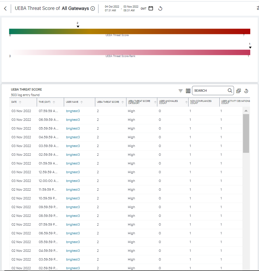
FIGURE 325 Viewing User UEBA Threat Score detailed logs
Each detail view shows logs for the corresponding chart or category. To learn more about using the chart detail page, see Viewing Detailed Logs for a Chart.
Using the Summary Ribbon
The Summary Ribbon at the top of the Users page shows activity totals for the user during the selected time filter:

FIGURE 326 Viewing the summary ribbon
The ribbon indicates totals accrued for the selected user during the displayed time period. The summary ribbon provides the following metrics:
Non-compliances: The number of non-compliant access attempts by this user during the period.
Geo Location Anomalies: The number of application accesses attempted from anomalous geographic login locations by this user during the period.
Business Hours Anomalies: The number of application accesses attempted outside of normal business hours by this user during the period.
Auth failures: The number of authentication failures experienced by this user during the period.
User groups: The user groups of which this user is a member. Click the name of a group to access the user groups page.
Viewing UEBA Threat Data for the Selected User
The User UEBA Threat Data panel displays information concerning UEBA Threat for the selected user:
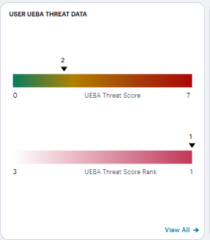
FIGURE 327 Viewing UEBA Threat data for a user
The panel provides:
The selected user’s UEBA Threat score, as calculated at the end of the selected time period.
The UEBA Threat score is shown as an indicator on a linear scale of no risk up to the highest recorded score during the time period. To learn more about a user’s UEBA Threat score, see Viewing a Summary of UEBA Threat Scores for your Users.
The selected user’s UEBA Threat Score rank, as calculated at the end of the selected time period.
A user’s UEBA Threat Score rank is the UEBA Threat score as measured against other active users in the organization, displayed on a linear scale. As a user increases their UEBA Threat score, the more the rank position (the indicator) decreases towards 1 out of the total of active users (the value at the start of the scale). A rank of “1” means that a user ranks highest for risk out of all active users.
A link to reset the selected user’s UEBA Threat score
Viewing Access Trends for the Selected User
nZTA uses this section to show access trends for the selected user that occurred during the selected time period.
You can choose to display this information through line and bar charts, or in a Sankey chart. Use the toggle icon at the top-right to select the required view:
FIGURE 328 Toggle between line/bar chart view and Sankey chart view
To expand the current view, click the Full Screen icon:
FIGURE 329 Expand the current view
The line and bar chart shows user access trends through each hourly interval of the day:
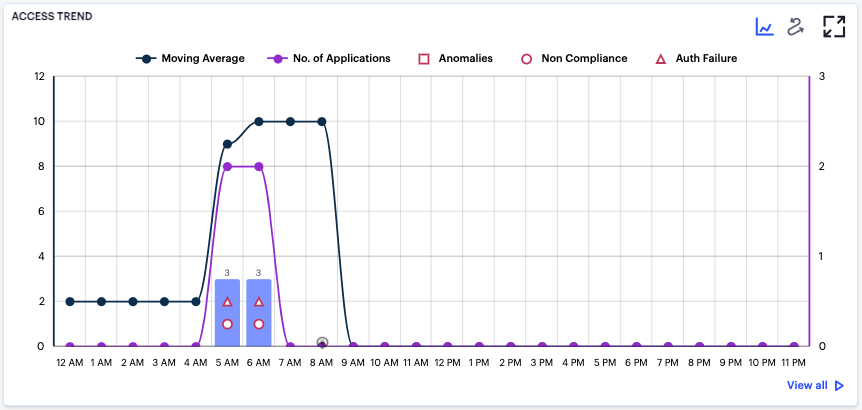
FIGURE 330 Viewing hourly access trends for a user
The horizontal axis reflects the 24 hourly intervals in a day, with the vertical axis showing the number of accesses. As a user interacts with your nZTA infrastructure, access attempts are recorded and shown in this chart according to the hour in which they occurred. This in turn provides an overview of the daily access trends for the user.
The bars denote the number of accesses made, with the lines charting the number of applications accessed, and the moving average over 30 days.
Anomalies, non-compliances, and authentication failures detected in the hour are marked as per the legend.
Hover your pointer over an hour interval to see a tooltip summary of data points for that hour:
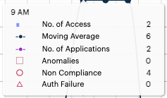
FIGURE 331 Viewing a data summary tooltip
To learn more about the User Access Sankey chart, see Viewing the User Access Sankey Chart.
Viewing the User Access Sankey Chart
The User Access Sankey chart provides an alternate visualization of your selected user’s activity, showing directed flow between related objects. The width of each stream in the flow is proportional to the utilization of the object the flow passes through, allowing an administrator to view significant usage trends for the selected user and your application infrastructure.
To toggle between the User UEBA Threat Score chart and the User Access Sankey chart, use the icons at the top-right:

FIGURE 332 Toggle between User UEBA Threat Score view and User Access Sankey chart view
By clicking the toggle display icon, the User Access Sankey chart replaces the User UEBA Threat Score graph in the display. All other components remain unchanged.
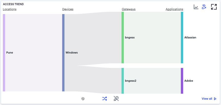
FIGURE 333 Displaying the User Activity Sankey Chart View
The nZTA User Activity Sankey chart maps Locations > Devices > Gateways > Applications for the selected user. By hovering your pointer over a flow of interest, nZTA displays a tooltip confirming the scale of the activity between the two objects connected by the flow.
To focus the display on a specific flow, or to identify related objects that interact with this flow, click the chart at a point of interest. nZTA provides highlighting to all flows that pass through the point selected.
To activate the User Non-Compliances Sankey chart view, use the toggle icons at the bottom of the chart:

FIGURE 334 Toggle between User Access Sankey chart view and the User Non-Compliances Sankey chart view
Use this toggle to switch the Sankey chart between displaying User Application Access or User Non-Compliances flows.
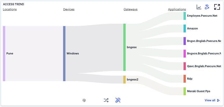
FIGURE 335 Displaying the User Non-Compliance Sankey Chart View
Viewing User Activity Charts
The Top User Locations and Top User Activity charts show the top locations and applications the user is active with at different times of the day. Each chart provides a visual breakdown of normal activity across the day, with anomalies highlighted when they occur.
Viewing and Terminating User Sessions
To view the list of currently active user sessions:
Log into the Controller as a Tenant Admin, see Logging in as a Tenant Administrator.
The Network Overview page appears.
From the nZTA menu, click the Insights icon, then select Users > User Sessions.
The User Sessions page appears:
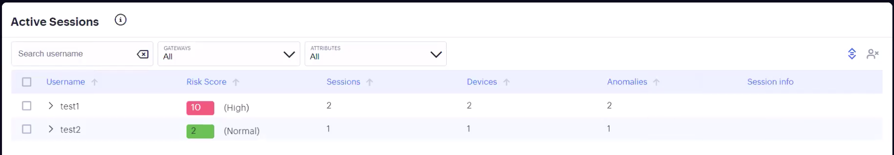
FIGURE 336 Viewing active user sessions
Use this page to view currently-active user sessions, and to terminate selected sessions as required. Each row corresponds to a single user and shows the following details:
The username
The user’s UEBA Threat score. For more information on UEBA Threat scores, see Reviewing User Activity.
The number of active sessions.
The number of devices used.
The number of anomalies observed. For more information on anomalies, see Using the Active Anomaly, Connected Clients Version, and Non-Compliance Charts.
Session information, if available
Click the arrow icon adjacent to each column to sort in ascending or descending order.
Use the search boxes at the top of the page to search by:
an entered username
a specified Gateway
attributes:
Username: enter a user name
Device ID: select a device ID
Risk: select a UEBA Threat score level
The data automatically updates to reflect the chosen search criteria.
Click the arrow icon adjacent to the user name to view all active sessions for the user:
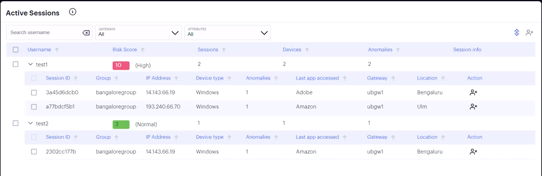
FIGURE 337 Viewing all active sessions for a user
Alternatively, to expand or collapse the list of sessions for all users, click the icon at the top-right:
FIGURE 338 Expand or collapse the complete user session list
To terminate a specific user session, locate the session row on the page and click the corresponding terminate button:
FIGURE 339 Terminate a session
To terminate multiple sessions in one operation, use the checkboxes adjacent to each username (to terminate all sessions for that user), or adjacent to each session row (to terminate individual sessions for one or more users). Then click the terminate multiple sessions button at the top-right.
In all cases, nZTA provides a confirmation dialog showing the session, or sessions, selected to be deleted:
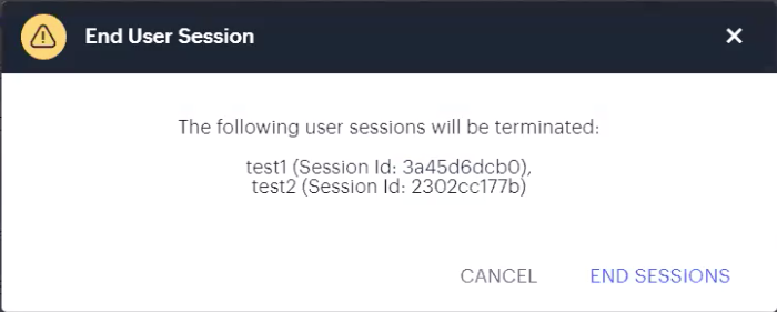
FIGURE 340 Confirming the session(s) to terminate
All session terminations performed through this page are logged in the nZTA Access Logs.
Note
You can also terminate active user sessions through the Anomalies info-panel. For more details, see Using the Summary Ribbon.
Reviewing Application Usage
Applications in nZTA are defined primarily by the URI you use to access them, and can be fully defined (for example, a complete URI denoting a specific application at a location) or discovered (for example, a wildcard-prefixed FQDN that denotes an endpoint containing one or more applications).
The Insights > Applications pages shows usage data for all applications requested through your nZTA deployment.
nZTA provides the following views for your application usage:
All Applications: Shows usage metrics for all defined applications in your nZTA deployment. See All Applications.
Discovered Applications: Shows usage metrics for all discovered applications in your nZTA deployment. See Discovered Applications.
Default Gateway Applications: Shows usage metrics for all applications managed through the default ZTA Gateway defined in your Application Discovery secure access policy. See Default ZTA Gateway Applications.
Note
A default ZTA Gateway is used to handle all requests from applications that are not referenced by any secure access policy. To learn more about setting a default ZTA Gateway, see Configuring a Default Gateway for Application Discovery.
To learn more about defining applications for use with secure access policies, see Defining Applications and Application Groups.
To view application usage:
Log into the Controller as a Tenant Admin, see Logging in as a Tenant Administrator.
The Network Overview page appears.
From the nZTA menu, click the Insights icon, then select Applications and choose either All Applications, Discovered Applications, or Default Gateway Applications.
The Applications Overview page appears, showing the selected metrics.
Use the tabs at the top of the page to switch between the different views: All Applications, Discovered Applications, and Default Gateway Applications. Each tab consists of a number of panels containing metrics and charts to show application usage in one of the aforementioned categories.
To view data relating to a specific application, see Showing Usage Data for a Specific Application.
All Applications
The All Applications tab shows usage metrics for all defined and discovered applications:
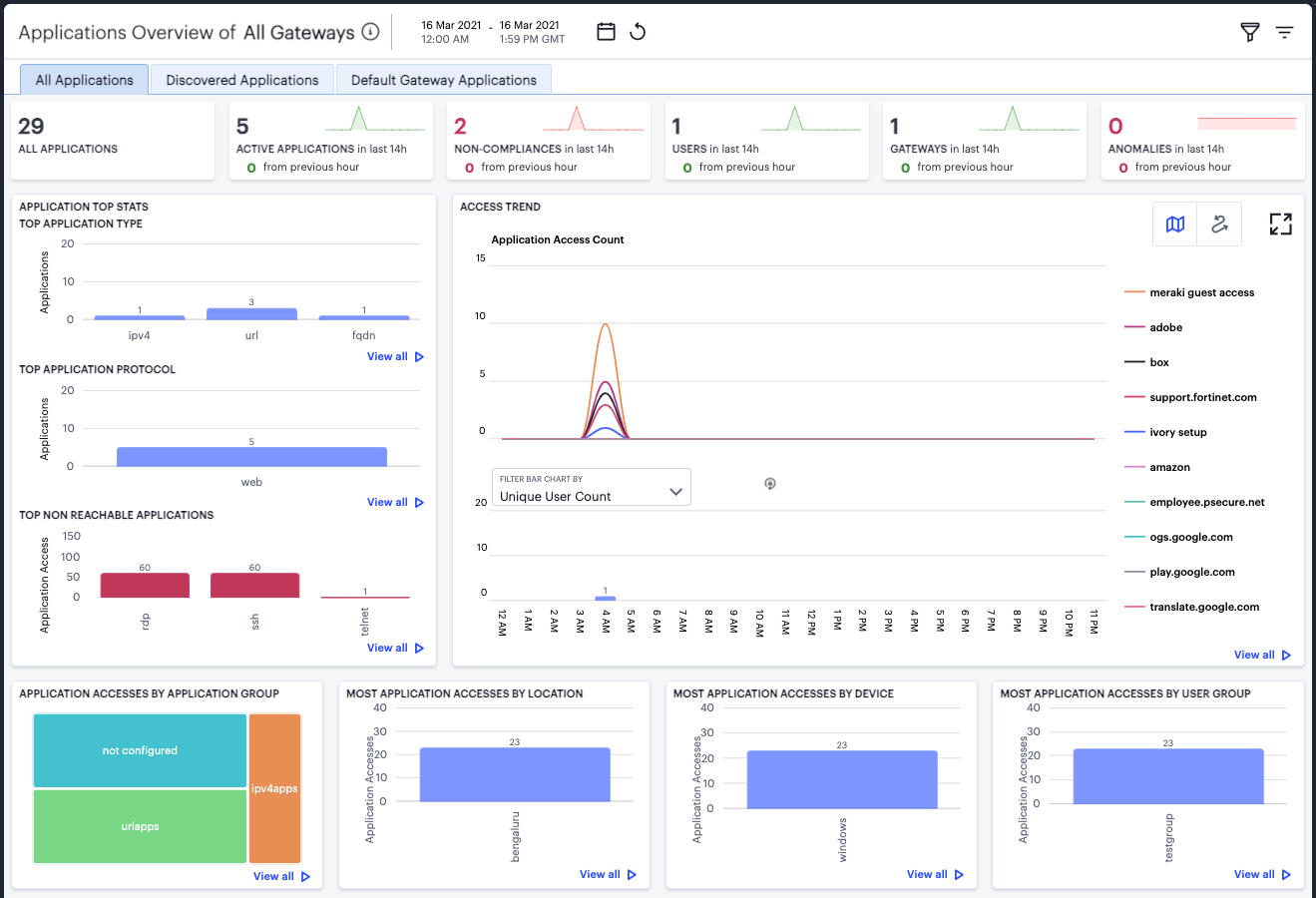
FIGURE 341 Viewing usage charts and graphs for your applications
The display is split into sections:
Summary Ribbon
Application Top Stats
Access Trends
Activity charts for Application Accesses by Application Group, Most Application Accesses by Location, Most Application Accesses by Device, and Most Application Accesses by User Group.
Note
Each chart in the display includes a View all link providing access to a detail page showing log records for the corresponding chart. These log records include links to the application and user involved in the logged event. Ivanti recommends using this page to access the metrics page for the specific application (see Showing Usage Data for a Specific Application) or user (see Showing Activity for a Specific User). This method of navigation offers an alternative to searching for a specific application through the “Select Application” filter option, where the exact application name might not be known (for example, discovered and default applications not specifically defined in a secure access policy). To learn more about using the chart detail page, see Viewing Detailed Logs for a Chart.
The summary ribbon provides the following metrics:
All Applications: The total number of applications defined on the Controller.
Active Applications: The number of applications accessed during the selected time period.
Non-compliances: The number of non-compliant attempts to access applications.
Users: The number of active users.
Gateways: The number of active ZTA Gateways.
Anomalies: The number of anomalous application accesses based on geographic and business hours irregularities.
The Application Top Stats panel provides the following charts:
Top Application Type: A bar chart showing the application types that attracted the greatest numbers of application accesses during the selected time period (for example, FQDN, URL, or IP address).
Top Application Protocol: A bar chart showing the application protocol types that attracted the greatest number of application accesses during the selected time period (for example, Web, RDP, or SSH).
Top Non Reachable Applications: A bar chart showing the applications marked most-often not reachable by the Controller. To learn more about application availability status, see Viewing your Secure Access Policies.
Note
The Top Non Reachable Applications chart includes only applications where the status can be determined. It does not show applications where the status is unknown, such as for applications based on FQDNs, wildcard-based FQDNs, and IPv4/IPv6 ranges - all of which are unsupported by the application health monitoring feature.
For all charts, hover your pointer over each bar to display a tooltip of the type and number of accesses recorded.
The Access Trends panel shows application access trends that occurred during the selected time period. You can choose to display this information through line and bar charts, or in a Sankey chart. Use the toggle icon at the top-right to select the required view:
FIGURE 342 Toggle between line/bar chart view and Sankey chart view
To expand the current view, click the Full Screen icon:
FIGURE 343 Expand the current view
Note
Click this icon again to return to the standard view.
In line/bar chart view. The display is split into two segments:
A line chart showing the number of accesses for the top-10 applications during each hourly period of the day
A bar chart showing one of four data types, selected using the Filter Bar Chart By drop-down control:
– Unique User Count: Shows a count of unique user activity identified during each hourly period. – Unique Device Type Count: Shows a count of unique device types identified during each hourly period. – Unique Location Count: Shows a count of activity from unique user locations identified during each hourly period. – Unique User Group Count: Shows a count of activity from unique user groups identified during each hourly period.
Note
If you set a Time Period filter than spans more than one day, the data values shown in each hour period are cumulative totals for the same hour in each day during the time period.
In this chart, hover your pointer over each hourly interval to view a tooltip showing the corresponding data totals. Furthermore, you can click and drag a select box across a shorter time period to zoom in on a narrower time window. To return to the full 24 hour period, click the zoom out icon:
FIGURE 344 Zoom out from a selected time period
To toggle on or off the data for a particular application, click the name in the legend. Or, to view only the data for a specific application, click the corresponding line in the graph.
In the Sankey chart view, nZTA provides an alternate visualization of application access activity, showing directed flow between related objects.
FIGURE 345 User Access Trends Sankey chart
The chart maps User Groups > Devices > Gateways > Applications. By hovering your pointer over a flow of interest, nZTA displays a tooltip confirming the scale of the activity between the two objects connected by the flow. To focus the display on a specific flow, or to identify related objects that interact with this flow, click the chart at a point of interest. nZTA provides highlighting to all flows that pass through the point selected.
The Activity Charts on this page represent top application access totals in the following categories:
Application Accesses by Application Group: a grid chart showing the application groups containing the applications that accrued the highest number of successful accesses. Application group sizes in the chart are proportional to the number of accesses, compared with other groups. Tooltips show a count of the accesses made to that group. To learn more about Application Groups, see Adding Application Groups to the Controller.
Most Application Accesses by Location: a bar chart showing a list of the most active user locations with respect to application access. Tooltips show a count of the application accesses by that location.
Most Application Accesses by Device: a bar chart showing a list of the most active user device types with respect to application access. Tooltips show a count of the application accesses by that device type.
Most Application Accesses by User Group: a bar chart showing a list of the most active user groups with respect to application access. Tooltips show a count of the application accesses by users in that user group.
Hover your pointer over a particular element to view a tooltip showing the label and total.
Discovered Applications
The Discovered Applications tab shows usage metrics for applications discovered by the Controller for applications defined with a wildcard domain and with Application Discovery enabled:
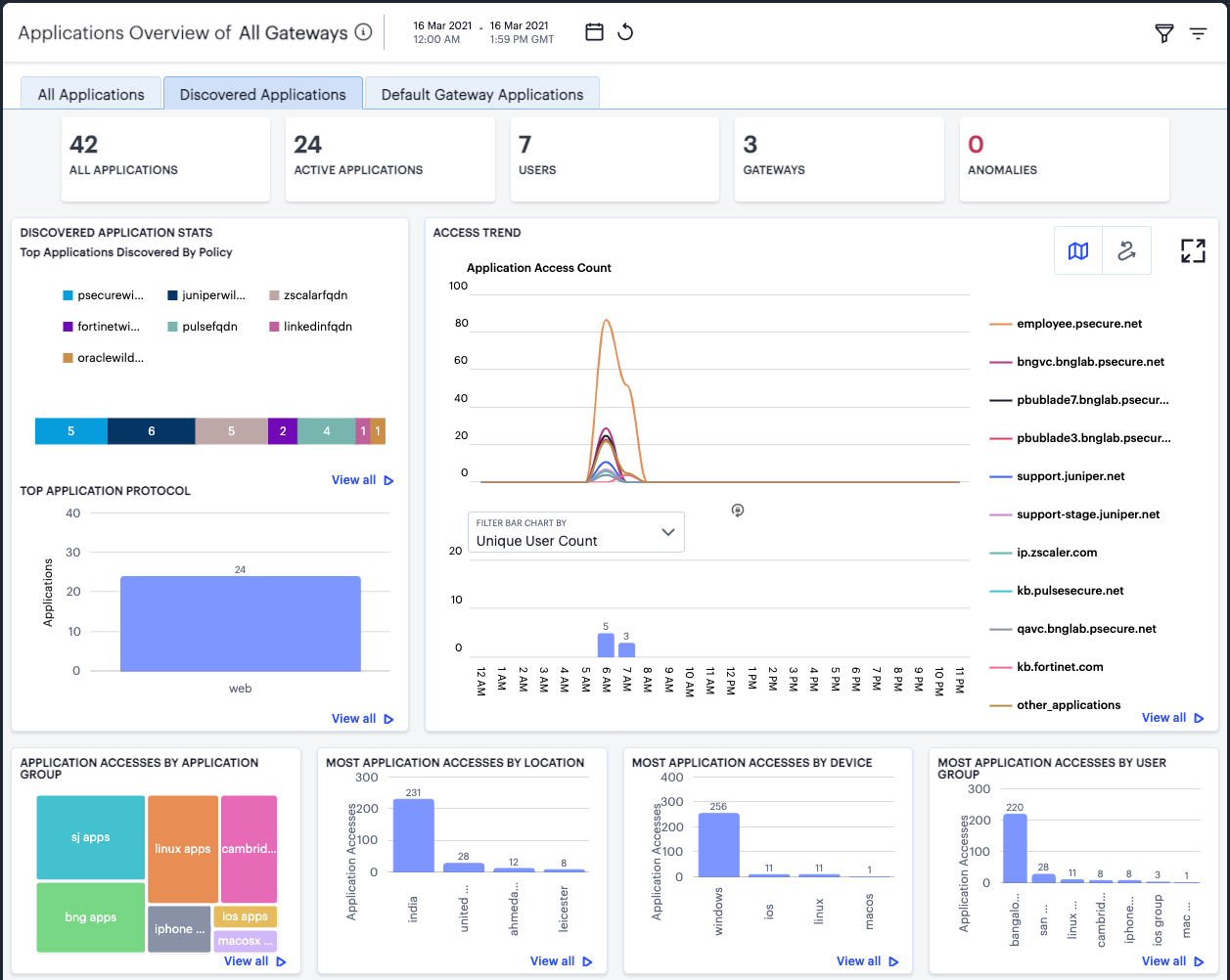
FIGURE 346 Viewing usage charts and graphs for discovered applications
The display is split into sections:
Summary Ribbon
Discovered Application Stats
Access Trend
Activity charts for Application Accesses by Application Group, Most Application Accesses by Location, Most Application Accesses by Device, and Most Application Accesses by User Group.
Note
Each chart in the display includes a View all link providing access to a detail page showing log records for the corresponding chart. These log records include links to the application and user involved in the logged event. Ivanti recommends using this page to access the metrics page for the specific application (see Showing Usage Data for a Specific Application) or user (see Showing Activity for a Specific User). This method of navigation offers an alternative to searching for a specific application through the “Select Application” filter option, where the exact application name might not be known (for example, discovered and default applications not specifically defined in a secure access policy). To learn more about using the chart detail page, see Viewing Detailed Logs for a Chart.
The summary ribbon provides the following metrics:
All Applications: The number of applications discovered by the Controller.
Active Applications: The number of discovered applications accessed during the selected time period.
Users: The number of users active with discovered applications.
Gateways: The number of ZTA Gateways serving discovered applications.
Anomalies: The number of anomalous application accesses based on geographic and business hours irregularities.
The Discovered Application Stats panel provides two charts:
Top Applications Discovered by Policy: A chart showing the application definitions, with Application Discovery enabled, for which the greatest number of applications were discovered. The segment sizes are proportional to the number of discovered applications for each application domain.
Top Application Protocol: A bar chart showing the application protocol types, with Application Discovery enabled, that attracted the greatest number of application accesses during the selected time period (for example, Web, RDP, or SSH).
For both charts, hover your pointer over each bar to display a tooltip of the type and number of accesses recorded.
The Access Trend panel shows application access trends that occurred with discovered applications during the selected time period. You can choose to display this information through line and bar charts, or in a Sankey chart. Use the toggle icon at the top-right to select the required view:
FIGURE 347 Toggle between line/bar chart view and Sankey chart view
To expand the current view, click the Full Screen icon:
FIGURE 348 Expand the current view
Note
Click this icon again to return to the standard view.
In line/bar chart view. The display is split into two segments:
A line chart showing the number of accesses for the top-10 discovered applications during each hourly period of the day
A bar chart showing one of four data types, selected using the Filter Bar Chart By drop-down control:
– Unique User Count: Shows a count of unique user activity identified during each hourly period. – Unique Device Type Count: Shows a count of unique device types identified during each hourly period. – Unique Location Count: Shows a count of activity from unique user locations identified during each hourly period. – Unique User Group Count: Shows a count of activity from unique user groups identified during each hourly period.
Note
If you set a Time Period filter than spans more than one day, the data values shown in each hour period are cumulative totals for the same hour in each day during the time period.
In this chart, hover your pointer over each hourly interval to view a tooltip showing the corresponding data totals. Furthermore, you can click and drag a select box across a shorter time period to zoom in on a narrower time window. To return to the full 24 hour period, click the zoom out icon:
FIGURE 349 Zoom out from a selected time period
To toggle on or off the data for a particular application, click the name in the legend. Or, to view only the data for a specific application, click the corresponding line in the graph.
In the Sankey chart view, nZTA provides an alternate visualization of application access activity, showing directed flow between related objects.
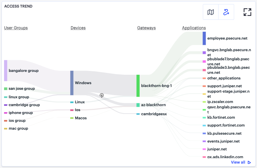
FIGURE 350 User Access Trends Sankey chart for discovered applications
The chart maps User Groups > Devices > Gateways > Applications. By hovering your pointer over a flow of interest, nZTA displays a tooltip confirming the scale of the activity between the two objects connected by the flow. To focus the display on a specific flow, or to identify related objects that interact with this flow, click the chart at a point of interest. nZTA provides highlighting to all flows that pass through the point selected.
The Activity Charts on this page represent top application access totals in the following categories:
Application Accesses by Application Group: a grid chart showing the application groups containing the applications, with Application Discovery enabled, that accrued the highest number of successful accesses. Application group sizes in the chart are proportional to the number of accesses, compared with other groups. Tooltips show a count of the accesses made to that group. To learn more about Application Groups, see Adding Application Groups to the Controller.
Most Application Accesses by Location: a bar chart showing a list of the most active user locations with respect to application access. Tooltips show a count of the application accesses by that location.
Most Application Accesses by Device: a bar chart showing a list of the most active user device types with respect to application access. Tooltips show a count of the application accesses by that device type.
Most Application Accesses by User Group: a bar chart showing a list of the most active user groups with respect to application access. Tooltips show a count of the application accesses by users in that user group.
Hover your pointer over a particular element to view a tooltip showing the label and total.
Default ZTA Gateway Applications
The Controller includes a default secure access policy called “Application discovery”, disabled by default, that is used to define behavior for applications and resources that are not controlled by a specifically-created secure access policy. In this policy, you can add a default ZTA Gateway that you want to use to handle all such requests. To learn more about configuring a default ZTA Gateway, see Configuring a Default Gateway for Application Discovery.
Due to the nature of the typical background resource and API requests made by a client device during normal use of a web-based application, the metrics shown on this page might include a large number of secondary application and API requests that nZTA identifies and logs as not falling under the remit of the primary application’s secure access policy. Such requests have been handled instead by the default ZTA Gateway.
Note
The applications listed on this tab could be operating system triggered resource requests related, for example, to the act of connecting to the internet. It should not be assumed that the URLs and IP addresses shown here are automatically connected to accessing a nZTA-controlled application or resource.
The Default Gateway Applications tab shows usage metrics for all applications and resources handled by the default ZTA Gateway:
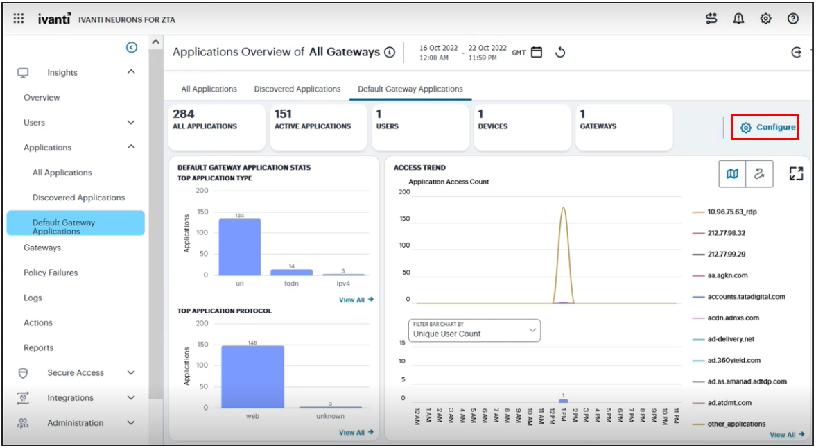
FIGURE 351 Viewing usage charts and graphs for default ZTA Gateway applications
The display is split into sections:
Summary Ribbon
Default Gateway Application Stats
Access Trend
Activity charts for Most Application Accesses by Location, Most Application Accesses by Device, and Most Application Accesses by User Group.
Note
Each chart in the display includes a View all link providing access to a detail page showing log records for the corresponding chart. These log records include links to the application and user involved in the logged event. Ivanti recommends using this page to access the metrics page for the specific application (see Showing Usage Data for a Specific Application) or user (see Showing Activity for a Specific User). This method of navigation offers an alternative to searching for a specific application through the “Select Application” filter option, where the exact application name might not be known (for example, discovered and default applications not specifically defined in a secure access policy). To learn more about using the chart detail page, see Viewing Detailed Logs for a Chart.
The summary ribbon provides the following metrics:
All Applications: The number of applications handled by the default ZTA Gateway.
Active Applications: The number of default ZTA Gateway applications accessed during the selected time period.
Users: The number of users active with default ZTA Gateway applications.
Devices: The number of devices accessing default ZTA Gateway applications.
Gateways: Denotes the ZTA Gateway, or number of ZTA Gateways in the Gateway Group, selected as the default Gateway in the “Application Discovery” secure access policy.
Note
The application details shown here are unique to this page and are not included in other summary ribbons or metrics involving all applications.
The Default Gateway Application Stats panel provides two charts:
Top Application Type: A bar chart showing the application types that attracted the greatest numbers of application accesses during the selected time period (for example, FQDN, URL, or IP address).
Top Application Protocol: A bar chart showing the application protocol types that attracted the greatest number of application accesses during the selected time period (for example, Web, RDP, or SSH).
For both charts, hover your pointer over each bar to display a tooltip of the type and number of accesses recorded.
The Access Trend panel shows application access trends that occurred during the selected time period. You can choose to display this information through line and bar charts, or in a Sankey chart. Use the toggle icon at the top-right to select the required view:
FIGURE 352 Toggle between line/bar chart view and Sankey chart view
To expand the current view, click the Full Screen icon:
FIGURE 353 Expand the current view
Note
Click this icon again to return to the standard view.
In line/bar chart view. The display is split into two segments:
A line chart showing the number of accesses for the top-10 requested applications during each hourly period of the day
A bar chart showing one of four data types, selected using the Filter Bar Chart By drop-down control:
– Unique User Count: Shows a count of unique user activity identified during each hourly period. – Unique Device Type Count: Shows a count of unique device types identified during each hourly period. – Unique Location Count: Shows a count of activity from unique user locations identified during each hourly period. – Unique User Group Count: Shows a count of activity from unique user groups identified during each hourly period.
Note
If you set a Time Period filter than spans more than one day, the data values shown in each hour period are cumulative totals for the same hour in each day during the time period.
In this chart, hover your pointer over each hourly interval to view a tooltip showing the corresponding data totals. Furthermore, you can click and drag a select box across a shorter time period to zoom in on a narrower time window. To return to the full 24 hour period, click the zoom out icon:
FIGURE 354 Zoom out from a selected time period
To toggle on or off the data for a particular application, click the name in the legend. Or, to view only the data for a specific application, click the corresponding line in the graph.
In the Sankey chart view, nZTA provides an alternate visualization of application access activity, showing directed flow between related objects.
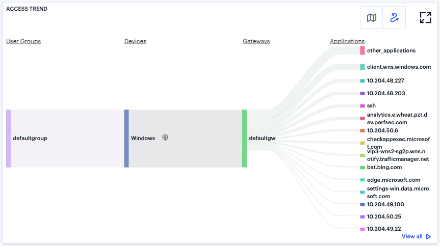
FIGURE 355 User Access Trends Sankey chart for default ZTA Gateway applications
The chart maps User Groups > Devices > Gateways > Applications. By hovering your pointer over a flow of interest, nZTA displays a tooltip confirming the scale of the activity between the two objects connected by the flow. To focus the display on a specific flow, or to identify related objects that interact with this flow, click the chart at a point of interest. nZTA provides highlighting to all flows that pass through the point selected.
The Activity Charts on this page represent top application access totals in the following categories:
Most Application Accesses by Location: a bar chart showing a list of the most active user locations with respect to application access. Tooltips show a count of the application accesses by that location.
Most Application Accesses by Device: a bar chart showing a list of the most active user device types with respect to application access. Tooltips show a count of the application accesses by that device type.
Most Application Accesses by User Group: a bar chart showing a list of the most active user groups with respect to application access. Tooltips show a count of the application accesses by users in that user group.
Hover your pointer over a particular element to view a tooltip showing the label and total.
When viewing metrics on this page, the following limitations should be noted:
Non-Compliance messages are not generated for the default ZTA Gateway. This is due to the fact Ivanti Secure Access Client blocks such messages directly without sending them on to the ZTA Gateway.
The default ZTA Gateway application details captured on this page are not included in the metrics captured on the Network Overview page. However, the default ZTA Gateway is still shown on the Network Overview page for monitoring purposes (for example, CPU, disk, and memory usage).
Anomaly detection for applications handled by the default ZTA Gateway (especially business hours anomalies) is not displayed on any of the Insights dashboards. This is due to the fact that the number of applications detected can be very large, which can in turn impact the user UEBA Threat score.
Log records for applications handled by the default ZTA Gateway are displayed only on the Secure Access > Gateways > Logs page. These records are not displayed on the Insights > Logs page.
If a user associated with the default User Group tries to access applications handled by the default ZTA Gateway, the Users dashboard for that specific user displays only the user UEBA Threat score, risk rank and the moving average on the Access Trend chart. It does not capture details of the default gateway applications accessed, primarily to ensure that the application data displayed here does not become overpopulated.
Configuring Default Gateway Application
A Configure button is provided in the ZTA Gateway Applications page to trigger the workflow of blocking the discovered applications behind default gateway.
To configure default ZTA Gateway application:
In the default ZTA Gateway applications page, click Configure.
The Configure Applications page is displayed showing a list of discovered applications behind the default gateway.
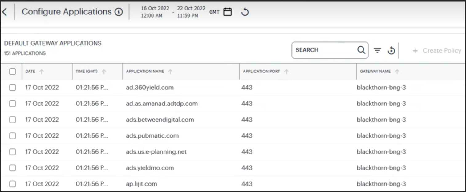
FIGURE 356 Configure default ZTA Gateway applications
In the search box provided, start typing the application name. nZTA auto-completes any matching application name.
Select an application from the list and click Create Policy to create a Secure Access Policy. To learn more about creating a secure access application, see Creating/Editing Secure Access Policies.
Showing Usage Data for a Specific Application
To view usage data and metrics for a specific application, use the Set Application option in the filter menu:
FIGURE 357 Activating the Set Application option
Alternatively, from the Network Overview page, access specific application data from the Applications info-panel view. For more details, see Using the Summary Ribbon.
nZTA displays the Application page, showing activity for the selected application:
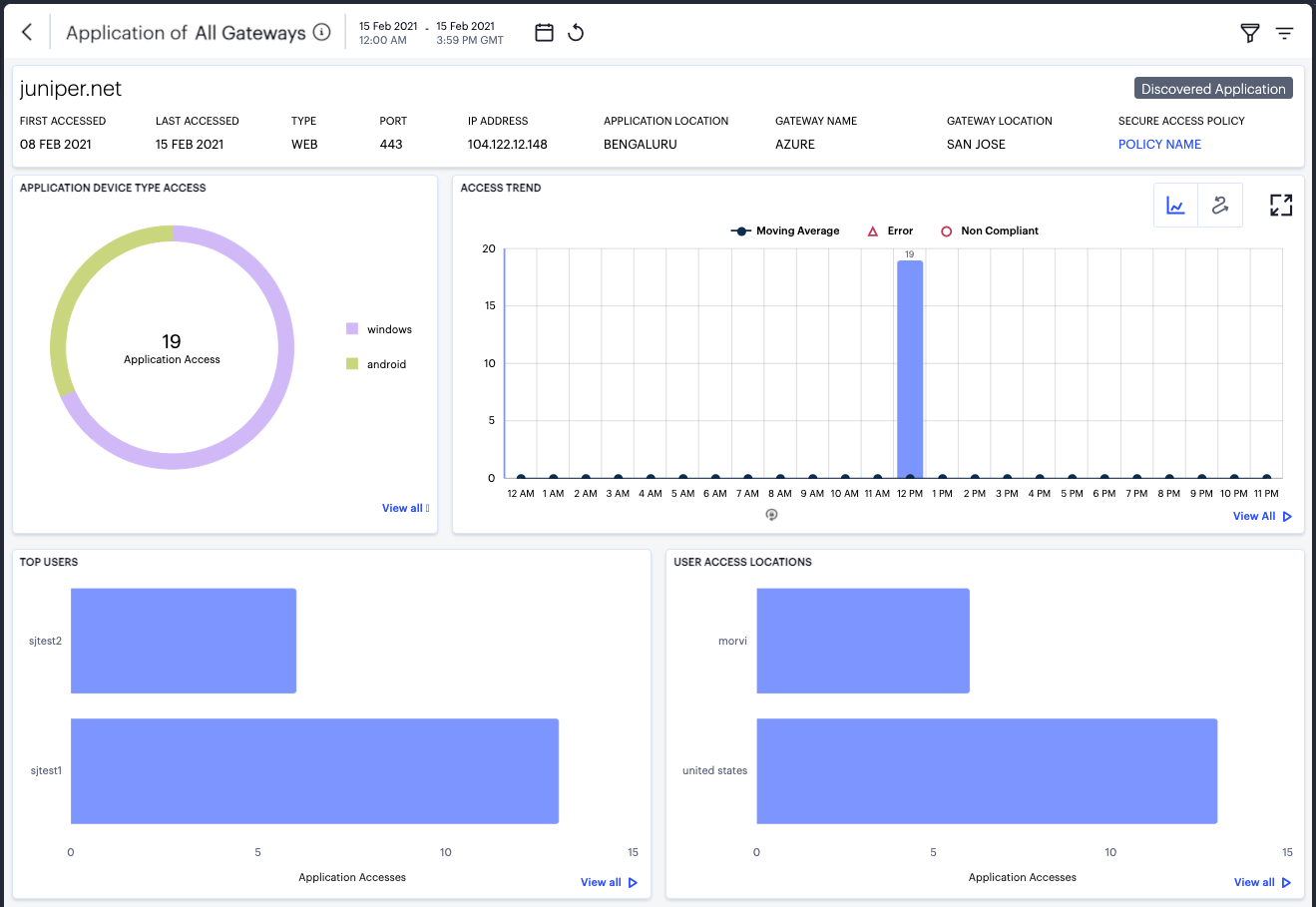
FIGURE 358 Viewing usage data for a specific application
Understanding the Display
The Application page contains the following components:
Filter bar, allowing the selection of active or historic data. For details, see Using the Filter Bar.
Summary ribbon, showing details of the selected application. For more details, see Using the Summary Ribbon.
Application Device Type Access, showing accesses per device type. For more details, see Viewing Application Accesses by Device Type.
Access trend, showing application accesses, non-compliance, and errors over time. For more details, see Viewing Access Trends for the Selected Application.
Activity charts, showing top users and locations. For more details, see Viewing Application Activity Charts.
Each chart on this page includes a View all link. This link provides access to a detail view showing logs for the corresponding chart. For example:
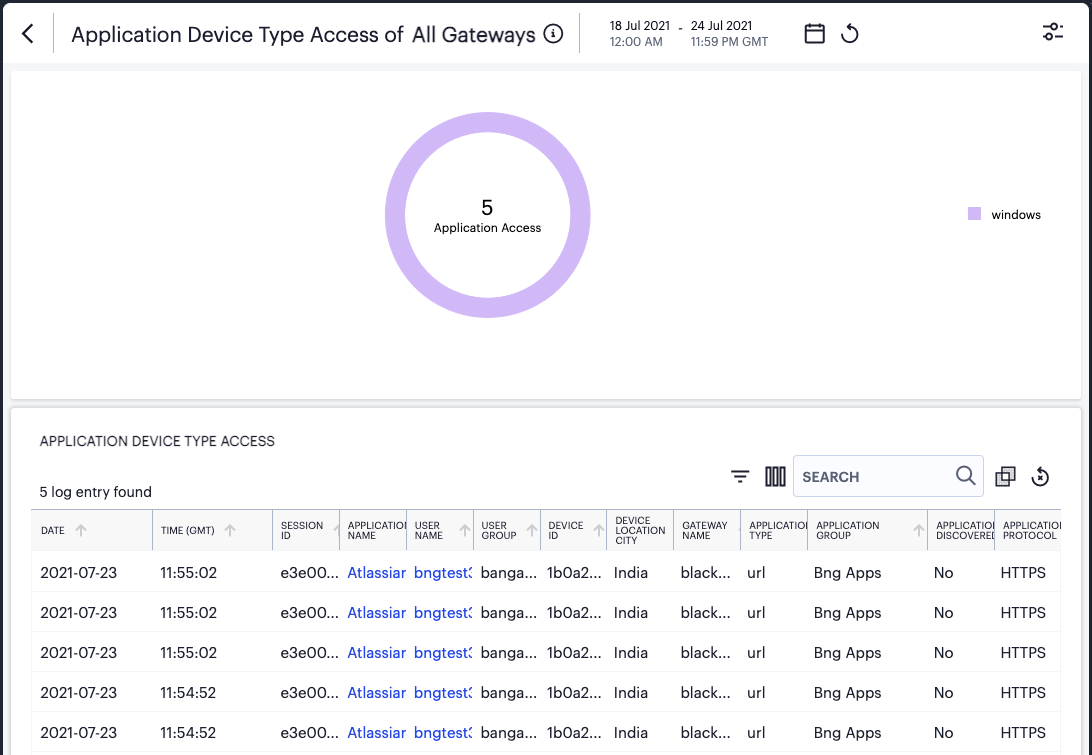
FIGURE 359 Viewing Application Device Type Access detailed logs
Each detail view shows logs for the corresponding chart or category. To learn more about using the chart detail page, see Viewing Detailed Logs for a Chart.
Using the Summary Ribbon
The Summary Ribbon at the top of the Application page shows details for the application:

FIGURE 360 Viewing the summary ribbon
The summary ribbon provides the following information:
First Accessed: The date on which the application was first accessed.
Last Accessed: The date on which the application was most recently accessed.
Type: The application type. For example, “Web”.
Port: The port on which the application is accessed.
IP Address: The IP address through which the application is accessed.
Application Location: The geographic location where the application is hosted.
Gateway Name: The name of the ZTA Gateway managing the application.
Gateway Location: The location of the ZTA Gateway managing the application.
Secure Access Policy: The name of the Secure Access Policy governing access to the application. Click the name of the policy to access the Secure Access Policies page.
Note
If your application is discovered, this is denoted by a label in the ribbon. To learn more about discovered applications, see Reviewing Application Usage.
Viewing Application Accesses by Device Type
The Application Device Type Access panel shows application accesses by device type:
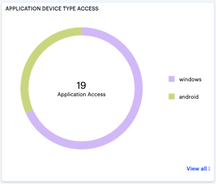
FIGURE 361 Viewing application accesses by device type
The chart provides a breakdown of application accesses for each device type. The number in the center of the chart is a total for all device types. Hover your pointer over a device type to view a tooltip showing the number of accesses made by devices of that type.
Viewing Access Trends for the Selected Application
nZTA uses this section to show access trends for the selected application that occurred during the selected time period.
You can choose to display this information through line and bar charts (as shown), or in a Sankey chart. Use the toggle icon at the top-right to select the required view:
FIGURE 362 Toggle between line/bar chart view and Sankey chart view
To expand the current view, click the Full Screen icon:
FIGURE 363 Expand the current view
The line and bar chart shows application access trends through each hourly interval of the day:
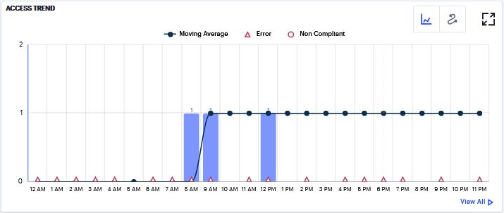
FIGURE 364 Viewing hourly access trends for an application
The horizontal axis reflects the 24 hourly intervals in a day, with the vertical axis showing the number of accesses. As users access the application, access attempts are recorded and shown in this chart according to the hour in which they occurred. This in turn provides an overview of the daily access trends for the application.
The bars denote the number of accesses made, with the line charting the moving average over 30 days.
Errors and non-compliances detected in the hour are marked as per the legend.
Hover your pointer over an hour interval to see a tooltip summary of data points for that hour:
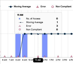
FIGURE 365 Viewing a data summary tooltip
To learn more about the application access Sankey chart, see Viewing the Application Access Trends Sankey Chart.
Viewing the Application Access Trends Sankey Chart
` The Application Access Trends Sankey chart provides an alternate visualization of access activity for your selected application, showing directed flow between related objects. The width of each stream in the flow is proportional to the utilization of the object the flow passes through, allowing an administrator to view significant usage trends for the selected application.
To toggle between the application access trends line/bar chart and the application access trends Sankey chart, use the icons at the top-right:
FIGURE 366 Toggle between line/bar chart view and Sankey chart view
By clicking the toggle display icon, the Application Access Trends Sankey chart replaces the line/bar chart in the display. All other components remain unchanged.
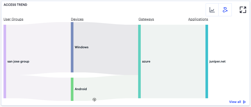
FIGURE 367 Displaying the Application Access Sankey Chart
The Sankey chart maps Locations > Devices > Gateways > Application for the selected application. By hovering your pointer over a flow of interest, nZTA displays a tooltip confirming the scale of the activity between the two objects connected by the flow.
To focus the display on a specific flow, or to identify related objects that interact with this flow, click the chart at a point of interest. nZTA provides highlighting to all flows that pass through the point selected.
Viewing Application Activity Charts
On the Application page, nZTA provides the following charts:
Top Users: Shows the users who accrued the most accesses for the selected application.
User Access Locations: Shows the user locations from which the most accesses were recorded for the selected application.
Hover your pointer over a bar in the chart to view a tooltip showing the number of accesses made.
Monitoring ZTA Gateway Activity
To view usage data and metrics for all ZTA Gateways, or for a specific ZTA Gateway, use the Gateways Overview page.
To view the Gateways Overview page, select Insights > Gateways:
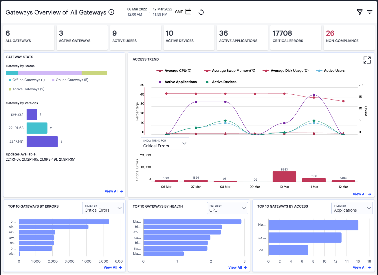
FIGURE 368 Viewing ZTA Gateway metrics
By default, this page shows data for all ZTA Gateways. To view data for a specific ZTA Gateway, use the filter feature described in Using the Filter Bar.
Note
Some features on this page require your ZTA Gateways to be running as version 22.1R1 or later. ZTA Gateways running versions earlier than this might not be included in some status and health data.
Understanding the Display
The Gateways Overview page contains the following components:
Filter bar, allowing the selection of active or historic data. For details, see Using the Filter Bar.
Summary ribbon, showing metrics for deployed ZTA Gateways. For more details, see Using the Summary Ribbon.
Gateway Stats, showing an overview of the status of your deployed ZTA Gateways. For more details, see Reviewing the Status of your Deployed ZTA Gateways.
Access trend, showing ZTA Gateway usage metrics over time. For more details, see Viewing ZTA Gateway Access Trends.
Activity charts, showing top 10 ZTA Gateway usage metrics in a number of categories. For more details, see Viewing ZTA Gateway Activity Charts.
Each chart on this page includes a View all link. This link provides access to a detail view showing logs for the corresponding chart. For example:
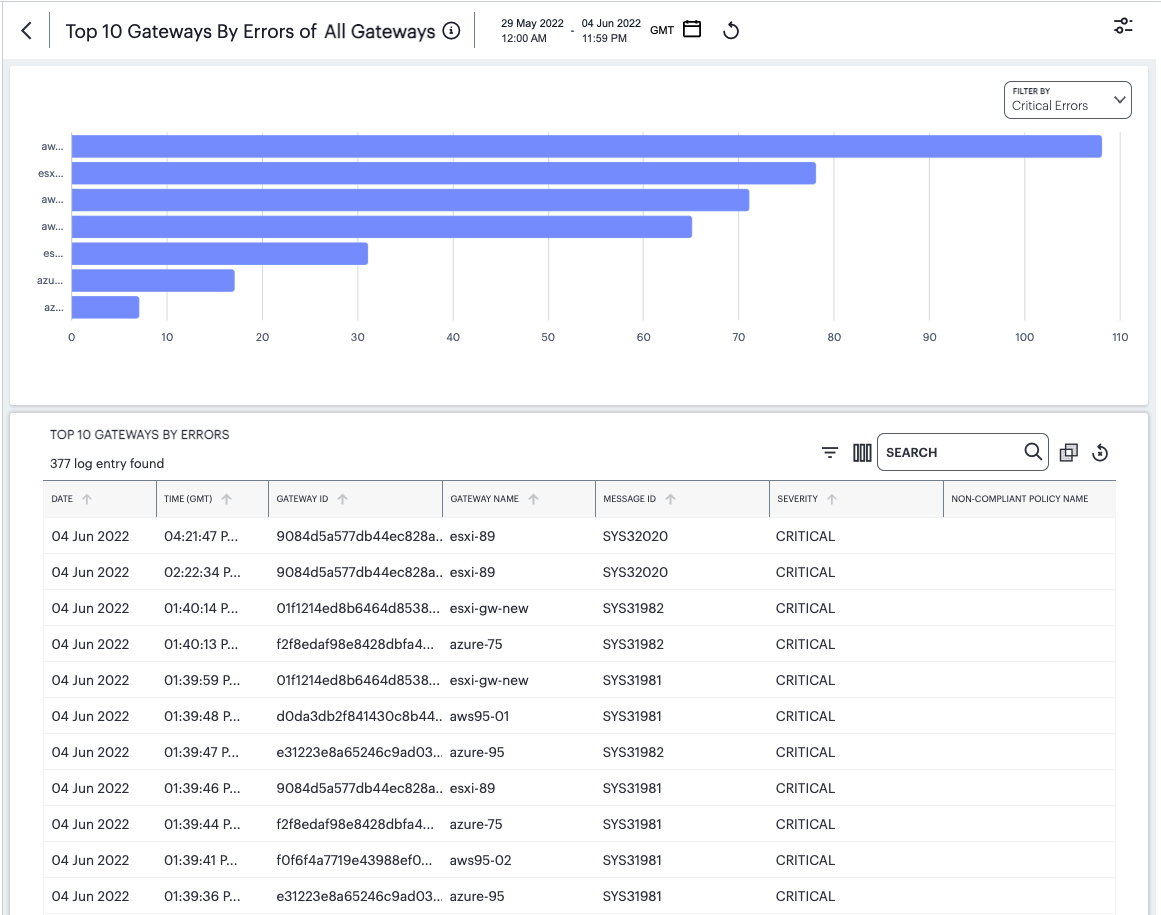
FIGURE 369 Viewing detailed logs for Top 10 Gateways by Errors
Each detail view shows logs for the corresponding chart or category. To learn more about using the chart detail page, see Viewing Detailed Logs for a Chart.
Using the Summary Ribbon
The Summary Ribbon at the top of the Gateways Overview page shows relevant summary statistics relating to your deployed ZTA Gateways:

FIGURE 370 Viewing the summary ribbon
The summary ribbon provides the following information:
All Gateways: The total number of deployed ZTA Gateways.
Active Gateways: The number of active deployed ZTA Gateways in the selected time period. In other words, those ZTA Gateways that are online and reporting activity.
Active Users: The number of users accessing applications and resources managed by your active ZTA Gateways during the selected time period.
Active Devices: The number of unique devices used to access applications and resources managed by your active ZTA Gateways during the selected time period.
Critical Errors: The number of critical errors observed on your ZTA Gateways during the selected time period.
Non-Compliance: The number of non-compliant attempts to access the applications managed by your ZTA Gateways.
Reviewing the Status of your Deployed ZTA Gateways
The Gateway Stats panel shows the status of your deployed ZTA Gateways during the selected time period:
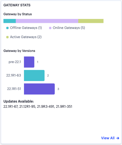
FIGURE 371 Viewing the Status of your deployed ZTA Gateways
The panel provides three separate components:
A visual breakdown of your deployed ZTA Gateways as Offline Gateways (ZTA Gateways deployed but unresponsive/unavailable), Online Gateways (responsive ZTA Gateways not currently handling user traffic), and Active Gateways (ZTA Gateways handling user traffic).
A visual breakdown of your deployed ZTA Gateways by version.
The software updates available for your deployed ZTA Gateways, if applicable.
Viewing ZTA Gateway Access Trends
This section shows ZTA Gateway access trends that occurred during the selected time period:
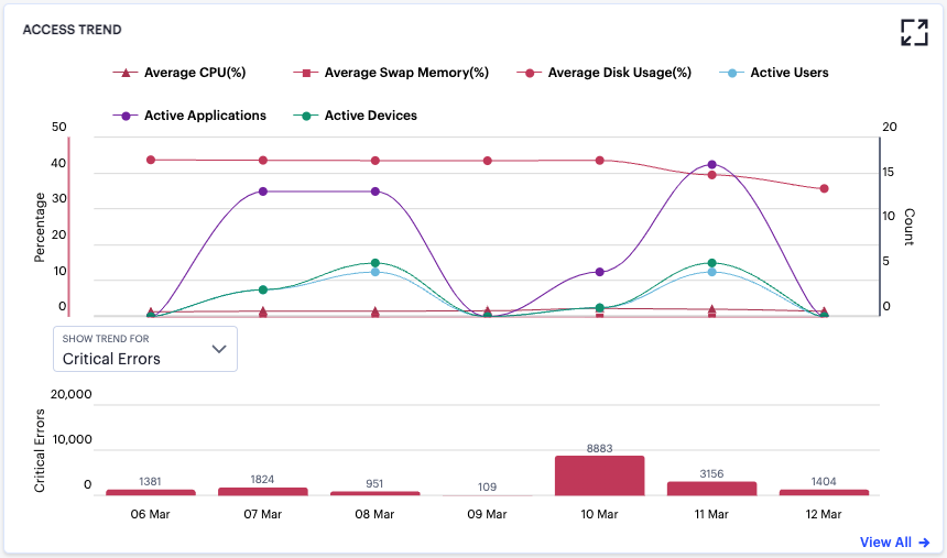
FIGURE 372 Viewing ZTA Gateway access trends
The horizontal axis of each chart reflects the selected time period, and dynamically adapts to span the period in increments appropriate to that period. For example, 5 minute intervals for the Last Hour view, or hourly intervals where you select a whole day.
To expand the current view, click the Full Screen icon:
FIGURE 373 Expand the current view
The display is split into two segments:
A line chart showing the number of ZTA Gateway accesses in the selected time period.
A bar chart showing access trends for a selected data type. Use the Show Trend For drop-down control to select the chart data type. Choose from:
Critical Errors
Throughput (MB)
Major Errors
Non Compliances
In this chart, hover your pointer over each interval point to view a tooltip showing the corresponding data totals. Furthermore, you can click and drag a select box across a shorter time period to zoom in on a narrower time window. To return to the full period, click the zoom out icon:
FIGURE 374 Zoom out from a selected time period
In the line chart, toggle on or off the data for a particular trend type by clicking the name of the type in the legend.
Viewing ZTA Gateway Activity Charts
On the Gateways Overview page, nZTA provides the following charts:
Top 10 Gateways by Errors: The top 10 ZTA Gateways for which errors were reported. Use the Filter By drop-down control to select the criteria for the chart. Choose from Critical Errors, Major Errors, or Non-Compliances.
Top 10 Gateways by Health: The top 10 ZTA Gateways by system health. Use the Filter By drop-down control to select the criteria for the chart. Choose from average CPU usage, average Swap Memory usage, average Disk Usage, or Network Throughput.
Top 10 Gateways by Access: The top 10 ZTA Gateways by the number of accesses. Use the Filter By drop-down control to select the criteria for the chart. Choose from Applications, Users, or Devices.
Hover your pointer over a bar in the chart to view a tooltip showing the ZTA Gateway name and total applicable to that bar.
Reviewing Policy Failures
When a device attempts to access an application or resource controlled by a Secure Access Policy, the device must first comply with all relevant device policies. If the device does not meet one or more of the conditions in a policy, a failure event is recorded and access is denied. nZTA displays policy failure data and metrics in the Policy Failures page.
To view the Policy Failures page, select Insights > Policy Failures:
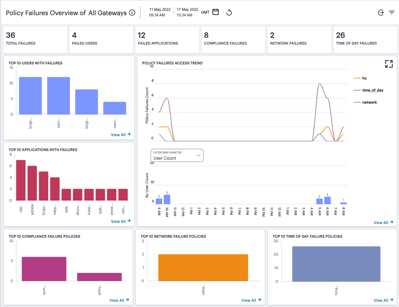
FIGURE 375 Viewing policy failure metrics
The failure types reported on this page are comprised of the following types:
Network policy failures: a device does not meet the conditions in a policy containing a Network type device rule.
Time-of-day policy failures: a device does not meet the conditions in a policy containing a Time of day type device rule.
Compliance policy failures: a device does not meet the conditions in a policy containing other device compliance rules.
Note
In this release, policy failures based on rules of type Location are not included in these metrics.
For more information on configuring device rules and policies, see Creating Device Policies and Device Policy Rules.
Understanding the Display
The Policy Failures page contains the following components:
Filter bar, allowing the selection of active or historic data. For details, see Using the Filter Bar.
Summary ribbon, showing metrics pertaining to detected policy failures across various categories. For more details, see Using the Summary Ribbon.
Policy Failures Access trend, showing policy failure counts over time. For more details, see Viewing Policy Failures Access Trends.
Activity charts, showing top 10 failure counts in various categories. For more details, see Viewing Policy Failure Activity Charts.
Each chart on this page includes a View all link. This link provides access to a detail view showing logs for the corresponding chart. For example:
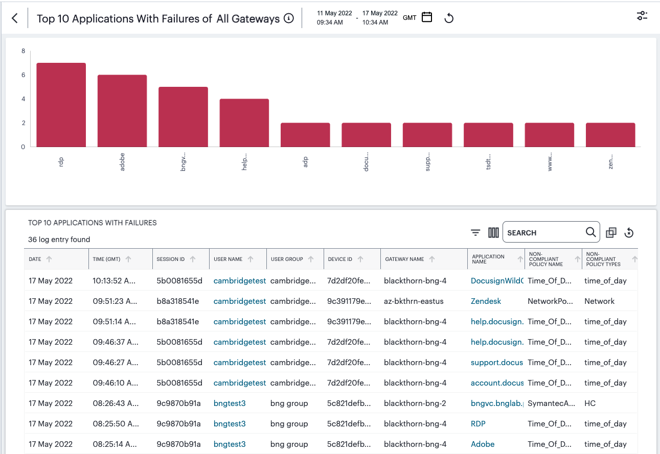
FIGURE 376 Viewing detailed logs for Top 10 Applications With Failures
Each detail view shows logs for the corresponding chart or category. To learn more about using the chart detail page, see Viewing Detailed Logs for a Chart.
Using the Summary Ribbon
The Summary Ribbon at the top of the Policy Failures page shows policy failure totals across a number of categories:

FIGURE 377 Viewing the summary ribbon
The summary ribbon provides the following information:
Total Failures: The total number of policy failures detected across your deployment in the selected time period.
Failed Users: The number of users who triggered a policy failure upon attempting to access an application or resource controlled by a Secure Access Policy.
Failed Applications: The number of applications to which access was denied due to a policy failure.
Compliance Failures: The number of compliance failures recorded against all device policies, excluding network and time-of-day type policies.
Network Failures: The number of failures recorded against a network type device policy.
Time of Day Failures: The number of failures recorded against a time-of-day type device policy.
Viewing Policy Failures Access Trends
nZTA uses this section to show policy failure access trends that occurred during the selected time period:
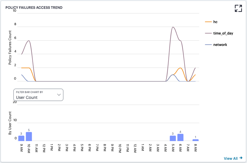
FIGURE 378 Viewing policy failure access trends
To expand the current view, click the Full Screen icon:
FIGURE 379 Expand the current view
The display is split into two segments:
A line chart showing the number of policy failures for network, time-of-day, and compliance (marked in the chart as “hc”) policy types during each hourly period of the day
A bar chart showing one of two data types, selected using the Filter Bar Chart By drop-down control:
User Count
Application Count
Note
If you set a Time Period filter than spans more than one day, the data values shown in each hour period are cumulative totals for the same hour in each day during the time period.
In this chart, hover your pointer over each hourly interval to view a tooltip showing the corresponding data totals. Furthermore, you can click and drag a select box across a shorter time period to zoom in on a narrower time window. To return to the full 24 hour period, click the zoom out icon:
FIGURE 380 Zoom out from a selected time period
In the Policy Failures Count line chart, toggle on or off the data for a particular failure trend type by clicking the name of the type in the legend. Or, to view only the data for a specific type, click the corresponding line in the graph.
Viewing Policy Failure Activity Charts
On the Policy Failures page, nZTA provides the following charts:
Top 10 Users With Failures: The top 10 users users who triggered a policy failure upon attempting to access an application or resource controlled by a Secure Access Policy.
Top 10 Applications With Failures: The top 10 applications to which access was denied due to a policy failure.
Top 10 Compliance Failure Policies: The top 10 compliance device policies that reported failures.
Top 10 Network Failure Policies: The top 10 network device policies that reported failures.
Top 10 Time of Day Failure Policies: The top 10 time-of-day device policies that reported failures.
Hover your pointer over a bar in the chart to view a tooltip showing the number of failure in that case.
Checking the Logs
The nZTA Logs page displays audit and activity events observed by your nZTA secure access infrastructure. These events are reported to the Controller by your ZTA Gateways and the Authentication, Authorization and Accounting (AAA) service.
To view the Logs page:
Log into the Controller as a Tenant Admin, see Logging in as a Tenant Administrator.
From the nZTA menu, click the Insights icon, then select Logs.
The Logs page appears.
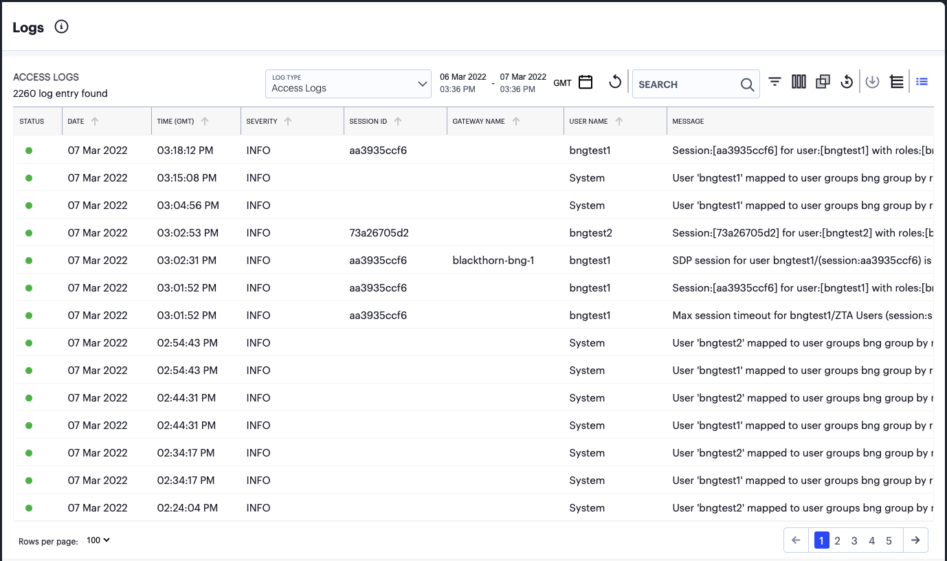
FIGURE 381 Viewing the Logs
This page comprises the following sections:
The time period selector, see Setting a Log Time Period.
Log selection and filtering controls, see Setting Log Criteria and Filtering the Output.
The log record display, see Viewing Log Records.
Note
nZTA additionally provides a separate log records page pertaining to activity for specific ZTA Gateways. To learn more, see Viewing and Monitoring Gateways in the Controller.
Setting a Log Time Period
Use the time period selector to set a time period or time range for your log results. Click the date-time display (highlighted) to show the selector dialog:
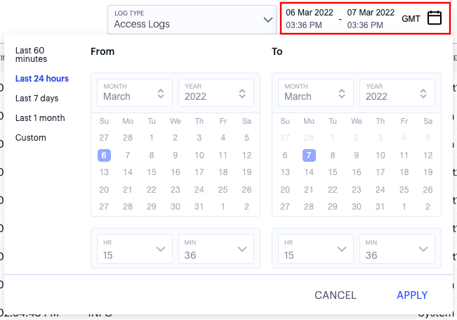
FIGURE 382 Setting a log time period
Set the time period you want to view using the available ranges at the top-left. Choose from:
Last 60 minutes
Last 24 hours (default)
Last 7 days
Last 1 month
Custom
For Custom, set a specific From and To to denote the start and end of your custom date/time range.
Note
The date/time calendar controls are enabled for only the Custom option. However, the calendar continues to identify the applicable start and end date-time for all predefined time periods.
To apply your changes, click Apply. The selected time period is displayed in the filter bar and data on the page updates accordingly.
Note
To configure the timezone, see Setting the Timezone.
Setting Log Criteria and Filtering the Output
To set the criteria you want to use for viewing log data, use the controls above the main log display. This section also contains functions to highlight search terms, apply filters, and schedule log export jobs.
Select the primary log type you want to display by using the Log Type drop-down list:
FIGURE 383 Selecting a log type
Choose from:
Access Logs
Admin Logs
Event Logs
Then, use the icons adjacent to the log selector to further control your log selection. Choose from the following:
Logs are refreshed automatically by changing the criteria. To manually refresh the log display, click the following icon:
FIGURE 384 Page refresh
To search for a term in the displayed logs, click the following field:
FIGURE 385 Search term highlighting
nZTA highlights all matches in the log display.
To trigger the advanced filter selection, use the following icon:
FIGURE 386 Advanced Filtering
To learn more, see Filtering the Logs.
To change the fields displayed for each log line, click the following icon:
FIGURE 387 Show or hide log fields
In the field selector, click a field name to toggle between show or hide. A tick icon indicates a displayed field. After you are finished, click the context menu icon to close the selector. See Viewing Log Records.
To apply grouping to the displayed log records, click the following icon:
FIGURE 388 Group log records by selected criteria
This feature applies grouping to a selected field in the log record display, such that records are accumulated and grouped together under each unique data item identified in that field. Through grouping, an admin can quickly view the number of records of a particular type.
To learn more about record grouping, see Viewing Detailed Logs for a Chart.
To remove any applied filters from the data set, click the following icon:
FIGURE 389 Remove any applied filters from the data
To export the displayed log as a CSV or JSON text file, or to set up a new scheduled log export job, click the following icon:

FIGURE 390 Export filtered logs
To learn more about log export jobs, see Exporting Logs.
To view the status of currently-scheduled log export jobs, click the following icon:

FIGURE 391 View scheduled log export jobs
To learn more about log export jobs, see Exporting Logs.
To change the view density, click the following icon:

FIGURE 392 Switching between default and dense log record views
Viewing Log Records
The main part of the page shows the log records that match your selected criteria. The number of matching log records is displayed at the top-left.
Each log line includes the following fields:
A status indicator showing the level of severity associated with each log event. Use the following table for a guide to the meaning of each indicator color:
Severity
Status Color
INFO
Green
MINOR
Amber
MAJOR
Amber
CRITICAL
Red
The date and time of the event.
The message ID that identifies this type of event.
The severity of the event in words.
The session ID that was the source of the event, where applicable.
The ID of the ZTA Gateway that reported the event, where applicable.
The name of the ZTA Gateway that reported the event, where applicable.
The IP address identified as the source of the event.
The user name associated with the event, where applicable.
The ID of the device associated with the event, where applicable.
The message (description) of the event.
Use the page controls at the bottom to select the number of log records/rows per page:
FIGURE 393 Setting the number of log rows per page
Choose from:
50
100 (default)
200
To cycle through the log pages, use the page controls at the bottom-right.
Where a single log message is too long for the display, use your pointing device to scroll the optional fields display to the left or right.
Furthermore, to view a single log entry in a dedicated panel, click the log message text to activate the info-panel view:
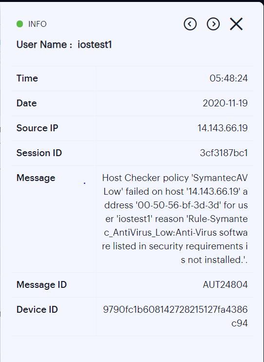
FIGURE 394 Viewing a single log entry in the info-panel
Note
In the info-panel, use the Previous and Next icons to cycle through each log entry in turn.
Filtering the Logs
The Logs page provides an advanced field filter through which you can narrow down the displayed log entries to a sub-set that matches the filters you apply. You can also save filter definitions for later use.
To set a filter, click the following icon:
FIGURE 395 Activating the advanced filter
Next, use the side-panel dialog to add one or more new field filters.
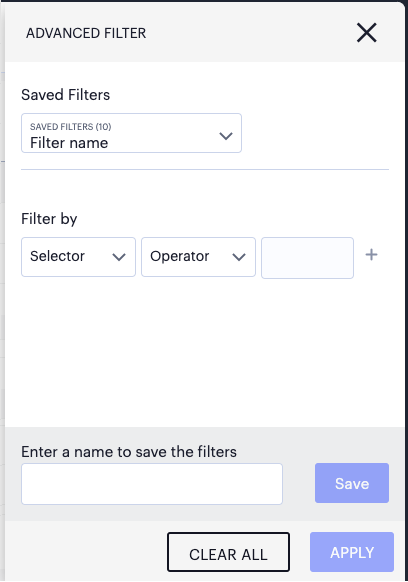
FIGURE 396 Adding a new log filter
In this dialog, recall a saved filter through the Saved Filters drop-down list or set new filter criteria through the Filter by section.
By selecting a saved filter, the filter criteria are populated into the panel. To then apply the saved filter, click APPLY FILTER.
Note
You can add additional criteria lines to a recalled filter before applying it, but the saved filter is unaffected.
Note
Saved filters are preserved across all log pages in the Tenant Admin portal, but might not be valid for all pages. For example, a saved filter created on the Insights > Logs page might not be applicable to the data on the Gateways > Logs page (in other words, where a filter references a log field not applicable to ZTA Gateways). In this case, where you attempt to select an invalid filter, nZTA presents an error.
When setting new filter criteria, use the Selector drop-down list to choose the field you want to filter on, add an Operator type, and then enter the Value you want to apply. For the operator, choose from:
IS: The selected field matches exactly the value you specify.
CONTAINS: (where applicable) The selected field contains as a sub-string the value you specify.
To add further criteria to this filter, click the plus symbol. Then, repeat the above step as desired. To remove a criteria line, click the corresponding X icon.
To apply the defined filter, click APPLY FILTER.
Your filters remain in place through data refreshes, and active filters are identified by the Filters are applied on this page label at the top of the page. To remove a filter, click the filter icon (or the link at the top of the page) to re-display the filters side-panel dialog. Then, click CLEAR ALL to remove all active filters.
To save a filter for future use, use the save-as facility at the bottom of the panel. Enter a name for your saved filter in the text box provided, then click Save. You can recall your filter through the Saved Filters list at the top of the panel.
To delete saved filters, use the Saved Filters list. Select the checkbox adjacent to the filter, or filters, you want to delete, then click DELETE from the bottom of the panel.
Exporting Logs
nZTA provides the ability to export the currently-displayed log as a Comma-Separated Value (CSV) or JavaScript Object Notation (JSON) text file. You can download the log immediately or set up a scheduled job to activate or repeat the export action at a defined time and interval of your choosing.
To access the Export Logs page:
Log into the Controller as a Tenant Admin, see Logging in as a Tenant Administrator.
From the nZTA menu, click the Insights icon, then select Logs.
The Logs page appears.
Select the log type you want to display in the Log Type drop-down list. Choose from:
Access Logs
Admin Logs
Event Logs
Click the cloud icon at the top of the page:
FIGURE 397 Accessing the Export Logs Settings page
The Export Logs page appears:
FIGURE 398 The Export Logs settings page
Use the Export Logs settings page to configure an export operation, either to execute immediately as a one-off job, or as a scheduled job.
Configure the following settings:
Select either CSV or JSON as the output format.
Select the frequency of the export operation. Choose from:
Export one time: Perform the log export now as a single job.
Daily data export: Create a daily export job executed once per day from the selected start date, up to and including the stop date (if defined).
Weekly data export: Create a weekly export job executed once per week on the selected start day, up to and including the stop date (if defined).
Monthly data export: Create a monthly export job executed once per month on the selected start day, up to and including the stop date (if defined).
If a stop date is specified, this is the date the schedule ceases. In the case of weekly or monthly jobs, if this date falls before the expected run date for that period, the job is terminated without running. For example, in a weekly run scheduled to execute every Thursday, if the stop date is set as a Tuesday, the final run of the job would be the previous Thursday.
Note
A daily data export job continues to run for one extra day beyond the selected end date in order to process the logs for the final scheduled day.
Note
For daily/weekly/monthly frequency export jobs, nZTA allows for a maximum of 5 runs per scheduled export job. That is, each schedule runs a maximum of 5 times. On the sixth run, the first run is deleted (together with the log file), and so on.
Set an export time frame. For one-time exports, choose from:
Last 60 minutes
Last 24 hours
Last 7 days
Last 1 month
Set a date range (30d max): This option presents a configurable start and end date.
For daily, weekly, and monthly exports, this option switches to show start and end date parameters. You do not need to specify an end date; in this case, the job remains active until deleted.
Enter a Job name for the export operation. nZTA suggests an appropriate name; use this, or type your own.
To execute the defined job, click Export.
To view all scheduled export logs jobs, and to download the log files created by each job, see Viewing Scheduled Log Export Jobs and Downloading Log Files.
Note
nZTA allows for a maximum of 5 defined export jobs. Each job that you add reduces the total, as displayed at the bottom of the page. This is a separate limit to the maximum number of job runs described earlier.
Viewing Scheduled Log Export Jobs and Downloading Log Files
To view the status of your current log export jobs:
Log into the Controller as a Tenant Admin, see Logging in as a Tenant Administrator.
From the nZTA menu, click the Insights icon, then select Logs.
The Logs page appears.
Click the list icon at the top of the page:
FIGURE 399 Accessing the Job Status page
The Job Status page appears:
FIGURE 400 The Job Status page
Use the Job Status page to:
View the status and progress of currently scheduled log export jobs.
Download log files for completed job runs.
For each job on the Job Status page, you can view the configured details of the export operation along with status indicators for progress of the previous and outstanding job runs.
Note
A job run refers to a single run of a scheduled job. For example, in a weekly data export job, a job run refers to the export operation scheduled or completed for one specific week within the start and end dates. Thus, a scheduled log export job is comprised of one or more job runs.
The Summary column provides totals of successful job runs, unsuccessful/failed job runs, and inactive job runs.
Click any of the fields in a single job row to display an info-panel at the side showing more details about the scheduled job:
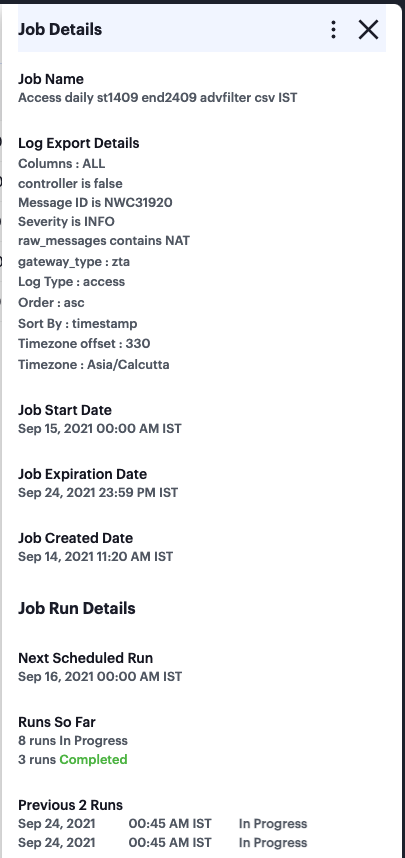
FIGURE 401 The Job Details info-panel
To access the log files and view more information about each individual job run, click the down-arrow adjacent to the Job name:
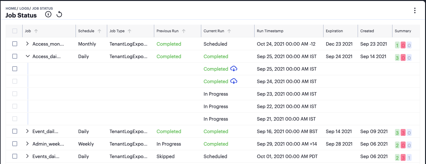
FIGURE 402 Showing all job runs for a scheduled export job.
Note
For daily/weekly/monthly frequency export jobs, nZTA allows for a maximum of 5 runs per scheduled export job. That is, each schedule runs a maximum of 5 times. On the sixth run, the first run is deleted (together with the log file), and so on.
As with a scheduled job, click on any of the fields in the job run row to display an info-panel at the side showing more details about the job run:
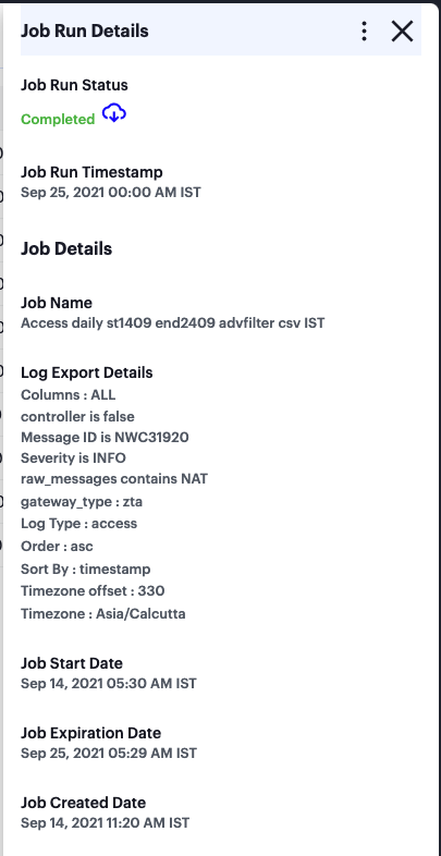
FIGURE 403 The Job Run Details info-panel
To download the log file generated by the job run, click the cloud icon for a completed job run:
FIGURE 404 Downloading a log file
To remove a scheduled log export job, or any of the completed job runs within the job, tick the checkbox adjacent to the job/job run and then access the context menu at the top of the page:
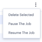
FIGURE 405 The Job Status menu
Select from the following options:
Delete Selected: Remove all jobs or job runs that have been selected.
Pause the Job: Instruct the outstanding job runs in the schedule to become inactive. The schedule continues chronologically, but no further log export operations are completed while in this state.
Resume the Job: Resume the schedule starting at the next scheduled job run.
Note
If you choose to delete a complete job, all job runs and log download files are removed permanently.
Associating Geographical locations to IP Addresses
nZTA provides the mapping of Gateway geographic location to IP address.
Before you start, make sure that you have the following information:
The public IP address/range for the Gateway. This is the IP address at which clients can externally reach the Gateway.
The Gateway geographic location information such as country, state/province and city.
To add a new location:
Log into the Controller as a Tenant Admin, see Logging in as a Tenant Administrator.
The Network Overview page appears by default.
From the nZTA menu, click the Administration icon, then select Custom Geo IP.
The Custom Geo IP page appears. This page lists all defined geographical associations to IP addresses.
Click “+” at the top of the page:

FIGURE 406 The Custom Geo IP
Enter the IP Address/range.
Select the Country.
Select the State/Province.
Select the City.
Enter a Tag for this IP Address/range.
Click Save.
Actions
nZTA enables you to configure actionable insights, such that when certain conditions are met a defined action is executed.
To configure an action:
Log into the Controller as a Tenant Admin, see Logging in as a Tenant Administrator.
The Network Overview page appears by default.
From the nZTA menu, select the Insights icon, then select Actions.
The Actionable Insights page appears.
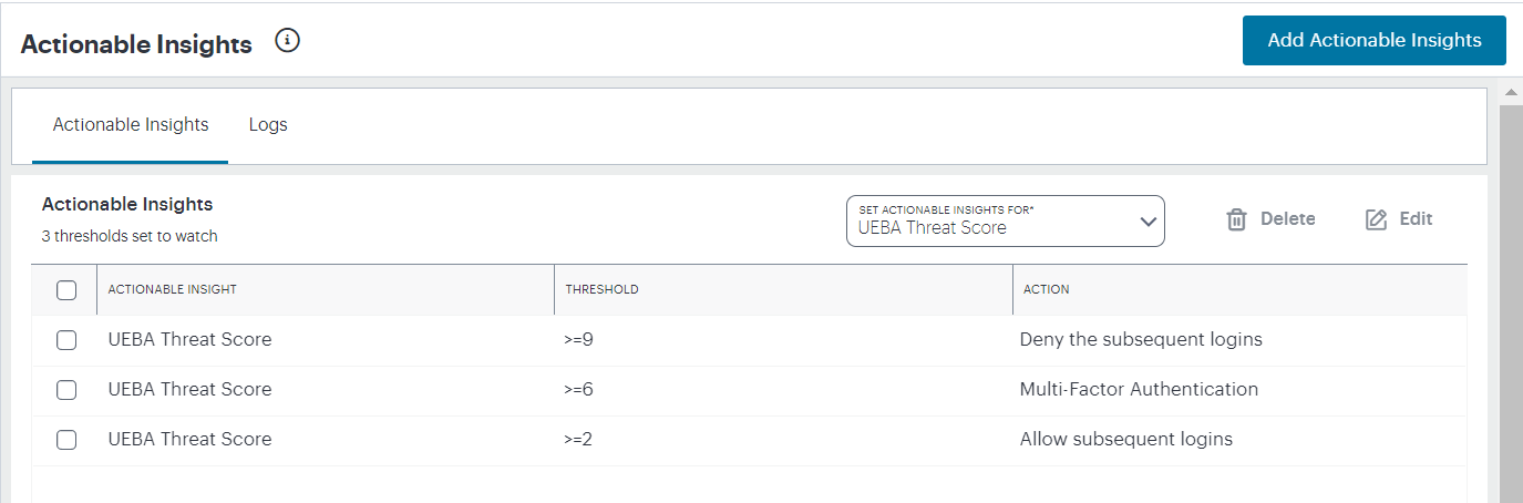
FIGURE 407 Viewing Actionable Insights
Use this page to view and configure actions that are triggered by a condition being met.
The following conditions are supported in this release:
UEBA Threat Score: If a user’s UEBA Threat score breaches a set threshold, the selected action is triggered.
Note
The condition remains in force until the user’s UEBA Threat score is manually reset. To learn more about resetting a UEBA Threat score, see Viewing UEBA Threat Data for the Selected User.
The following actions are supported in this release:
Terminate all existing sessions for the user: If the set condition is reached, all sessions for the affected user are terminated. If that user attempts a further login, Ivanti Secure Access Client denies the attempt and displays a message concerning the breach, directing the user to contact their administrator. nZTA also records an admin log event referencing the fact (see Checking the Logs).
To add a new condition:
Select Add Actionable Insight.
In Set Actionable Insight for, select a condition to apply.
The configurable options for that condition are displayed.
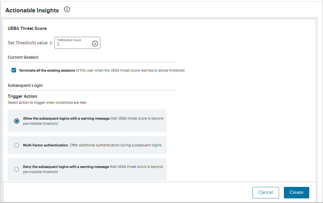
FIGURE 408 Add Actionable Insights
Set the required options/thresholds for the condition.
In Trigger Action, select the applicable action to be applied if the condition is met.
From the Subsequent Login section, select one of the following actions to trigger when conditions are met:
Allow subsequent logins with a warning message
Offer Multi-factor Authentication during the subsequent logins
Deny subsequent logins with a warning message
To save your changes, select Create.
To edit or delete an actionable insight, select the check box adjacent to the desired condition and select Delete or Edit as applicable.
When the user sessions are terminated due to reaching the threshold UEBA Threat score, the admin log messages are generated in nSA. Select the Logs tab to view the list of log messages.
Reports
nZTA provides the ability to generate and download activity reports from pre-defined report templates or through a custom defined report. It also supports scheduling the reports, to be generated either daily, or weekly once, twice or thrice.
To access the Reports page:
Log into the Controller as a Tenant Admin, see Logging in as a Tenant Administrator.
The Network Overview page appears by default.
From the nZTA menu, click the Insights icon, then select Reports.
The Reports page appears, on the Report Templates tab.
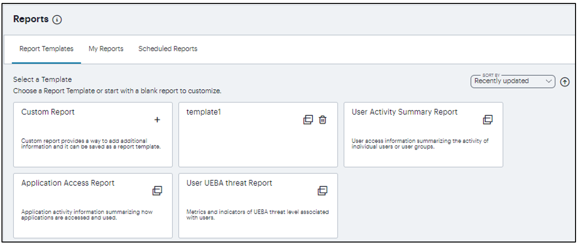
FIGURE 409 Viewing report templates
The Reports page provides the following tabs:
Report Templates: Contains all built-in and custom-saved templates upon which all reports are based, including a Custom Report option to enable creation of customized reports.
Built-in templates are read-only whereas custom-saved templates added by a tenant admin can be deleted. You can identify custom templates as per the following image:
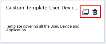
FIGURE 410 Identifying a custom-created report template from a built-in template (the delete option - indicated)
My Reports: Contains all generated report instances:
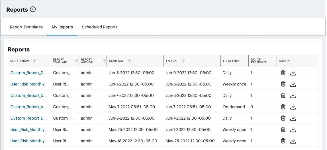
FIGURE 411 The list of generated reports
Reports shown on this page either originate from a singular on-demand request, or represent an instance of a scheduled report run. For example, if you schedule a report to run daily, at the requisite time each day a new instance of the report is generated and placed here.
For each generated report, you can:
Select the report name to view a summary of the configured parameters:
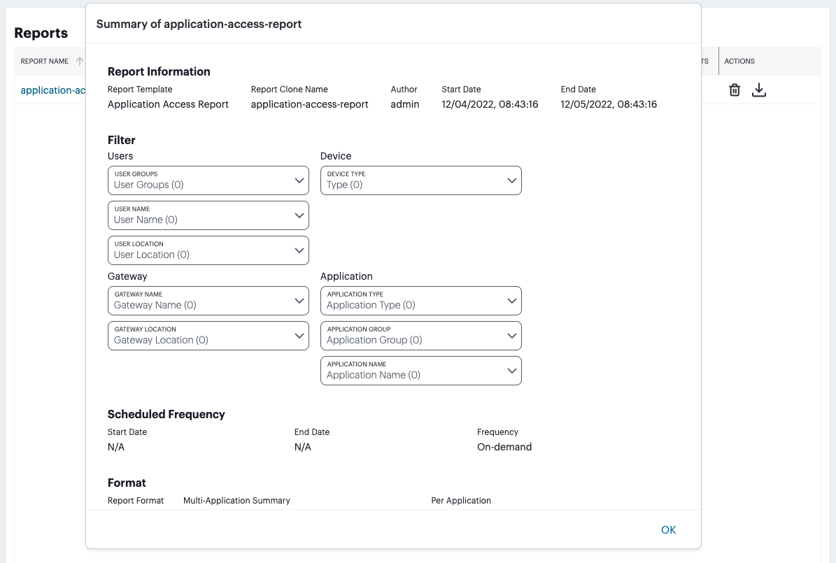
FIGURE 412 Report parameters
In the Actions column, select the download icon to view and download the report in the specified format (PDF, JSON, or CSV)

FIGURE 413 The Download icon
In the Actions column, select the delete icon to permanently remove the report instance.

FIGURE 414 The Delete icon
Scheduled Reports: Contains the list of report schedules:
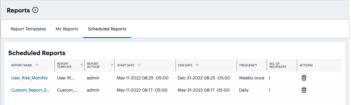
FIGURE 415 The list of report schedules
Each entry on this page represents a scheduled report definition. For each entry, you can:
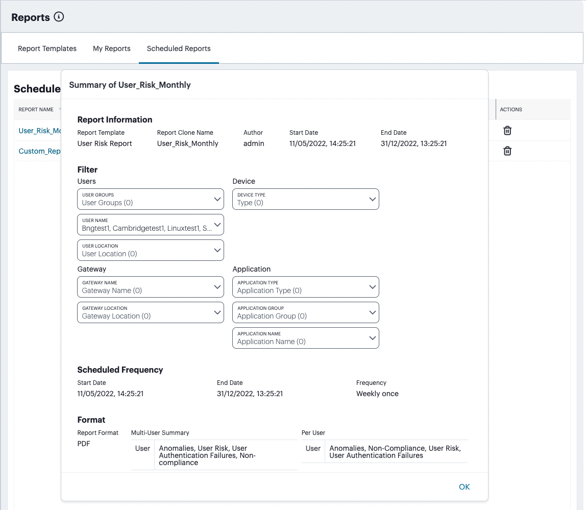
Creating a Report
This section describes how to create a new report. You can choose to create the report based on one of the following methods:
Create a new custom report
Create a new report based on one of the built-in predefined report templates provided as a part of your subscription
Create a new report based on a custom template created by a tenant admin
To configure a report:
On the Report Templates tab, choose the template option from which to create your report.
To add a new custom report, select the “Custom Report” option:
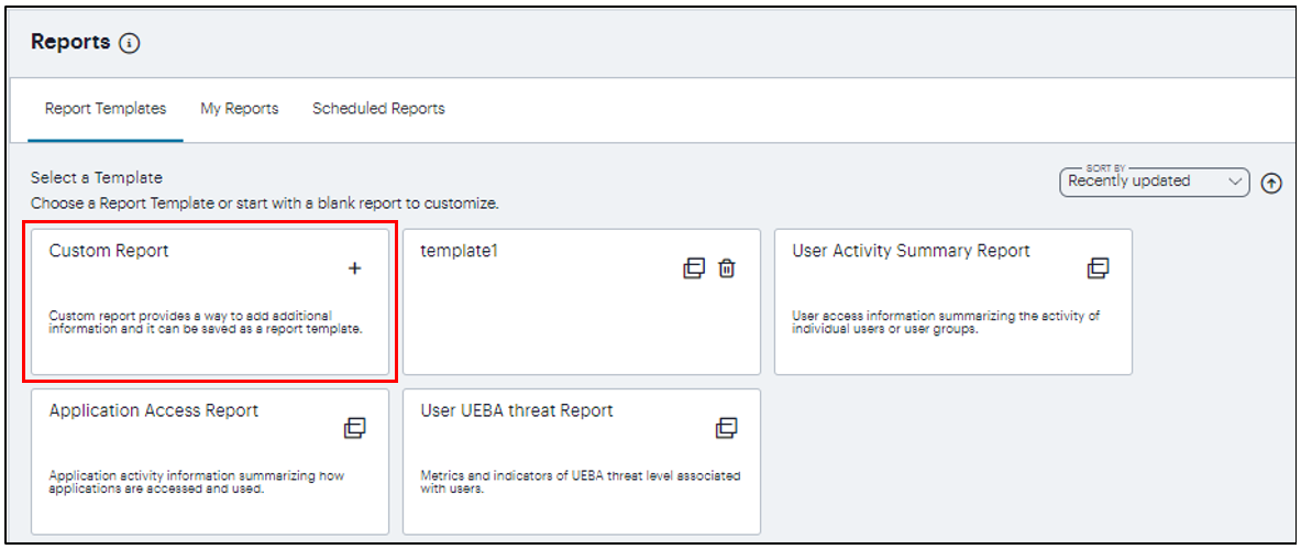
FIGURE 418 Adding a new custom report
To add a report based on a template, select the built-in or custom template of your choice:
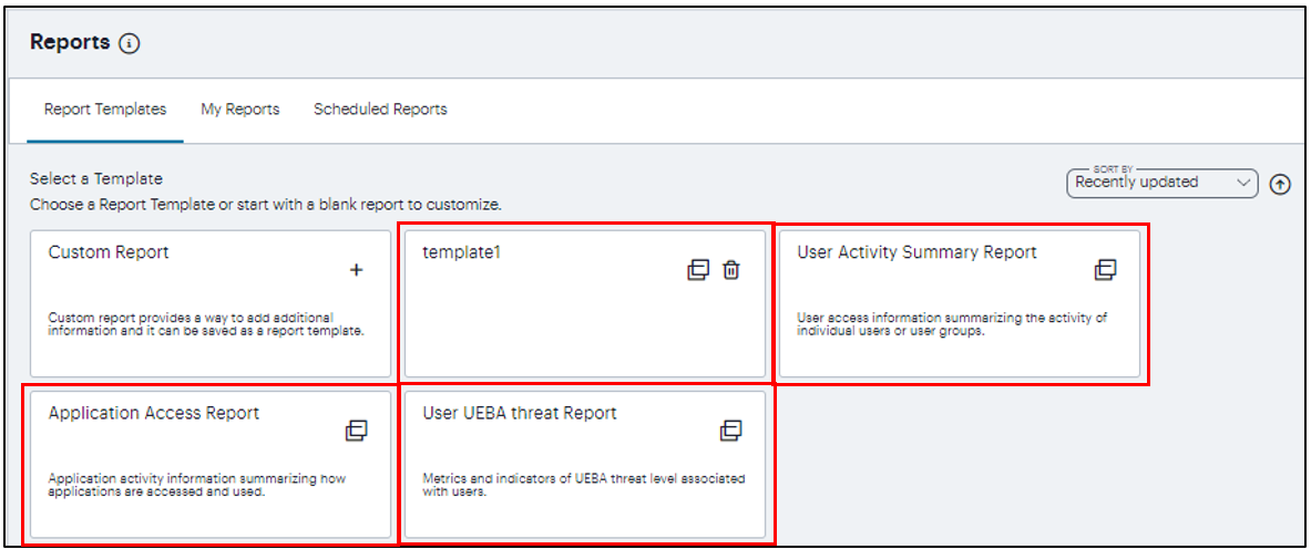
FIGURE 419 Adding a new report based on a template
The report wizard appears, beginning with the Clone step:
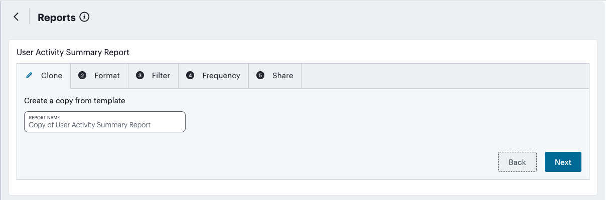
FIGURE 420 Creating a report - Clone step
Enter a unique name for the report and click Next to continue.
In the Format step:
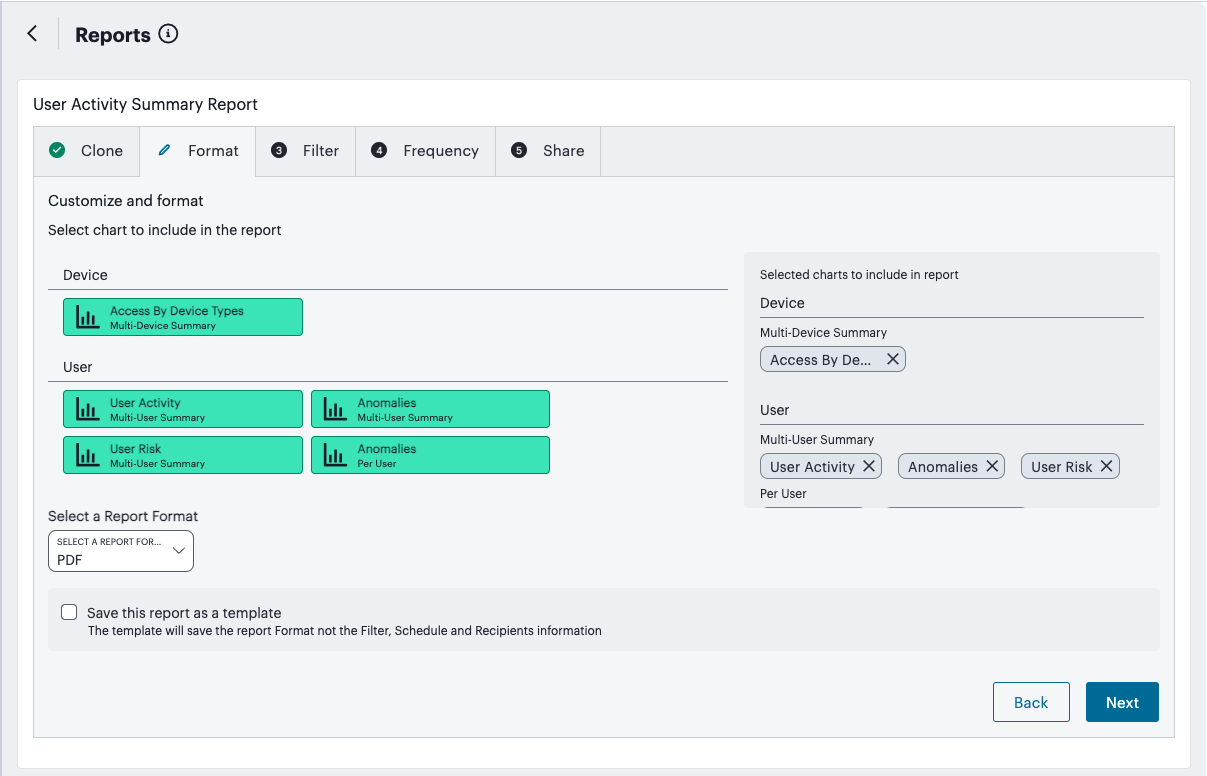
FIGURE 421 Creating a report - Format step
Select or deselect the required charts from the User, Device, and Application sections as applicable. Selected items appear in the right-hand panel.
Note
Use your pointing device to vertically scroll the charts panel as required.
Select the report format (PDF, JSON, or CSV).
(Optional) select Save this report as a template to create a new custom template containing your selections. Enter a template name and description in the fields provided.
Click Next to continue.
In the Filter step, for each category of Users, Devices, Gateways, and Applications, select or deselect the named items you want to include. For example, within Users, use the drop-down controls to select specific User Groups, User Names, or User Locations you want to include in the report:
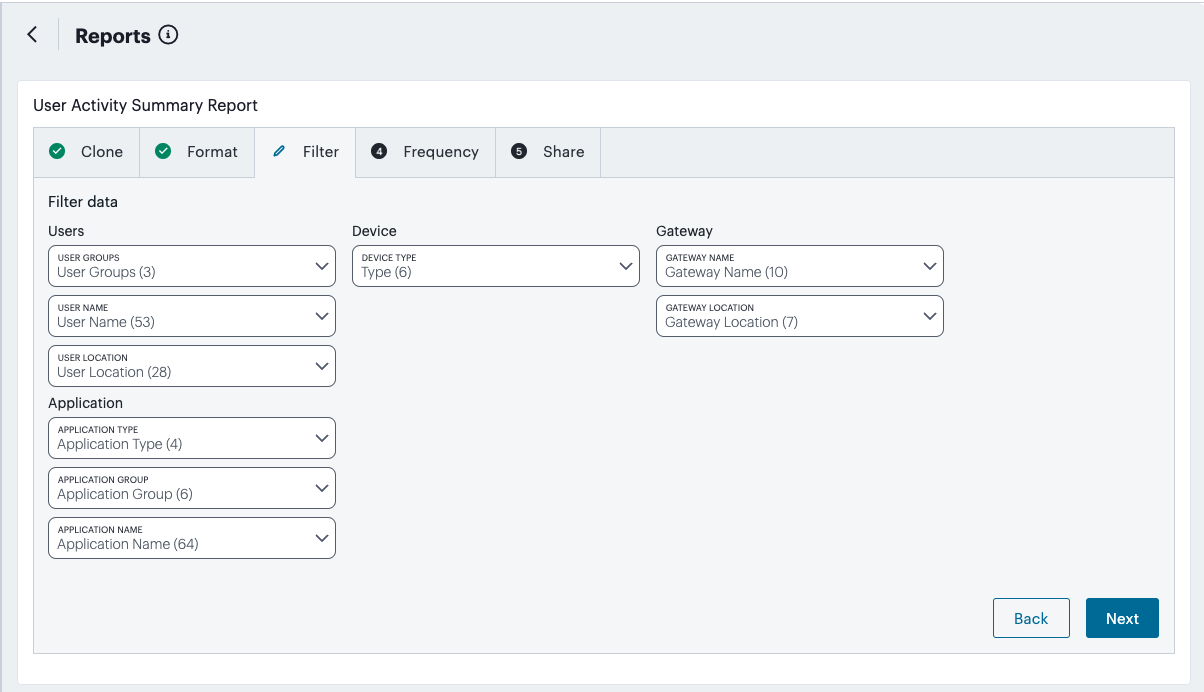
FIGURE 422 Creating a report - Filter step
Note
Objects that appear in the drop-down lists in this step are derived from those items last accessed within the previous 30 days only. Items last accessed earlier than this time are not shown.
Click Next to continue.
In the Frequency step, set the frequency with which you want this report to run:
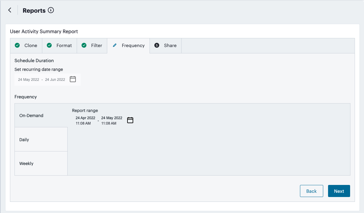
FIGURE 423 Creating a report - Frequency step
Choose from:
On Demand: Run once for a specified date and time period
Daily: Run daily at a defined time
Weekly: Run at a specified time on certain days of the week
Note
For Daily and Weekly, use Set recurring date range to set the start and end dates for which you want the schedule to run.
Click Next to continue.
In the Share step, add the recipients with which the report should be shared (if applicable):
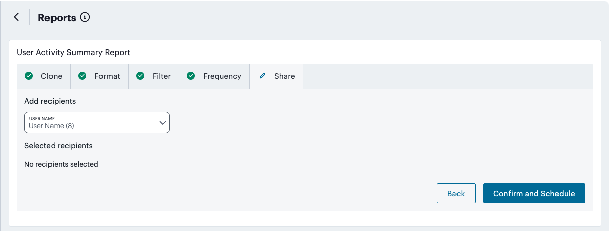
FIGURE 424 Creating a report - Share step
To complete the wizard and schedule the report according to the selections made, select Confirm and Schedule.
Note
If you elected to save the report as a custom template during the Format step, the new template is displayed on the Report Templates tab.
Viewing Alerts and Notifications
The Alerts page lists all alerts and notifications that have been raised by nZTA.
To view the Alerts page, click the Alerts icon and then click See all Alerts:
FIGURE 425 Alerts icon
The Alerts page appears. For example:
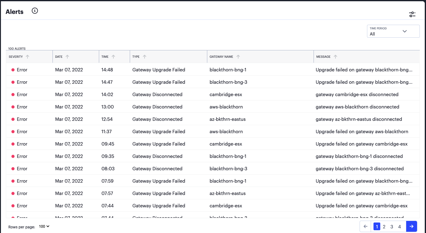
FIGURE 426 Alerts page
The alerts table supports the following alert types:
AAA Config Pull Failure
AAA Config Pull Success
AAA Config Pull Success - Failure Resolved
AAA Journal Update Failed
AAA Journal Update Success
Config Sync Rule Deleted
Config Sync Rule Updated
Config Sync Target Cluster Deleted
Custom Domain Certificate for mTLS Domain Due for Renewal
Custom Domain Certificate for mTLS Domain Expired
Custom Domain Certificate for TLS Domain Due for Renewal
Custom Domain Certificate for TLS Domain Expired
Device Vulnerability Risk Rating (VRR) Critical
Device Vulnerability Risk Rating (VRR) High
Device Vulnerability Risk Rating (VRR) Medium
Device Vulnerability Risk Rating (VRR) Low
Gateway Config Apply Failed
Gateway Config Import Failed
Gateway Disconnected
Gateway Invalid Configurations Cleared
Gateway Upgrade Failed
To filter the alerts table by type:
Click Configure Alert Rules icon.
FIGURE 427 Configure Alert Rules icon
The Configure Alerts & Notifications page appears.
Click Alert Types and select the required type.
Click Close.
To filter the alerts table by time period, click Time Period and select the required time period.
To sort the alerts table into ascending or descending order of a specific property, click on one of the following column headings in the alerts table:
Severity
Type
Message Type